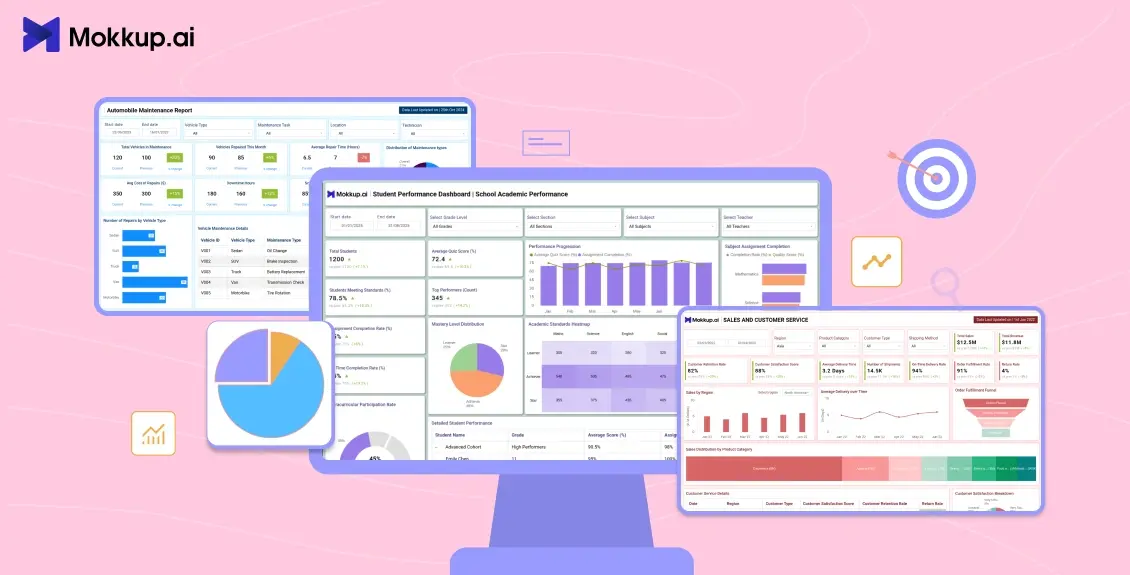
Have you ever wished you could communicate with your data rather than simply viewing it? Interactive data visualizations allow you to do just that. They turn static charts into dynamic experiences, creating engaging data viz that combines interactive data exploration with data storytelling, revealing insights through clicks, hovers, and zooms. It's more about exploring, questioning, and finding patterns on your own than about numbers on a page.
However, interactivity is a method of making complicated information understandable and enjoyable. By allowing people to choose what they see and how they view it, you can create dashboards and visualizations that are clear, memorable, and actually helpful.
Table of Contents
- Getting Started with Interactive Data Dashboards
- What are the Benefits of Interactive Data Visualization?
- The Key Differences Between Static and Interactive Data Visualizations
- What are the Examples of Interactive Data Visualizations?
- Best Practices for Interactive Data Visualizations
- The Future Landscape of Interactive Data Visualization
Getting Started with Interactive Data Dashboards
Think of interactive data visualizations as charts that you can actually play with. Instead of staring at static numbers, you can explore, click, zoom, and hover, discovering insights as you go. Your data becomes more responsive, helping you find patterns and trends easily.
Here’s why they matter:
- Explore Your Way: You choose what to focus on. Filter by region, product, or time period, and the data adjusts to your preferences.
- Spot Hidden Insights: A quick hover or click can uncover trends or outliers you might never notice in a static chart.
- User Control Matters: Rather than showing only what the designer thinks is important, interactive visuals let users dig into what they care about.
- Real-life Examples: Sales dashboards help managers quickly view performance by location, product, or month, while health dashboards enable doctors to make informed decisions by tracking patients based on age, therapy, or test findings.
- Data That Feels Alive: Interactive dashboards do more than display numbers; they provide clickable data visualizations that make insights easy to understand and engaging to explore.
Making interactive data informs users and encourages them to think, analyze, and make confident decisions. The best visualizations allow viewers to participate in the story rather than simply showing it.
What are the Benefits of Interactive Data Visualization?
Interactive visualization's real power lies in bridging the gap between data and decision-making. By turning passive observation into active exploration, it helps organizations get deeper insights, improve engagement, and make informed decisions faster.
Here’s why they stand out:
- Improved Understanding: Interaction helps users assimilate complicated information efficiently by letting them quickly explore connections, patterns, and trends.
- Increased Involvement: When users can click, filter, and explore a chart rather than just passively seeing it, they stay more involved.
- Faster Insights: Interactive visualizations allow users to focus on the most important data, reducing the time spent looking through reports or unprocessed data.
- Personalized Exploration: Every user can dive into the relevant details to their role, whether it’s a marketer tracking campaign performance or a manager reviewing sales by region.
- Better Decision-Making: Users can make more confident data-driven decisions by examining data from several perspectives.
- Clearer Storytelling: Interactivity brings context to your data, helping users connect the dots and understand the “why” behind the numbers. Using data-driven storytelling can lead to a remarkable 300% increase in audience engagement.
Interactive data visualization isn’t just a design upgrade; it’s a more innovative, user-friendly way to turn information into action.
The Key Differences Between Static and Interactive Data Visualizations
Not all visualizations have the same objective. Static visualizations provide a fixed portrayal of information, which is easy to understand but limited in scope. On the other hand, interactive visualizations allow users to interact with the data, explore multiple perspectives, and discover insights for themselves. Understanding the differences can help you select the best approach for your audience and the story you want your data to convey.
|
Features |
Static Data Visualization |
Interactive Data Visualization |
|
User Engagement |
Passive — users only view the chart |
Active — users can click, filter, hover, or zoom |
|
Exploration |
Limited to what’s presented |
Users can explore data from multiple angles |
|
Flexibility |
Fixed view, cannot adjust |
Dynamic and adaptable to user input |
|
Insights |
Insights may be hidden or missed |
Easier to spot trends, patterns, and outliers |
|
Decision-Making |
May require additional reports or analysis |
Facilitates faster, data-driven decisions |
|
Storytelling |
One-way communication |
Two-way experience, users interact and discover insights themselves |
Static visuals are ideal for conveying simple, plain information, whereas interactive visuals offer a fuller, more engaging experience that allows users to explore, evaluate, and act on data.
What are the Examples of Interactive Data Visualizations?
Interactive data visualizations aren’t limited to fancy charts; they’re everywhere, and they bring data storytelling to life by showing trends and insights in a way users can explore and understand. From sales dashboards that track performance in real time to healthcare visuals that uncover patient trends, these Mokkup.ai templates turn raw numbers into experiences you can actually explore. Each one offers a unique way to interact with data, helping users discover insights faster and make better decisions more easily.
Let's look at a few of the examples below:
1. Email Campaign Performance Dashboard Template:
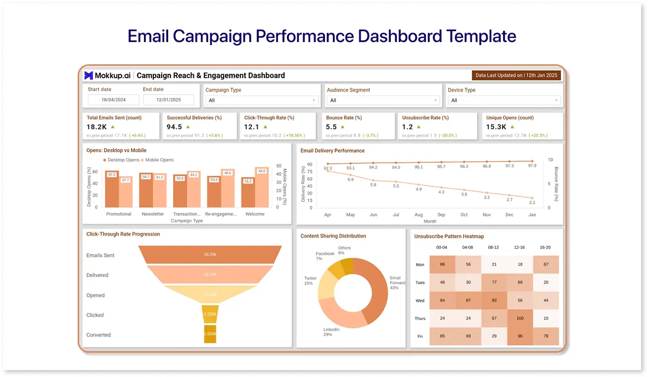
The Email Campaign Performance Dashboard Template lets marketers visualize their email campaign performance at a glance. Users can monitor open rates, click-through rates, and conversions, and filter results by campaign or audience segment to identify trends or patterns. It simplifies campaign optimization by converting complex email data into clear, actionable insights.
2. Auto Maintenance Dashboard Template:
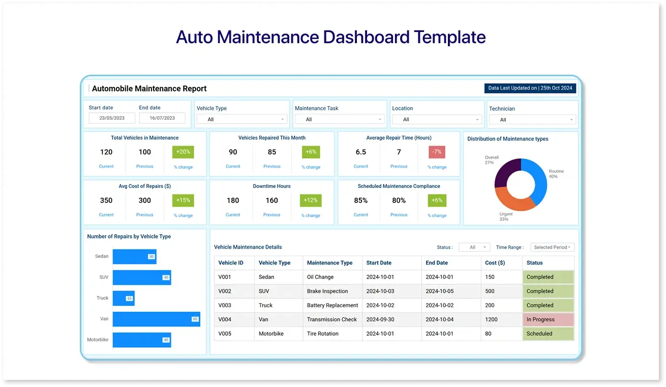
The Auto Maintenance Dashboard Template allows users to track vehicle maintenance and servicing data in one place. You may manage service schedules and repair costs and identify recurring issues while filtering by vehicle type, date, or service category. It converts complex maintenance records into a clear visual picture, making planning repairs easier and tracking fleet performance.
3. Sales and Customer Service Analytics:
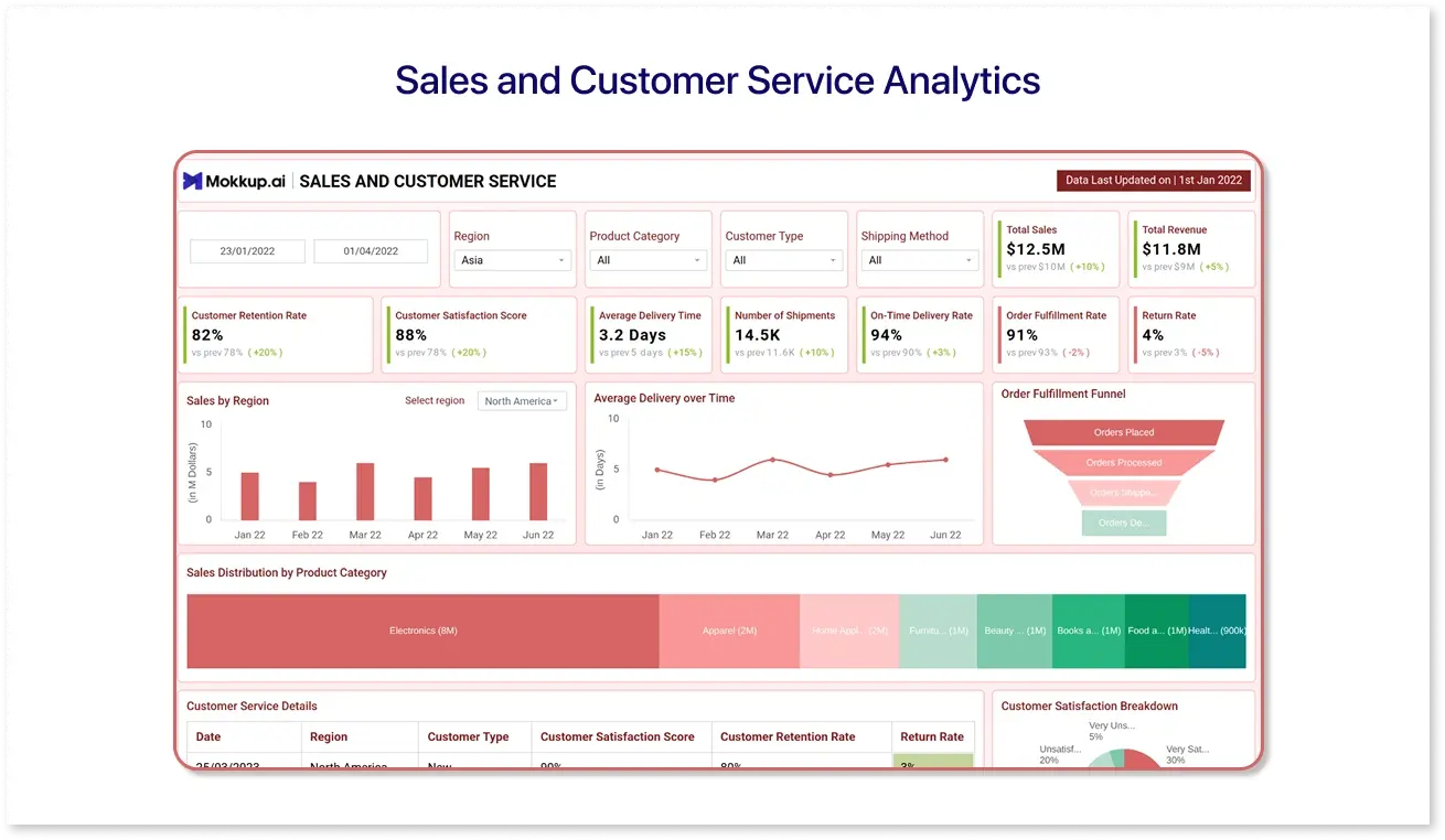
The Sales and Customer Service Analytics dashboard template lets users view key sales and customer service KPIs simultaneously. It allows you to evaluate sales performance, monitor customer inquiries, measure response times, and find patterns in client interactions. It helps teams make informed decisions, improve service efficiency, and boost overall sales performance.
4. Student Performance Dashboard Template:
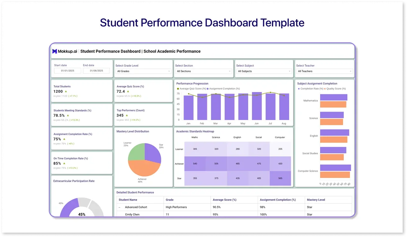
The Student Performance Dashboard Template helps users visualize performance data clearly and in an organized way. Users can track key metrics, highlight top performers, filter by categories or groups, and identify patterns or areas that need attention.
These are just a few examples of how interactive dashboards can make complex data easy to understand. Mokkup.ai offers a variety of pre-built, fully interactive templates that you can customize to your needs. They’re designed to help you explore, uncover insights, and create engaging visualizations without starting from scratch.
Best Practices for Interactive Data Visualizations
Creating interactive dashboards is more than adding filters or hover effects. The goal is to make interactive charts and graphs simple, meaningful, and engaging. Here are some best practices to keep in mind:
- Keep Things Simple: Less is more. Focus on crucial indicators; too many charts or options can overwhelm users. Consider this: "highlight the story, not every number."
- Make it Simple to Explore: Filters, buttons, and hover effects should appear natural. Users should not require a manual to use your dashboard.
- Label Everything Clearly: Axes, charts, and legends must be visible. Labels that are confusing lead to frustrated users.
- Highlight What Matters: Use color, size, or annotations to emphasize important points, enhancing data storytelling so users understand the story behind the numbers.
- Allow Users to Dig Deeper: Give them the ability to filter, drill down, or identify metrics that are relevant to them - interactive dashboards are all about curiosity.
- Maintain Consistency: Colors, fonts, and chart styles should all match across the dashboard. Inconsistency detracts from the data.
- Design for All Screens: Test dashboards on computers, tablets, and smartphones. Interactivity should be smooth everywhere.
- Provide Context: Use benchmarks, targets, or short notes to assist users in grasping the story behind the figures, rather than leaving them guessing.
Following these best practices ensures your interactive dashboards are visually appealing and valuable tools for exploration, understanding, and decision-making.
The Future Landscape of Interactive Data Visualization
As technology evolves, interactive visualizations become smarter, faster, and more user-friendly. The next generation of dashboards will not just display data, they’ll think, adapt, and communicate like never before. Here are a few significant trends shaping this transformation:
1. AI-Powered Visualizations:
Artificial intelligence is changing the way people explore and understand data. Instead of manually creating charts or looking for trends, AI can now:
- Automatically create dashboards based on user queries.
- Identify patterns, outliers, and trends immediately.
- Use predictive analytics to foresee potential outcomes.
Tools like Mokkup.ai are changing how dashboard wireframes are built. Users can describe what they need in plain language and instantly see it come to life as an interactive visualization.
2. Personalized and Adaptive Dashboards:
Personalization is set to play a significant role in how visualizations evolve. Dashboards will tailor themselves to individual roles, goals, and preferences. They’ll:
- Adapt insights depending on the user’s expertise or focus area.
- Provide flexible layouts, filters, and interactions for deeper exploration.
- Enable fine-grained sharing controls, so teams can securely collaborate and customize what each member sees or edits.
3. Storytelling Through Data:
Data visualization is transitioning from static reporting to storytelling. Future dashboards will combine visuals with guided narratives to make insights easier to follow and understand. Expect to see:
- Interactive storyboards that take users on a journey through their data.
- AI-generated summaries that explain trends in simple, conversational language.
For example, modern dashboards are already experimenting with built-in narratives that describe what's going on in the data, transforming raw numbers into simple stories that allow users to act more quickly.
Conclusion
Interactive data visualizations are changing how we explore and understand information. From AI-powered dashboards to personalized and story-driven visualizations, the goal is to make data easier to use, more informative, and interesting.
By following best practices and keeping up with emerging trends, anyone can turn complex data into clear insights that support better decisions. The world of data visualization is evolving rapidly, offering new ways to explore, understand, and act on information.
Frequently Asked Questions
It’s a way of presenting data that allows users to explore, filter, and interact with charts or dashboards to uncover insights.
With tools like Mokkup, you can quickly design interactive dashboard wireframes by adding charts, filters, and interactive elements. Users can use their own data or start with dummy data, and once done, download the dashboard wireframes as Power BI or Tableau files for further use.
It makes data easier to understand, helps identify trends quickly, enables better decision-making, and engages users more effectively.
Popular tools include Tableau, Power BI, Mokkup.ai, Qlik Sense, and Google Data Studio, depending on your needs.
Keep it simple, highlight key insights, allow customization, maintain consistency, and provide clear labels and context.
Filtering, sorting, drilling down, hover-over details, and clickable elements that let users explore data naturally.
Prompt it. Wireframe it with Mokkup.ai.
