HR analytics is one of the fastest-growing verticals in HR tech, driven by rising company sizes and complex workforce data. The numbers reflect this surge precisely. According to Grand View Research, the global HR analytics market size was at $4.77 billion in 2025 and is growing at a 13% CAGR. But building an HR dashboard from scratch to establish the analytics is a slow way to get there, especially when there’s a faster way around it.
Ready-to-use Power BI HR dashboard examples are the quicker, more reliable alternative, and HR teams already lean on them for exactly that reason. Starting with them means building on something that's already been argued over, edited, and approved by industry people.
This guide covers 8 of such HR Dashboard templates. Taken from how HR managers, People Ops leads, and HR business partners actually use them week to week, the KPIs behind each one, and a link to 35+ free wireframe templates you can edit right in your browser.
Table of Contents
- 8 Power BI HR Dashboard Examples
- Power BI HR Dashboards– Quick Comparison
- What Is a Power BI HR Dashboard?
- Key KPIs Every Power BI HR Dashboard Should Track
- Types of Power BI HR Dashboards
- How to Design a Power BI HR Dashboard (The Wireframe-First Approach)
- Explore All 35+ Free to Explore Power BI HR Dashboard Templates
8 Power BI HR Dashboard Examples
All Power BI HR dashboard examples mentioned below that are worth modelling your next build on are pulled straight from Mokkup's HR template library. Each one links to the live wireframe. Open it, swap in your own KPIs, export straight to Power BI or Tableau once your CHRO or HR director signs off.
1. HR Attrition & Retention Dashboard
Use the HR Attrition Dashboard Template →
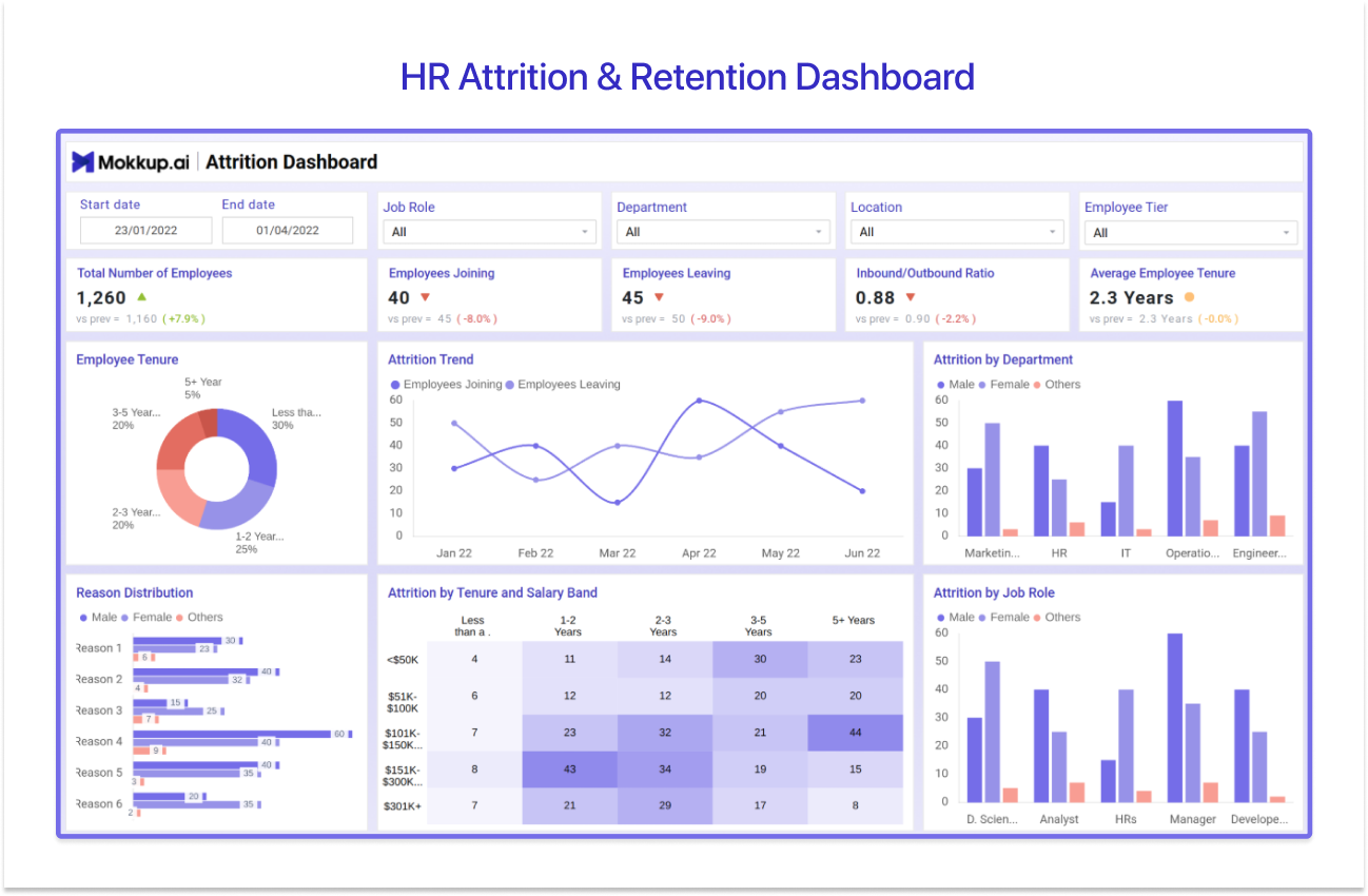
First up, Mokkup calls this one the HR Attrition Dashboard Template. Most people just know it as the HR Attrition & Retention Dashboard, the layout you open when you have to explain why turnover just spiked. The five KPI cards are: total number of employees, employees joining, employees leaving, an inbound-to-outbound hiring ratio, and average employee tenure. All filterable by job role, department, location, and employee tier.
Underneath, a donut chart splits the workforce into tenure bands. A trend line tracks joiners against leavers month over month. A heatmap cross-tabs attrition by tenure and salary band, and that's usually where the real story hides, mid-tenure people in one specific salary band leaving faster than anyone expected. This is a reason that the distribution chart and a job-role breakdown round out.
If you need a Power BI employee attrition dashboard that does more than spit out one turnover number, this is what HR managers and department heads reach for first. It doubles as an early-warning system for employee retention, too, as flight-risk teams tend to show up in that tenure-and-salary heatmap weeks before anyone hands in a resignation letter.
2. HR Recruitment Dashboard
Use the HR Recruitment Dashboard Template →
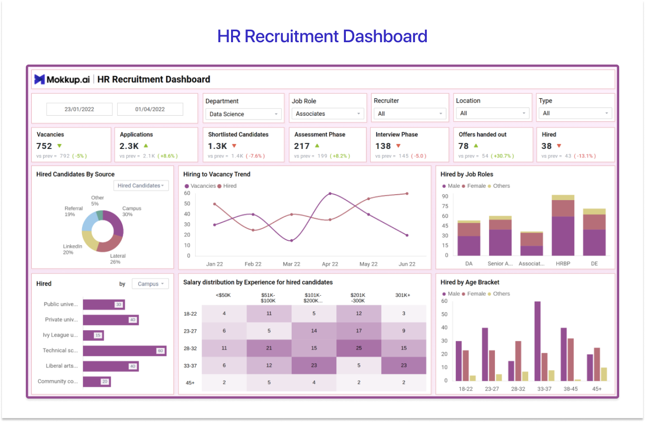
Next, on Mokkup, this one's called the HR Recruitment Dashboard Template. It's what talent acquisition teams pull up every Monday to check pipeline health. The KPI row covers vacancies, applications, shortlisted candidates, candidates in the assessment phase, candidates in the interview phase, offers handed out, and total hires. Filtered by department, job role, recruiter, location, and role type.
The visuals do most of the work here. A donut breaks down hired candidates by source: referral, campus, LinkedIn, and lateral. A line chart plots vacancies against hires over time, so bottlenecks show up early. A stacked bar shows hires by job role and gender. A heatmap layers salary against candidate experience, and a bar chart segments hires by age bracket.
For those building a Power BI recruitment dashboard for a team that needs actual funnel visibility and not just a headline hiring number, this one will suit well.
3. HR Performance Management Dashboard
Use the HR Performance Management Dashboard →
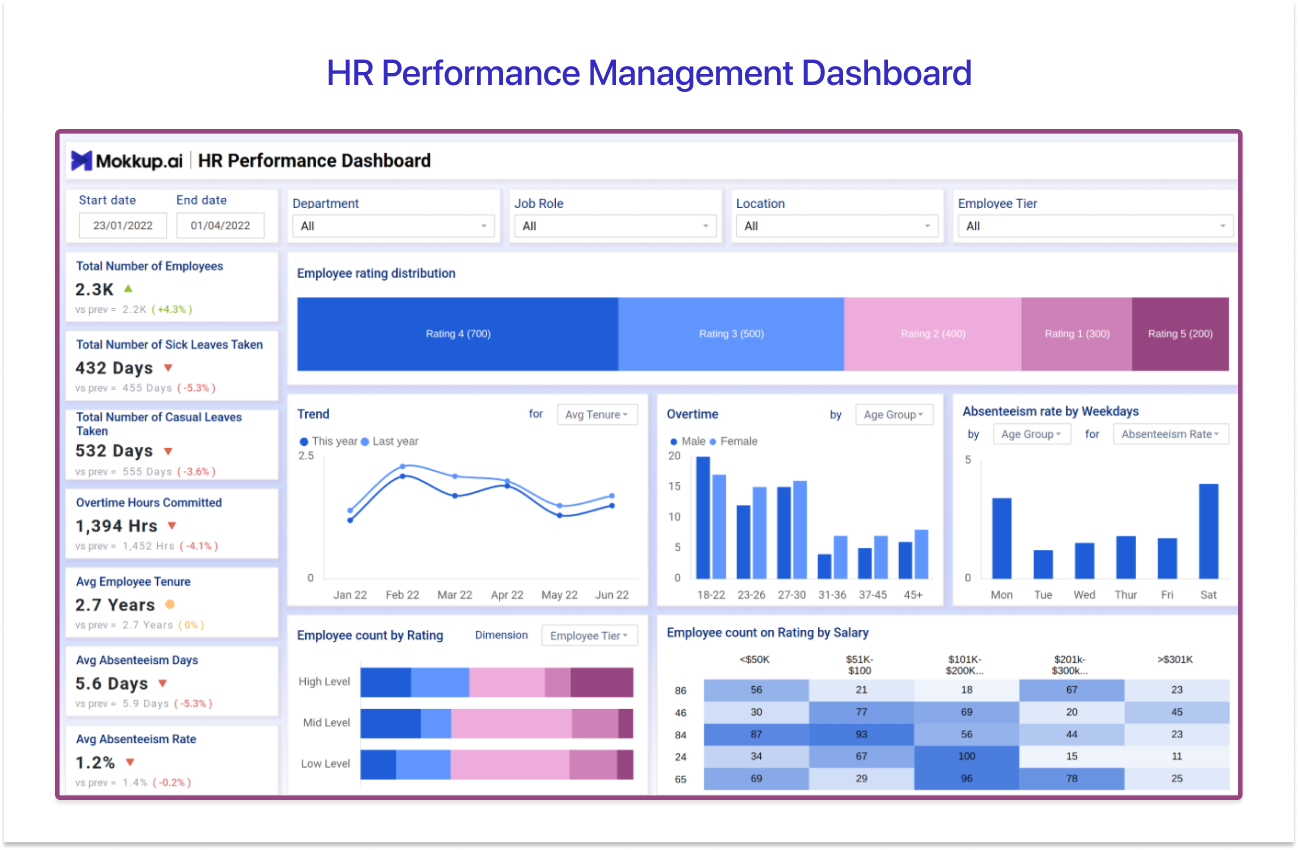
The HR Performance Management Dashboard is where HR teams and department leads review ratings, attendance, and overtime together instead of digging through three separate reports.
A line chart tracks the yearly performance trend against prior periods. A column chart breaks overtime hours down by gender and age group, a bar chart shows absenteeism rate by weekday, and tree maps plus stacked bars connect employee count by performance rating with salary bracket, so reviewers can spot where compensation and performance line up. Or don't.
It's the right call whenever the conversation shifts from "how's the team doing" to "show me the actual data," which is exactly what a Power BI HR analytics dashboard built for performance reviews needs to answer.
4. HR Salary & Compensation Dashboard
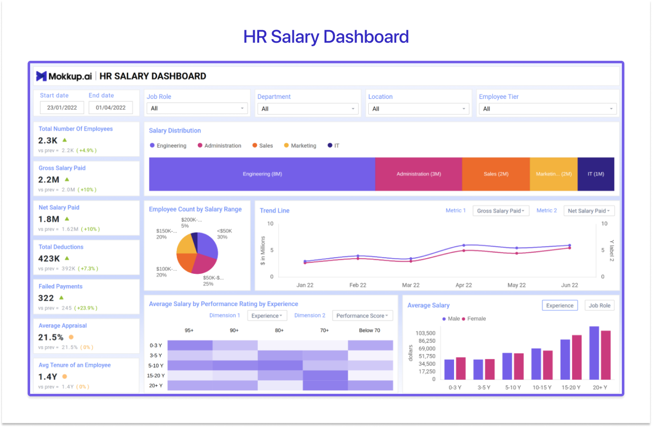
Use the HR Salary Dashboard Template →
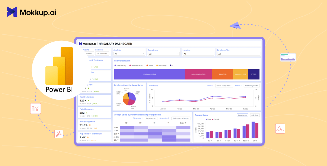
Payroll teams and finance leaders know this one as the HR Salary Dashboard Template for HR Reporting. It's what gets pulled up before every compensation review. The vertical KPI strip covers total employees, gross salary paid, net salary paid, total deductions, failed payments, and average appraisal-linked increment.
A bar chart shows salary distribution across Engineering, Sales, Marketing, Administration, and IT. A pie chart breaks employees down by salary range. A trend line tracks gross versus net salary paid over time, so payroll drift gets caught early, and a heatmap correlates average salary with performance rating and experience level.
Teams running a genuine compensation analysis across departments, tiers, and demographics tend to land on this layout, mostly because it puts payroll accuracy and pay equity on the same page. It also tends to become the Power BI HR reporting dashboard that finance and HR both end up using, so payroll numbers stop living in two different versions of the truth.
5. Talent Management & Succession Planning Dashboard
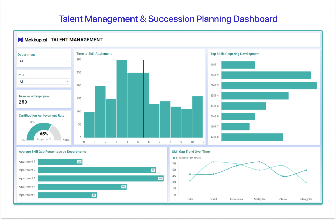
Use the Talent Management Dashboard Template →
Mokkup lists this one simply as the Talent Management template. HR business partners and L&D leads use it to answer one uncomfortable question: if a key person quits tomorrow, who's actually ready to step in?
The wireframe runs across three screens. Skill Gap covers headcount, time-to-skill-attainment, the top skills that need development, and the average skill gap percentage by department. Succession Planning (Overview) maps the succession pipeline against employee age distribution and shows critical-position and role coverage by department. Succession Planning (Developmental Progress) tracks named employees against their target role, completion rate in development programs, and how they're actually performing in training.
Open this one whenever succession planning for critical roles is the real agenda item, not just a bullet point buried in the HR strategy deck.
6. Employee Wellness & Engagement Dashboard
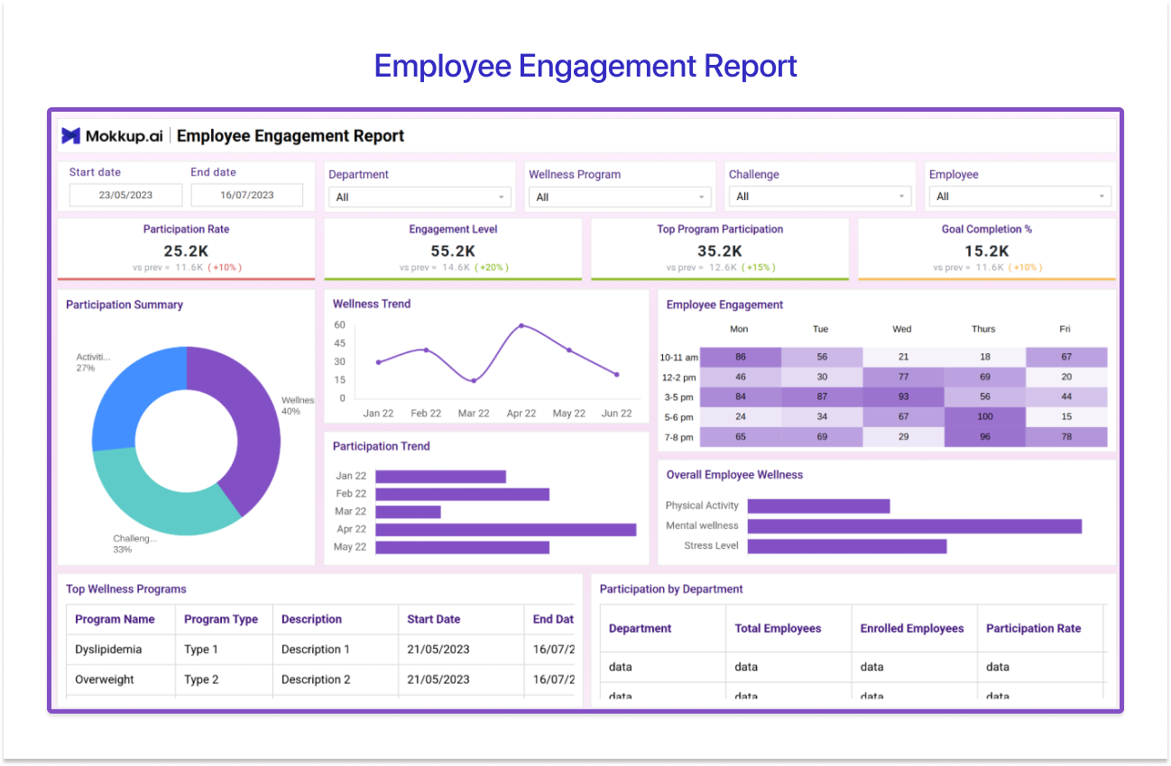
Use the Employee Engagement Report Template →
The Employee Engagement Report template, or the Employee Wellness & Engagement Dashboard, as most people call it, gives wellness program owners and HR one place to check whether anyone's actually using the programs they built.
Four screens make up the wireframe: Wellness Overview (participation rate, engagement level, goal completion percentage, participation trend by department), Physical Health (activity completion rate, average step-count trend, a BMI summary), Mental Health (meditation session logs and stress-level distribution), and Employee Feedback (feedback type, trend, and whether suggestions actually went anywhere).
Wellness leads reach for this one when the question stops being "do we have a wellness program" and becomes "is anyone using it, and is it doing anything for employee engagement" across departments.
7. Training & Development Dashboard
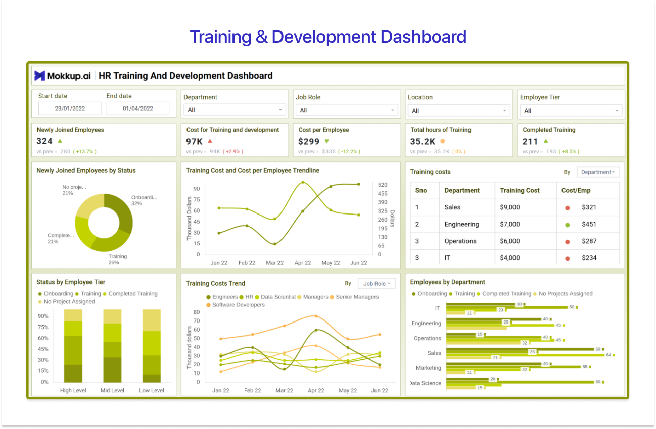
Use the Training and Development Dashboard Template →
Called the Training and Development Dashboard Template on Mokkup, this is what L&D teams use to prove training spend is actually paying off. Five KPI cards sit up top: newly joined employees, cost for training and development, cost per employee, total training hours, and completed training count.
A donut chart shows newly joined employees by onboarding status. A dual-line trendline plots training cost against cost per employee over time. A departmental table breaks training cost and cost-per-employee down by team, a stacked bar shows employee status by tier, onboarding, in training, completed, or unassigned, which works as a rolling training completion rate view, and a job-role trendline tracks training cost by role over time.
Best for L&D teams and HR managers who need something more than a certificate count to defend a training budget.
8. Workforce & Headcount Overview Dashboard
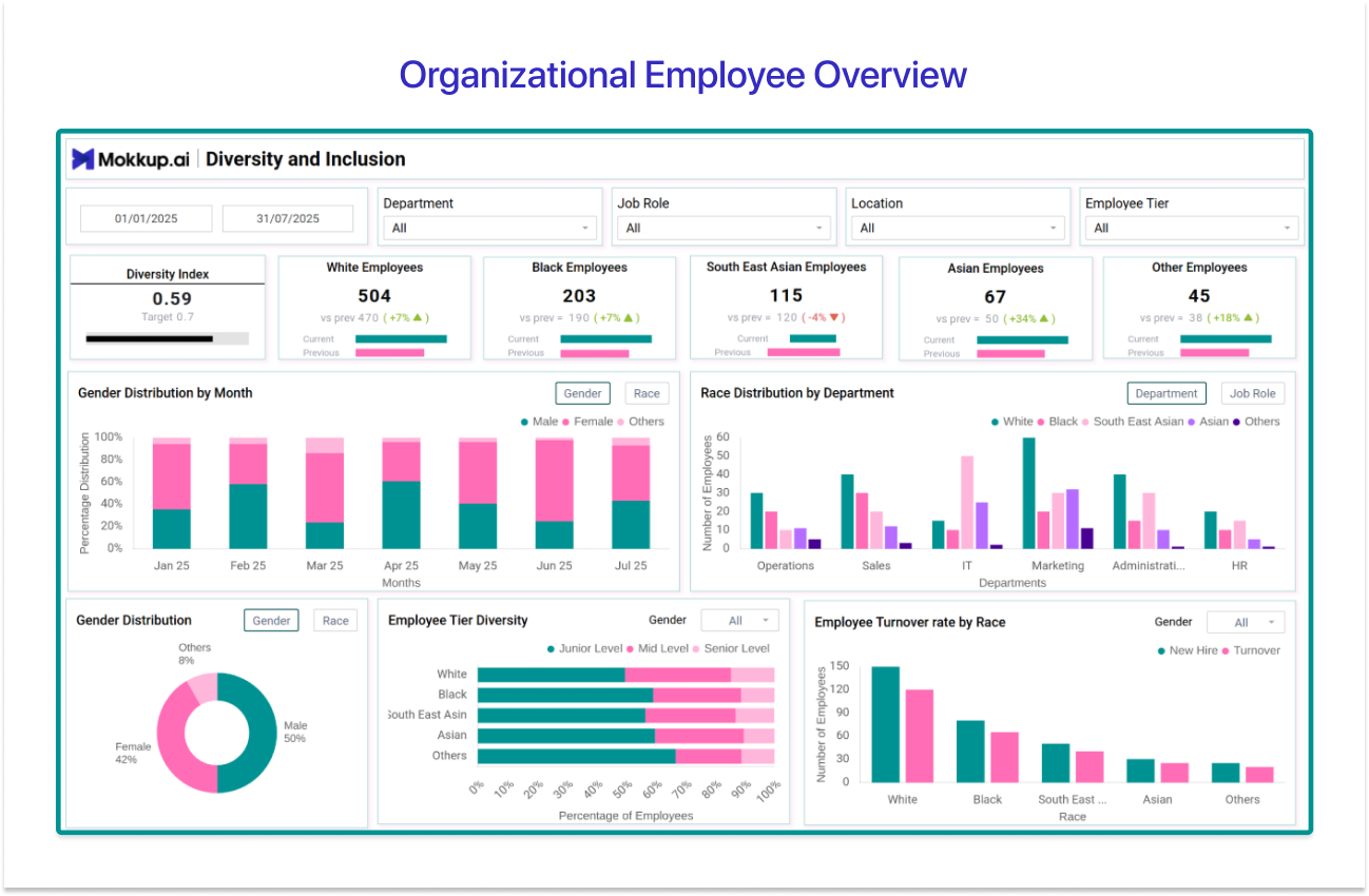
Use the Organizational Employee Overview Template →
Mokkup’s Workforce & Headcount Overview Dashboard is the single page HR leaders pull up when the question is about the whole workforce, not just one department's numbers.
The KPI row tracks a diversity index alongside headcount broken out by race and ethnicity, filterable by department, job role, location, and employee tier. A stacked bar tracks gender distribution by month. A grouped bar breaks race distribution down by department, a donut shows the current gender split, an employee-tier diversity chart compares junior, mid, and senior representation, and a final chart tracks turnover rate by race, so leaders catch retention gaps a single company-wide number would otherwise hide.
It's the layout for HR leaders and department heads who need one page on workforce composition and headcount trends before walking into a board review.
Power BI HR Dashboards– Quick Comparison
Match a layout to your role and whatever question you actually walked in with, before you even open Power BI.
|
Dashboard |
Best For |
Pick This When… |
|
1. HR Attrition & Retention Dashboard |
HR managers, department heads |
A turnover spike needs context, department, tenure, salary band, not just one number floating on its own. |
|
2. HR Recruitment Dashboard |
Talent acquisition teams, HR managers |
Hiring velocity and funnel health across open roles matter more than a headline vacancies-filled count. |
|
3. HR Performance Management Dashboard |
HR teams, business leaders |
Ratings, attendance, and overtime all need reviewing together, not scattered across three different reports. |
|
4. HR Salary & Compensation Dashboard |
HR managers, payroll teams, and finance leaders |
Pay distribution, compensation equity, and payroll accuracy are all on the same table in one sitting. |
|
5. Talent Management & Succession Planning Dashboard |
HR business partners, L&D leads |
You need to know who's ready to step into a critical role tomorrow, not just who scored well last quarter. |
|
6. Employee Wellness & Engagement Dashboard |
HR, wellness program owners |
The real question is whether people are using your wellness programs, not whether the programs exist on paper. |
|
7. Training & Development Dashboard |
L&D teams, HR managers |
You need more than a certificate count to defend a training budget, completion rates, and ROI included. |
|
8. Workforce & Headcount Overview Dashboard |
HR leaders, department heads |
You need one page on headcount, demographics, and workforce composition before a leadership review. |
What Is a Power BI HR Dashboard?
A Power BI HR dashboard is a single interactive report, built on Microsoft's Power BI platform, that pulls headcount, attrition, recruitment, performance, and compensation data into one real-time view, filterable by department, role, location, or tenure. It's what stops you from logging into five different HR systems before a review, a real problem when HR professionals already spend up to 57% of their time on administrative tasks, according to Deloitte.
What separates a good one from a mediocre one usually comes down to what it doesn't make you dig for. Leadership's favorite numbers should already be sitting on the page. What changed since last time should be obvious without a second query. The 8 examples above cover those jobs in a few different ways, depending on who opens the dashboard and what they came looking for.
Key KPIs Every Power BI HR Dashboard Should Track
Before picking a layout, it helps to know which HR KPIs actually earn a spot on the page. Whether you're scoping a Power BI HR analytics dashboard from zero or just patching up one that already exists, the right set depends on who's reading it: a CHRO scanning for headline health, or an HR manager drilling into one department's numbers specifically.
Headcount and Retention KPIs
-
Total headcount comes first, mostly because everything else on the page gets measured against it anyway.
-
Right behind it sits attrition rate, the percentage of people who left in a given stretch, and leadership will ask for this one before anything else, though it's not much use without a department or tenure breakdown sitting next to it.
-
Turnover rate gets confused with attrition a lot, but split it into voluntary versus involuntary exits, and you'll see why the fix for one has nothing to do with the fix for the other.
-
Then there's average tenure, which tells you how long people usually stick around, and doubles as an early warning when one team is bleeding faster than the rest of the org.
-
New hires versus exits is just the net movement each period, and two negative periods back-to-back is usually what gets the CHRO asking questions.
-
Attrition by department takes that same big number and shows you exactly where it's piling up, so retention budget actually goes where it's needed instead of getting spread thin everywhere.
Recruitment, Performance, and Engagement KPIs
-
Time to hire measures how long a role stays open from posting to accepted offer. It's the number most talent acquisition leads live or die by, and it has a nasty habit of creeping up if nobody's watching.
-
Offer acceptance rate tells you how often extended offers actually get accepted, and a slow slide here usually means a comp or process problem long before anyone admits it out loud.
-
Employee rating distribution matters more than the average rating alone, since that's exactly where rating inflation likes to hide.
-
Employee engagement, tracked by department rather than company-wide, catches the low-engagement pockets that a single average would otherwise smooth over and hide.
-
And training completion rate, the share of assigned training people actually finish, is about as close as you'll get to a training ROI number finance won't push back on.
Types of Power BI HR Dashboards
The eight examples above generally fall into three broad categories. Identifying which one aligns with your role early on can save significant rework later.
Executive and Workforce-Level Dashboards
Group one is for whoever's got thirty seconds and a leadership title, the CHRO, the HR director, someone scanning for headcount, attrition, and compensation health. Examples 1, 4, and 8 land here. Together, they're usually the first HR dashboard Power BI users end up building for a leadership audience, and Example 1 in particular doubles as the Power BI employee attrition dashboard that shows up in board-level reviews.
Operational HR Dashboards
Group two is for the day-to-day operations. HR managers and talent acquisition teams are in here constantly, hiring pipeline health and performance review tracking that gets acted on the same week, not filed into a quarterly deck nobody reads later. Example 2 is essentially the Power BI recruitment dashboard, which talent acquisition checks daily. Example 3 sits right next to it for performance management.
Talent Development and Wellbeing Dashboards
Group three is planning-focused. Built for HR business partners, L&D, and wellness program owners who care about skill gaps, succession pipelines, training ROI, and engagement trends over the next quarter, not the next meeting. Examples 5, 6, and 7 fall here. Add all three groups up, and that's basically every Power BI HR dashboard example an HR team runs into across a full reporting calendar.
How to Design a Power BI HR Dashboard (The Wireframe-First Approach)
Most HR dashboards built straight in Power BI get sent back on the first review. Not because the data's wrong, usually, but because the layout never answered the specific retention, headcount, or compensation question the CHRO or HR director actually walked in with. Plus, a second round of stakeholder review that pushes the whole reporting cycle back a week, you didn't have.
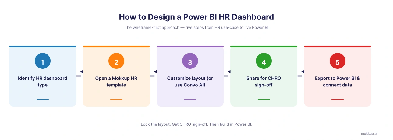
Wireframing the dashboard before you touch a data model fixes most of that. In practice, it looks like this:
-
Start with the 8 examples above and figure out whether you're building an executive rollup, an operational tracker, or something more talent-development focused.
-
Open whichever Mokkup wireframe template matches and customize it, move KPI cards around, swap out visuals, add or cut sections, all before any real data enters the picture.
-
Then share that wireframe link to the CHRO or HR director directly via Mokkup and let them mark it up. Get the sign-off on placement before a single DAX measure gets written, because this is genuinely where most of the time savings come from, not later. Once it's approved, export straight to Power BI in one click.
You're starting the build with a layout everyone's already agreed on, then hooking it up to your live HR data source.
Mokkup's Convo AI pushes this even further for teams that already have data sitting somewhere. Upload the HR data file, describe the dashboard you want in plain language, and Convo AI reads the file's headers itself, then builds a full wireframe around your actual fields. No blank canvas required, and no guessing at column names either.
Explore All 35+ Free to Explore Power BI HR Dashboard Templates
The 8 examples above are just the starting point. Mokkup has 35+ Power BI HR dashboard template designs covering every HR use case an analyst is likely to hit: attrition, recruitment, performance, compensation, talent and succession, wellness, and training.
Unlike a static PBIX download that locks you into someone else's layout, every Mokkup template is editable in your browser. Drag and drop visuals, share the wireframe link with your CHRO or HR director for sign-off, and export to Power BI or Tableau in one click once your data is ready to connect. That export now goes further too. The newly added semantic export means your exported workbook arrives with the datasets, formulas, metrics, and calculated fields already configured, so you're not rebuilding calculations you already wireframed. Between Convo AI on the way in and semantic export on the way out, the manual work that usually eats up a reporting cycle mostly disappears.
Browse all free Power BI HR dashboard templates →
Conclusion
The right HR dashboard always comes down to two things: who's looking at it, and what question they came to ask. The 8 Power BI HR dashboard examples above cover all four, and the wireframe-first approach means none of them require a rebuild just to get a first draft in front of the right person. All 35+ Mokkup templates are free to start with, so there's no reason to open Power BI on a blank report.
Browse all free Power BI HR dashboard templates. Edit with AI, export to Power BI in one click.
Prompt it. Wireframe it with Mokkup.ai.
