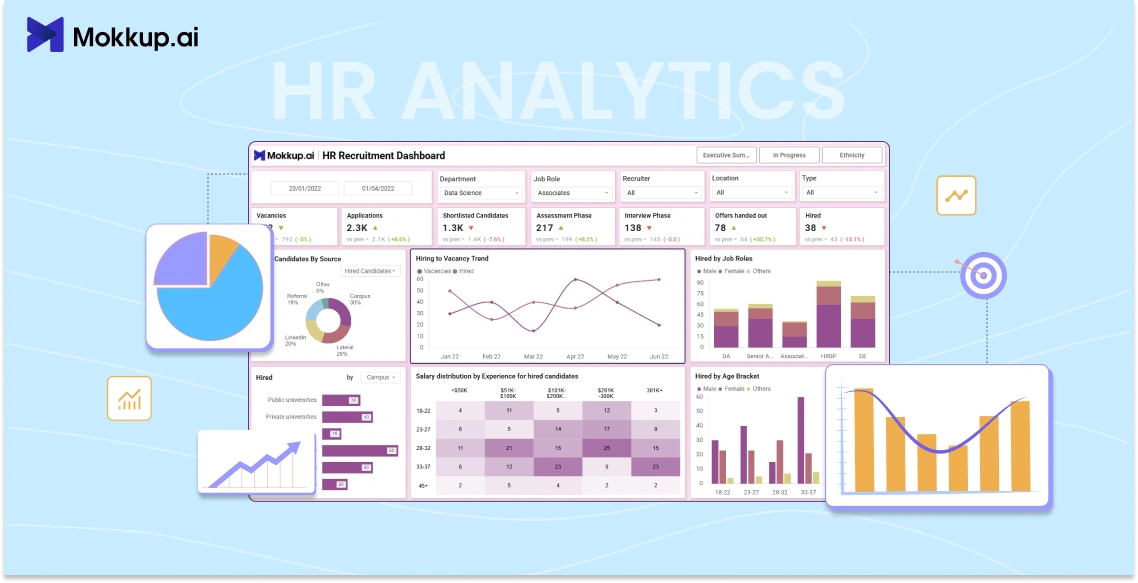
HR analytics isn’t just for large enterprises anymore. Even lean teams are using data to figure out what’s working and what’s not, across hiring, retention, engagement, and more.
But here’s the problem: most of that data lives in dashboards that take weeks to build. And if HR teams don’t know how to use Power BI tools, they’re stuck waiting for analysts or designers to help.
That’s why having a faster way to plan and build dashboards matters. It’s not just about saving time; it’s about making decisions faster. Because when someone’s about to quit or engagement is dipping, you don’t have time to wait for a “Q2 dashboard.”
This blog will examine how Mokkup.ai helps HR teams wireframe dashboards quickly without needing design or BI skills.
Table of Contents
- Role of mokkup.ai in modern HR
- How to Use Data to Spot Attrition Early
- What to Track When Measuring Engagement
- Building HR Dashboards Without Starting From Scratch
Role of Mokkup.ai in Modern HR
HR teams today are expected to move fast. They track everything from attrition and hiring funnels to DEI metrics and engagement scores. But when it comes to actually building dashboards that show all this? That’s usually where things slow down.
Most teams still rely on BI developers to design Power BI or Tableau dashboards. That often leads to a lot of back-and-forth. HR knows what they want to see, but they can’t always explain it clearly in BI terms. Meanwhile, the BI team is trying to translate business requirements into visual layouts, which takes time.
This is exactly the gap Mokkup.ai helps close.
So, what is Mokkup?
It’s a no-code dashboard wireframing tool built for teams who want to sketch out reports without needing Figma, Power BI, or Tableau skills. You can drag and drop charts, KPIs, filters, and even dummy data into a layout, then collaborate with your team before handing it off to developers.
This is especially useful for HR teams who often have the data but not the tools (or time) to mock up what they want to see.
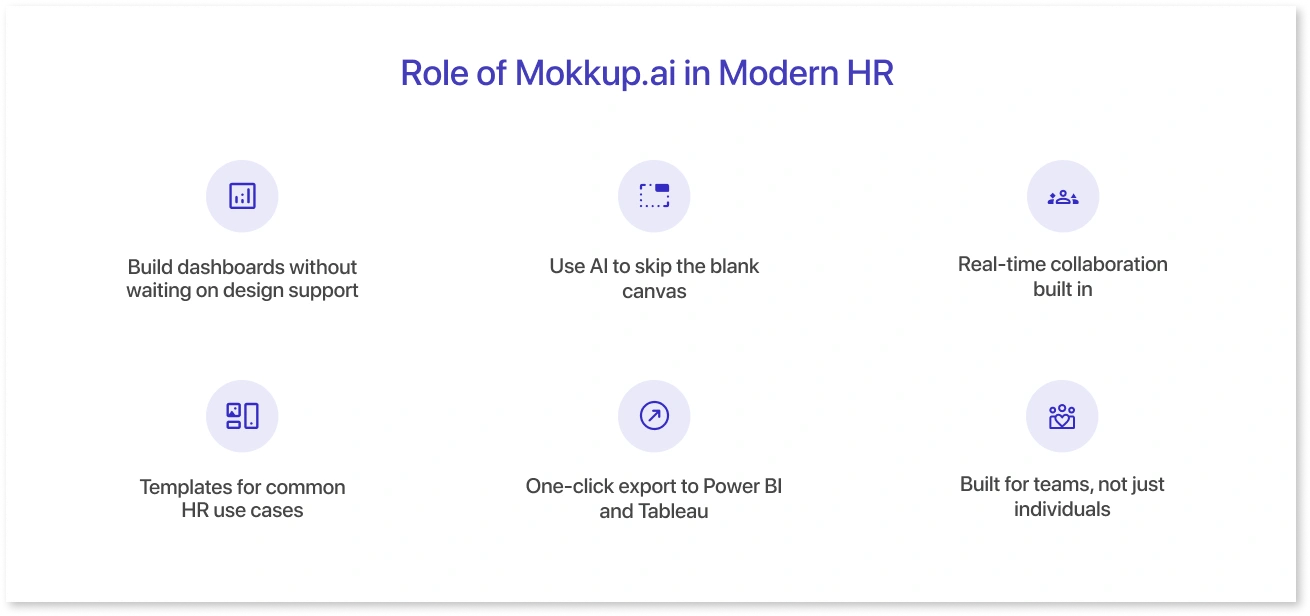
Here’s how Mokkup fits into modern HR workflows:
1. Build dashboards without waiting on design support
You don’t need to open Figma or know how to use Power BI. Mokkup gives you a simple canvas to create dashboard wireframes using pre-built components, such as bar charts, tables, KPI cards, filters, and more.
There’s no steep learning curve. You drag the elements you want, arrange them how you like, and move on.
2. Use AI to skip the blank canvas
If you don’t know where to start, Mokkup’s AI assistant can help. Just type a prompt like “Employee attrition trend by department with filters for location and tenure”, and it generates a dashboard wireframe for you.
This saves time and gives you a visual starting point to tweak or share.
3. Real-time collaboration built in
Once you’ve created a wireframe, you can share it with other HR teammates, your manager, or the BI team. Everyone can comment directly on the layout, tag others for feedback, and resolve changes, all inside the tool.
This removes the need for endless email threads or scattered feedback across files and screenshots.
4. Templates for common HR use cases
Mokkup also has ready-to-use templates for dashboards HR teams build often, like:
- HR Recruitment Dashboard
- HR Attrition Dashboard
- Organizational Employee Overview
- Employee Engagement Report
- Talent Management Dashboard
These templates aren’t just blank frames. They come with dummy data, smart layout suggestions, and best-practice design, so you don’t have to figure out where to place filters or what kind of chart works best. You just plug in your content and adjust as needed.
This can make a big difference for HR teams that are pressed for time or don’t want to start from scratch every month.
5. One-click export to Power BI and Tableau
Once your wireframe looks good and everyone’s on board, you can export it directly as a Power BI (.pbix) or Tableau (.twbx) file.
What’s cool is that the export isn’t just a static image. It keeps the layout, charts, dummy data, and formatting, giving BI developers a proper starting point. No more trying to explain “put a KPI card here” over email or in long briefing docs.
It makes handoff cleaner, faster, and way less frustrating for both HR and BI teams.
6. Built for teams, not just individuals
HR work is rarely done in a silo. You’ll often need input from HRBPs, L&D leads, the DEI team, leadership, and the data team.
Mokkup supports shared workspaces and real-time commenting so everyone can stay on the same page. You can tag teammates, leave notes directly on components, and make changes on the fly without switching tools or chasing approvals in email threads.
This kind of visibility helps avoid last-minute surprises and keeps everyone aligned from day one.
How to Use Data to Spot Attrition Early
Attrition doesn’t just happen overnight. Most of the time, people give off signs weeks, sometimes months, before they actually resign. They might stop engaging in meetings, miss feedback cycles, or quietly start applying elsewhere.
The tricky part is catching those signals early, before acting too late.
That’s where dashboards come in. They give HR teams a way to pull all the right data points into one place, so you’re not just looking at turnover in hindsight, but spotting trends as they build.
Here are a few metrics HR teams are using to track attrition risk:
1. Survey scores over time
If someone’s engagement score has dropped over the last few quarters, that’s worth a second look even more so if the dip is isolated to one team or manager.
2. Training and development activity
Employees who stop participating in training programs or skill-building sessions may be disengaging. A sudden drop in L&D activity can sometimes signal a deeper issue.
3. Absenteeism and time off
Unplanned leaves or a rise in sick days, especially when it’s not seasonal, often show up before someone decides to leave. It’s not always the case, but it adds context when seen with other factors.
4. Promotion history or role stagnation
If someone hasn’t moved roles, received new responsibilities, or seen any growth in a long time, it can start to weigh on morale. Dashboards can help track how long employees have been in the same position across departments.
5. Team or manager changes
Switching managers, especially more than once in a short span, can throw off someone’s rhythm. A dashboard showing recent structural changes alongside engagement or performance scores can reveal patterns you’d otherwise miss.
In Mokkup, HR teams can pull all these elements into one dashboard wireframe. You can lay out cards for key KPIs, add a trend line for engagement scores, include a filter for departments or tenure, and even create a dummy “attrition risk score” to simulate what you want your BI team to build later.
It’s all about getting clarity up front.
Instead of explaining what you need in long email threads or calls, you can just show it. The wireframe becomes the conversation starter and a faster path to getting the right dashboard live.
This kind of proactive tracking doesn’t just help you reduce attrition. It also builds trust with employees. When they know someone’s paying attention and acting early, it shows the company actually cares.
What to Track When Measuring Engagement
Engagement isn’t just about whether someone filled out a survey. It’s about how involved, motivated, and connected they feel at work, and that can show up in different ways depending on the team, role, or even the company culture.
The challenge? There’s no one-size-fits-all metric. Most HR teams track a mix of inputs to get a more complete picture.
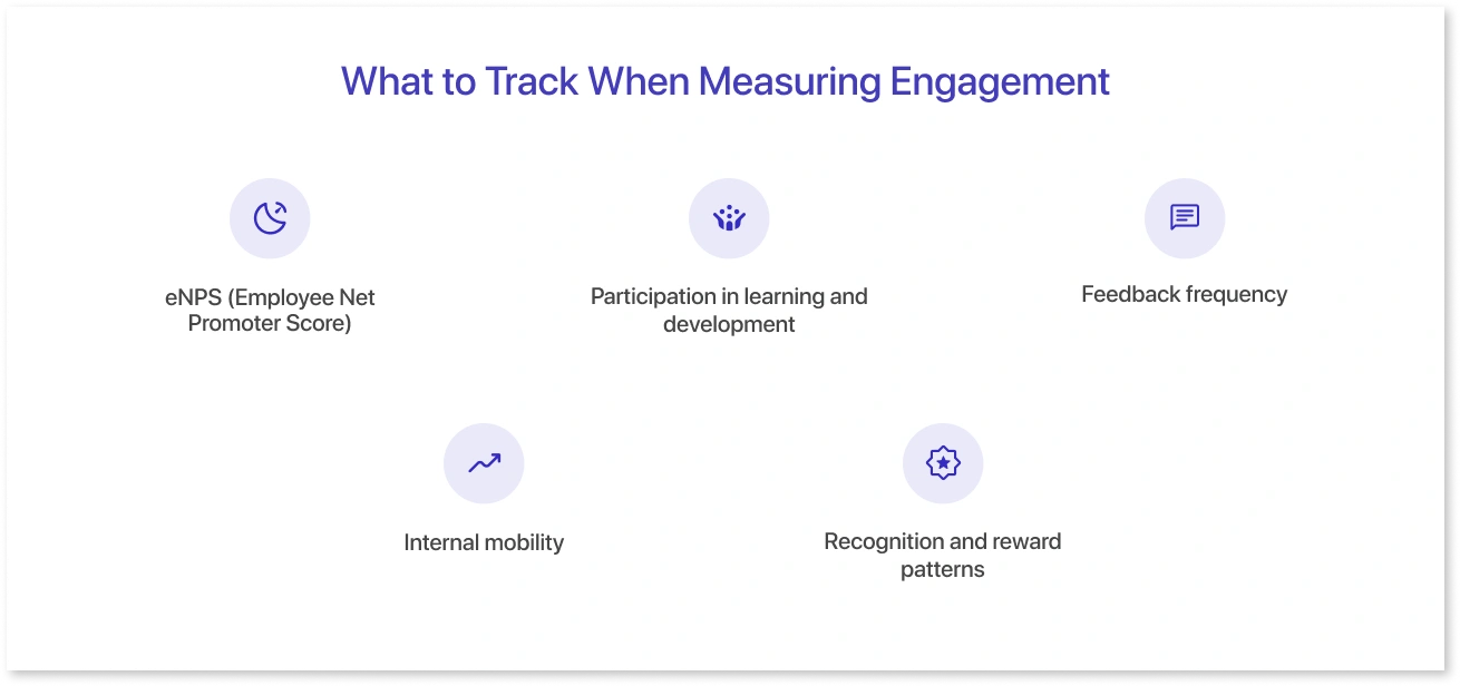
Here are a few that are worth including in your dashboard:
1. eNPS (Employee Net Promoter Score)
It’s a simple question, “Would you recommend this company to others?”, but it gives you a quick read on overall sentiment. You can track this score monthly or quarterly and look for trends across departments or job levels.
2. Participation in learning and development
Engaged people are often the ones investing in their growth. If participation in L&D drops, especially for a specific team, it might be a sign of disengagement or burnout.
3. Feedback frequency
How often are managers holding one-on-ones? How many employees submitted self-reviews? Dashboards that show feedback activity can help spot gaps in communication or support.
4. Internal mobility
Are people applying for internal roles or taking on stretch assignments? If not, it could be a sign that they’re feeling stuck. Mobility metrics are often overlooked, but they say a lot about how engaged someone is with their future at the company.
5. Recognition and reward patterns
Whether it’s peer-nominated awards or manager shoutouts, recognition data adds another layer to your engagement dashboard. A dip in recognition activity can reflect cultural issues or even signal manager disengagement.
Using Mokkup, you can bring all these pieces into a wireframe that makes sense visually. Add cards for each KPI, insert team-level filters, and sketch out a trend line for eNPS. You don’t have to build anything from scratch; you just pick a layout and drag things into place.
Because you can plug in dummy data, it’s easy to show how the dashboard might look once it goes live. This makes it easier to get buy-in from leadership before your BI team starts building.
When you have the right engagement metrics in front of you, and they’re easy to read, it becomes much easier to act on them.
Building HR Dashboards Without Starting From Scratch
Creating an HR dashboard from scratch can be exhausting, especially when you’re pressed for time and still waiting on input from BI or leadership. You know what you need to track, but starting with a blank canvas every single time is not ideal.
That’s why Mokkup comes with pre-built templates for all the standard HR dashboards. These aren’t just placeholders with random charts. They’re designed with real HR workflows in mind, covering key metrics, clear layouts, and dummy data that gives you context.
You open a template, tweak a few things, and you’re off to a solid start, no design tools, no dragging charts around aimlessly.
Here’s a closer look at some of the most useful templates you’ll find inside Mokkup’s HR library:
1. HR Recruitment Dashboard
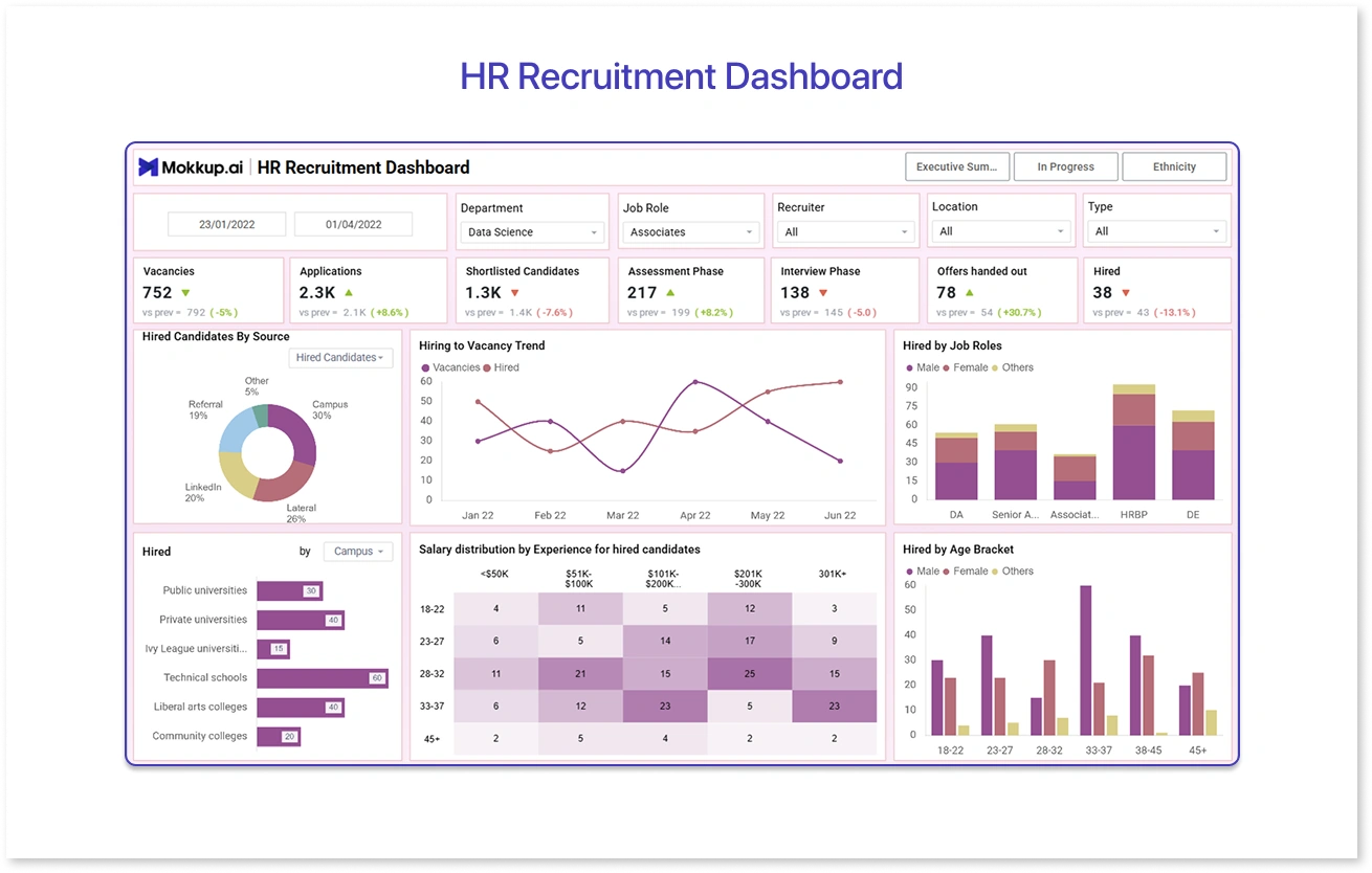
This template gives you an instant overview of job openings, applications in the pipeline, time-to-hire, and recruiter activity.
You can filter by department or role type, spot bottlenecks in the process, and get a visual breakdown of how long it’s taking to fill roles. This is super handy for weekly catch-ups with the talent acquisition team.
2. HR Attrition Dashboard
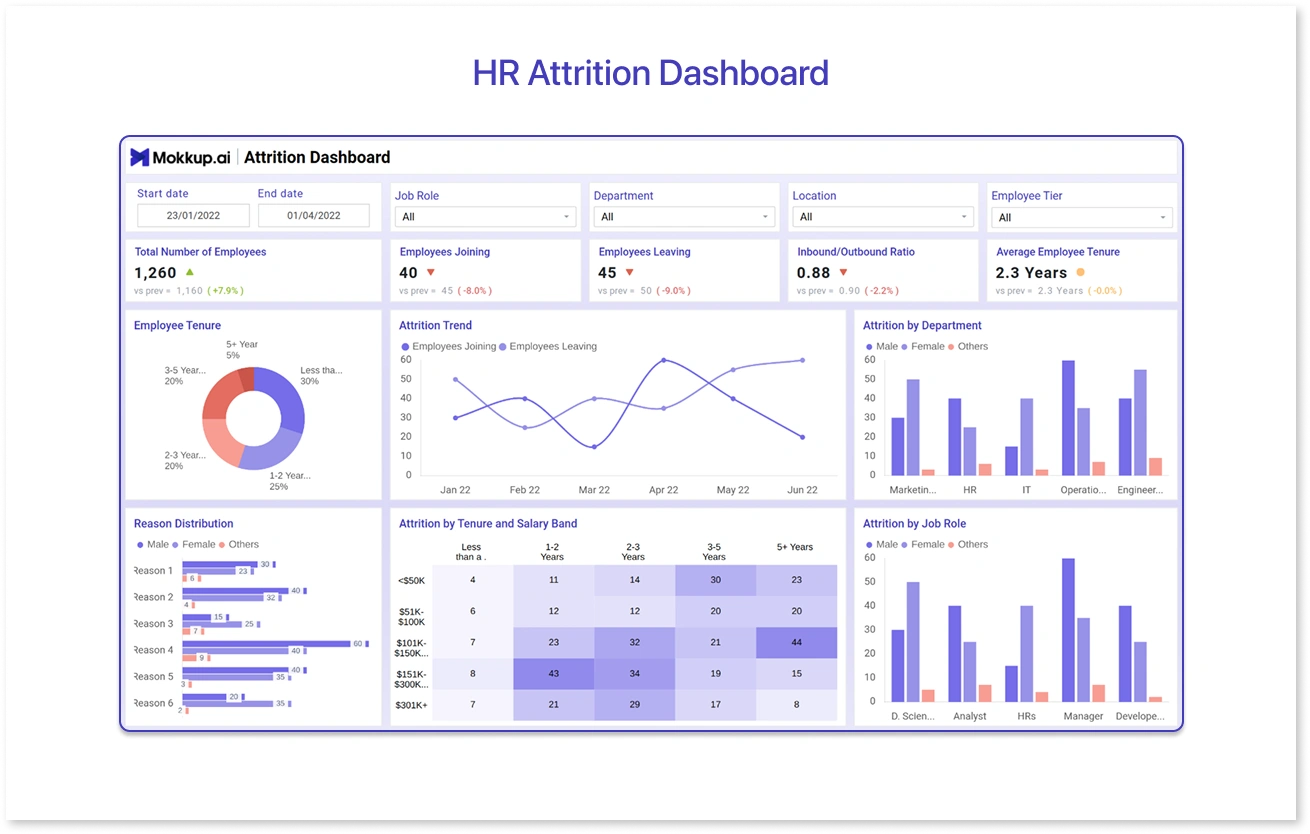
HR Attrition template shows resignation patterns by department, tenure bands, job grades, and even location. There’s also room to add voluntary vs. involuntary exits, top reasons for leaving (if captured), and compare attrition against hiring to show overall net movement.
3. Organizational Employee Overview
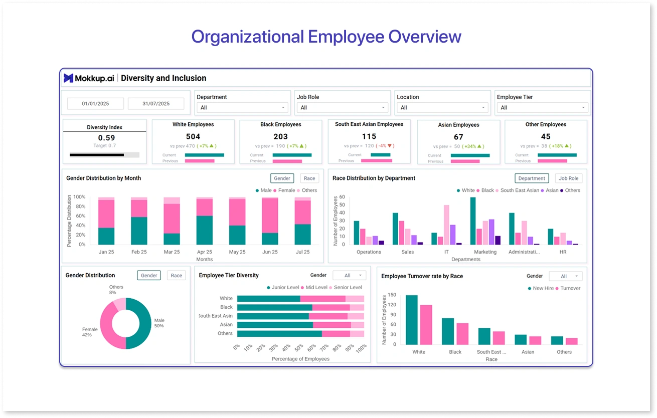
You get a clear snapshot of total headcount, department splits, gender ratio, age groups, and reporting lines. Perfect for monthly people reports or leadership decks when someone asks, “How are we structured right now?” During organisation restructuring or annual planning, it's also useful to see where the talent sits today.
4. Employee Engagement Report
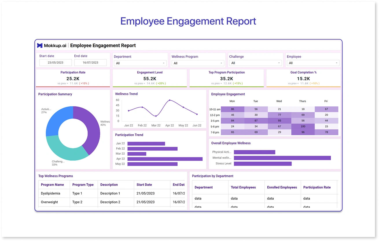
Engagement can feel abstract, but this template makes it more concrete. It includes:
- eNPS trends
- Participation in engagement surveys
- Manager feedback activity
- Recognition patterns (like peer shoutouts or awards)
You can easily plug in filters like team, region, or tenure, so it’s easier to spot where engagement is strong and where it needs a lift.
5. Talent Management Dashboard
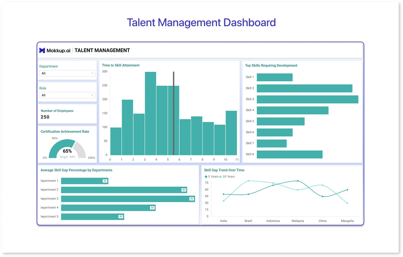
Talent management dashboard one focuses on growth and movement. It shows how many employees have been promoted, moved internally, or are part of any succession planning programs. You can also track skill gaps and top talent by rating or performance tier and map out your talent pipeline for critical roles.
Want Something Custom? Just Type It Out
If you can’t find a suitable template, you can use Mokkup’s AI feature to generate one for you, just by writing a prompt.
For example, type:
"Create an HR dashboard with employee attrition by department, filters for location and joining year, and a KPI for voluntary exits."
Mokkup will create a dashboard layout based on your prompt in seconds, complete with KPIs and suggested structure. You can tweak it further from there.
Is it perfect every time? Not always. But it gives you a strong starting point that you can quickly fine-tune. This is especially useful if you’re short on time or don’t want to spend 20 minutes thinking through every single component.
Note: The AI doesn’t use your data for training; your prompt stays private and secure.
Live Collaboration, Feedback, and Export
Once your dashboard wireframe is ready, you don’t need to export a PDF or take screenshots. You can:
- Share the link with your team
- Leave comments and tag colleagues
- Collect feedback directly on the layout
- Resolve changes before they go into development
It works like a shared doc, so everyone stays aligned and you don’t lose time chasing feedback over Slack or email.
When you’re ready, just hit export to download your dashboard wireframe as a .pbix (Power BI) or .twbx (Tableau) file. The export keeps your layout, visual types, filters, and dummy data, making it easier for BI developers to turn it into a real report without starting over.
Future Trends
HR analytics is quickly moving beyond static reports and annual reviews. In 2025, the focus will be on being more proactive, spotting attrition risks early, tracking engagement in real time, and connecting people metrics directly to business goals. Teams aren’t just measuring what happened but forecasting what’s coming next.
HR teams need faster ways to plan dashboards, test ideas, and collaborate across teams to keep up. That’s why tools like Mokkup are gaining traction. Whether it’s building a quick wireframe, prompting AI to generate layouts, or exporting to BI tools without any back-and-forth, the goal is clear: turn HR data into decisions, faster.
Frequently Asked Questions
It helps HR teams build dashboards faster, without needing design or BI support. You can plan layouts, share feedback, and export to BI tools in just a few steps.
Mokkup offers templates like HR Recruitment, Attrition, Employee Overview, Engagement Reports, and Talent Management, all pre-built with dummy data and clean layouts.
Super simple. You don’t need any design or coding skills. Just drag and drop elements, use a ready-made template, or type a prompt, and Mokkup’s AI will generate a dashboard layout for you.
Yes, you can export your wireframe directly as a .pbix or .twbx file. It keeps the layout and structure intact, so BI teams can build faster with fewer revisions.
Prompt it. Wireframe it with Mokkup.ai.
