
A bubble chart is a type of data visualization that displays three dimensions of data using bubbles or circles in a two-dimensional space. Similar to a scatter plot, it uses Cartesian coordinates to represent data points. Some of the key characteristics of a bubble chart include:
- Axes: Bubble chart has two axes (X and Y), that shows two variables or dimensions of the data. These variables are usually quantitative in nature.
- Bubble Size: The size of the bubbles represents the third dimension of the data. Each data point has a bubble, and its size depends on the value of the third variable. Smaller bubbles signify lower values, whereas larger bubbles represent higher values.
- Color: It displays additional information by showing different groups within the dataset.
Table Of Contents
- When to Use a Bubble Chart?
- How to Interpret a Bubble chart?
- Effective Usage Tips for Bubble Charts
- Charts Similar to Bubble Chart
Bubble charts also known as bubble plots stand out as one of the most visually striking ways to represent data. They demonstrate the relationship between the first two parts of information. Additionally, they highlight another significant part that is not always directly dependent on the first two parts.
Using a bubble chart is useful when attempting to examine correlations between several data points. Their visual nature accelerates the recognition of relationships between data, typically allowing for quicker understanding compared to looking over statistical tables.
When to Use a Bubble Chart?
Showing a bubble chart to your audience can be difficult because they have to understand a lot of information. So, it's important to think carefully when using a bubble graph or chart is better than its downsides. Bubble charts are good for showing many dimensions, scatter plots are best for showing only two dimensions.
Bubble charts or maps are useful for comparing data points with multiple data sets. These data sets can include population size, demographics, age, and gender. The charts or maps allow for a clear three-way visual comparison.
In contrast, there are times when a bubble chart is not the best option. Avoid using a bubble chart if extra dimensions don't add enough value to justify including them.
Here’s an example:
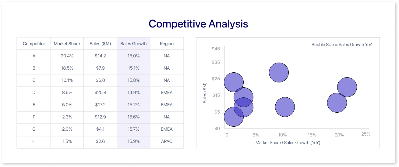
Let's change the YoY sales growth number to make it easier to compare. This change will ensure that the numbers are similar for all competitors.
The bubbles in the bubble chart example are all the same size. Therefore, it is challenging to gain any significant knowledge from this additional dimension. Our eyes can't accurately compare visuals by area, let's explore this more with another example to understand it better.
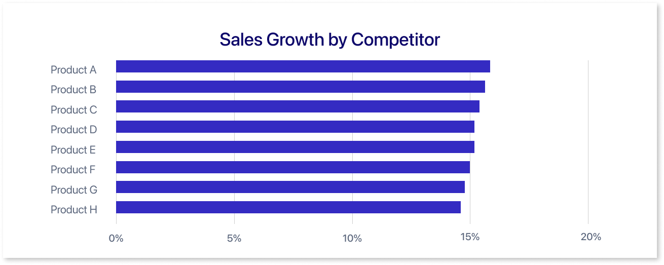
Using different types of charts to encode data can be challenging. This is because there is no consistent baseline for comparison. Diverse charts, like bubble charts and pie charts, show data in a distinct manner. Imagine using a bar chart instead of a bubble plot—it's easier for your eyes to catch small differences in data that way.
The kind of data you have determines which chart works best. Bubble charts don’t work well for every type of data. If you’re not sure, think about how much time it takes to explain a graph. Using more charts can make things clearer for your audience.
It can also avoid overwhelming them. Instead of cramming too much information into one chart, consider using multiple charts.
Understand if these charts are possible in development by creating a wireframe first. Incorporating various charts in the wireframe helps determine the most suitable chart type that aligns with your requirements.
One of the tools that can help you with easy wireframing is Mokkup.ai, which is a cloud-based dashboard wireframing tool equipped with a wide array of charts, graphs, various elements, and more. It makes designing dashboard wireframes easier, helping users visualize and plan their data-driven dashboards efficiently.
How to Interpret a Bubble chart?
Learn how to create a bubble chart by following these steps. Imagine managing data collection for a competitive analysis at a global company.
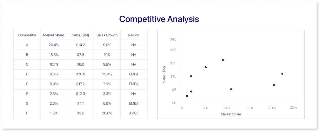
You've compiled a table containing columns of data for various competitors. This includes their market share, sales volume, annual growth rate, and geographical presence. They need to consider these factors.
The scatter plot illustrates the correlation between market share, measured as a percentage on the x-axis, and sales volume in million dollars on the y-axis. Each dot on the chart shows a competitor. It helps us see how market share and sales volume are connected for these competitors.
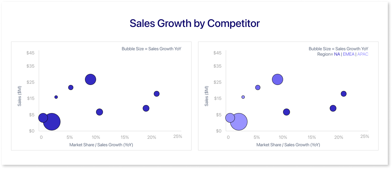
Similarly, a bubble chart displays multiple dimensions. The x-axis displays market share and sales growth as percentages. The y-axis displays sales values. Each bubble denotes a competitor, with its size reflecting the sales growth across years, offering an insightful representation of multiple data points.
Expanding upon the previous chart, another variable—region—can be incorporated to categorize the competitors. Using color codes in the bubble chart, each bubble can show market share, sales growth, sales values, and competitor regions. This addition enhances the visualization by providing insights into regional distribution among the competitors.
Effective Usage Tips for Bubble Charts
Bubble charts can be difficult for people to understand, even if they are well-made. Here are some steps or use cases of the bubble chart that you can consider to make effective bubble charts, graphs:
Scale Bubble Area As per the Value
One common error is to scale the diameters or radii of the points to the values of the third variable. Using scaling like this means a point with double the value of another point will have four times the area. This makes it seem much larger than it actually is.
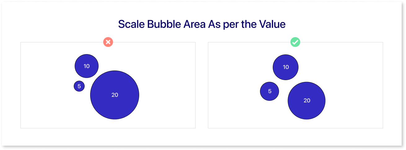
However, ensure that the bubbles’ areas correspond to the values of the third variable. Make sure the sizes of the bubbles match the values of the third variable. If one point has double the value of another, increase its diameter or radius. This increase is necessary to make its area twice as small.
The way you make your bubble chart might need you to adjust your data so that the sizes of the points match up with the values you have. Some visualization tools represent value using area, but be cautious when they use diameter or radius to convey value.
Limit the Number of Data Points
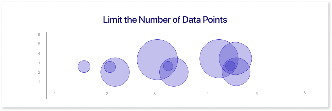
Bubble charts are often transparent to show overlaps when all points are small. Although there aren't any guidelines for using data in bubble charts, there are a few things to think about when making one. If there is too much plotting, summarize or use a different chart type to show your data. Smaller bubbles can separate points, but it's harder to read values from them.
Legend and Labeling for Clarity
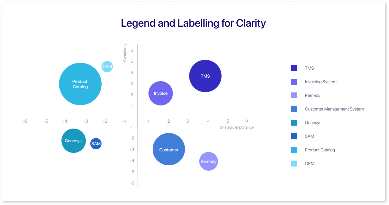
Labeling and legend in bubble charts are important. The bubbles' size and position alone may not show their importance. To grasp their importance, we require additional information. They are essential for clarifying the scale and context of your chart, making understanding easier.
Without these basic components, your chart faces the risk of being misunderstood or perhaps ignored entirely. Including both helps the audience use the chart well and understand the data more effectively.
Illustrate a Distinct Pattern
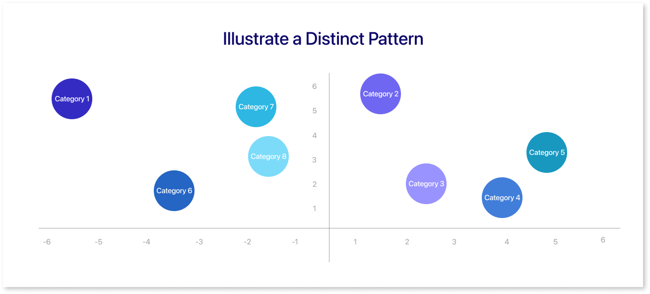
When using a bubble chart, make sure the size of the bubbles reflects the values to clearly show information to others. When creating your chart, try different ways to arrange the data.
The two most important things or the most important connection should be on the horizontal and vertical positions. If the third variable doesn't add much to the main idea, don't use a bubble chart. Use simpler charts instead.
Dealing with Negative Values
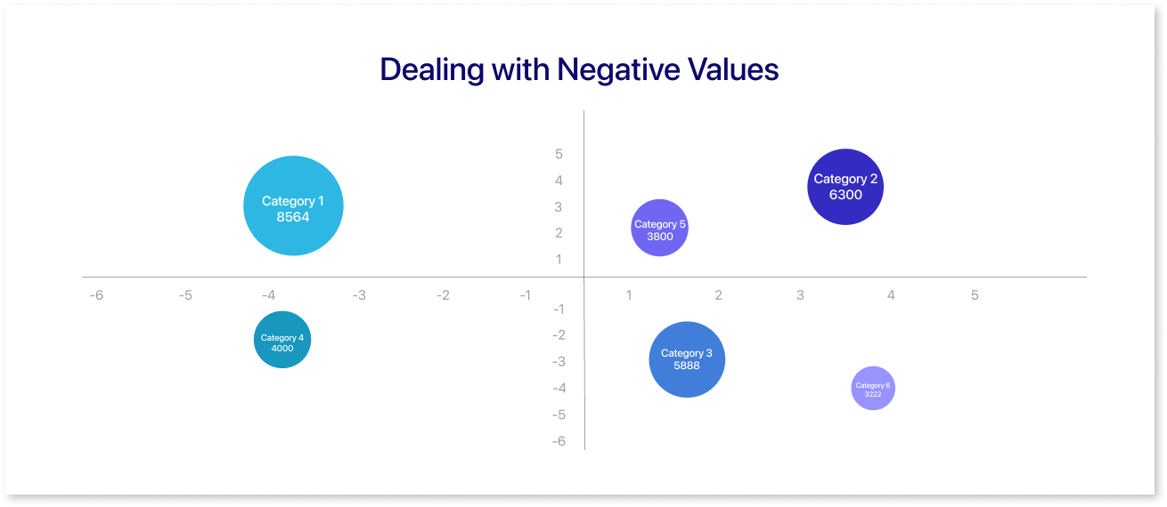
Using a dataset in a bubble chart is not subject to any particular guidelines. So, we have to use other ways to show negative values. One way is to use filled circles for positive numbers and unfilled circles for negative numbers. Another option is to use different colors for positive and negative numbers.
Bubble charts use negative values to display significant data, such as financial losses or declines in performance. These charts primarily emphasize the size and direction of change.
Charts Similar to Bubble Chart
Many other charts and visuals work like bubble charts. They can show lots of different info at once and help us see how things relate and make patterns clearer. Some of these charts include:
Scatter Plots
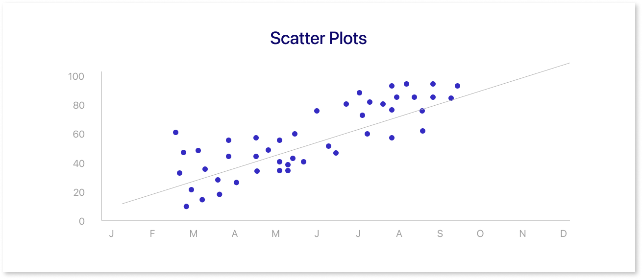
People commonly use scatter plots to display data in two or more dimensions. Individual markers represent data points in scatter plots, making them suitable for visualizing two-dimensional data.
Scatter plots are simple charts that display paired data on the x and y-axes. The observations represented by points on a scatter plot align with the values of two variables. The scatter plot can display a connection between variables, which can be linear or nonlinear, and positive or negative. And are handy for spotting outliers and patterns hidden within data.
Bubble Maps
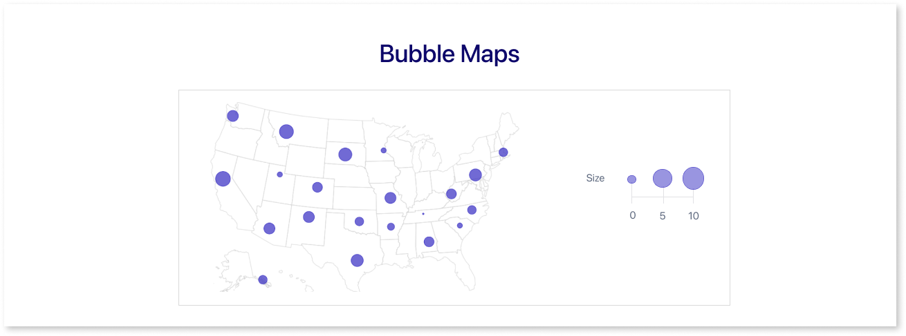
Bubble maps are like bubble charts. They use maps as a background and show data points as bubbles in specific places on the map. Additionally, the size of bubbles can encode a third variable in the scatter plot.
The two positional numeric variables indicate geographical coordinates (i.e. latitude and longitude), we can create a bubble map by laying bubbles over a map in the backdrop. A bubble map is an extension of the scatter map that can assist with possible over plotting difficulties.
If a scatter map has many points in one area, it may be hard to see them all. We can simplify by using one bubble to show the total points in an area. Similarly, we can use multiple bubbles to represent different areas on the chart.
Packed Circle Charts
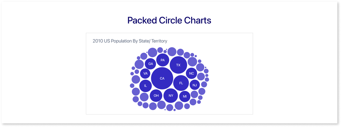
A packed circle chart is a type of data visualization that uses circles to display hierarchical or nested categories. A large circle encircles smaller circles in the chart, each small circle shows a smaller part of the main category.
In a full circle chart, the only thing shown is the numbers or frequencies represented by the bubbles. Without any actual positional axes, they densely arrange themselves.
Conclusion
Once you've read this article, you'll grasp what a bubble chart is and how to apply it. Unlike other charts or graphs, bubble charts excel at visually representing intricate connections within data sets.
They use simple pictures to explain complex connections, helping us understand relationships without using numbers. Bubble charts may not always work, but they can help your audience understand the data you present.
Try Mokkup.ai today!
Prompt it. Wireframe it with Mokkup.ai.
