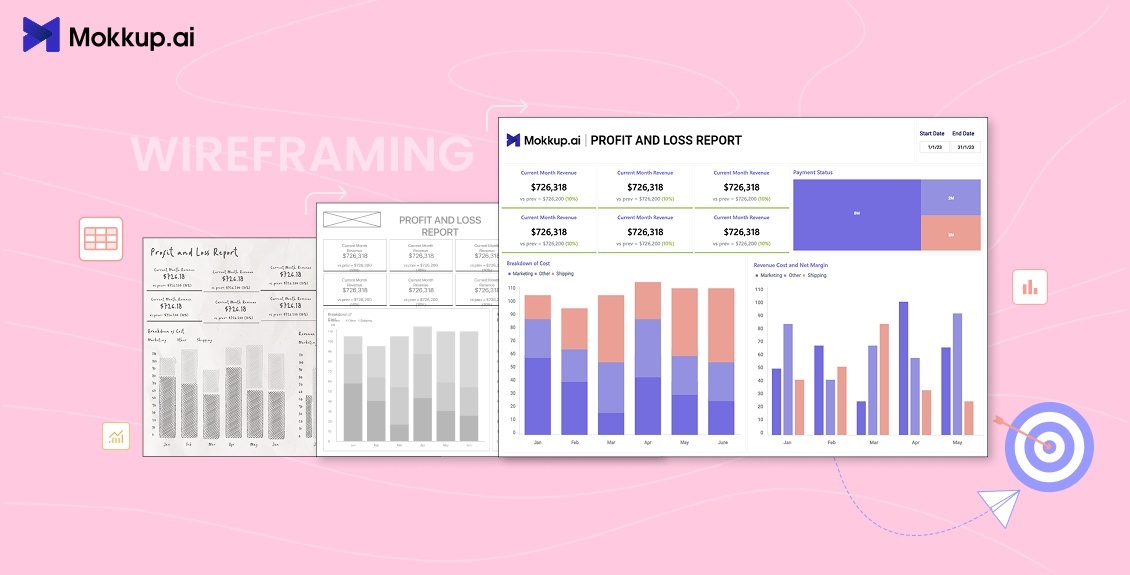
Imagine you are trying to find your way in a completely dark room filled with furniture. You bump into chairs, trip over tables, and can’t even reach the light switch. Frustrating, right? Now replace that room with your digital product, like your website, app, or BI dashboard. Without a clear plan, users can feel the same way: lost, confused, and frustrated.
This is what wireframing solves for BI developers. Think of it as switching on the lights and mapping the room before moving the furniture around. A wireframe gives you a blueprint of your interface, showing where things go and what’s most important, before you even pick a color or font.
In 2025, wireframing is a strategic step that saves time, reduces errors, and improves user experience. Whether you’re creating a dashboard packed with KPIs or a sleek new app, wireframing ensures everything makes sense to the people who will actually use it.
So, what is wireframing really, and why is it so critical in modern UI/UX design? Let’s break it down, step by step, with examples, tips, and real-world analogies to make it easy to understand
Table of Contents
- What is Wireframing?
- Wireframing Basics: Why It Matters Before Design
- Types of Wireframes
- UI Wireframing vs UX Wireframing
- Wireframe vs Prototype
- The Wireframing Process Step by Step
- Wireframing Design Principles
- Dashboard Wireframing Tools & Trends in 2025
- Where Mokkup Leads the Pack
What is Wireframing?
Wireframing involves sketching out the structural layout of a digital interface. Unlike final designs, wireframes focus purely on structure, layout, and functionality. They don’t worry about colors, fonts, or graphics.
Think of a wireframe like an architectural plan for a building. You know where the rooms, doors, and windows are, but you haven’t picked paint colors or furniture yet.
Wireframes are a universal language between designers, developers, and stakeholders. They are crucial for BI dashboards because they organize data logically, ensuring that metrics and KPIs are easy to understand and act upon. A well-structured wireframe can improve UX design while saving time, reducing errors, and improving user satisfaction.
Wireframing Basics: Why It Matters Before Design
The core principle of wireframing basics is simple: structure comes before aesthetics. When designers skip wireframing, they risk costly redesigns.
This is precisely why 85% of designers use wireframing to plan and outline their layouts, structures, and flows. In BI dashboards, too, wireframing isn’t just about design clarity. It’s about saving time, cutting costs, and building smarter from the start.
Wireframing helps teams:
- Map hierarchy and content flow
- Identify functional gaps early
- Test navigation and user interactions without coding
For BI dashboards, it ensures that charts, tables, and KPIs are prioritized
Types of Wireframes: Low-Fidelity vs Medium vs High-Fidelity
Wireframing doesn’t start at the same level as it ends. Designers move through stages of fidelity, from rough ideas to near-final layouts. Understanding this progression helps you use the right level of detail at the right time.
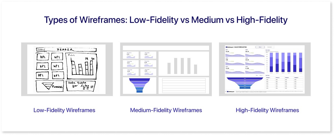
1. Low-Fidelity Wireframes (The Starting Point)
Think of a low-fidelity wireframe as the brainstorming stage. They are quick sketches, either on paper or using basic digital tools. At this point, the goal isn’t perfection, it’s clarity.
What they focus on:
- Layout and content placement
- User flow and navigation
- Early structure without styling
Why teams start here:
- Fast and low effort
- Easy to change or discard
- Encourages experimentation
- Helps stakeholders agree on direction before design work begins
Best for:
- New BI dashboard layouts
- Landing pages and app structures
- Early UI/UX wireframing decisions
Limitation:
They don’t show interactions or details, so they aren’t ideal for developer handoff or usability testing.
Example: Imagine you’re designing a dashboard to track sales metrics. A low-fidelity wireframe might show placeholder boxes for revenue, leads, and conversion charts, without worrying about colors or fonts. This allows the team to decide the logical placement of metrics before final visuals.
2. Medium-Fidelity Wireframes (The Clarification Stage)
Once the layout and flow are roughly approved, teams move on to medium-fidelity wireframing. This is where low-fidelity ideas are refined into something more structured.
What’s added here:
- Defined spacing and grid alignment
- Component placement (buttons, filters, cards)
- Basic typography and placeholders
- Early interaction hints
Why it matters:
- Helps teams validate layout decisions & functionality
- Improves clarity during stakeholder reviews
- Makes UX flaws visible before high-fidelity work begins
Best for:
- BI dashboards where the data hierarchy must be tested
- Client approvals before detailed design
- Aligning designers and developers on structure
Limitation:
Still not detailed enough for final usability tests or development.
Example: Imagine you’ve finalized the basic layout of that sales dashboard. In a medium-fidelity wireframe, those placeholder boxes evolve into clearer sections. You’d label each area—“Monthly Revenue,” “Top Products,” “Lead Sources”, and define spacing, test functionalities, decide chart types, and button placements. There’s still no final color scheme, but the layout feels structured enough for feedback from product managers or BI teams.
3. High-Fidelity Wireframes (The Final Blueprint)
Once structure and flow are locked in, teams upgrade to high-fidelity wireframes, which look similar to the final design.
What they include:
- Accurate fonts, icons, and spacing
- Real copy or dummy data
- Detailed component styling
- Interaction notes or clickable prototypes
Why this stage is critical:
- Makes usability testing meaningful
- Gives developers a visual reference
- Helps stakeholders almost “see” the finished product
- Bridges the gap between wireframing and prototyping
Best for:
- Developer handoff
- Testing dashboards with realistic data
- Final approvals before prototyping
Limitation:
If earlier stages were skipped, revisions here can be time-consuming and expensive.
Example: Once the structure is approved, the same dashboard moves to a high-fidelity wireframe. Now you add actual sample numbers, icons, fonts, tooltips, dropdowns, filter styles, and interaction hints. The revenue graph looks like a real chart, the colors follow your design system, and the layout could almost pass for the final interface. At this point, developers and stakeholders can visualize how the finished dashboard will function.
Understanding fidelity levels tells you how detailed your wireframe should be. But that still leaves one question: What purpose is your wireframe serving, visual design or user journey?
That’s where UI wireframing and UX wireframing come into play.
UI Wireframing vs UX Wireframing
A common misconception in the wireframing process is that UI wireframing and UX wireframing are the same thing. They work together, but they solve very different problems, and understanding this distinction is a core part of wireframing basics.
Although often used interchangeably, UI and UX wireframing serve distinct purposes:
UI wireframing is about the visual structure of the interface. It focuses on where elements like buttons, charts, filters, tabs, or input fields will appear. The goal is to create a layout that makes interaction effortless. UI dashboard wireframes determine how KPIs, graphs, and data cards are positioned so the interface doesn’t feel cluttered.
UX wireframing, on the other hand, is about how someone moves through the product. It maps the user journey, defines navigation patterns, reduces friction, and makes sure people don’t get stuck or overwhelmed. With dashboards, UX wireframes ensure users can interpret metrics quickly, switch views easily, and follow logical data paths.
Here’s a simple analogy:
UI wireframing is like arranging all the furniture so everything fits and looks balanced. UX wireframing is planning how people walk through the house, where the entrances are, which paths feel natural, and how easy it is to move around.
Now that UI and UX wireframing are clear, the next confusion most teams face is when a wireframe stops and a prototype begins. That’s where the real distinction comes in.
Wireframe vs Prototype: Key Differences
Many beginners confuse wireframes and prototypes, but they are not the same:
- Wireframes: Static representations of layout and function
- Prototypes: Interactive simulations that allow testing of navigation and features.
|
Aspect |
Wireframe |
Prototype |
|
Purpose |
Layout and structure |
Interactive simulation of the final product |
|
Fidelity |
Low or High |
Usually High |
|
Interaction |
Static |
Dynamic |
|
Goal |
Align stakeholders |
Test usability (mostly) |
The Wireframing Process: Step-by-Step
A systematic approach to wireframing ensures efficiency and clarity.
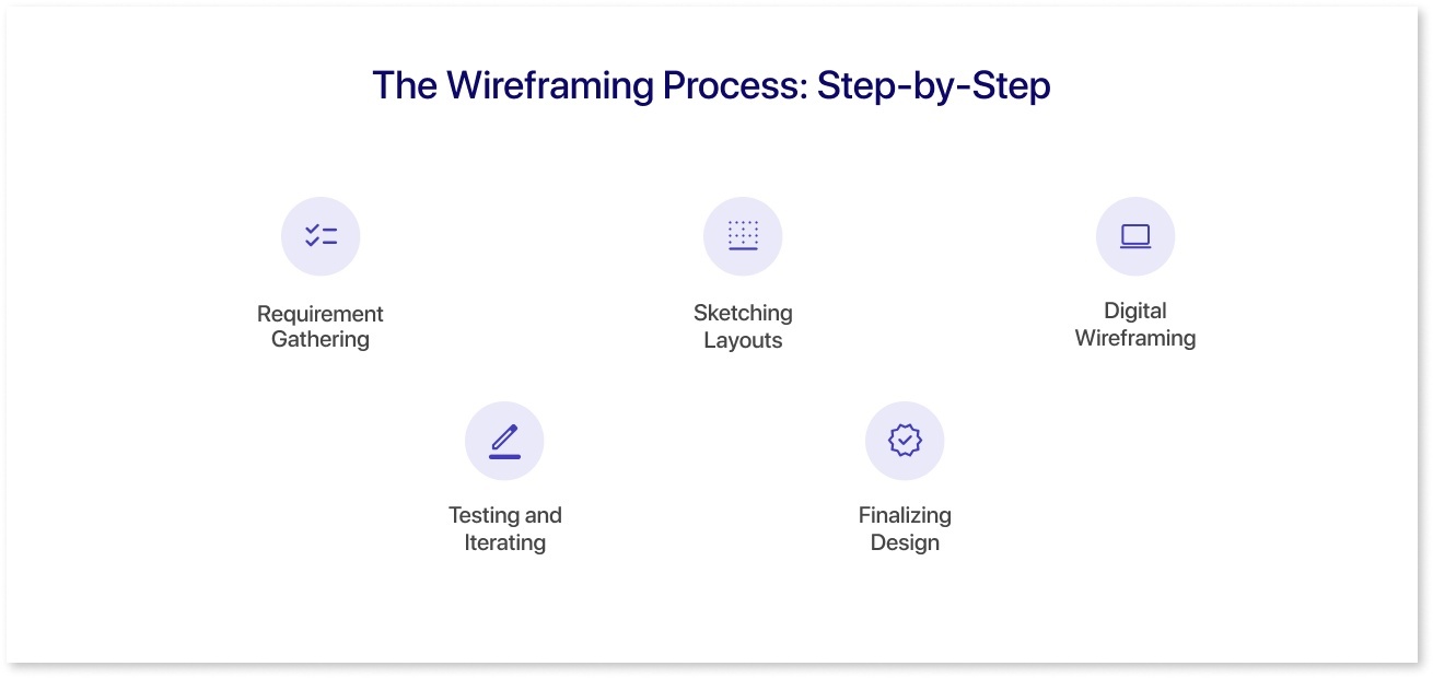
1. Requirement Gathering
Understand the project goals, user needs, and data requirements. For BI dashboards, this means knowing what business KPIs matter, who the end-users are, and what decisions they need to make.
2. Sketching Layouts
Start with rough sketches. Explore different layout ideas on paper or digitally. Focus on hierarchy, navigation, and content placement.
3. Digital Wireframing
Use tools like Mokkup.ai to create structured wireframes. It gives you a head start. Instead of building every screen from scratch, you can access 400+ ready dashboard templates designed for real BI use cases. If you prefer custom layouts, you can still develop your own wireframes using 20+ drag-and-drop elements, 50+ widget styles, and 15+ color palettes.
4. Testing and Iterating
Gather feedback from stakeholders and potential users. Refine layouts based on usability tests. This step prevents cluttered dashboards or confusing navigation.
5. Finalizing Design
High-fidelity wireframes are transitioned into prototypes for development. Developers now have a clear blueprint for implementation.

Wireframe Design Principles for 2025
The following principles are an essential part of the modern wireframe design guide:
- Simplicity: Keep layouts clean to reduce cognitive load
- Consistency: Standardize elements for intuitive navigation
- Accessibility: Design inclusively for all users
- Responsiveness: Ensure interfaces adapt across devices
- Performance: Optimize layouts for faster loading and smoother interactions
Dashboard Wireframing Tools & Trends in 2025
Wireframing in 2025 is no longer just about static layouts. It’s about speed, collaboration, and intelligent automation. The latest tools are reshaping the wireframing process with features that help teams move from idea to prototype faster than ever.
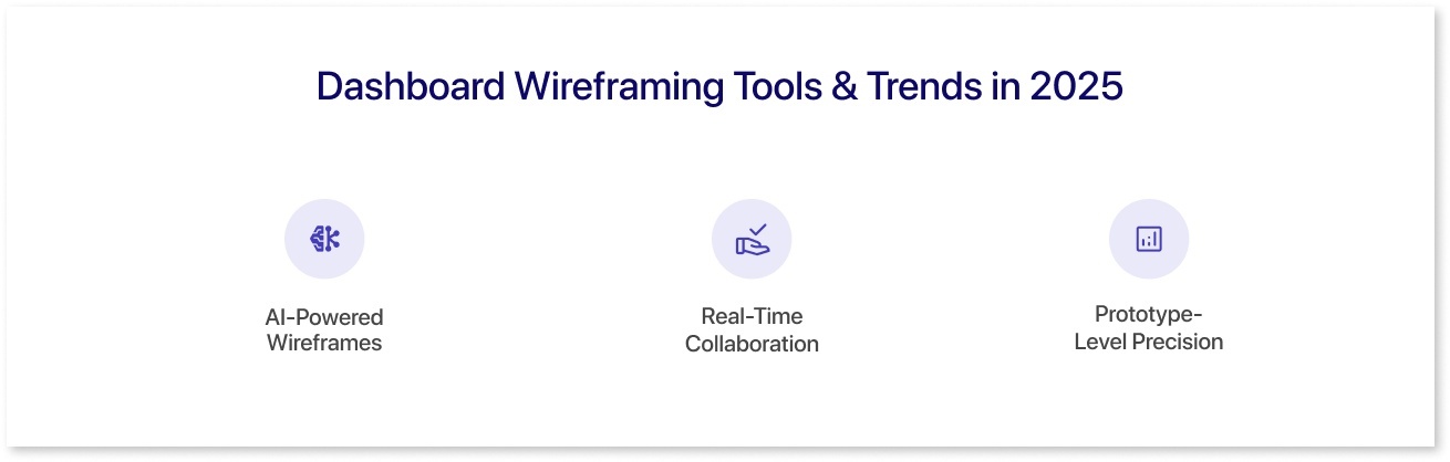
Here’s what’s changing:
AI-Powered Wireframes
Modern platforms now suggest layouts, grid structures, and widget placement automatically. This cuts down repetitive work and lets designers focus on flow and usabilireducesd of manual alignment. A survey commissioned by UiPath found that nearly 60% of respondents believe automation can address burnout and improve job fulfillment. This data underscores how AI-driven wireframing is expected to reduce manual effort and make the design process more enjoyable.
Real-Time Collaboration
Instead of passing files back and forth, teams can now co-design wireframes live, add comments, and iterate instantly. This is especially useful for cross-functional BI teams working on dashboards.
Prototype-Level Precision
The line between wireframe vs prototype is blurring. Many tools now let you test interactions and navigation early, without waiting for developers.
Where Mokkup Leads the Pack
Among the new-generation tools, Mokkup.ai stands out by combining all three trends:
- AI prompt-based wireframing will speed up the process.
- AI-powered wireframe review to instantly spot design gaps, layout issues, or missing KPIs before moving to development
- 400+ pre-built BI dashboard templates for faster kick-offs
- Drag-and-drop elements (20+ components, 50+ widget styles) to customize low and high-fidelity wireframes
- Real-time collaboration features for teams and stakeholders.
- Flexible color palettes for visual clarity
If you’re designing dashboards in 2025, Mokkup.ai lets you plan, test, and refine your wireframes efficiently. It combines the clarity of traditional wireframing with interactive features usually found in prototypes.
Conclusion
Wireframing is far more than a preparatory step. It’s a strategic part of the wireframing process that saves time, reduces errors, and improves user experience. From low-fidelity wireframes to detailed high-fidelity wireframes, understanding wireframing and applying solid wireframe design principles ensures your digital products are intuitive, functional, and user-centered. Whether refining UI wireframing layouts or focusing on UX wireframing flows, mastering these techniques in 2025 is essential for creating dashboards and apps that work for real users.
If you want to streamline this process and design more effective wireframes without starting from scratch, it’s worth exploring Mokkup.ai. It is built to make every stage of wireframing faster and smarter.

Frequently Asked Questions
Wireframing involves sketching out the structural layout of a digital interface. It focuses on layout, structure, and functionality rather than colors, fonts, or final visuals. Think of it as the skeleton of your website, app, or BI dashboard that guides the UI wireframing and UX wireframing process before moving into design or development.
A wireframe example could be a sales dashboard layout: simple boxes represent revenue, leads, and conversion charts in a low-fidelity wireframe, showing content placement without colors or graphics. A high-fidelity wireframe of the same dashboard would include real numbers, styled charts, and interaction notes to simulate the final interface.
There are several tools for wireframing, but modern platforms like Mokkup.ai are ideal. They combine UI and UX wireframing features, offer 400+ dashboard templates, drag-and-drop elements, and high-fidelity wireframe capabilities, making the entire process faster and more precise.
Yes. Wireframing is a fundamental design method in UI/UX development. It’s part of the wireframing process, helping designers and developers plan layouts, workflows, and interactions before moving into visual design or prototyping.
In UX wireframing, a wireframe focuses on the user journey, navigation, and accessibility rather than visual styling. It maps how users move through a product.
Prompt it. Wireframe it with Mokkup.ai.
