
Microsoft Copilot in Power BI is a big leap forward for BI teams. It has condensed complex tasks like creating a report page, DAX measures, and a full dashboard layout into the comfort of typing a plain-English prompt. For teams under deadline pressure, that kind of ease is a long-needed bliss.
So it makes sense that Microsoft Copilot BI dashboard wireframing is one of the most searched workflows in the Power BI space right now. Teams want to know: Can Copilot handle the Dashboard planning step too?
This article answers exactly that by showing what Microsoft Copilot dashboard wireframing misses, what happens when that step is skipped, and what fills it.
Table of Contents
- What Microsoft Copilot in Power BI Actually Does
- We Tested Copilot for Power BI Dashboard Design
- Why Microsoft Copilot BI Dashboard Wireframing Needs a Prior Step
- The Workflow That Fixes It: Mokkup.ai Before Copilot
- Microsoft Copilot vs. Mokkup: Side-by-Side Comparison
- Where Microsoft Copilot Genuinely Excels in a BI Workflow
What Microsoft Copilot in Power BI Actually Does
Microsoft Copilot in Power BI is an AI assistant built to assist in analyzing data and building reports. It works directly with Power BI’s semantic models and dashboards to ease the generation of insights from raw business data. Be it building a report from scratch or spotting specific information in your metrics, Copilot handles it so that analysts and BI developers can make decisions faster.
However, before building a workflow around it, there are a few things worth understanding about how Copilot actually works, including where it operates, what it can and cannot produce, and who can access it.
Copilot Builds Inside Power BI, Not Before It
Copilot reads your data model, understands tables and relationships, and generates visuals, summaries, DAX measures, and full report pages from plain-English prompts. It works inside Power BI Desktop or Service, not in a planning or wireframing environment. Thus, Copilot starts at the build step, not the design step, leaving no room for Power BI dashboard wireframing.
What Copilot Can Generate From a Prompt
The specific Copilot outputs worth knowing: report page generation from a natural language description, DAX measure suggestions, visual recommendations, narrative summaries, and Q&A-style data exploration. These are genuinely valuable capabilities, and the Copilot Power BI dashboard design is impressive at this stage. What Copilot cannot produce is a shareable, stakeholder-ready layout that exists before the build begins.
Who Has Access to Copilot in Power BI
Copilot in Power BI requires a paid Microsoft Fabric capacity of F2 or higher, or a Power BI Premium capacity of P1 or higher at the organisational level. A Power BI Pro or PPU licence alone is not enough. A segment of readers evaluating Microsoft Copilot BI dashboard wireframing workflows will not have access yet, and this context matters when deciding whether to build a process around it.
Understanding where Copilot excels and where it stops is easier shown than explained. So we ran a real Copilot Power BI dashboard design test with a genuine prompt, a live data model, and documented output to see exactly what gets built and what that creates downstream.
We Tested Copilot for Power BI Dashboard Design
The hands-on test for Microsoft Copilot BI dashboard wireframing is different from how we tested Claude Design or ChatGPT. The question here is not "can it wireframe?" but "what does it build, and what problem does that create?" The test is a real Copilot Power BI dashboard design prompt, documented output, and then the downstream consequence: a built report that stakeholders have not signed off on.
Note: This test was conducted in May 2026 on Power BI Service. Copilot's output may vary as Microsoft continues to update the feature.
1. The Prompt We Used
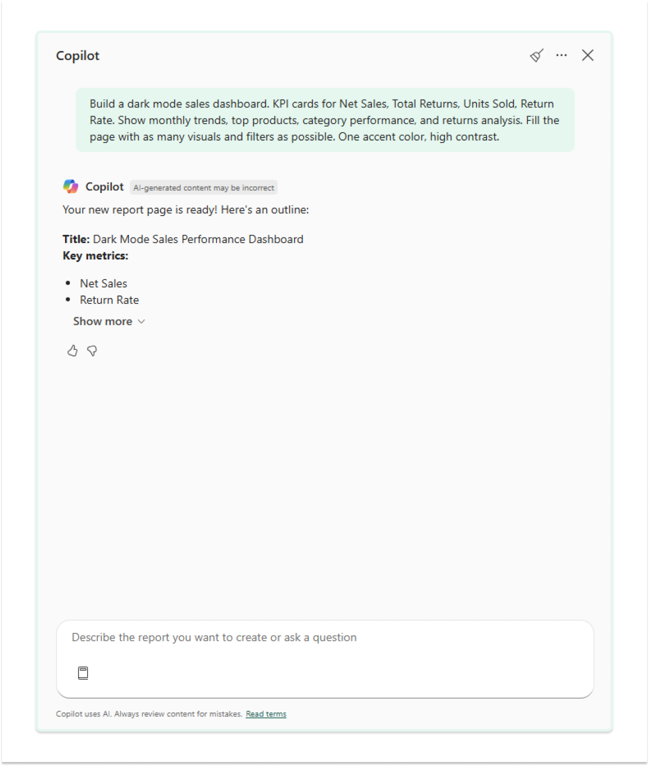
We ran the test inside Power BI Service using a Microsoft sample sales dataset covering products across XBOX, Office 365, Power Platform, and Power BI. The prompt we gave Copilot was deliberately detailed, covering layout, KPIs, visual density, and styling in a single instruction.
THE PROMPT:
"Build a dark mode sales dashboard. KPI cards for Net Sales, Total Returns, Units Sold, Return Rate. Show monthly trends, top products, category performance, and returns analysis. Fill the page with as many visuals and filters as possible. One accent color, high contrast."
2. What Copilot Produced
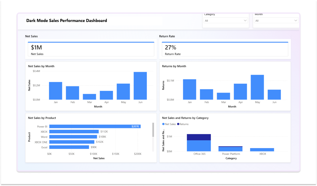
Copilot generated a report page almost immediately. What appeared on the canvas: two KPI cards (Net Sales at $1M and Return Rate at 27%), a Net Sales by Month bar chart, a Net Sales by Product horizontal bar chart, and a Net Sales and Returns by Category grouped bar chart. Category and Month slicers were placed at the top right. For a prompt-to-report turnaround measured in seconds, the core structure was recognisable.
That said, seven gaps appeared immediately on review:
- The background stayed white despite a dark mode request.
- Only two of the four requested KPI cards were generated, with Units Sold and Total Returns missing from one iteration.
- Two broken visuals on a second-generation attempt (shown below) with "Error fetching data for this visual" due to conflicting field placements in the data model.
- A Standard medium blue accent colour across all visuals rather than a high-contrast single-accent palette.
- A significant portion of the canvas was left unused, as the output showed broken visuals and a sparse layout.
- No time series chart was generated despite the prompt explicitly requesting monthly trends, with no MoM or YoY deltas, or period-over-period comparisons that any sales dashboard would be expected to include.
- Only generated what the data model structurally supported, not what a BI developer or stakeholder would consider analytically complete.
These gaps indicate that Copilot lacks business context. And without a wireframe step before it, that gap only surfaces after the build.
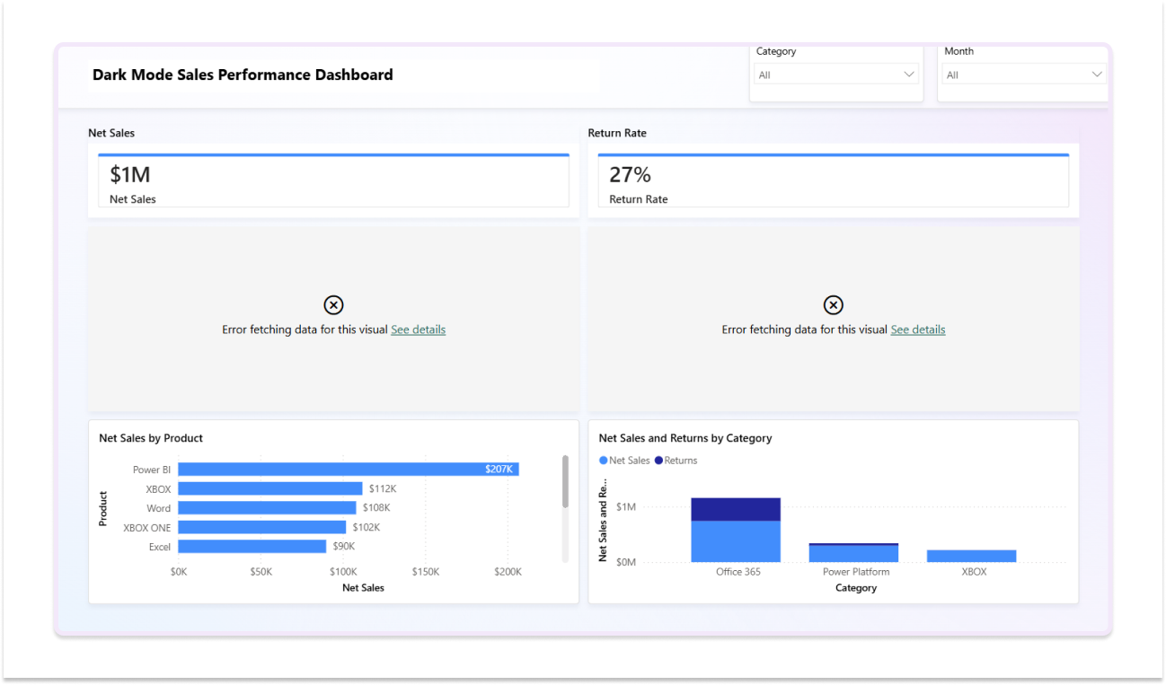
The output is not a failure. The working visuals are properly formatted, the chart types are appropriate, and the data is correctly connected where the model allowed it. But the gap between what the prompt asked for and what Copilot produced is significant, and none of it is visible until after the build runs.
3. The Problem That Appears After Copilot Builds
The wireframe design is built. It looks professional. Then it goes to the stakeholder.
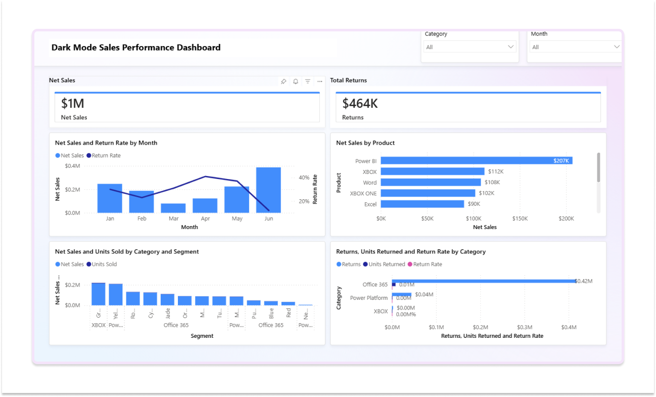
You share the report. The client immediately flags that dark mode was a firm requirement, specified in writing in the brief. Two of the four KPI cards they specifically asked for are missing. Two visuals are broken, which means a trip back into the data model before the report can even be presented. The layout uses less than half the available canvas space despite the prompt explicitly asking to maximise visual density.
None of this is fixable with a better prompt. The dark mode issue is a Power BI theme setting, not a Copilot instruction. The broken visuals stem from a data model conflict that Copilot cannot resolve on its own. The missing KPIs and metrics require manual additions. Each fix requires going back into Power BI, adjusting settings, rebuilding visuals, re-checking the data model, and re-exporting.
The rework is not dramatic. But it is real, and it all happens after the build. A wireframe sign-off step would have confirmed the four KPI cards, the dark theme, the target visual density, and the layout expectations before Copilot was opened. Every one of these gaps is a planning problem, not a build problem. And planning problems are orders of magnitude cheaper to resolve in a dashboard wireframe than in a half-built Power BI report.
Why Microsoft Copilot BI Dashboard Wireframing Needs a Prior Step
Copilot is not a Power BI wireframing tool and was never meant to be. If you're a BI developer, consultant, or team lead building reports against a Copilot workflow, this gap will cost you revision time on every project. Here are four specific consequences of skipping the wireframing step in a Microsoft Copilot BI dashboard wireframing workflow.
Stakeholders React to a Built Report, Not a Wireframe
When stakeholders see the first Copilot Power BI dashboard design output, they are reacting to a built report: real data, real formatting, DAX already written. Changes at this stage cost build time, not wireframe revision time. Rework in Power BI is significantly more expensive than rework in a wireframe. This is precisely why using a dedicated Power BI wireframing tool before Copilot is opened is not a nice-to-have but a must-have step to control cost.
Copilot Interprets the Brief, Not the Stakeholder's Mental Model
Copilot generates the most statistically reasonable dashboard from the prompt. But the stakeholder's mental model of what the dashboard should look like is not in the prompt; it is in their head. Without a wireframe before Power BI Copilot runs, the gap between what Copilot builds and what the stakeholder expected only surfaces after the build. This is precisely why Microsoft Copilot dashboard wireframing as a prior step matters so much in a real delivery workflow.
No Layout Alignment Before DAX Is Written
Copilot writes DAX measures to support the visuals it generates. If the layout changes after stakeholder review, the measures may need to be rewritten, too. This happens more than we think. As per The Modern Data Survey Report, 60% of Data Teams rework their tracks often. A Copilot Power BI wireframe step, done before the build, locks the layout and therefore the measure logic before Copilot touches the data model.
No Shareable Pre-Build Artefact for Distributed Teams
For BI consultancies and enterprise teams working with offshore developers or distributed stakeholders, no Copilot output functions as a pre-build alignment document. A Power BI wireframing tool produces that document. Copilot has no equivalent, and distributed teams feel that gap most acutely.
The Workflow That Fixes It: Mokkup.ai Before Copilot
While understanding Copilot vs Mokkup.ai properly, it is important to note that Mokkup does not position itself as a replacement. It is the pre-Copilot step that makes Copilot more effective.
The workflow is:
- Step 1 → Mokkup– wireframe the dashboard and get stakeholder sign-off
- Step 2 → Copilot– build the approved layout inside Power BI
Such a flow is collaborative, credible, and accurate. This is where Microsoft Copilot BI dashboard wireframing becomes a real, structured workflow rather than a build sprint with planning debt.
Start dashboard wireframing for Free!
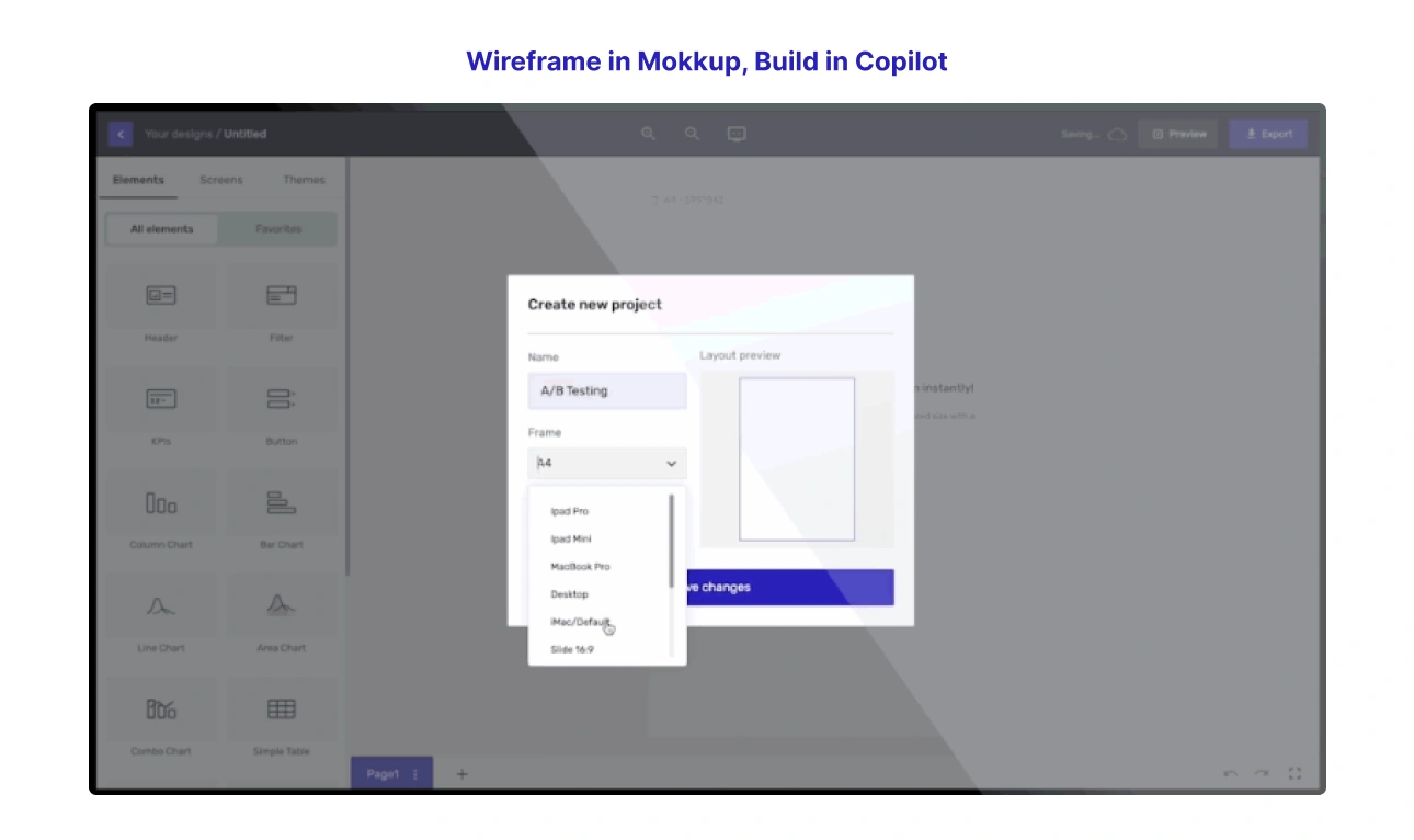
Wireframe in Mokkup, Build in Copilot
Follow the two-step workflow: use Mokkup to wireframe the dashboard, get stakeholder sign-off on the layout, then hand the agreed wireframe to Copilot as the brief. Since now it builds what was already approved, the practice eliminates the rework loop. This is one of the ways Mokkup streamlines the wireframing step that Copilot skips, with planning and sign-off handled before the build begins.
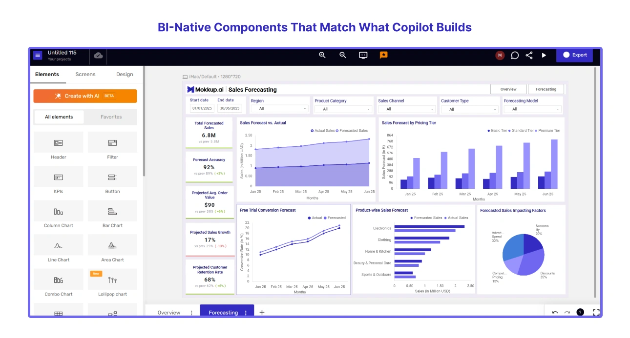
BI-Native Components That Match What Copilot Builds
Mokkup's component library uses the same Power BI visual vocabulary as Copilot's output: KPI cards, slicers, matrix visuals, chart types and more. So when a stakeholder approves the Mokkup wireframe, they are signing off on something that looks like the report Copilot will actually build. That is exactly why the sign-off is meaningful, and why Mokkup is the right Power BI wireframing tool to pair with Copilot.
Shareable Wireframe Links for Stakeholder Sign-Off
Mokkup produces a shareable link that stakeholders can review and comment on before Copilot is opened. The sign-off is on the wireframe, not on a half-built Power BI report in the middle of a review meeting. This is one of the clearest practical differences in the Copilot vs Mokkup comparison: Mokkup produces a shareable wireframe before the build begins, with no Power BI licence and no live data. Copilot produces a built report, which means stakeholders are reviewing finished work, not approving a plan.

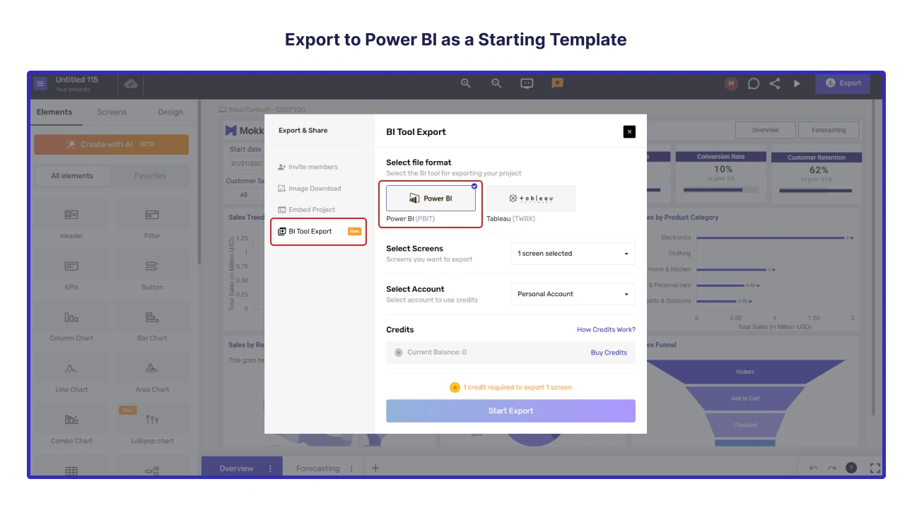
Export to Power BI as a Starting Template
After stakeholder sign-off, the Mokkup exports the wireframe directly to Power BI as a starting template. Copilot builds on top of a layout that stakeholders have already signed off on. The layout is locked before the build begins, which means the rework loop disappears before it has a chance to start.

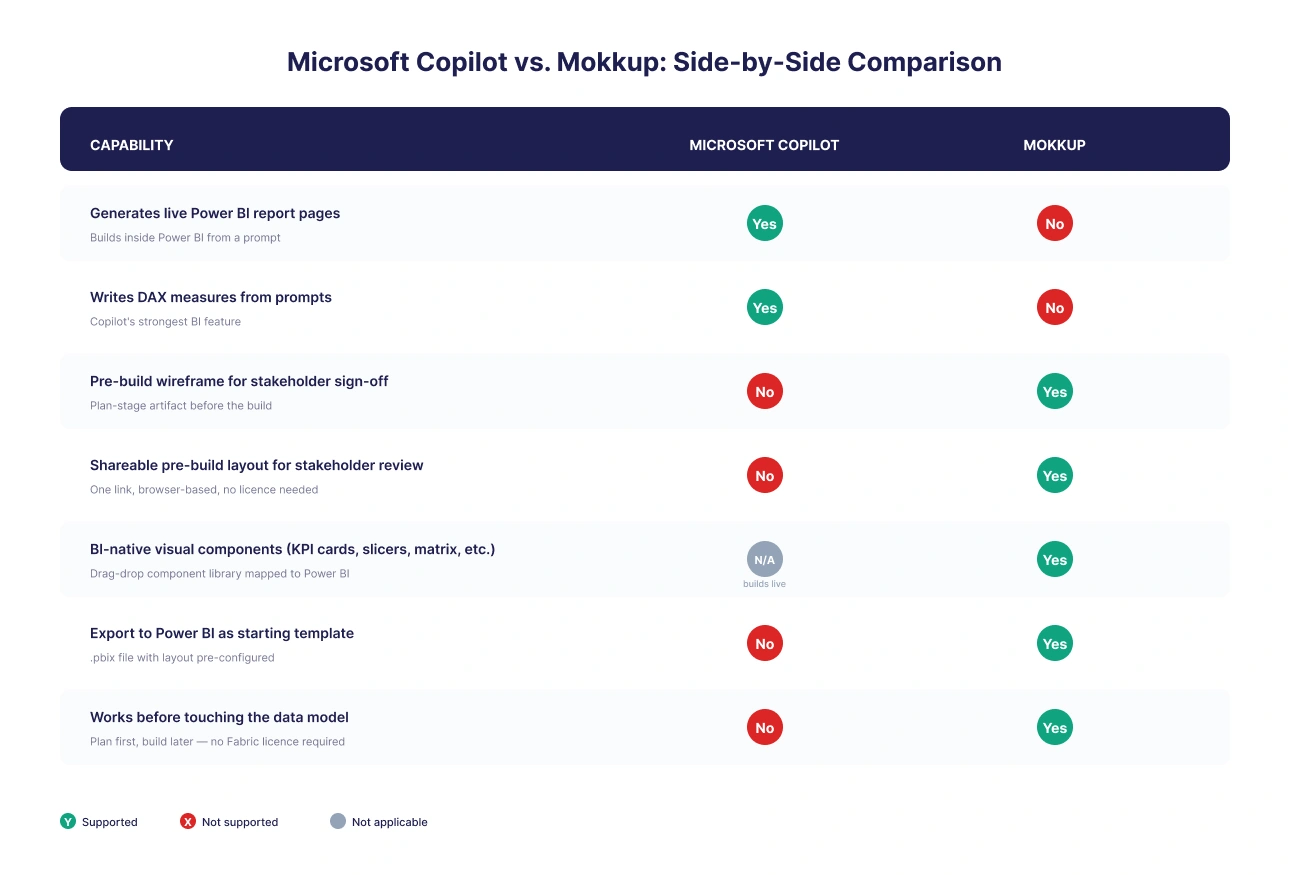
Microsoft Copilot vs. Mokkup: Side-by-Side Comparison
The Copilot vs Mokkup comparison below is not a traditional head-to-head. These tools serve different steps in the BI workflow. The table makes that complementary relationship visible. Microsoft Copilot BI dashboard wireframing and Mokkup's wireframing capability are not competing features; they are sequential steps.
Where Microsoft Copilot Genuinely Excels in a BI Workflow
Microsoft Copilot BI dashboard wireframing is not a weak workflow. However, Copilot is a build tool that needs a planning step before it. Once the planning step is handled, Copilot is an exceptionally capable build tool. Here is where the Copilot Power BI dashboard design is genuinely best-in-class.
- Report page generation. Only a few AI tools in the BI space generate full Power BI report pages from a prompt with the same accuracy. Copilot reads your actual data model and produces visuals connected to real data, not placeholder layouts.
- DAX measure writing. For experienced Power BI developers, Copilot's DAX generation is a substantial time saver. For less experienced analysts, it removes a skill barrier that previously blocked certain analysis types.
- Narrative summaries. Copilot can generate plain-English summaries of what the data shows, a feature that is genuinely useful for executive report pages and non-technical stakeholder updates.
- Build acceleration. Once the layout is agreed, Copilot gets a developer to a first build faster than any other method. That speed advantage is real and compounds over time for teams with high report volume.
Conclusion
Copilot is one of the most powerful additions to the Power BI stack in years. But speed without alignment is just faster rework. Teams that skip wireframe before Power BI Copilot consistently spend more time fixing the output than they saved building it.
The fix is a single step added before Copilot is opened. Wireframe in Mokkup, get stakeholder sign-off, export the Copilot Power BI wireframe to Power BI as a starting template, and Copilot then builds what was already approved. And Microsoft Copilot BI dashboard wireframing stops being a fast build with planning debt attached and becomes a genuinely end-to-end delivery workflow.
Start wireframing for free at Mokkup.ai!

Frequently Asked Questions
Copilot generates Power BI report pages directly inside Power BI. It does not produce a wireframe or mockup. Microsoft Copilot BI dashboard wireframing as a planning step does not exist inside Copilot itself. For a pre-build wireframe that stakeholders can sign off on, a dedicated Power BI wireframing tool like Mokkup is used before Copilot is opened.
Copilot in Power BI requires a paid Microsoft Fabric capacity of F2 or higher, or a Power BI Premium capacity of P1 or higher at the organisational level. A Power BI Pro or Premium Per User (PPU) licence alone is not sufficient.
The most effective workflow is: wireframe before Power BI Copilot runs using a tool like Mokkup, get stakeholder sign-off on the layout, then use Copilot to build the agreed design.
Copilot reads your data model and generates Power BI visuals, report pages, DAX measures, and narrative summaries from plain-language prompts. It is a build acceleration tool, not a planning tool. It produces no Copilot Power BI wireframe, no stakeholder-shareable layout, and no pre-build artefact.
No. The Copilot vs Mokkup framing misreads the relationship. Mokkup handles wireframing and stakeholder sign-off before build. Copilot handles Copilot Power BI dashboard design inside Power BI. Used together, they eliminate both planning friction and build rework. They are complementary tools for sequential steps in the same workflow.
Prompt it. Wireframe it with Mokkup.ai.
