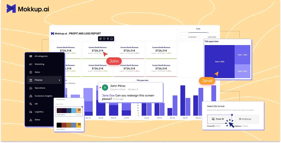
Building a BI dashboard doesn’t start in Power BI or Tableau; it starts on a blank canvas. Before charts come into play, BI teams usually plan their layouts, decide on key visuals, and get stakeholder approval. This early phase is where wireframing becomes essential.
To map out these dashboards, many teams turn to tools like Figma. It’s widely known in the design world and offers flexibility for layout planning. But here's the catch: Figma isn't built for BI. It lacks native support for charts, filters, or KPIs that developers actually use in Power BI or Tableau.
This disconnect creates more problems than it solves. What starts as a quick design exercise often ends up in miscommunication, layout mismatches, and hours of rework when rebuilding the dashboard in BI tools.
That’s where Mokkup changes everything. It’s a wireframing platform created specifically for BI teams, designed to match how dashboards are actually built, reviewed, and deployed. Whether you're working in Power BI or Tableau, Mokkup bridges the gap between planning and execution.
Table of Contents
- How BI Teams Design Dashboards Today
- Why This Process Doesn’t Work Well
- What Makes Mokkup Different?
- Designing a Dashboard in Mokkup
- Exporting to Power BI or Tableau
- Mokkup vs Figma: A Simple Comparison
How BI Teams Design Dashboards Today
Most BI teams follow a fairly standard process when planning dashboards. It typically starts with designing a layout in Figma, especially when stakeholder approval is needed before building the actual dashboard in Power BI or Tableau.
In this process, the BI developer, or sometimes a designer, creates a mockup in Figma using basic shapes and icons. They place rectangles to represent charts, filters, and KPIs, mimicking the final dashboard layout. This wireframe is then reviewed internally or shared with clients for feedback.
Once approved, the developer manually reconstructs the entire design inside Power BI or Tableau. This includes aligning charts, adjusting sizes, placing slicers, and configuring visuals to match the mockup. It’s a long and repetitive step that doesn’t add value but is still necessary due to the disconnect between Figma and BI tools.
This method may work in small teams or simple use cases, but it doesn’t scale well. A recent study shows that companies using traditional manual reporting spend over 180 hours per year on repetitive updates, hours that tools like Figma + Power BI handoffs can't reclaim.
As dashboard complexity grows, the manual nature of the Figma to BI handoff becomes a bottleneck. That’s why more BI teams are now questioning if this is really the best approach.
Why This Process Doesn’t Work Well
At first, using Figma for dashboard wireframing seems like a practical choice. It gives teams a visual way to plan layouts and align with stakeholders. But in reality, the process introduces several inefficiencies that slow down development and increase the risk of errors.
First, there’s the manual rebuild. Everything designed in Figma has to be recreated from scratch in Power BI or Tableau. That means resizing visuals, aligning elements, and manually applying themes, all of which take time and effort that could’ve been avoided.
Second, Figma comes with a learning curve. Most BI developers aren’t trained designers. They may know how to build complex DAX models or data pipelines, but navigating Figma’s interface or design layers often becomes a frustration, not a solution.
Another common issue is visual mismatches. What looks perfect in Figma can look completely different once recreated in a BI tool. Fonts don’t align, spacing feels off, and interactions like filters or drill-downs aren’t part of the mockup, leading to confusion later.
Finally, the process slows down feedback cycles. Stakeholders reviewing a Figma file often have to imagine how the layout will work in Power BI or Tableau. This misalignment leads to back-and-forth edits and rework that could’ve been avoided with a more BI-native tool.
A BI-focused article reports that 75% of BI project failures stem from inadequate stakeholder involvement during the design phase, highlighting the importance of feedback loops and collaborative design tools.
In short, the Figma workflow adds extra steps that don’t move the dashboard forward. That’s where purpose-built tools like Mokkup come in to fix the gap between design and delivery.
What Makes Mokkup Different?
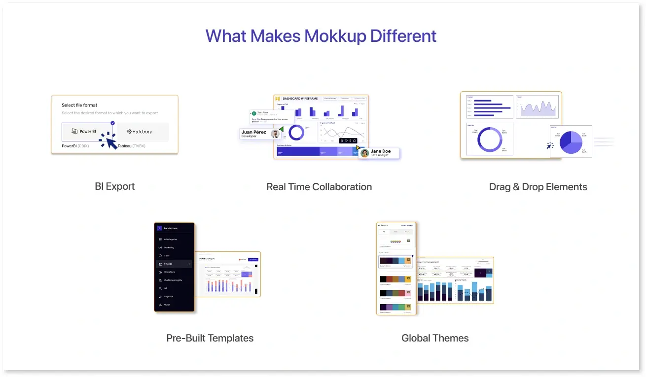
The biggest reason BI teams are switching to Mokkup is its direct export feature. Unlike design tools that stop at visuals, Mokkup lets you export your wireframe directly to Power BI or Tableau, where it opens as a fully structured layout, saving hours of manual rework.
Once your dashboard layout is finalized in Mokkup, you don’t have to recreate anything. Just click export, and you’ll get a BI file with all elements pre-arranged, sized, and styled to match your design. The result? A 95%+ layout match in your BI tool. This drastically reduces development time and ensures that your final dashboard looks exactly like the one approved by stakeholders.
But export is just one part of the picture.
Mokkup is a dashboard wireframing platform made exclusively for BI, which means every feature is tailored to how data teams think and build. You get a drag-and-drop canvas with BI-specific visuals like KPI cards, bar charts, tables, slicers, maps, and filters. No more rectangles or guesswork, just components that look and feel like the real thing.
There’s no need to start from scratch, either. Mokkup includes a library of ready-to-use dashboard templates for common use cases like sales, marketing, finance, and HR. Each template follows design best practices, helping teams move faster with optimized layouts.
You can also apply themes and branding to match your organization’s look and feel. Just pick a color scheme or upload brand guidelines, and your wireframe instantly reflects your corporate style, perfect for client work or internal reporting.
Mokkup also supports real-time collaboration, so multiple users can work together on the same project, leave comments, and make updates instantly. Whether you're part of a small team or a global BI function, this feature keeps everyone aligned.
And to top it off, everything is built for simplicity. No design experience is required; Mokkup’s intuitive interface ensures that even non-technical users can contribute to the dashboard layout process without slowing things down.
Still, what makes Mokkup stand out isn’t just how dashboards are designed,but how seamlessly they’re translated into working BI reports. The export feature closes the gap between planning and development, something no general-purpose tool can offer.
Designing a Dashboard in Mokkup
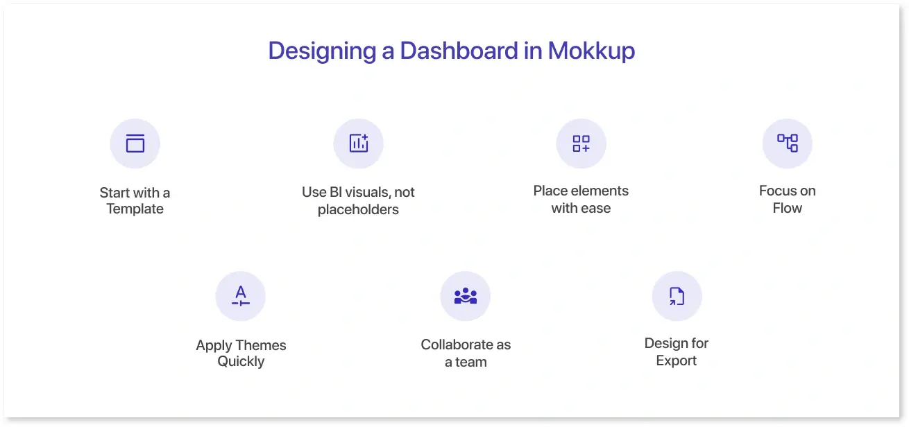
Designing a dashboard in Mokkup mirrors how BI developers actually think logically, visually, and with precision. Instead of struggling with freeform design tools, you get structured components built for Power BI and Tableau workflows.
1. Start with a Template
Instead of a blank screen, you can choose from pre-built dashboard templates for sales, marketing, finance, and more. These templates follow real BI structures, so you’re not wasting time setting up gridlines or guessing visual placement.
2. Use BI visuals, not placeholders
Mokkup provides actual BI-style components like KPIs, bar charts, slicers, maps, and filters. This gives you a realistic view of how your dashboard will look in Power BI or Tableau, no more drawing rectangles to represent charts.
3. Place elements with ease
With drag-and-drop controls, everything fits naturally into place. Spacing, alignment, and layout snapping happen automatically, making it easy for anyone, regardless of design experience, to build clean, structured dashboards.
4. Focus on Flow
Because all components are BI-specific, you can focus on visual hierarchy, data flow, and user interaction instead of spending time adjusting dimensions or pixel positions like you would in Figma.
5. Apply Themes Quickly
Want to apply brand colors or adjust themes? You can do that in a few clicks,no need to manually apply styles to every object.
6. Collaborate as a team
Multiple users can edit the same project, leave comments, and tag others. This makes it easy for BI developers, analysts, and stakeholders to review wireframes together and suggest updates without waiting for meetings or slides.
7. Design for Export
The best part? Everything you build here is export-ready. That means you're not just designing for reference, you’re laying out a structure that can be directly transferred into Power BI or Tableau with over 95% layout accuracy.
Exporting to Power BI or Tableau
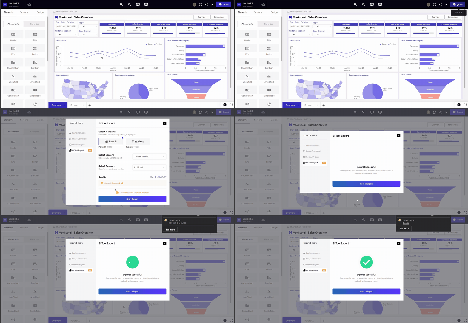
This is where Mokkup really sets itself apart. Once your dashboard layout is ready, you don’t need to rebuild it from scratch in Power BI or Tableau. With just a click, Mokkup lets you export the entire wireframe directly into either platform. No need to rebuild in Power BI or Tableau. Here’s how it works and why it matters:
1. One-click export
- Click the Export button next to the Share option, choose your format (Power BI or Tableau), and select which screens to export.
2. Screen-based credits
- Each exported screen uses one credit.
- For example, exporting a five-screen dashboard deducts five credits from your account
3. Manageable credit system
- Credits last for 365 days and can be purchased in simple bundles (10, 20, 50, 100).
- You’re never locked into an annual plan to export files.
4. High accuracy export
- Layout, spacing, and visual placeholders are preserved with a 95%+ match, so your design is exactly what you build, cutting development time and misalignment.
5. Platform-ready files
- Exports produce editable Power BI (.PBIT/.PBIX) or Tableau (.TWB/.TWBX) files, so developers can immediately hook up data and fine-tune without redoing the layout.
6. No Pro subscription required
- Even free users can export wireframes as long as they purchase credits.
- So export isn’t gated behind expensive plans.
Mokkup vs Figma: A Simple Comparison
While Figma is a powerful tool for UI and web design, it's not tailored for BI workflows. Mokkup, on the other hand, is purpose-built for BI teams working with Power BI and Tableau. Here's how they compare:
|
Feature |
Mokkup |
Figma |
|
Built for BI |
Yes – Designed for Power BI & Tableau wireframes |
No, a General-purpose design tool |
|
BI Visual Components |
Pre-built KPIs, charts, filters, maps |
Only rectangles and design elements |
|
Dashboard Templates |
Industry-specific templates |
Requires manual layout creation |
|
Ease of Use for BI Teams |
No design skills needed |
Requires design knowledge |
|
Direct Export to BI Tools |
Yes – Power BI/Tableau |
Not supported |
|
Layout Accuracy Post-Export |
95%+ match |
Manual recreation leads to mismatches |
|
Collaboration |
Real-time, inline comments |
Real-time collaboration |
|
Cost of Exporting |
Credit-based, no subscription lock-in |
Not available |
|
Final Output Usability |
Editable BI files (PBIX, TWBX) |
Only visual mockups |
Figma is excellent for pixel-perfect UI/UX designs, but it falls short when it comes to BI dashboard planning. Mokkup bridges that gap with pre-built components, real-time collaboration, and direct export, removing the need to recreate layouts inside BI tools.
Conclusion
BI teams don’t need to waste time designing in tools that weren’t made for dashboards. Mokkup offers a faster, more accurate way to plan layouts, with drag-and-drop BI components and templates made for Power BI and Tableau.
And with its standout export feature, you can turn approved wireframes into working BI files in just one click,no manual rebuilds, no layout mismatches.
If your team wants to simplify dashboard design and speed up delivery, it’s time to switch to Mokkup.
Frequently Asked Questions
Figma is a general-purpose design tool, while Mokkup is purpose-built for BI dashboards. It includes ready-made BI visuals, dashboard templates, and direct export to Power BI and Tableau, features Figma doesn't offer.
Mokkup offers templates for sales, marketing, finance, HR, and operations dashboards, each optimized for BI reporting.
Yes. You can export your wireframes into Power BI (.PBIX/.PBIT) or Tableau (.TWB/.TWBX) with over 95% layout accuracy.
Mokkup can be used for free. Exporting requires credits, which can be purchased separately; no subscription is required.
Absolutely. Once exported, you can open the file in Power BI or Tableau and immediately begin adding data, visuals, and logic.
Prompt it. Wireframe it with Mokkup.ai.
