
It is quite frustrating when a dashboard looks and feels dynamic but fails to answer the right questions. It could be filled with charts, but it still won’t tell what actions to take. Such problems usually arise due to the wrong selection of key metrics that diminish the impact of a KPI dashboard.
While the right key performance indicators metrics turn a static display into a real decision-making engine, the wrong ones turn it into digital wallpaper. So, let’s break down how to maximize your dashboard impact by choosing the right key metrics, with examples, pitfalls, and real-world insights.
Table of Contents
- What Are Key Metrics?
- Why Choosing the Right Metrics Matters?
- How to Identify the Right Metrics for Your Dashboard?
- Best Practices for Presenting Key Metrics
- Key Metrics Dashboard Examples by Use Case
- Common Pitfalls When Selecting Metrics
What Are Key Metrics?
Key metrics definition is the data points that help measure whether you’re achieving your business goals. Think of them as the vital signs of your business growth and overall performance. If you have too many metrics to track, you lose focus. If you track too few, you miss critical signals.
For example:
- A marketing KPI dashboard might take customer acquisition cost, return, and conversion rate as the key metrics.
- Key performance metrics for manufacturing companies might be different, such as defect rate, OEE, and downtime percentage.
While people often confuse KPIs with metrics, there’s a clear distinction. While a KPI or Key Performance Indicator tells you whether you are hitting your business goals, key metrics work as the supporting numbers that show aspects of that goal. In other words, KPIs are the signals you care about, and metrics give you the context to understand them.
For instance, a marketing KPI dashboard might highlight lead conversion rate as a KPI, while metrics like website visits, click-throughs, or social engagement help explain why that rate moves the way it does.
If you need a full breakdown, see our guide on KPI vs Metric to clarify how they relate.
Why Choosing the Right Metrics Matters?
According to Inshorts, nearly 80% of business performance dashboards go unused because they overwhelm the users. Similarly, a BARC survey found dashboard adoption struggles at just 20%, as stated in Decision Foundry. This states that having the right and enough components in the dashboard is the key deciding factor for its usage. An important element is a dashboard's key metrics that make it useful for the targeted users.
While it might seem helpful to include every possible metric, doing so can backfire. Overloading the dashboard with numbers means burying the key insights. This is where choosing the right key metrics matters to maximize the dashboard's impact. When you pick the right metrics, you get these advantages:
- Faster decision-making: Decision speed increases as users get the data they are looking for faster without first examining irrelevant metrics.
- Increased trust: Users trust the dashboard more because it answers their exact questions.
- Better alignment: Teams stay aligned because they work off the same definitions.
- Focused performance tracking: With the right set of key metrics, organizations can effectively monitor the most critical objectives.
Thus, choosing the right metrics directly influences how effectively your KPI dashboard drives action and insights.
How to Identify the Right Metrics for Your Dashboard?
Picking the right key metrics (or key performance indicators metrics) to maximize your dashboard impact begins with identifying them first. Since the surface-level advice like “pick metrics that matter” isn’t enough, here’s a structured approach.
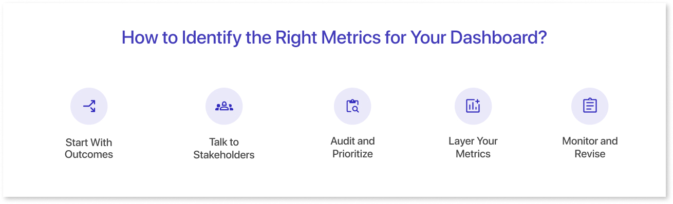
1. Start With Outcomes
Define the end goal as the first step. This goal can be revenue growth, customer retention, or reduced production time. Then ask which numbers best measure progress toward that outcome.
2. Talk to Stakeholders
The next step towards reaching the final metrics & dashboards is to discuss the metrics with managers and frontline teams who will use them regularly. The goal is to focus on key metrics that influence actions, not just numbers that look interesting. For example, if you are building a sales KPI dashboard, tracking the number of calls might be less valuable than monitoring meetings booked, because the latter directly influences revenue outcomes. Look for similar dashboard metrics examples to get inspiration and ideas for yours, and then customize them as per your specific business needs. For example, if you are in the manufacturing business, look for the most tracked KPIs for the manufacturing business to get some idea.
3. Audit and Prioritize
List down every possible key metric that could be of some importance to the business. Rank them with a prioritization framework like RICE (Reach, Impact, Confidence, Effort). Shortlist the most crucial key performance indicator metrics out of them.
4. Layer Your Metrics
The next step is understanding the right hierarchy to place those key metrics for your data dashboard. Place your primary KPIs at the top of the dashboard for quick scanning, with supporting breakdowns beneath. Check out these dashboard wireframe examples designed for clarity and hierarchy if you need layout inspiration.
5. Monitor and Revise
Sometimes, finding the right key metrics involves trial-and-error. You pick a set of key metrics examples, and some of them prove unnecessary. Then, you replace them with others to find a better set that works for your enterprise. Thus, it is important to monitor your key metrics and replace them if necessary over time.
Best Practices for Presenting Key Metrics
Even the perfect set of key metrics can lose its value if presented poorly. Here’s how to avoid that by following a few best practices:
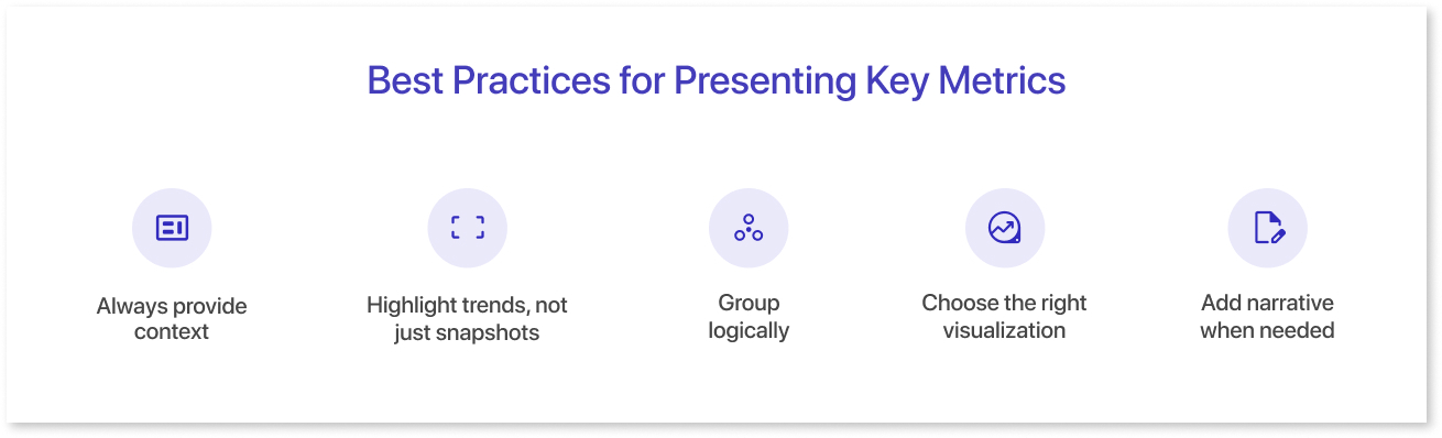
- Always provide context. A number without comparison means nothing. Show change over time or against a target.
- Highlight trends, not just snapshots. Include week-over-week or month-over-month changes so users see direction, not just status.
- Group logically. Segregate similar key metrics according to their fields, target users, and goals. For example, keep all marketing key metrics together and all operations metrics together to reduce cognitive load in the dashboard.
- Choose the right visualization. The right metrics' effectiveness also depends on how they are visualized. Thus, pick the right way to showcase them by understanding the basics. For example, understanding the differences between bar and column charts ensures you pick the clearest way to display data.
- Add narrative when needed. A short note like “Traffic dropped 15% due to planned downtime” where needed prevents misinterpretation.
Key Metrics Dashboard Examples by Use Case
To help you get started, let’s go through some real-world use cases of key metrics dashboards one by one:
1. Marketing KPI Dashboard
Key metrics:
- Customer Acquisition Cost (CAC)
- Conversion Rate
- Churn Rate
- Website Traffic & Sources
- Return on Marketing Investment (ROMI)
For further layout ideas and feature inspiration, explore Mokkup’s ready-to-use marketing templates.
2. Manufacturing Performance Dashboard
Key metrics:
- Overall Equipment Effectiveness (OEE)
- Defect Rate
- Throughput Time
- Downtime Ratio
Due to the different manufacturing methods, the key metrics examples for such business performance dashboards often vary widely. For example, if the manufacturing involves machine work, then key metrics may change accordingly. Consider viewing this ready-to-use manufacturing template by Mokkup for better understanding. It has several important key performance metrics for manufacturing, like total machine working, parts overview, and more.
3. Small Business Dashboard
Key metrics for small business:
- Cash Conversion Cycle
- Average Order Value (AOV)
- Customer Satisfaction Score (CSAT)
- Repeat Purchase Rate
If you’re unsure where to start, our guide on how to set KPIs for a department walks through the process step-by-step.
4. Company Metrics Dashboard
A cross-functional view combining:
- Finance: Gross margin, burn rate
- Customer: Net Promoter Score (NPS), churn rate
- Operations: Support ticket resolution time
This holistic view ensures every team within the company is tracking toward shared outcomes.
Common Pitfalls When Selecting Metrics
Below are certain loopholes that one must avoid when selecting the right key performance indicator metrics.
- Vanity metrics. Certain numbers may look important, but don’t drive decisions (like raw social likes). Including them can clutter your dashboard and distract users from more important data.
- Inconsistent definitions. If different teams of an entity define “sales qualified leads” differently, the data becomes unreliable. Thus, make sure to establish consistent definitions for all the key metrics first.
- Misapplied benchmarks. Industry averages can mislead if your business model or scale is unique.
- Over-segmentation. Too many filters and dimensions can clutter rather than clarify.
- Ignoring performance. A slow dashboard, no matter how insightful, won’t be used.
Apart from dodging these pitfalls, it is also equally important to include some must have features for your KPI dashboard after selecting the key metrics for a good final result.
Final Thoughts
A powerful dashboard isn’t about showing more data; it’s about showing the right data. Selecting precise key metrics, giving them context, and presenting them clearly ensures your dashboard earns its place as a daily decision tool. In some scenarios, having a ready-to-use KPI dashboard template helps by giving an outline for your dashboard. Mokkup.ai provides over 250+ pre-built and industry-tailored dashboard templates with curated key metrics examples, making it easier than ever to create impactful dashboards.
Frequently Asked Questions
All KPIs are key metrics, but not all key metrics are KPIs. KPIs directly measure performance toward strategic goals. Key metrics, on the other hand, include any important data points that help you understand your operations.
Focus on 3 to 5 at the top of your dashboard. Add supporting data beneath, if required.
To choose the right KPIs, align metrics with strategic goals, focus on actionable insights, prioritize clarity, and ensure they reflect true performance on your KPI dashboard.
Yes. Sales, operations, marketing, and finance will each have different priorities, but it is good if the company metrics dashboard aligns them.
Executive dashboards drive impact with high-level KPIs like revenue, profit, customer churn, pipeline value, project completion, and employee productivity for quick, informed decisions.
Prompt it. Wireframe it with Mokkup.ai.
