
A Key Performance Indicator (KPI) quantifies and assesses a business's effectiveness in achieving its primary goals.
These dashboards provide users with:
- A quick and simple way to keep track of KPIs and other business metrics.
- A cohesive data overview that enhances insight into the current situation of the business.
- Adjustable data visualization incorporates performance and status indicators.
The KPI dashboards offer real-time snapshots of performance metrics, facilitating quick assessment and well-informed decision-making. Furthermore, they enable an in-depth understanding of trends and patterns, which promotes proactive approaches for enhancing business performance.
Table of Contents
- What are KPI Dashboards?
- What is a KPI and Why Does it Matter?
- Different Types of KPIs
- Create KPI Presentations with Design in Mind
- Top KPI dashboards in Action
- How KPI Dashboards Help You?
- Things to Understand Before You Begin
- Tips for Visualizing Key Metrics
What are KPI Dashboards?
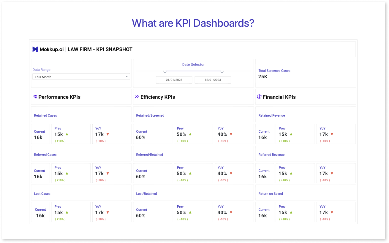
A KPI dashboard provides quick and organized evaluation and analysis by showcasing key performance indicators with interactive graphs and charts. These indicators stand for measurable performance criteria for certain strategic goals over specified periods of time. Modern KPI dashboards make it easy to explore data, enabling any user to explore the data that supports these measures and draw conclusions that are useful.
As a result, a KPI dashboard transforms large information from across an organization into data-driven decisions that improve your company operations.
What is a KPI and Why Does it Matter?
A key performance indicator (KPI) are quantifiable measurements that gauges the success of achieving set goals. Consider these as your organization's scoreboard, a tool to assess how well you're doing in reaching your objectives.
Identifying and monitoring key performance indicators (KPIs) help determine if your company is moving in the right direction or requires adjustments to save money and time.These are effective instruments that can assist you when used correctly. It helps to:
- Keep an eye on the financial condition of the organization.
- Analyze development in relation to strategic objectives.
- Identify issues at an early stage.
- Make timely strategic changes.
- Make faster and better decisions.
Whether your goals are departmental or company-wide, first define your strategic objectives to identify the key performance indicators (KPIs) for your organization. These goals provide direction for identifying the key metrics that are relevant to your company. The only things that affect the choice of important KPIs are the ability to measure performance and their viability.
Next, describe the goals you are aiming for as well as the measurement techniques. Note that these may include both short- and long-term goals.
Different Types of KPIs
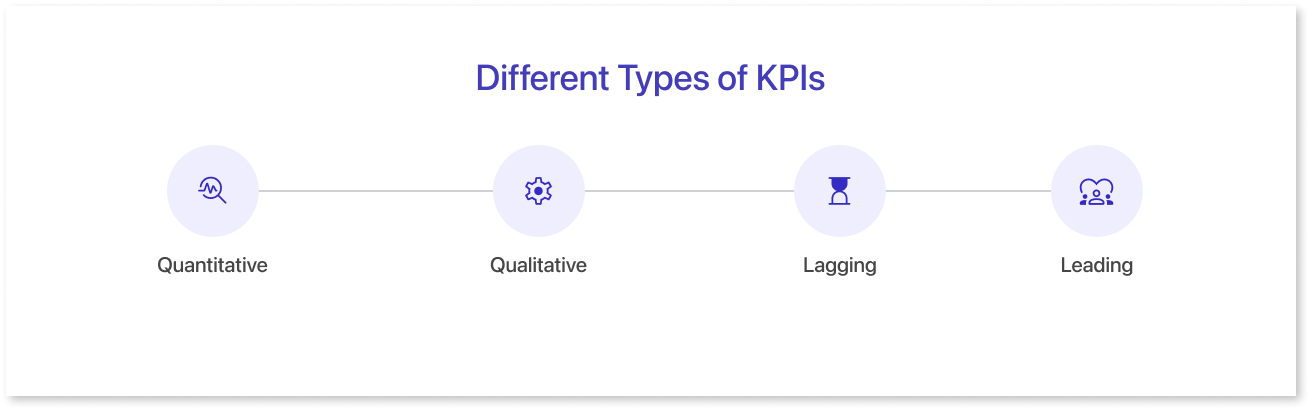
Getting a deeper understanding of the various types of Key Performance Indicators (KPIs) that are most frequently used to measure success will help you identify which ones to track. Let's have a look at them below:
- Quantitative: are measurable metrics that use numerical data for evaluation. They offer insights into a range of business operations, including revenue, sales, production output, client counts, and any other quantifiable data that helps assess progress and success of the business.
- Qualitative: are subjective metrics that evaluate performance based on descriptive or non-numeric characteristics. These emphasize on factors such as client satisfaction, employee motivation, etc. They give an extensive overview of performance by shedding light on subjective aspects that quantitative statistics might overlook.
- Lagging: They are performance indicators that measure past results and outcomes. They often evaluate the performance of plans or activities after implementation, relying on historical data. Examples that provide information about previous performance and trends include revenue, client retention rates, employee turnover, and more.
- Leading: These are metrics that forecast and influence future outcomes. They offer insights into patterns and behaviors that predict future achievement. Examples include metrics such as sales leads generated, website traffic growth, or customer engagement levels, guiding decisions to drive future performance and success.
Create KPI Presentations with Design in Mind
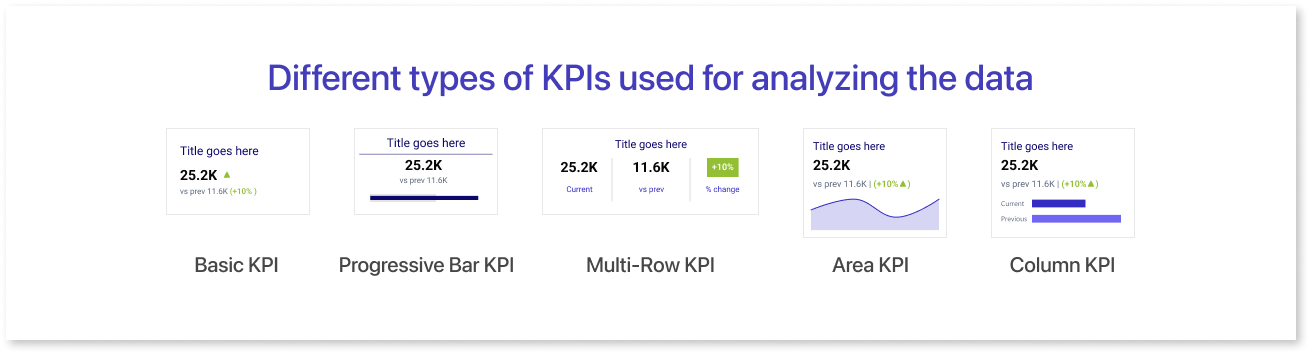
When showcasing KPIs, consider the purpose behind their presentation. Do you aim to display current performance against a prior period, or solely focus on current figures? Evaluating the impact of presenting percentage changes can enhance understanding and decision-making.
Let’s have a look at different types of KPIs used for analyzing the data:
- Basic KPI: The Basic KPI displays the present performance level or current value of a specific metric or objective.
- Progressive Bar KPI: A Progressive Bar KPI visually represents progress toward a particular objective using a bar that gradually fills up.
- Multi-Row KPI: The Multi-Row KPI displays the current value, previous value, and the percentage change for a given metric or objective.
- Area KPI: An Area KPI represents the percentage change over a specific period compared to previous values.
- Column KPI: A Column KPI compares current data against previous values or a set benchmark.
Adapting the design to your specific goals guarantees that the KPIs successfully communicate the intended insights and connect with your target audience. To make informed choices, it's critical to strike a balance between relevant data representation and visual impact.
Top KPI dashboards in Action
Each dashboard possesses its own uniqueness, often aligning with one of four different categories determined by their intended purpose and audience.
These templates aim to emphasize specific aspects, enabling a more engaging storytelling approach and highlighting the essential KPIs relevant to your business. Let's have a look at KPI dashboard examples.
1. Law Firm
A Law Firm KPI Snapshot dashboard template aggregates key performance indicators (KPIs) crucial for a law firm's evaluation. It presents a concise overview of various performance, efficiency, and financial metrics, helping in quick analysis and decision-making for the firm's operations and strategies.
2. Customer Support
A Customer Support dashboard provides essential customer service metrics and data. It offers real-time insights into support team performance, ticket resolution rates, customer satisfaction levels, and other KPI metrics, enabling efficient monitoring and decision-making to enhance service quality.
3. Financial Overview
A Financial Overview dashboard template summarizes crucial financial metrics. It offers an overview of an organization's fiscal health, including financial KPIs like revenue, expenses, profits, and cash flow, providing quick insights into the financial performance of a business.
4. Project Management Dashboard
A Project Management dashboard offers real-time insights into various aspects like tasks, timelines, resources, and progress. The KPIs include an overview of project performance, enabling efficient tracking, analysis, and decision-making to ensure successful project execution within a specific time frame.
Key Performance Indicators (KPIs) serve as high-level metrics important for assessing performance across diverse aspects. There are various types of key performance indicators: leading KPIs like customer acquisition rates, providing foresight, and lagging KPIs such as employee turnover rate, reflecting historical performance.
For example, employee satisfaction is a vital lagging KPI indicating retention success, while customer acquisition acts as a leading KPI forecasting growth. These KPI measures guide effective decision-making, providing insights into project management dashboards, ensuring projects stay on track with allocated resources and timelines.
How KPI Dashboards Help You?
KPI dashboards are effective instruments that combine important metrics into a visual representation. They offer a quick overview of a business's performance, helping in decision-making and strategy refinement.
These dashboards facilitate data-driven insights, enabling informed actions to improve operations, understand trends, and align teams towards common objectives. Let's look at some of the key points below:
1. Elevate Your Data Insights
Many organizations have vast amounts of unorganized data. Visual dashboards offer a structured way to navigate this data, ensuring that the right individuals in your organization understand its significance for their roles.
2. Engaging with the Ideal Stakeholders
A KPI dashboard is a tool for gaining over key stakeholders and promoting flexibility in response to changing needs across the organization. It can help in situations like:
- Looking for high-level management support on a particular project.
- Investigating new business opportunities while abiding to trends.
- Recognizing and effectively resolving significant issues.
3. Build a Foundation of Data-Driven Decision-Making
Sharing a KPI dashboard company-wide promotes an innovative and exploratory culture that gives every employee the ability to gain a competitive edge. Rational and well-structured data facilitates faster and intelligent decision making.
Things to Understand Before You Begin
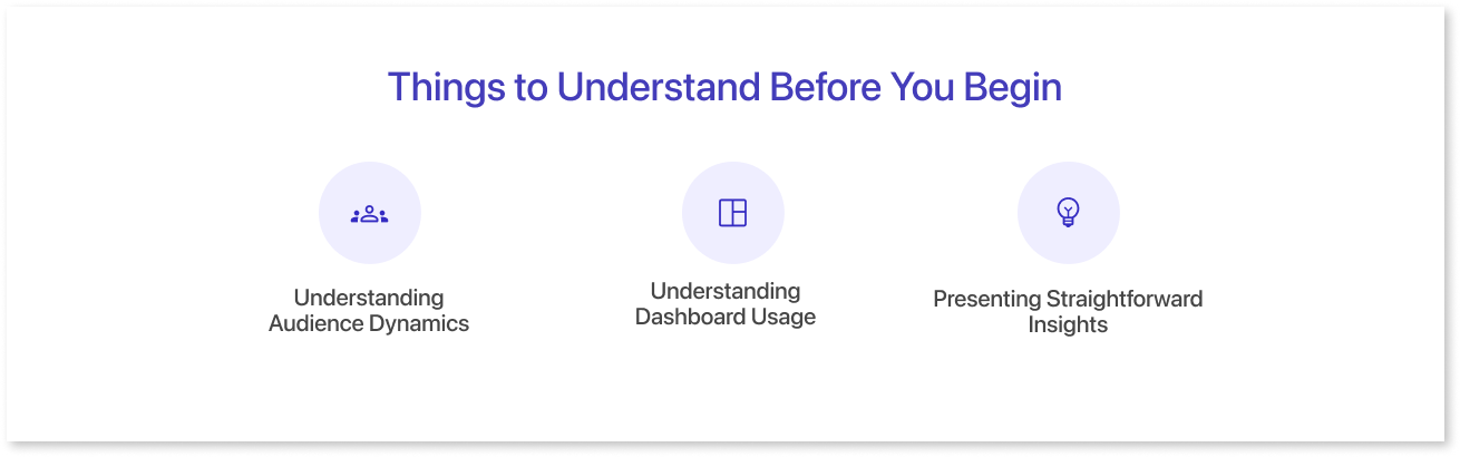
It's essential to be clear about the needs of your audience and how they plan to use the information provided when creating a KPI dashboard template. Understanding their requirements and usage patterns is important for effective dashboard design.
1. Understanding Audience Dynamics
It is essential to know who will be using your dashboard—a marketing expert, data analyst, operations manager, or product developer for an effective dashboard design. For example, a finance manager could need a thorough financial overview for budget analysis and planning, whereas a product developer might need a dashboard that shows product performance indicators or trends.
2. Understanding Dashboard Usage
Consider the diverse scenarios in which your audience engages with your dashboard. For instance, a marketing manager swiftly assessing campaign results might require distinct marketing KPIs compared to a financial analyst reviewing year-end forecasts. Understanding these specific contexts is vital for effective communication and to avoid unnecessary obstacles or misunderstandings.
3. Presenting Straightforward Insights
It's important to represent information that is easily understandable in the fast-paced environment we are living in today. Set high-priority items first in order to prioritize important key content. Employ color and font size strategically to emphasize details. Save less important elements for later and consider offering takeaways or summaries for additional clarity.
Tips for Visualizing Key Metrics
Understanding how to effectively handle Key Performance Indicators (KPIs) is vital for optimal outcomes. When incorporating KPIs into a dashboard, it's essential to:
1. Identifying Specific Organizational Goals
Engage with your team's stakeholders to outline strategic objectives and targets that align behaviors, steer strategy, and measure achievements. For example, a customer service team valuing response time might measure success differently than one emphasizing customer satisfaction ratings. Testing your choices against data can validate their effectiveness.
2. Conveying Insights Through Storytelling
What's the main point you are conveying? Which KPIs are most important for your business? Use information hierarchy to guide readers effectively.
To emphasize revenue growth this quarter, use bigger numbers. Use smaller numbers to show the data from the previous quarter.
3. Emphasize Iteration and Growth
It is not practical to use a "set it and forget it" strategy when it comes to KPIs. Selecting the right KPIs is a continuous effort. For example, changes in customer behavior or the entry of a significant competition may need you to modify your KPIs.
Having a wireframe is crucial for gathering stakeholder feedback and improving designs before integrating data. Tools like Mokkup.ai facilitate wireframing and visualizing KPI dashboards, enabling iteration and refinement before implementation in BI tools.
Conclusion
In a world with an excessive amount of data, Key Performance Indicators (KPIs) and their visual representation in dashboards serve as guiding lights for businesses. These tools quickly summarize business activities, aiding data-driven decisions in different departments and offering instant insights.
By embracing the power of KPI dashboards, companies foster a culture of data-driven decision-making. These dashboards assist various users in making informed decisions and aligning their strategies.
Try Mokkup Today!
Prompt it. Wireframe it with Mokkup.ai.
