The Healthcare Providers Dashboard template offers a comprehensive view of critical performance metrics, operational efficiency, and patient outcomes. Designed for healthcare administrators and professionals, it enables organizations to monitor hospital performance, track patient care quality, and ensure compliance with industry standards.
Patient Care and Outcomes
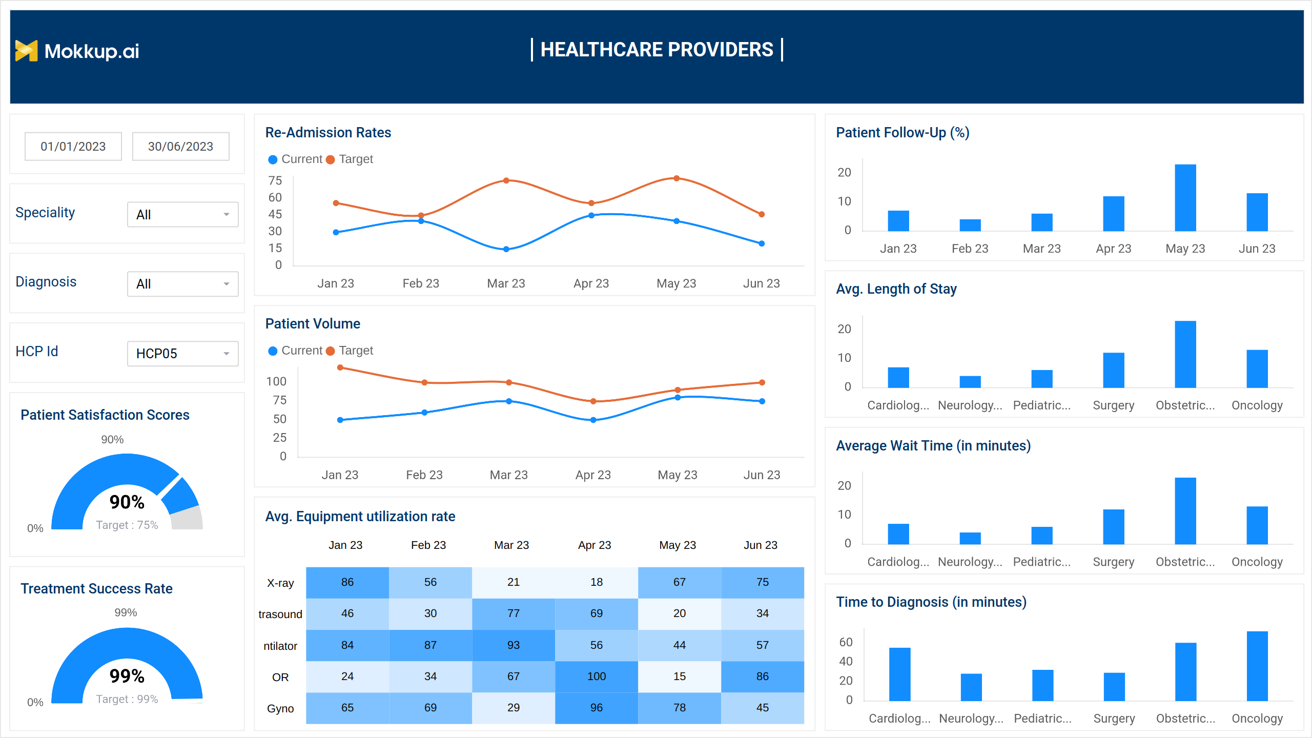
The dashboard wireframe, designed to improve decision-making and healthcare delivery, allows providers to track trends, improve processes, and allocate resources more effectively.
Its interactive filters for specialty, diagnosis, and healthcare provider (HCP ID) allow for more targeted analysis and help resolve critical healthcare concerns.
Key Terms to Know
- Patient Satisfaction Score: A key metric that measures patients’ overall satisfaction with their healthcare experience. It helps healthcare providers assess service quality and identify areas for improvement.
- Treatment Success Rate: Measures the percentage of successful treatments, indicating the effectiveness of care provided.
- Re-admission Rate: The percentage of patients who return to the hospital within a certain time frame following discharge. Lower rates indicate improved patient care and discharge planning.
- Patient Volume: Tracks the number of patients treated over a specific period, providing insights into workload and resource utilization.
- Average Equipment Utilization Rate: A heatmap depicts the usage rate of medical equipment, highlighting areas of overuse or underutilization.
- Patient Follow-Up Rate (%): The percentage of patients who return for follow-up care, which ensures therapy continuity and quality.
- Average Length of Stay (ALOS): The average time patients spend in a healthcare facility. A lower ALOS frequently indicates effective care delivery and resource management.
- Average Wait Time (Minutes): This measures the average time patients spend waiting for consultations or treatments, which is an important component of patient satisfaction.
- Time to Diagnosis (Minutes): Measures the time it takes from patient admission to diagnosis, indicating the efficiency of diagnostic procedures.
Efficiency and Resource Utilization
The second screen of the Healthcare Providers Performance dashboard wireframe focuses on operational efficiency. It provides critical insights into staffing, resource management, and patient flow, helping healthcare facilities streamline operations, improve service delivery, and optimize resource allocation.
Key Terms to Know
- Staffing Efficiency: Monitors the efficiency of staff utilization over time, showing how successfully staff resources are allocated and used to satisfy patient demand.
- Schedule Adherence: Assesses how closely healthcare practitioners adhere to set schedules, indicating their ability to meet appointment and operational deadlines.
- Average Patient Stay by Department: Displays the average length of stay for patients in various departments, helping identify trends and areas needing improvement to enhance patient throughput.
- Resource Utilization: Provides a visual breakdown of how different resources are used across departments, helping to identify overuse or underutilization.
- Cancellation & No-Show Rate: This column chart depicts the total number of canceled and no-show appointments for a given time period. It identifies trends in scheduling inefficiencies and patient behavior, allowing for better operational planning and resource allocation.
Profile View
The third screen of the dashboard wireframe provides a full view of individual doctor profiles, showcasing essential personal information, performance metrics, continuing education progress, and patient feedback. It enables healthcare organizations to monitor and evaluate the performance of their medical staff, track ongoing training, and identify areas for improvement based on patient feedback.
Key Terms to Know
- Personal Information: Provides important information about each doctor, such as area of expertise, years of experience, and biography.
- Personal Performance Metrics: This shows a doctor's patient volume compared to the facility's benchmark, allowing one to measure performance against defined targets.
- Continuing Education or Training: Lists ongoing or finished training courses and certifications to ensure doctors stay updated with industry standards.
- Patient Feedback: Represents patient feedback, categorized by sentiment or theme, to show areas of satisfaction or concern for each doctor.
Dashboard Template Insights
The Healthcare Providers Performance dashboard wireframe is designed to improve the efficiency and effectiveness of healthcare operations. Below are the key insights offered:
- Monitors patient satisfaction and success rates to improve healthcare quality.
- Analyses re-admission rates and wait times to maximize patient flow.
- Highlights resource utilization to find inefficiencies and optimize consumption.
- Monitors staffing efficiency and adherence to provide better workforce alignment.
- Provides full doctor profiles, including performance data and training progress.
- Collects patient feedback to help steer service and personnel improvements.
- Identifies trends in appointment cancellations and no-shows to improve scheduling.
- Compares patient volume to facility criteria for demand management.
Conclusion
The Healthcare Providers Performance dashboard template combines key metrics and provides actionable insights to improve healthcare, resources, and staff performance. It enables medical centers to provide excellent care, increase efficiency, and ensure patient satisfaction.