
A sales dashboard is a visual representation of your sales data. It provides an overview of your key performance indicators (KPIs) so you can track your progress and identify areas for improvement. Sales dashboards are an essential tool for any sales team, as they can help you:
- Stay on top of your sales pipeline.
- Identify trends and opportunities.
- Make informed decisions about your sales strategy.
- Motivate and track your sales team's performance.
This guide covers everything you need to know about a sales dashboard, from the most relevant metrics and update frequency to the best tools for designing one. You'll also discover practical strategies for getting the most out of your sales dashboard.
Table of Contents
- What is a Sales Dashboard?
- Why is a Sales Dashboard Important for Sales & Other Teams?
- 5 Best Sales Dashboard Examples
- What Metrics You Should be Tracking on Your Sales Dashboard?
- Best Tools To Create Sales Dashboards
- Ideas & Strategies for Maximizing Value of Sales Dashboard
What is a Sales Dashboard?
A sales dashboard visually displays sales-related KPIs and metrics in an organized, interactive format. It helps sales managers and reps monitor performance, track progress toward goals, and make fast, data-informed decisions.
Whether you're designing a sales performance dashboard, sales pipeline dashboard, or sales analytics dashboard, your layout should include data visualizations—such as graphs, charts, tables, or gauges—to communicate data effectively. A well-designed sales KPI dashboard streamlines how your team interprets complex information and helps them act with clarity and speed.
Why is a Sales Dashboard Important for Sales & Other Teams?
A powerful sales report dashboard goes beyond the sales team. It helps multiple departments with real-time insights. Here's how:
1. Sales Team: Track Performance & Hit Targets
The sales monitoring dashboard allows reps and management to monitor key performance indicators (KPIs) such as revenue and pipeline status. It identifies top performers and delayed deals and enables accurate forecasting and goal tracking.
2. Marketing Team: Align Campaigns With Sales
Marketers can identify which leads convert, allowing them to fine-tune campaigns and focus on high-impact channels. It guarantees that lead generation efforts are consistent with sales results.
3. Finance Team: Accurate Revenue Insights
Revenue visibility from a sales analytics dashboard supports budgeting, planning, and forecasting initiatives.
4. Operations Team: Improve Processes
Sales data improves resource allocation and operational effectiveness. It guarantees that logistics, inventory, and delivery teams are ready for future demand.
5. Leadership & Strategy: Make Informed Decisions
Leaders get a comprehensive view of sales performance, allowing them to identify opportunities, address bottlenecks, and make strategic, data-driven choices throughout the organization.
5 Best Sales Dashboard Examples
Here are five examples of sales dashboards showing how different teams can use real-time data to streamline decision-making, track performance, and stay focused on business goals.
1. E-commerce Sales Forecasting:
An eCommerce sales forecasting dashboard wireframe offers a clear layout to visualize trends, seasonal patterns, and category-wise projections. With filters for time, products, and channels, it enables teams to prepare ahead of time and make informed decisions before connecting to live data.
2. SaaS Lead Generation:
A SaaS lead generation dashboard wireframe lays out essential metrics for lead acquisition and funnel performance. It helps organize data visually to evaluate lead quality, track campaign effectiveness, and support decision-making around marketing and sales strategies.
3. SaaS Product Analysis:
A SaaS product analysis dashboard wireframe shows how customers engage with the product, highlighting key metrics, including active users, feature usage, retention trends, and churn insights. It is a planning tool for structuring data to allow for better product decisions and performance tracking.
4. Growth Department Performance:
A growth department performance dashboard wireframe provides an in-depth analysis of key information such as user acquisition, subscription, retention, and revenue growth. It helps to define how data should be structured to monitor growth experiments, measure outcomes, and drive strategic actions to expand the business.
5. SaaS Geographical Analysis:
A SaaS geographical analysis dashboard wireframe shows user distribution, revenue, and engagement across regions. It provides a visual structure for analyzing market performance, identifying growth possibilities, and adjusting strategy to regional trends.
What Metrics You Should be Tracking on Your Sales Dashboard?
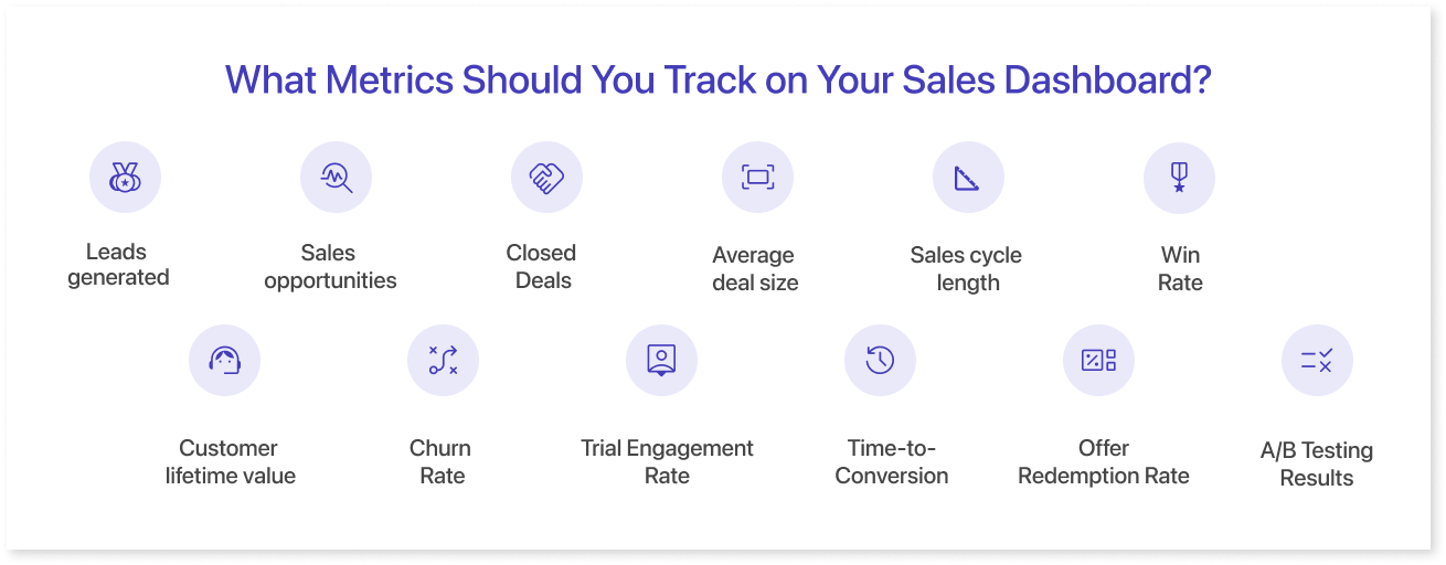
The KPIs you track on your dashboard for sales should align with your company’s goals. While the ideal set of indicators varies by company and industry, here are some commonly used sales performance measures:
- Leads Generated: Tracks the number of leads your sales team has generated.
- Sales Opportunities: Measures the number of sales opportunities your sales team has.
- Closed Deals: Reflects how many sales have been completed.
- Average Deal Size: Indicates the average value of the deals your team closes.
- Sales Cycle Length: This shows how long it typically takes to close a deal.
- Win Rate: Reveals the percentage of opportunities that result in a sale.
- Customer Lifetime Value (CLV): Estimates the total revenue a customer is expected to generate over time.
- Churn Rate: Measures the rate customers cancel or stop doing business with you.
- Trial Engagement Rate: This metric measures how actively trial users engage with your product or service during their trial period. It could include actions like usage frequency, feature adoption, or interactions with support resources.
- Time-to-Conversion: The average duration for trial users to convert to paid customers. This metric gives insights into the effectiveness of your trial duration and the urgency of the value proposition.
- Offer Redemption Rate: This metric calculates the percentage of targeted recipients who redeem the offer for special offers or discounts. It helps evaluate the appeal and relevance of your promotional offers.
- A/B Testing Results: When experimenting with different trial structures or offer strategies, A/B testing can reveal which variations perform better regarding conversion rates, engagement, and revenue.
Whether you're in SaaS or e-commerce, tailoring your sales KPI dashboard to your sales funnel ensures you’re tracking what really matters. In addition to these common metrics, you can track metrics specific to your industry or sales process. For example, if you sell software, you should track the number of trials started, the number of trials converted to paid subscriptions, and the number of active users.
The most important thing is to track the most critical metrics for your business. By monitoring the right metrics, you can understand your sales performance and make better decisions about improving your sales strategy.
Here are Some Tips for Choosing the Right Metrics to Track on Your Sales Dashboard:
1. Focus on the Metrics That Are Most Important to Your Business.
A successful sales forecasting dashboard tailors its metrics to align with these goals. Rather than overwhelming users with many data points, the dashboard narrows its focus to the essential metrics that directly impact the business's success, like customer churn rate and customer lifetime value.
2. Track the Metrics That Are Relevant to Your Sales Process.
A sales forecasting dashboard should be designed to reflect and analyze the stages of your particular sales cycle. This might include metrics such as lead conversion rates, opportunity pipeline velocity, and average deal size. By tracking metrics relevant to your sales process, you can identify bottlenecks, optimize each stage, and improve overall sales efficiency.
3. Track the Actionable Metrics.
The most valuable metrics provide actionable insights, allowing teams to make informed decisions and take practical actions. Actionable metrics can directly influence sales outcomes. For instance, tracking metrics related to lead generation sources from different marketing channels can help you allocate resources more effectively and optimize your marketing strategy.
4. Track the Metrics That Are Easy to Understand.
A successful sales forecasting dashboard presents information clearly and intuitively. All stakeholders, from sales representatives to senior management, should easily understand the metrics. Visualizations like charts, graphs, and trend lines can simplify complex data sets and make it easier for users to identify patterns, trends, and potential anomalies. For example, a bar chart displaying monthly sales revenue over the past year can offer a quick understanding of performance fluctuations.
By following these tips, you can choose the right metrics to track on your sales dashboard and get a clear understanding of your sales performance.
Best Tools To Create Sales Dashboards
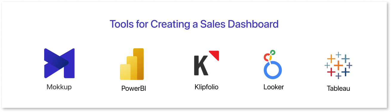
There are several tools available for creating effective Sales Dashboards. Here are some popular options:
- Tableau: A powerful data visualization tool that allows you to connect to various data sources and create interactive and dynamic dashboards. It offers a user-friendly interface for designing visually appealing and insightful sales visualizations.
- Mokkup: A dashboard wireframing tool that allows users to visualize and structure their dashboard designs before development. It offers a wide range of templates to cover diverse business needs and includes a BI export option, enabling users to export wireframes directly into Power BI and Tableau files.
- Microsoft Power BI: This tool enables you to create interactive reports and dashboards using data from various sources, including Excel, databases, and cloud services. It's beneficial for businesses already using Microsoft products.
- Looker: Looker is a data exploration and business intelligence platform that helps you create and share dashboards with your team. It offers a range of customization options and supports data integrations.
- Klipfolio: A cloud-based dashboard and reporting tool that allows you to build custom dashboards using various data sources. It's beneficial for tracking and visualizing key sales metrics.
When selecting a tool for creating a sales dashboard wireframe, consider your data sources, the complexity of visualizations you need, ease of use, collaboration features, integration capabilities, and budget. Many of these tools offer trial periods or free versions, so you can explore them and determine which best meets your business needs.
Ideas & Strategies for Maximizing Value of Sales Dashboard
A well-designed sales dashboard is more than a reporting tool; it improves performance. It enables teams to track KPIs, identify patterns, and make better, faster decisions. Here are some tips to make the most of yours:
1. Choose the Right Metrics to Track:
Focus on metrics that align with your goals, such as leads generated, win rate, average deal size, CLV, or churn. Avoid clutter by tracking only what drives action.
2. Make Sure Your Dashboard is Easy to Use and Understand:
The layout should be visually appealing and intuitive. Data must be presented clearly so users can quickly grasp key insights.
3. Tailor Your Dashboard to the Specific Needs of Your Sales Team:
Customize your setup based on your team’s focus. For example, inside sales reps may require different KPIs than field reps.
4. Update Your Dashboard Regularly:
Ensure your visualizations reflect the most current data so your team always works with accurate, timely information.
5. Prioritize User Experience:
Design for speed and clarity. Sales teams should be able to spot key performance indicators at a glance and act without delay.
6. Use Your Dashboard to Track Progress and Identify Areas for Improvement:
By tracking your progress over time, you can identify areas where your team can improve. This information can be used to provide targeted coaching and training to help your team improve their performance.
7. Use Your Dashboard to Make Better Decisions About Your Sales Strategy:
A clear view of your sales data helps you allocate resources more effectively and focus your sales efforts where they’ll have the most impact.
By following these tips, you can create a sales dashboard that is easy to use and understand and will help you improve your sales performance.
Conclusion
A well-designed sales KPI dashboard is more than just a visual; it's a decision-making tool that helps your team stay aligned, focused, and data-driven. Whether you're running a startup or a huge sales operation, tracking the correct KPIs allows you to keep ahead of trends, optimize performance, and complete more deals. By selecting the appropriate metrics, visual layout, and tools (such as templates), you can transform your dashboard into a powerful growth engine.
Frequently Asked Questions
A sales dashboard is a visual tool that displays key sales metrics, KPIs, and trends in one place. It helps teams track progress, spot issues, and make informed decisions.
Used by sales managers to track performance, reps to monitor targets, analysts to find insights, and leaders to guide strategy.
Key KPIs include sales revenue, conversion rate, average deal size, pipeline value, and win rate. Depending on your business, you might also track CAC, churn, or MRR.
Yes, templates offer a ready-made layout with essential KPIs, helping you build dashboards faster while following best practices. You can customize them as needed.
Prompt it. Wireframe it with Mokkup.ai.
