What is an Employee Overview Dashboard?
The Organizational Employee Overview Dashboard template gives HR professionals insights into workforce composition, diversity, and employment trends. It helps track diversity efforts, workforce distribution, and hiring patterns for informed decision-making.
Best Employee Overview Dashboard Example
The Employee Overview Dashboard wireframe combines key workforce metrics, such as headcount, department-wise distribution, job roles, tenure, and employee status, into one clear and organized layout. Designed for HR analytics, operations, and leadership teams, this template simplifies monitoring workforce trends, hiring activity, and organizational structure.
How to Analyze Data in Employee Overview Dashboards
Analyzing an employee overview dashboard wireframe helps you understand your workforce's structure, trends, and diversity. You can uncover valuable insights for better HR planning and decision-making by looking at key sections and using filters.
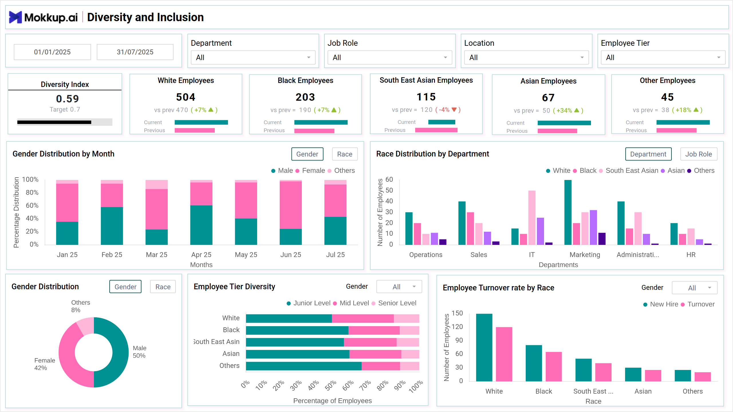
- Diversity and Inclusion: Check representation by race, gender, department, and role to spot gaps and track inclusivity.
- Workforce Composition & Trends: Review employment types, hiring activity, and changes in team size over time.
- Compare Departments: Identify staffing imbalances or high-turnover areas.
- Use Filters: Apply filters for location, role, or time period to refine your view.
This helps HR teams make smarter, data-driven decisions.
How to Create an Employee Overview Dashboard
You don’t need to build your report from scratch—just start with a ready-to-use sample employee dashboard template from Mokkup. Add in your data and export it however you like. Here’s how to do it:
1. Create or Log in to Your Mokkup Account
Start by signing up on Mokkup.ai using your email. Already have an account? Just log in, and you’re good to go.
2. Choose and Customize Your Dashboard Template
Find the Employee Overview Dashboard template in the Templates section. Use the drag-and-drop editor to adjust KPIs, edit filters, or add elements based on your data.
3. Export to Your BI Tool
Once your dashboard wireframe is ready, use the BI Tool Export feature to send it directly to Power BI or Tableau for further analysis and enhancements. You can also download the dashboard as a PDF, PNG, or JPEG, embed it on a platform, or invite your team to collaborate.
Note: This is a Pro template. To use and customize this dashboard wireframe, you’ll need a Pro subscription on Mokkup. Upgrade anytime to unlock full access.
Benefits of Employee Overview Dashboards
Employee performance dashboards give HR and management teams a quick and clear picture of the entire workforce. They help simplify reporting, improve planning, and support better decision-making. Here are some key benefits:
- Centralized Employee Data: View important details like headcount, departments, roles, and employee status in one place.
- Better Workforce Planning: Spot gaps, overstaffed areas, or hiring needs easily with clear visual breakdowns.
- Track Employee Trends: Monitor trends in hiring, exits, tenure, and team growth over time.
- Faster Decision-Making: Quickly access data for strategic planning, budgeting, or internal reviews.
- Improved Reporting: Create professional reports to share with leadership or HR teams.
- Custom Views for Specific Teams: Add filters to view data by department, location, or job level, making it useful for multiple users.
These dashboards make workforce data easier to understand and act on, helping teams stay organized and aligned.
KPIs to Track in Employee Overview Dashboards
Tracking the right KPIs in an employee overview dashboard wireframe lets HR teams and management stay informed about workforce health, structure, and performance. These indicators provide a view of the organization's staffing and help influence hiring, planning, and employee management decisions.
Here are some key KPIs to include:
- Diversity Index: Measures overall diversity within the organization.
- Gender Distribution by Month: A stacked column chart showing monthly gender diversity trends.
- Race Distribution by Department: A grouped column chart comparing racial distribution across departments.
- Gender Distribution: A donut chart displaying gender distribution across the organization.
- Employee Tier Diversity: A stacked bar chart showing how diversity is spread across different employee tiers (e.g., junior, mid-level, senior).
- Employee Turnover Rate by Race: A multi-column chart tracking turnover rates by race.
Frequently Asked Questions
1. What is an Employee Overview Dashboard?
It’s a tool that shows key details about your workforce — headcount, departments, roles, and hiring trends—all in one place.
2. Why is it useful for HR teams?
It helps HR quickly spot staffing gaps, track diversity, and make better hiring and planning decisions.