
"If the color doesn't add meaning or enhance the interpretation of your visualization, you probably don't need it"
Colors in data visualization can bring numbers to life and simplify complex information. A world filled with just black-and-white graphs and charts would be dull and boring. Yet, when you add the correct combination of colors for data visualization, your data comes to life and tells an imaginative and captivating tale.
Datacolor visualization is visually appealing. It also has its own language. This language can change how data is viewed. It can also change how data is understood. Additionally, it can change how data is used. Color choices in data visualization aren't mere whimsical selections; they are deliberate and strategic decisions. Let's explore this topic in more detail.
Also, if you want to know more about data visualization, here's a link to it.
Table of Content
- Choosing the right Color palettes
- Data Visualizations with Strategic Color Choices: Warm, Saturated, and Bright Colors
- The Concept of Colour theory in Data Visualization
- Benefits of Color Theory in Data Visualization
- Role of Background Colours in Data Visualization
- Guidelines for the use of color in data visualization
- Final Thoughts
Choosing the right Color palettes
Picking the right color combination chart for data visualization is important and can affect how well the data is understood. It is not only an aesthetic choice. The colors you choose are a strong tool that can either add to or take away from the clarity of your visualizations. Using the right color pattern helps guide your audience's understanding and highlight important details.
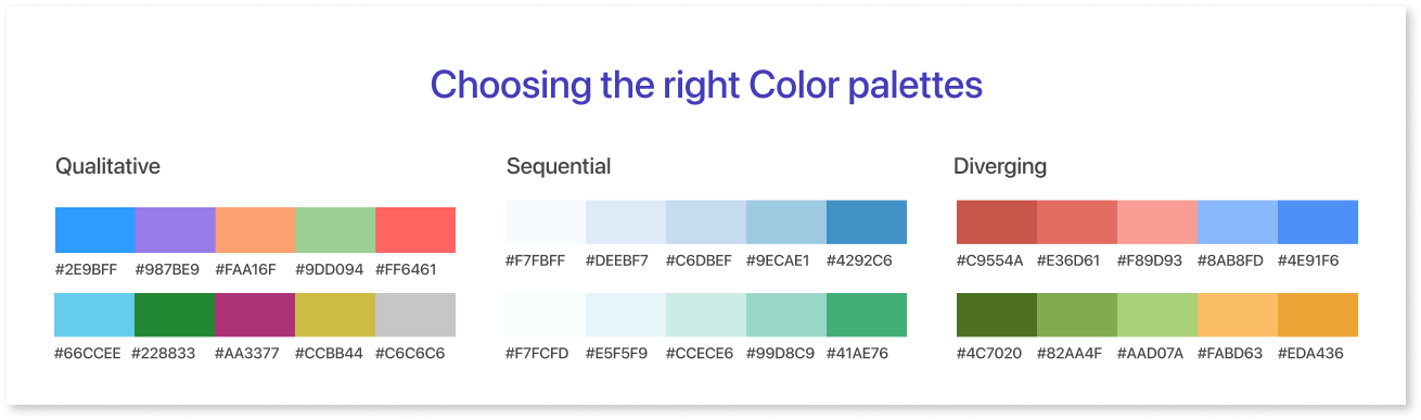
Qualitative Palettes: These color schemes are perfect for depicting categories that aren't inherently ranked or ordered. They are ideal for communicating non-sequential data because they offer a clearly discernible spectrum of hues. You may successfully distinguish between distinct data points or categories by using qualitative palettes.
Sequential Palettes: Conversely, sequential color palettes are intended to display data in a logical sequence or progression. These color scheme ideas smoothly transition between colors. They are suitable for showing data that changes slowly.
Examples of such data include temperature or time series data. In order to guarantee that viewers can comprehend patterns and changes over time, "sequential colors" are emphasized.
Diverging Palettes: Diverging palettes are used when you want to highlight a particular data point that falls between two or three. They are made up of two gradients of different colors that go together and intersect in the middle. Using different color palettes is beneficial for emphasizing changes in data.
These changes can include positive and negative values. It is particularly useful when the main focus is on deviations from a central value.
Data Visualizations with Strategic Color Choices: Warm, Saturated, and Bright Colors
Using warm, bright colors in data visualizations impacts how data is perceived and the message it conveys. This choice is strategic.
- Warm Colors: Warm colors, such as reds, oranges, and yellows, are known for their ability to evoke emotions like excitement, warmth, and urgency. In data visualizations, they can be employed to draw attention to specific data points or trends that require emphasis. To emphasize good trends or important data, use warm colors to make them noticeable and catch the viewer's eye.
- Saturated Colors: Saturated colors are vibrant and intense. They can be used to add energy and visual impact to data visualizations. Use vibrant colors to make a strong impact and add energy to your presentation. However, it's essential to use them sparingly, as an excessive use of saturated colors can overwhelm the viewer.
- Bright Colors: Bright colors, like electric blue, neon green, or vivid pink, are attention-grabbing and can make data visualizations visually stimulating. They are often used for infographics or presentations where you want to engage and captivate the audience. Bright colors can be especially effective when presenting data to a younger or more design-conscious demographic.
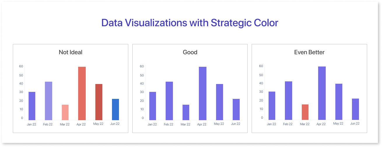
A crucial best practice is to refrain from using color where it is unnecessary. Though it may be alluring to have your color chart as brilliant as a vibrant landscape, using too much color may work against you.
The secret is to utilize color purposefully. Every hue in your visualization should have a distinct purpose and enhance the way the data is presented. Excessive use of the best color combinations might confuse your viewers in addition to clogging up your visuals.
Also, it is important to apply good color combinations across different charts and components. It creates a single look that helps people focus on the information without getting distracted. Pick matching colors to make data elements stand out, helping viewers easily understand the information you want to display. Each color on your palette should have a clear purpose and make it easy to tell data points or categories apart.
The Concept of Colour theory in Data Visualization
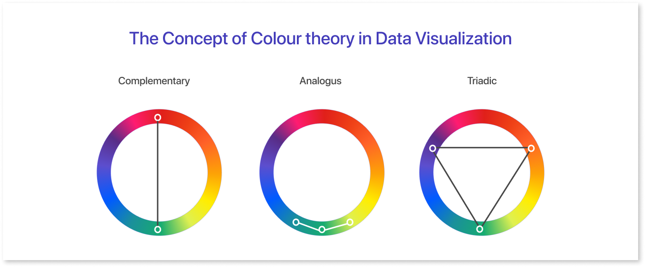
At the heart of effective color usage in data visualization lies the concept of "color theory." This old theory studies how colors that match each other relate, affect our minds, and create a pleasing combination.
Color nomenclature divides colors into primary, secondary, and tertiary groups based on the geometric arrangements of the color wheel. This basic knowledge of color theory has its roots in antiquity and is not a relatively modern idea.
This theory helps creators choose the appropriate colors for their designs. It ensures that the colors complement each other and convey the intended message. In data visualization, it helps to create visually pleasing and informative data visualizations. This is done by guiding the use of colors that go well together.
Benefits of Color Theory in Data Visualization
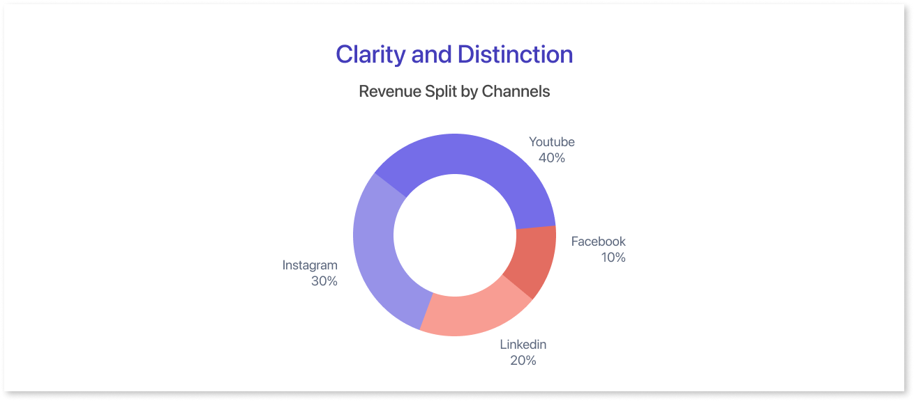
Clarity and Distinction: Color theory aids data visualization designers in choosing hues that make it simple for viewers to discern between various data points or categories. Using different colors for each category in charts makes it easier to read and understand the data.
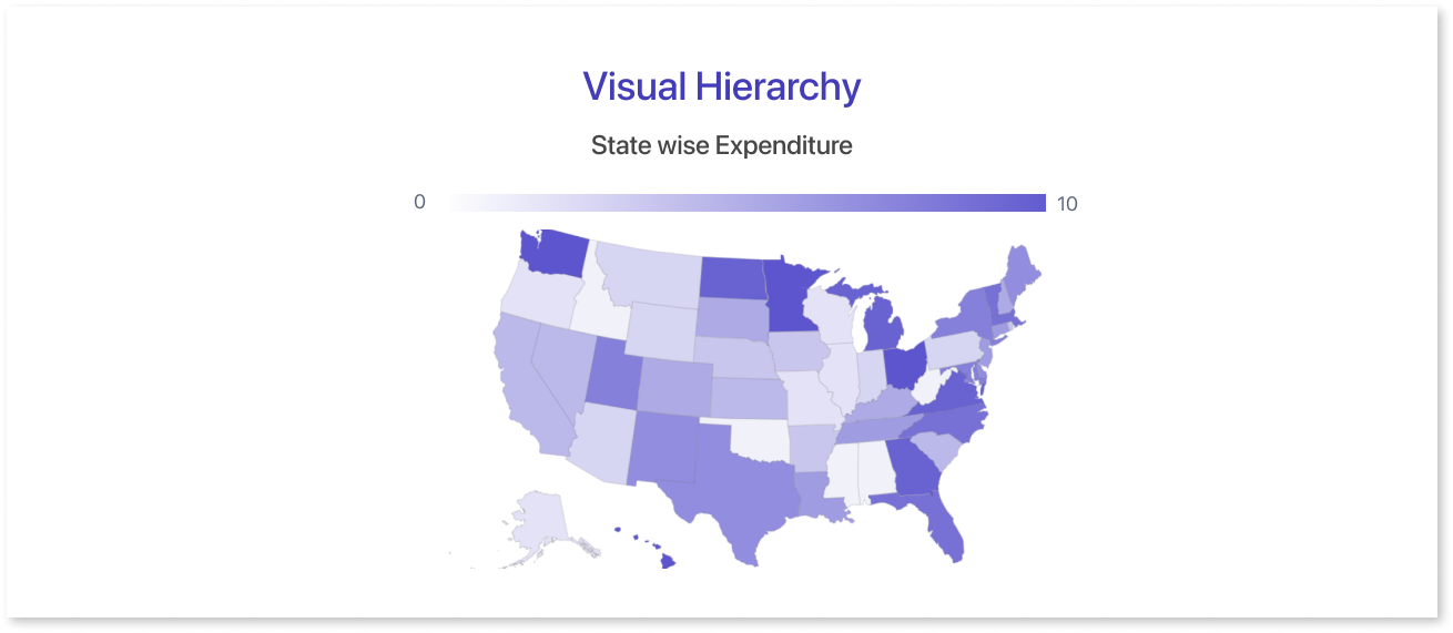
Visual Hierarchy: When creating a visual hierarchy for data visualizations, a color theory chart comes in handy. Designers use color to draw attention to important information and emphasize specific data points or patterns. This makes it easier for viewers to recognize the most crucial details in the data.
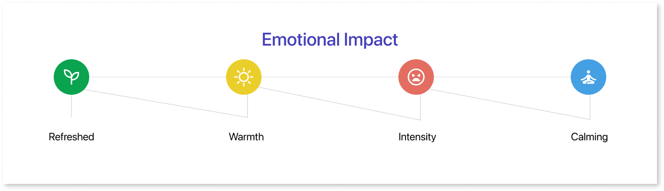
Emotional Impact: There are innate emotional connections between colors. Cold colors such as blue and green can create a sense of peace and trust. On the other hand, warm colors like red and orange can evoke feelings of urgency or excitement. Designers use color theory to make data more understandable by matching color chart selections to the desired emotional tone.
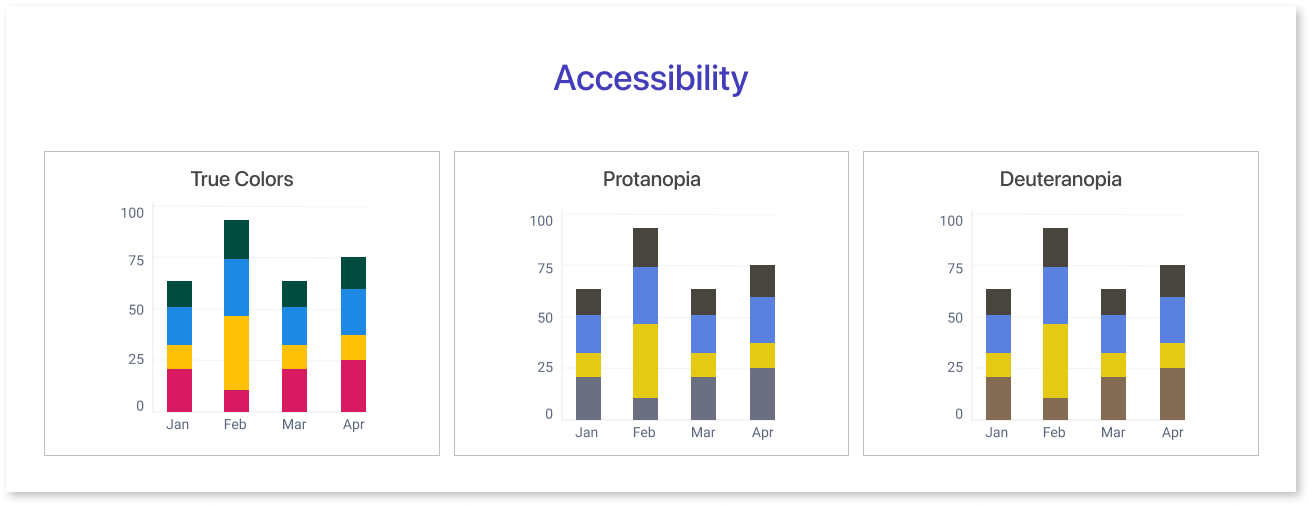
Accessibility: Accessibility concerns are also addressed by color theory. Creators can ensure their visuals are accessible to people with color vision issues by considering color contrasts and combinations. This is essential for connecting with a wide range of people.
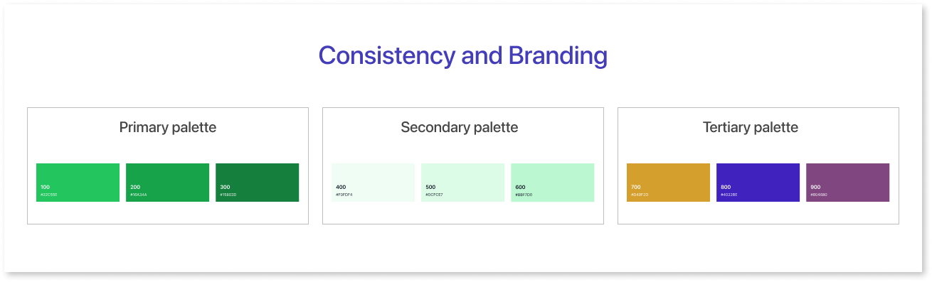
Consistency and Branding: Gaining an understanding of color theory helps creators use colors consistently in different data representations. In addition to supporting branding, this uniformity helps viewers identify and understand data items.
Role of Background Colours in Data Visualization
The influence of the background color combo on data visualization clarity cannot be overstated. Background colors impact visualization effectiveness by serving as the canvas for data elements. Careful selection is crucial.
Neutral colour chart, often subtle and unobtrusive, play a crucial role in providing a harmonious backdrop for data. Color charts with calming shades like gray or beige create a peaceful environment, letting data and graphics stand out.
In some instances, the simplicity and timeless appeal of black and white should not be overlooked. Black and white can make data stand out when trying to show elegance, formality, or strong differences. The sharp contrast between these two colors helps data elements pop and become more easily distinguishable.
In the pursuit of enhanced data visibility, the choice of background colors is pivotal. They should be carefully selected to not only complement data elements but also to provide a visually pleasing experience. The goal is to create a visual setting where data stands out and conveys its message clearly. This can be achieved by using calming neutrals, bold black and white, or carefully selected background colors.
Guidelines for the use of color in data visualization
A key component of successful data visualizations is the thoughtful application of colour combination chart. To make good charts, make sure the data is clear and useful, not just visually appealing.
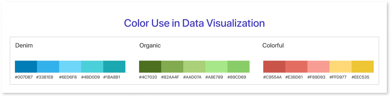
There are some recommended practices that should be adhered to in order to do this:
- Use a limited color palette ideas to avoid overwhelming the viewer. Simplicity enhances comprehension.
- Assign consistent meanings to colors. Also, ensure high contrast between data points and background to make the information stand out.
- Prevent overlapping colors in complex visualizations, as they can be confusing.
- Sequential and diverging gradients help in representing data trends and extremes, respectively.
- Be considerate of color blindness; use good color schemes that are distinguishable by everyone. Also, red-green combinations are often problematic for color-blind individuals.
- Consider cultural color associations, as meanings can differ across cultures when combining colors.
- Use color to highlight key data points or trends to guide the viewer's attention.
Final Thoughts
The art of thoughtful color choices in data visualizations cannot be overstated. It is an important aspect that can either elevate your data's impact or obscure its message. Choose colors wisely and use gradients well to maximize the impact of your data visualizations.
Use the knowledge and ideas we've provided for your data visualization efforts. Tell an engaging story with appealing colors that look good together and effectively convey, instead of just showing numbers.
And for those looking for a practical way to experiment with color gradients, consider giving Mokkup.ai a try. This versatile tool can be your creative partner in crafting stunning, impactful data visualizations. So, take the next step in your data visualization journey and make color work for you with Mokkup.ai today!
Prompt it. Wireframe it with Mokkup.ai.
