
Introducing AI Chart Generators and Mokkup, two powerful tools that have revolutionized the world of data visualization. In an era where data-driven solutions are essential for effective communication, these tools have emerged as leaders in their respective domains. The AI Chart Generator employs cutting-edge artificial intelligence algorithms to create dynamic and visually captivating charts, while Mokkup provides a comprehensive range of templates for creating stunning mock dashboards and wireframes. In this article, we will delve into each tool's features, capabilities, and unique advantages, aiming to determine which one reigns supreme when it comes to producing outstanding wireframes for dashboards. Join us as we compare AI Chart Generator vs. Mokkup free to determine which tool reigns supreme in creating stunning visuals. Discover the features, capabilities, and user experience of these tools to uncover the ultimate choice for eye-catching and robust wireframes.
What We Will Cover
- What Are AI Chart Generators?
- How To Create Charts In AI Chart Generators?
- AI Chart Generator Features
- Mokkup Features
- Mokkup Vs AI Chart Generator
What Are AI Chart Generators?
These are ingenious tools that bring the power of artificial intelligence to the realm of data visualization. They are designed to simplify the process of creating visually stunning and informative charts by leveraging advanced algorithms and machine-learning techniques. With AI Chart Generators, users can effortlessly transform raw data into visually appealing representations. The tools excel in their ability to analyze and interpret data, automatically generating charts that effectively communicate key insights. This eliminates the need for manual chart creation, saving users valuable time and effort. Even individuals without extensive design or data visualization skills can utilize AI Chart Generators to produce professional-looking charts that captivate audiences.
AI Chart Generators support a wide range of chart types, including bar graphs, line charts, scatter plots, pie charts, and more. Users can easily customize the appearance of their charts, adjusting colors, fonts, labels, and other visual elements to align with their preferences or brand identity. The generated charts are not only visually appealing but also easily understandable, allowing viewers to grasp complex information at a glance. With AI Chart Generator, data-driven presentations, reports, and dashboards become more engaging and persuasive, making it an indispensable tool for professionals in various fields, including business, marketing, academia, and beyond.
How To Create Charts In AI Chart Generators?
Creating charts in AI Chart Generators is a straightforward process. Here are the steps to guide you through the chart creation process:
- Data Input: Start by gathering the data you want to visualize in your chart. Prepare your data in a spreadsheet or a compatible format.
- Upload Data: Open AI Chart Generator and upload your data file. The tool supports various file formats, such as CSV, XLSX, or even copy-pasting data directly.
- Data Mapping: Once your data is uploaded, AI Chart Generator will analyze it and present a preview. Map the relevant columns to the appropriate chart parameters, such as X-axis, Y-axis, labels, or values.
- Chart Selection: Choose the type of chart that best suits your data and visualization goals. AI Chart Generator offers a range of options, including bar graphs, line charts, pie charts, scatter plots, and more.
- Customize Appearance: Customize the appearance of your chart to align with your preferences or brand identity. Adjust colors, fonts, labels, legends, and other visual elements to enhance the overall aesthetics.
- Review and Refine: Review the generated chart and ensure that it accurately represents your data. Make any necessary adjustments to refine the chart's appearance or data mappings.
- Generate Chart: Once you are satisfied with the settings and customization, click the "Generate Chart" or similar button to create the final version of your chart.
- Save and Export: Save your chart in a suitable format, such as PNG, JPEG, or SVG. You can also choose to export the chart directly into your preferred document or presentation software.
- Share and Present: Share your visually stunning chart with others by incorporating it into presentations, reports, dashboard mocks, or any other medium where data visualization is crucial.
By following these steps, you can leverage the capabilities of AI Chart Generator to effortlessly create captivating charts that effectively convey your data-driven insights.
AI Chart Generator Features
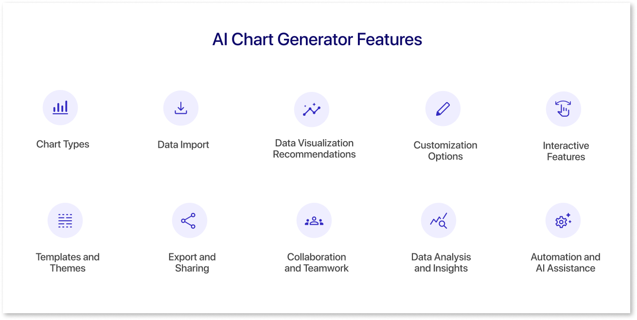
AI chart generators typically offer a range of features to assist users in creating visually appealing and informative charts. Here are some general features you can expect from AI-powered chart generator tools:
- Chart Types: AI chart generators provide a wide variety of chart types to choose from, including bar charts, line charts, pie charts, scatter plots, area charts, histograms, heat maps, and more. This allows you to select the most appropriate chart type for your data.
- Data Import: These tools allow you to import data from various sources, such as spreadsheets (e.g., Excel, Google Sheets), databases, or manually input data. Some tools may also offer integration with popular data analysis tools for seamless data import.
- Data Visualization Recommendations: AI chart generators can analyze your data and provide recommendations on suitable chart types based on the data's nature and objectives. This helps in selecting the most effective visual representation of your data.
- Customization Options: You can often customize various aspects of the chart, such as colors, fonts, labels, legends, axes, gridlines, and tooltips. These options allow you to tailor the chart's appearance and style to align with your branding or personal preferences.
- Interactive Features: Many AI chart generators enable interactivity, allowing you to create interactive charts with drill-down capabilities, tooltips, zooming, filtering, and sorting options. Interactive charts enhance user engagement and facilitate data exploration.
- Templates and Themes: These tools often provide a collection of pre-designed templates and themes that you can choose from. Templates offer ready-made chart layouts, while themes provide consistent color schemes and styles across multiple charts.
- Export and Sharing: Once you've created your chart, AI chart generators allow you to export the chart in various formats, such as image files (PNG, JPEG), vector graphics (SVG), or interactive formats (HTML, embeddable code). You can also share charts directly through social media or embed them in websites or presentations.
- Collaboration and Teamwork: Some chart generator tools offer collaboration features, enabling multiple users to work together on a chart, share feedback, and make edits simultaneously. This can be useful for teams or organizations working on data visualization projects.
- Data Analysis and Insights: Advanced AI chart generators may include built-in data analysis features, such as trend lines, statistical summaries, and predictive analytics. These features help you uncover patterns, correlations, and insights from your data directly within the charting tool.
- Automation and AI Assistance: Some chart generators allow users to simply ask a question about their data, and the chart generator responds with insights and trends in minutes. They leverage machine learning algorithms to automate certain tasks, such as data preprocessing, chart layout optimization, and intelligent recommendations. These AI-powered features aim to streamline the chart creation process and enhance efficiency.
It's important to note that the specific features may vary across different AI chart generator tools. It's recommended to explore the documentation and feature lists of individual tools to understand their capabilities fully.
Mokkup Features
Mokkup.ai has features that make it an ideal dashboard mokkup tool for businesses of all sizes. Here are a few of the most significant features:
1) Customizable Templates:
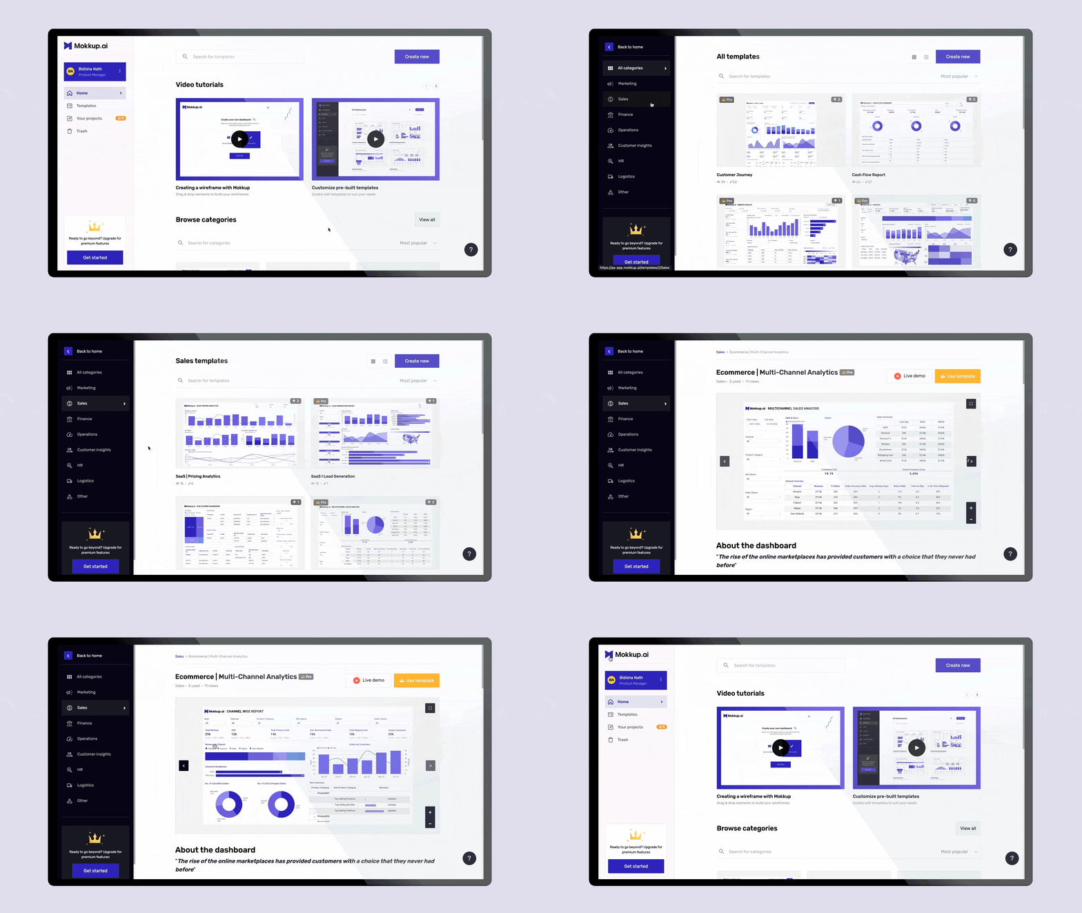
Mokkup.ai offers a wide range of pre-made templates across eight different categories that are listed below:
- Marketing
- Sales
- Finance
- Operations
- Customer Insights
- HR
- Logistics
- Other
Dashboard templates under these categories can be customized to fit your needs, including adding text, icons, and other design elements.
2) Drag & Drop Feature:
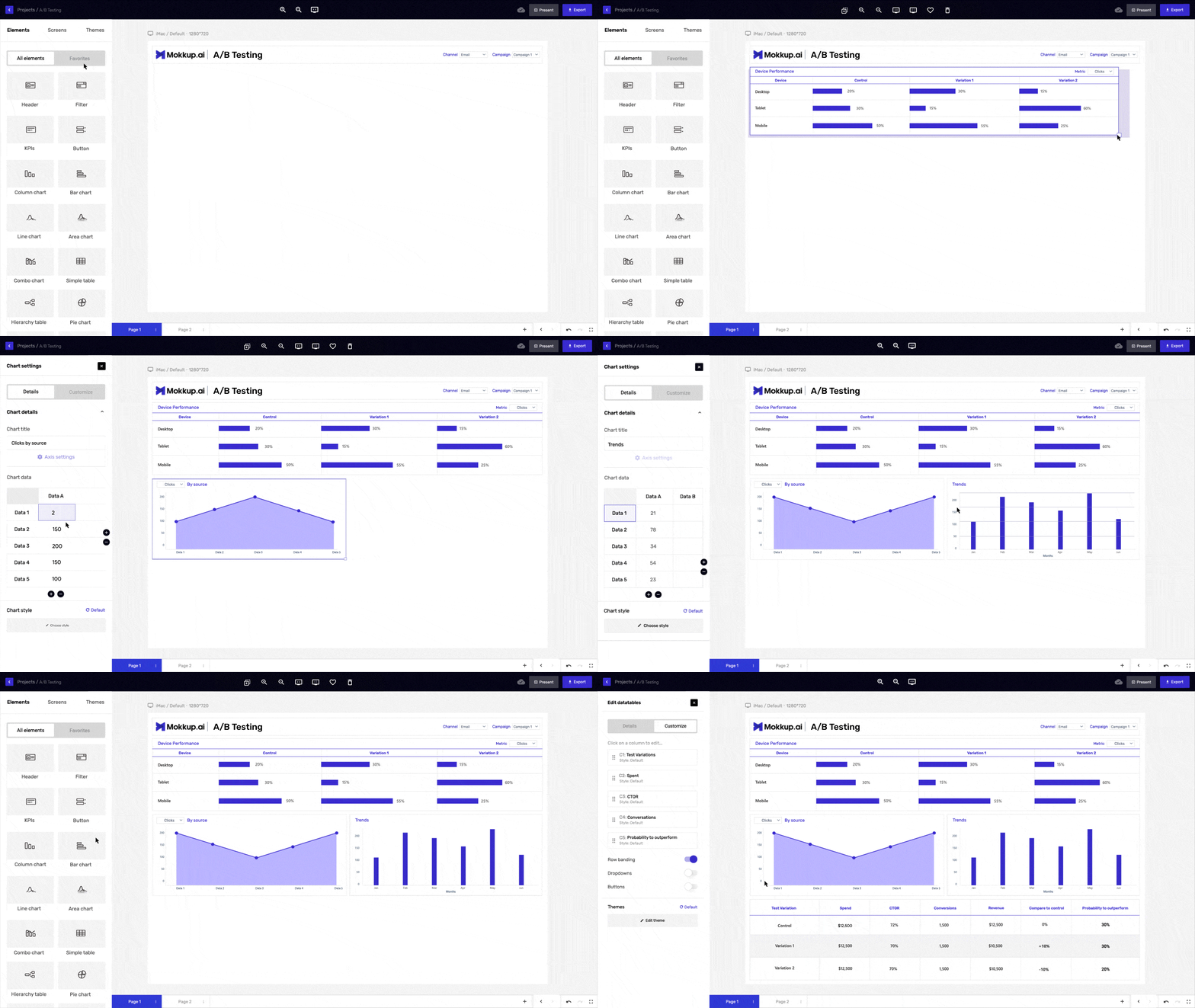
The drag-and-drop feature of Mokkup.ai allows users to quickly and easily add design elements such as icons, shapes, images, and text boxes. You can select the element you want to add to your design by clicking on it in the sidebar.
3) Realistic Mokkups:
With Mokkup.ai, you can create accurate and realistic Mokkups, giving you a better idea of your dashboard design in BI tools like Power BI and Tableau. This can help you identify issues or problems before investing time and money to create the final product.
4) Easy-to-Use Interface:
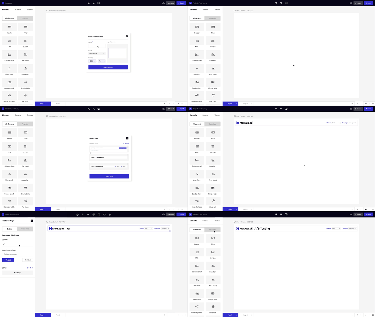
Mokkup.ai is designed to be user-friendly and easy to use. This tool gets everything done in just a couple of minutes, even if you're not an expert in design or development. The interface is great, the UI is intuitive, and it gets the job done.
5) Embedding Functionality:
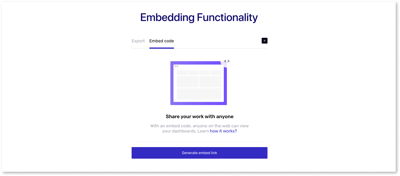
With this feature, Mokkup enables you to efficiently export your Mokkups and share it with team members or clients, facilitating seamless collaboration. You can embed the dashboard into your website or app. Use an iframe link or URL to easily share and showcase your creations.
6) Export Options:
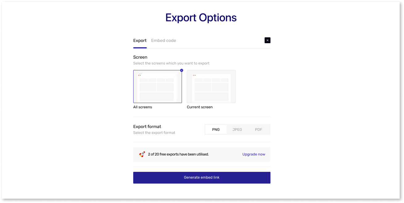
This tool allows you to export your designs in various formats, such as PDF, PNG, or JPEG. You can also choose between full-screen or only single-screen export options.
7) Curated Color Palette:
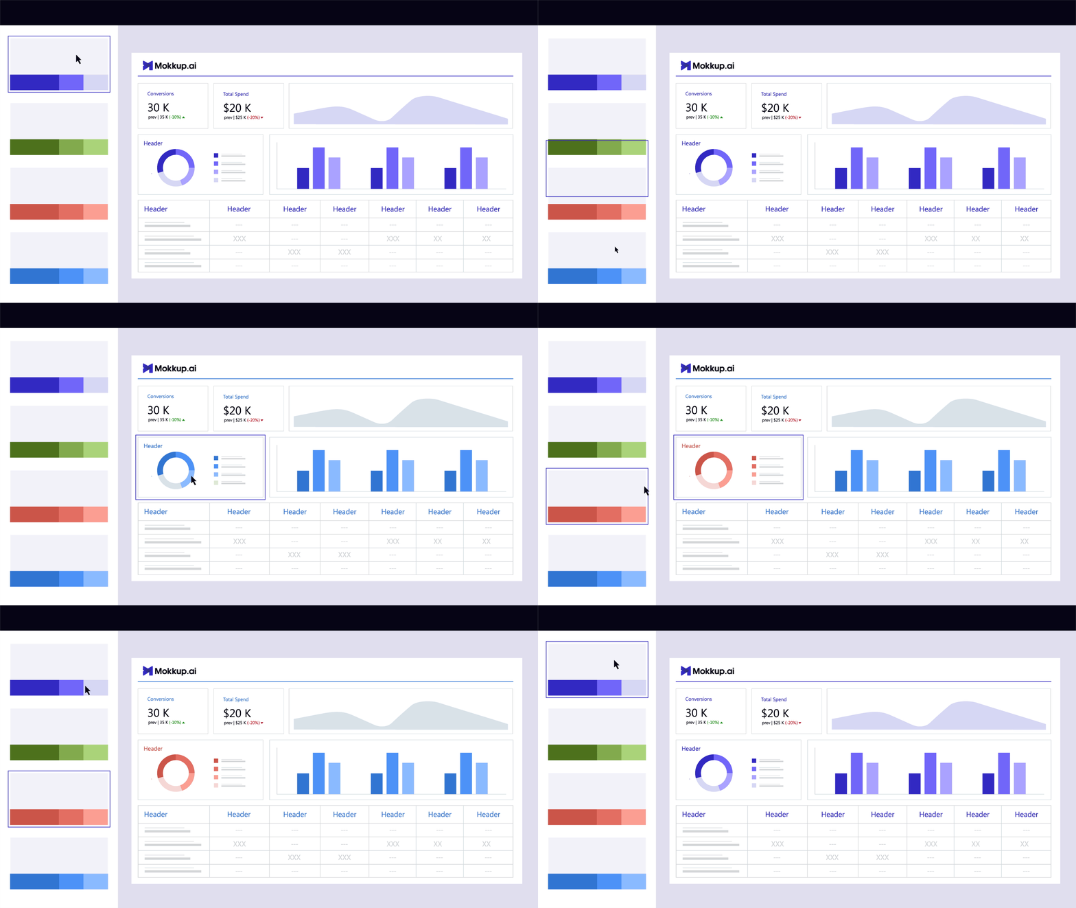
By choosing an organized color palette, you can ensure that your design has a harmonious palette that creates a cohesive and visually appealing mock. Mokkup.ai gives pre-built themes and color schemes that follow design principles. So you can experiment with different color palettes until you find the perfect one for your dashboard.
8) Live Demo:
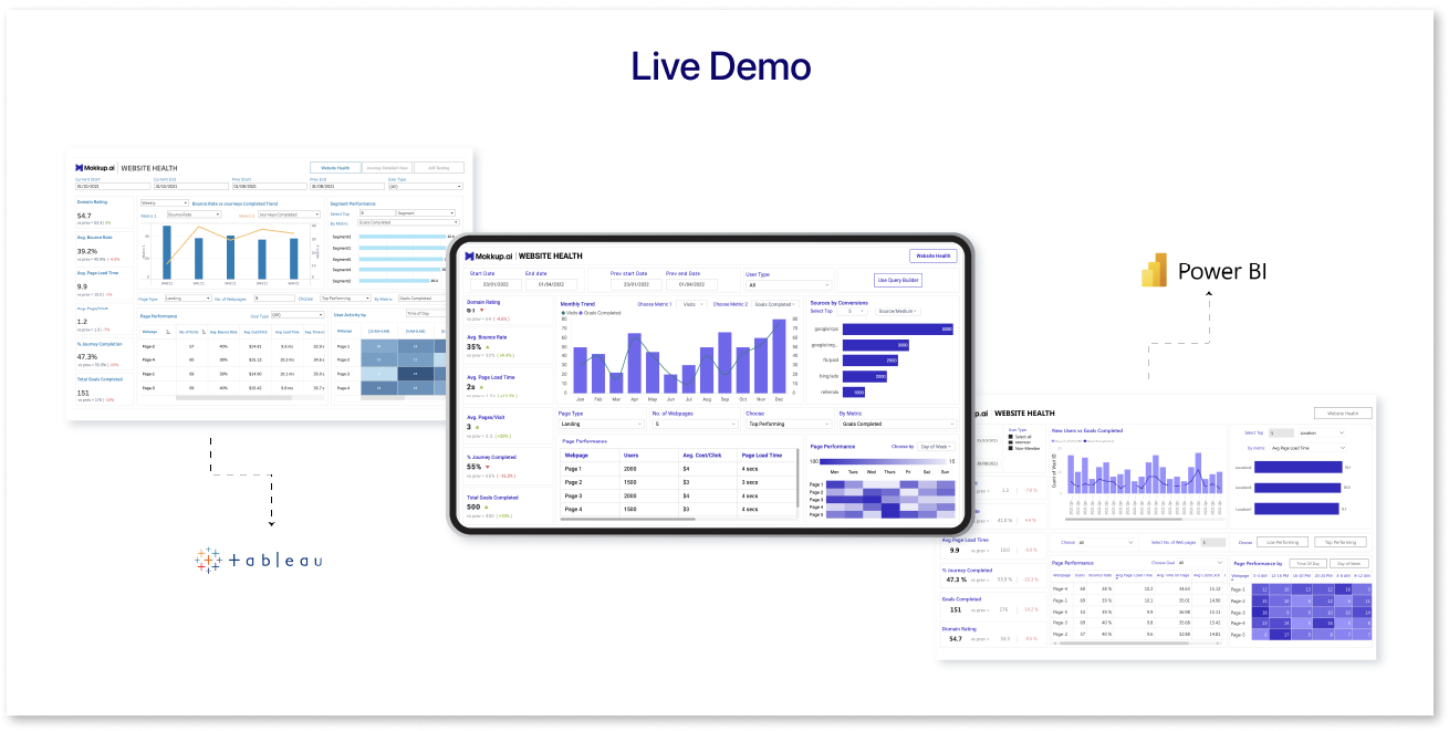
Using Mokkup.ai's live preview feature, you can see how the mokkup dashboard templates will look in Power BI & Tableau, including filter & chart interaction. This can help you visualize the template & the customizations that you need.
9) Customizable Screen Sizes:
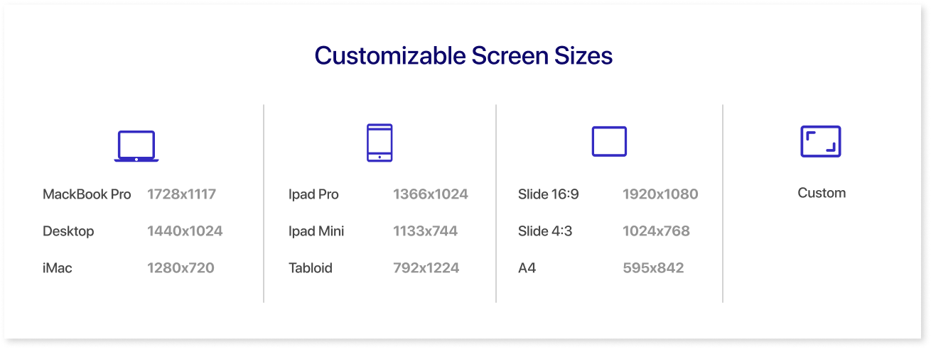
The best dashboards are built to avoid cluttering of visuals. This may require to extend your dashboard wireframe beyond the default 16:9 ratio most BI tools follow. Use Mokkup's set screen sizes or customize it to your liking and allow the wireframe visuals to breathe.

Mokkup Vs AI Chart Generator
Mokkup and AI chart generator tools serve different purposes in the design and data visualization processes. Here's a comparison between the two AI chart generator vs Mokkup online:
Mokkup:
Mokkup, also known as prototyping or wireframing tool, is primarily used for designing and creating visual representations of dashboards. This focuses on data visualization as well as other points such as layout, structure, and overall user experience. Here are some pros and cons of this free dashboard mockup tool:
Pros:
- Purpose: Mokkup is a dashboard wireframing tool that lets developers also be designers. They can use Mokkup to draft a quick version of their final dashboard, which they can get feedback on and use as a guide to the final dashboard. This saves countless hours in iterations on a final dashboard where data is involved, and making changes takes hours.
- Features: Mokkup offers features like drag-and-drop interface elements, embedding, designed variations for all charts, and pre-built dummy data that can be edited if you need. These tools prioritize the design process, user flows, and interactions.
- 100+ Design Templates: Mokkup has over 100+ awesome dashboard templates to choose from. It offers templates for every domain, such as marketing, sales, finance, operations, customer insights, and many more. Browse the templates and select the ones that best suit you. Customize them as per your team’s requirements, and you are good to go.
- Live Demo: Using Mokkup.ai's live preview feature, you can see how the mokkup dashboard template will look in a BI tool, including filter & chart interaction. This can help you visualize the template & the customizations that you need.
- Customize your charts with a few clicks: With Mokkup, you can easily add multiple charts and build a comprehensive wireframe, all with just a few clicks. This feature allows you to customize your charts seamlessly and create a cohesive dashboard. By incorporating various charts into a single wireframe, you can showcase trends, comparisons, or relationships between different datasets. Mokkup empowers you to effortlessly arrange and modify charts, ensuring that the wireframe is engaging, informative, and visually stunning.
Cons:
- Limited customization options: Mokkup is primarily focused on creating mockups and prototypes. It doesn't allow too much design customization, like font sizes, font family, etc. If you require advanced customization capabilities, complex interactions, or specific design elements, you may need to supplement Mokkup with other software or tools.
- Collaboration Limitations: While Mokkup often allows for sharing a wireframe once it is completed in the form of a HTML link, the level of collaboration features may be limited compared to dedicated collaboration tools. If you require robust collaboration capabilities like real-time co-editing, commenting, or version control, you might need to use other collaboration platforms.
AI Chart Generator Tools:
AI chart generator tools, as discussed earlier, are software applications or platforms that utilize artificial intelligence algorithms to automatically generate charts and graphs based on provided data inputs. These tools are designed to simplify the process of creating visually appealing and informative charts without the need for manual design or data manipulation. Here are some pros and cons of AI chart generator tools:
Pros:
- Purpose: AI chart generator tools are used to visualize only one set of data at a time, powered by AI. They analyze the data provided and generate charts that effectively visualize the information in a clear and concise manner. They allow no-code charts to be built in a matter of minutes.
- Features: AI chart generator tools offer to allow seamless integration with various data sources, such as spreadsheets, databases, or APIs. This enables the real-time or periodic updating of charts within the dashboard, ensuring that the displayed data is always current and relevant. These tools can handle large data sets efficiently, making them suitable for creating dashboards with multiple charts and complex visualizations.
- Single-Chart Restriction: Most of the AI tools allow you to add only one chart according to their UI. Although this may slow down the overall creation process for multiple charts, users can still benefit from the automated chart generation and customization options provided by these AI tools, enabling them to create visually appealing and informative charts with relative ease.
- Automation and AI Assistance: AI chart generators offer a significant speed advantage over traditional BI development processes due to the absence of coding and data connector requirements. These tools can eliminate the coding skills and extensive data integration, which works in traditional BI development, work, which. By removing the coding and data integration steps, AI chart generators significantly reduce the time required to create charts.
- Chart Recommendations: These tools have the capability to analyze your data and automatically select the most appropriate chart type based on the data characteristics. This can save time and effort in manually choosing the chart type. AI chart generators will suggest alternative chart types based on the nature of your data and the insights you want to convey.
Cons:
- Lack of Flexibility: While an AI Chart generator can automate the chart generation process, it may offer less flexibility in terms of customization compared to a comprehensive design tool like Mokkup. You might need more control over specific design elements or may need to rely on predefined templates or styles.
- Potential Accuracy Limitations: The accuracy and suitability of chart recommendations generated by AI algorithms may vary. While AI can make intelligent suggestions based on data analysis, it might not always capture the full context or specific requirements of your data. It's important to review and validate the generated charts to ensure they accurately represent your data and convey the desired insights.
- Dependency on Data Quality: AI chart generators heavily rely on the quality and structure of the data provided. If the input data has inconsistencies, errors, or missing values, it may affect the accuracy of the generated charts. Data preprocessing and cleaning might be required to obtain optimal results.
- Limited Scope: AI chart generators are specialized tools focused primarily on chart generation and visualization. They may not offer the broader capabilities for creating mockups, wireframes, or interactive prototypes like Mokkup. If your needs extend beyond charting, you may need to use additional tools or workflows to fulfill other design requirements.
Conclusion
Moving forward, Mokkup is geared towards designing dashboard wireframes using pre-built templates, while AI chart generator tools are specialized for data visualization and creating charts. Mokkup.ai focuses on user experience and interaction design, whereas AI chart generators focus on transforming data into visual representations that effectively convey insights. In short, this gives you the power of a designer to convert your data into a story within minutes.

Frequently Asked Questions
An AI Chart Generator is a tool that uses artificial intelligence to convert raw data into visual charts. It helps users create wireframes and structured designs quickly with accuracy.
Mokkup’s main feature is that it lets you create wireframes with quick drag and drop elements, design high-fidelity wireframes with simple text-based prompts, customize dashboards, and export them to BI tools, making it easy for users to build structured, interactive, and professional layouts.
Our AI Chart Generator Vs Mokkup comparison shows that Mokkup is better for creating detailed, high-fidelity wireframes and structured layouts, while AI Chart Generators focus mainly on quick data visuals.
Mokkup lets you create wireframes and export them to BI tools, so you can attach real data and deploy dashboards quickly, bridging prototypes and functional visualizations.
Yes, both tools offer free plans, but with limited functionality. You can access basic features and some free dashboard templates, though advanced options may require a paid subscription.
No, technical or design expertise isn’t required much to use these tools. Both tools are user-friendly, letting anyone create wireframes or visuals, even with little experience.
Prompt it. Wireframe it with Mokkup.ai.
