
The historical journey of data visualization unfolds with fascination as notable contributors made unique strides in graphical representation. In the 14th century, Nicole Oresme pioneered the use of a bar-like chart to show the accelerating object velocities. Joseph Priestley advanced this innovation by using bars to showcase life expectancies.
Often credited as the first to introduce the bar chart, William Playfair's portrayal in "The Commercial and Political Atlas" marked a significant milestone in the evolution of visual representations.
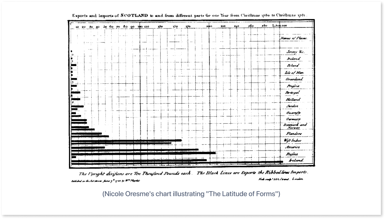
Together, these innovators have enhanced the history of data visualization, with each one contributing significantly to the creation of the bar chart as we know it today. (Source)
Table of Contents
- What are Bar Graphs?
- Various Types of Bar Graphs
- Characteristics of Bar Graphs
- When to Choose Bar Graphs and When to Explore Alternatives?
- Difference between Bar Graph and Histogram
- Optimizing Bar Graphs for Effective Communication
What are Bar Graphs?
Bar graphs, also known as bar charts, visually represent data using rectangular bars, where the length of each bar matches the value it represents. These charts can be either vertical or horizontal and serve as powerful tools for comparing categories or showing changes over time. Typically, each bar signifies a specific group or category, and its height or length indicates the numerical value of that category.
Bar graphs are highly effective for displaying categorical data and facilitating comparisons between different groups or values at a glance.
What is the Purpose of a Bar Graph?
Bar graphs are made to show visual and clear relationships. They use bars to represent different data categories. Imagine you have a bar graph that shows monthly sales of products by category.
The X-axis goes from $0 to $5K in increments of $1K, and the Y-axis is labeled with different product categories, such as category 1, category 2, and so on. Each horizontal bar represents the sales figures for a specific month.
The X-axis is used to display a variety of data, including time (months or years), financial measures (revenue, earnings per share), and other variables like cash flow, which can take the form of money or numerical values.
On the other hand, the Y-axis can effectively portray categories such as product categories, sources, countries, and more.
Various Types of Bar Graphs
There are several types of graphs such as gantt chart, waterfall chart, etc., each with unique characteristics that are suited to particular requirements for data display. Understanding these diverse types of bar graphs provides a comprehensive toolkit for conveying complex information in a clear and concise visual format.
1. Horizontal Bar Graph
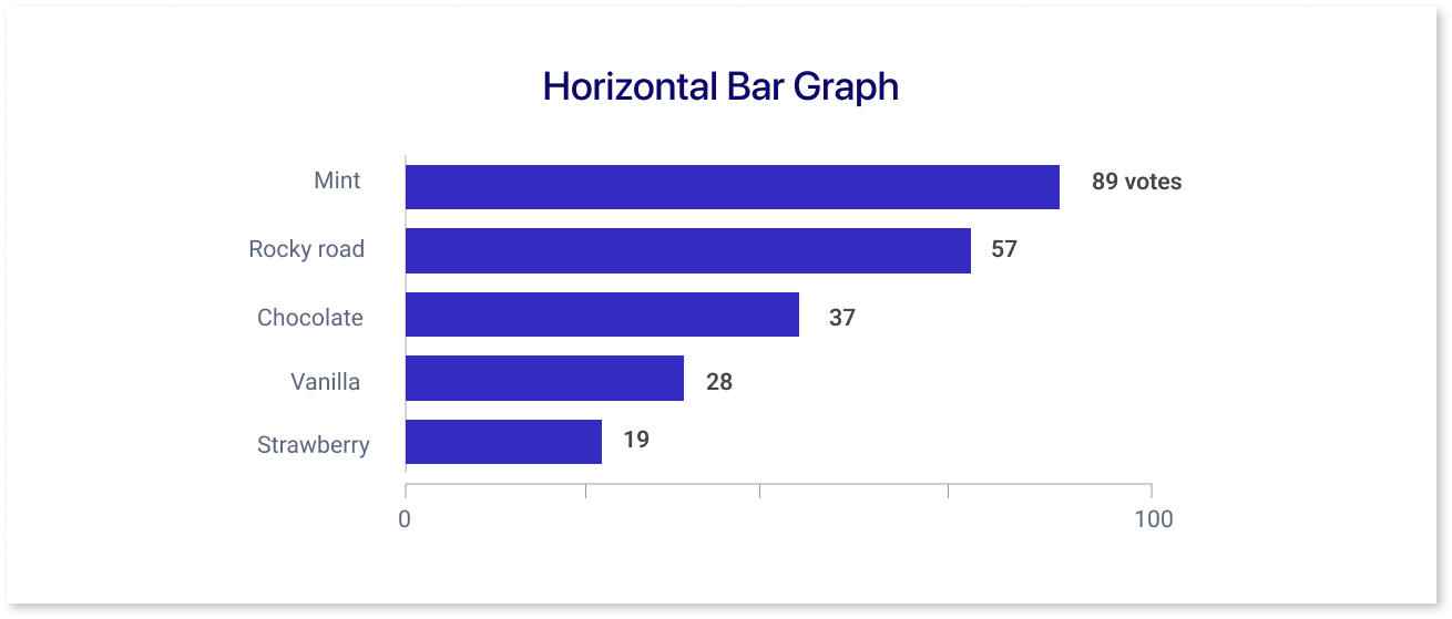
A horizontal bar chart, also known as a bar graph displays data using bars that extend along the horizontal axis. Each bar in this chart has a length that matches the value it represents. The bars are arranged horizontally, with the values or quantities represented by the x-axis and categories or labels commonly indicated by the y-axis.
Example: Showing the relative positions of different companies in an industry based on their share percentages, as well as each company's market share.
2. Clustered Bar Graph
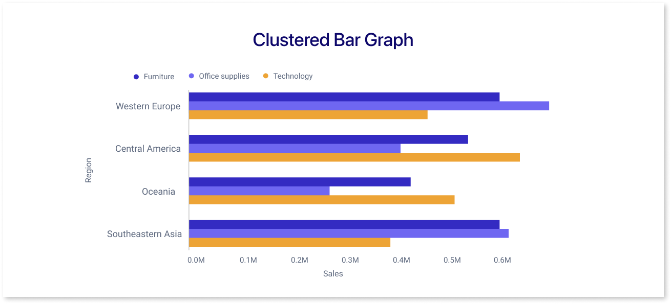
A clustered bar chart shows several bars, packed closely together within separate clusters, for each category or group. The categories in this chart have multiple bars positioned next to one another, making it simple to compare visually within the same group.
Example: A clustered bar chart would display bars grouped by product categories, with each group indicating sales in different regions for each quarter, if you were comparing sales numbers of various products across various regions for each quarter of the year.
3. Stacked Bar Graph
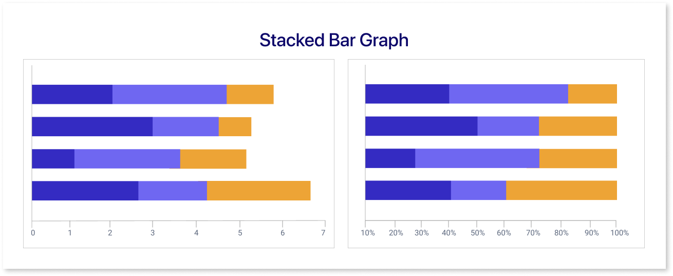
A stacked bar chart is a kind of bar graph in which several bars are layered on top of one another to display portions of a whole for each category. The entire value for each category is represented by the overall height of the stacked bars, which stays constant while each bar in the stack represents a different sub-category.
Another form of a stacked bar chart that shows the proportionate contribution of each subcategory to the total within each category is the 100% stacked bar chart, in which each stack of bars is normalized to 100%.
Example: Representing the breakdown of total revenue, where each bar section shows different revenue sources (such as services, products, subscriptions) contributing to the overall income.
4. Bullet Chart
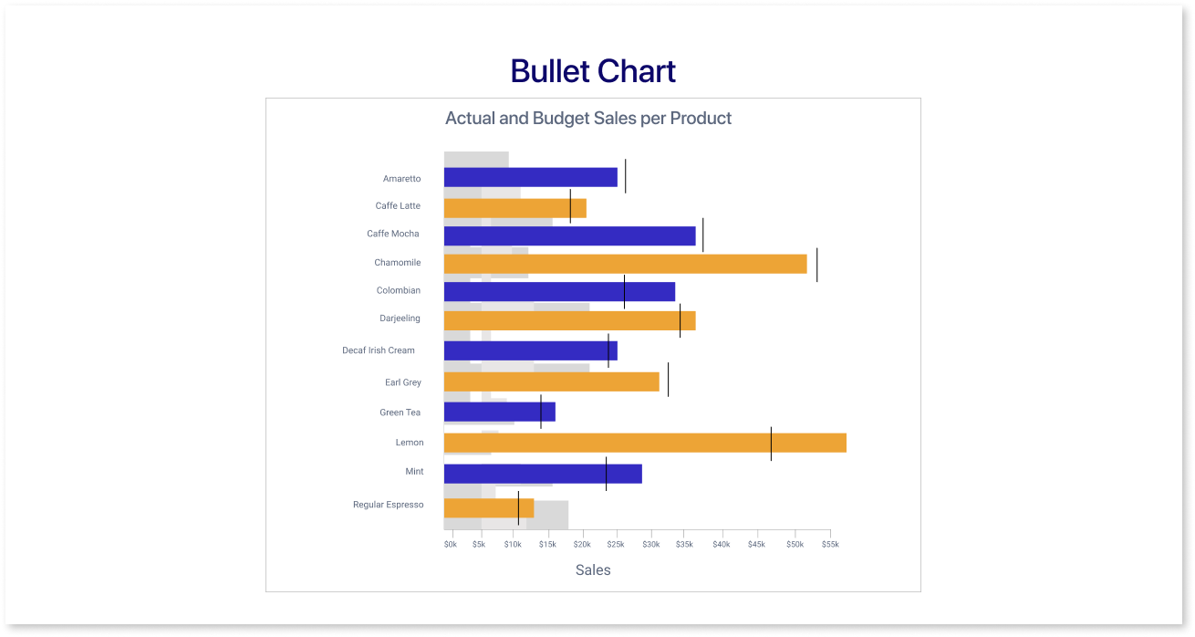
A horizontal bullet chart is a visual representation that shows performance against predefined benchmarks. It has a horizontal line that represents the target, bullets that show the actual performance, and colors that indicate different performance levels.
Example: Consider a tracker for project completion. The ideal completion date is shown by the target line, progress markers are represented by bullets, and several color variants (green, yellow, and red) indicate whether the project is ahead of schedule, on track, or behind schedule, respectively.
Characteristics of Bar Graphs
Bar graphs are widely used visualization tools that have unique qualities that make them perfect for displaying information visually. Let's discuss the key properties that define the usefulness and suitability of bar graphs in diverse contexts:
- Visual Representation: Bar graphs give a clear and simple approach to analyze data by using bars whose lengths match the values to clearly represent the data.
- Categorial Comparison: These charts or graphs are useful for comparing groups or categories because they provide quick insights into the similarities and contrasts between them.
- Clarity in Grouped Data: Bar graphs are especially helpful for grouped data since they can show more than one bar for each category, which makes it easier to compare values within different groups.
- Adaptability: These graphs are flexible tools that can be used to display different types of information, including frequencies, percentages, and numerical data.
- Sorting: Use sorting options for enhanced clarity; alphabetically for categories or in ascending/descending order by values, allowing easy analysis.
- Simple to Interpret: The simplicity of bar graphs makes them easy-to-understand, providing a straightforward way to communicate complex information to a large audience.
Gaining an understanding of these characteristics enables people to use bar graphs for a variety of data visualization purposes.
When to Choose Bar Graphs and When to Explore Alternatives?
Let us look at the instances where you can or cannot use the bar graphs for data analysis:
A. When to Use Bar Graphs:
1. Comparing Extensive Categorical Data Sets
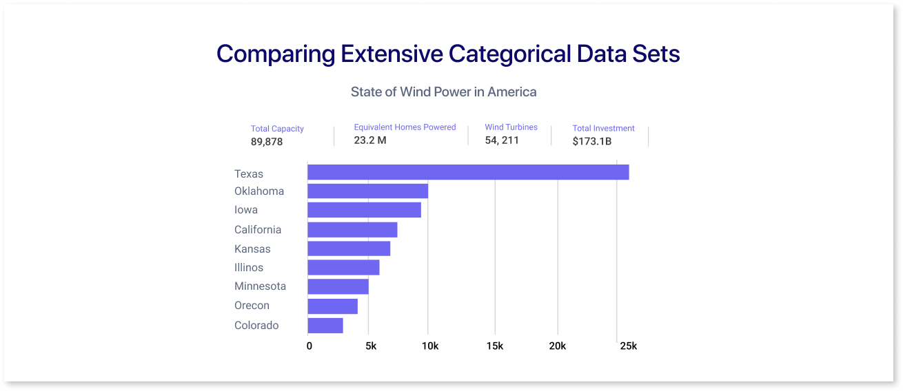
Bar graphs are perfect for comparing things like countries or categories of products, making differences easy to see. They're clear and simple for grouping data into categories. Bar charts are handy when we have lots of data, ensuring easy label reading.
They let data analysts identify how prices are moving and are useful for tracking price changes that lead to profitable trading choices.
2. When Comparing Multiple Categories at Once
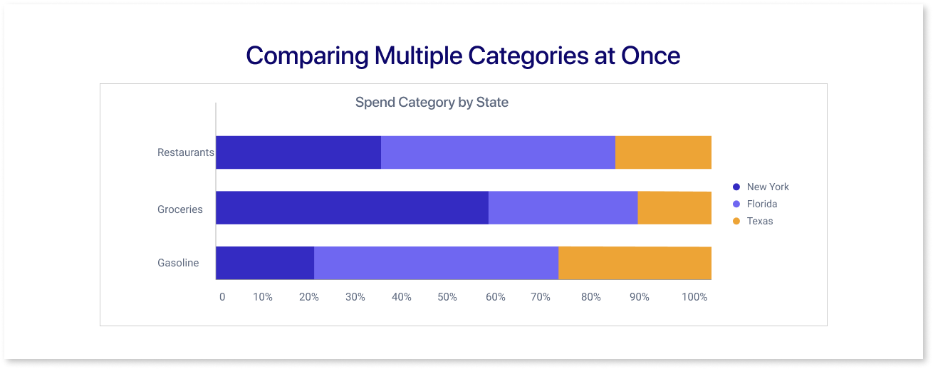
When comparing categories and subcategories, use bar charts. Groups of cluster bars represent multiple measured variables. Stacked bar charts highlight how each subgroup adds to the total for the category in which it appears. Useful for evaluating the performance of different organizations and figuring out how each subgroup fits into the bigger picture.
3. Visualizing Dual Data Sets on a Bullet Chart
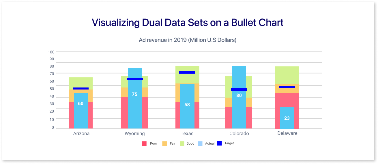
For comparing similar data sets, opt for a bullet chart – a single visual representation that uses bars of varying lengths. In this approach, the chart serves a dual purpose: one axis is used to compare categories, while the other is used to show individual values.
One can easily view a single data set or compare two data sets at once by selecting or deselecting legend labels. The simplified method used in bullet charts improves the readability of the data interpretation.
4. Understanding Data Variations
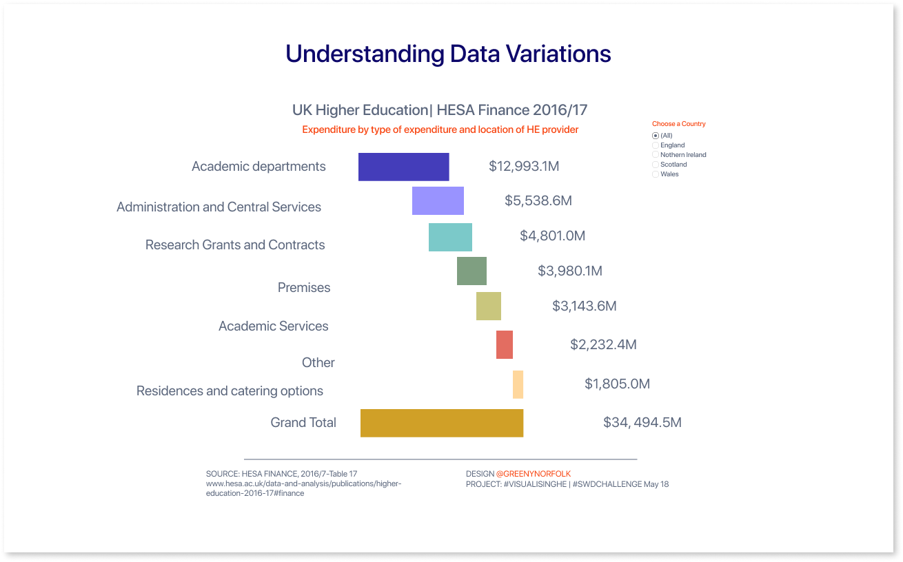
When comparing variables with both positive and negative values, a horizontal waterfall chart serves as a valuable tool. This format is useful for showing performance in relation to a benchmark and highlighting differences, much like column charts.
The horizontal waterfall chart provides a dynamic perspective on data distribution and performance trends by graphically illustrating the flow of both positive and negative contributions.
B. When Not to Use Bar Graphs:
Let's have a look at the instances where other forms of charts or graphs can be used for visualization:
1. When Comparing Continuous Data Sets
For continuous ordered quantities, use histograms instead of bar graphs. Histograms are used to show distributions in continuous data, like temperature changes over time. In order to avoid confusion, a bar graph should have spaces between the bars, but it shouldn't seem like a histogram.
2. When Illustrating Trends Over Time
Use line graphs for tracking trends in various quantities over time. Unlike bar graphs, which may be challenging for multiple trends as line graphs offer clarity. They are specifically good at highlighting small changes, making overall trends easily visible.
Difference between Bar Graph and Histogram
|
Features |
Bar Graph |
Histogram |
|
Data Type |
Categorical Data (Qualitative) |
Continuous Data (Quantitative) |
|
Gaps Between Bars |
Spaces between each bar |
No spaces; bars are placed side by side as the data is continuous |
|
X-Axis (Vertical Axis) |
Categories or Groups (Discrete) |
Presents range of continuous values |
|
Y-Axis (Horizontal Axis) |
Count/Sum/Avg |
Frequency or Density |
|
Bar Width |
Can vary but it’s often uniform |
Stays uniform, determined by the range of values |
|
Use Cases |
Comparing discrete categories, showing proportions |
Displaying distribution of continuous data |
Understanding the difference between bar graphs and histograms involves understanding how each type of chart visualizes various types of data distributions.
Optimizing Bar Graphs for Effective Communication
From ensuring clear category labels to thoughtful use of color, these guidelines aim to improve clarity, accuracy, and overall effectiveness in visually representing data. Let’s have a look at the best practices for using bar graphs:
1. Use Zero-Valued Baseline for Accurate Representation
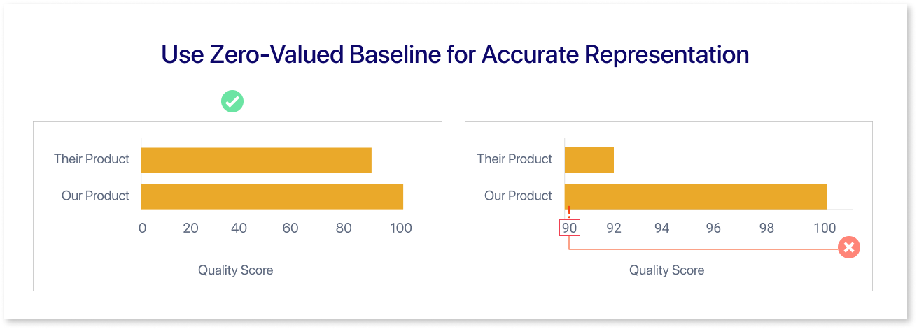
Bar graphs must have a zero-valued baseline in order to be accurately represented. By ensuring that each bar's length precisely matches its value, this method prevents misunderstandings and gives viewers an accurate visual reference point.
2. Maintain the Rectangular Structure of Your Bars
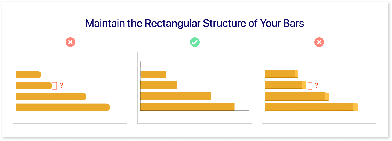
Ensuring the rectangular structure of your bars in a bar graph is essential for accurate representation. By avoiding visual distortions and promoting consistency in comparisons, this approach makes sure that each bar appropriately depicts its corresponding value.
3. Strategic Arrangement of Category Levels
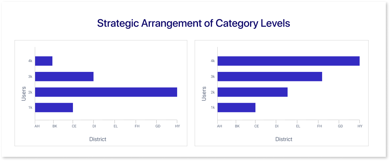
For effective communication, you must carefully consider how to arrange the category levels in your visual representation. Thoughtful category organization improves viewer comprehension and leads to a more perceptive interpretation of the data in the bar graph.
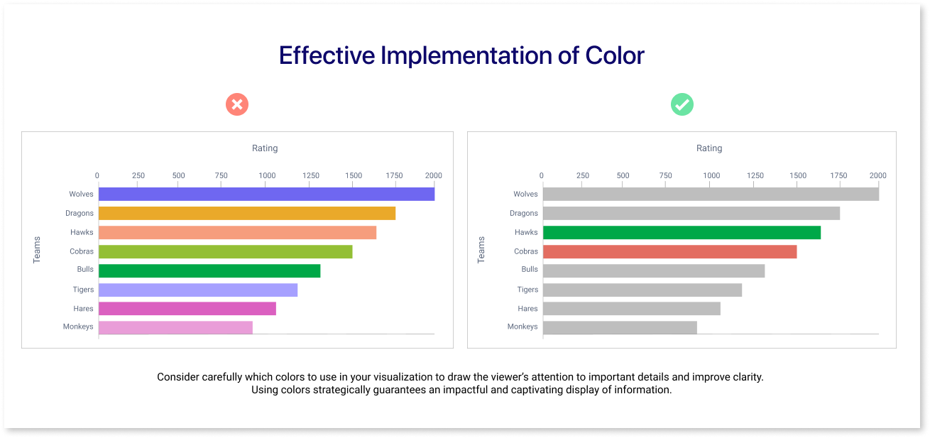
4. Effective Implementation of Color
Conclusion
The growth of data visualization has had a profound impact on the history of graphical representations, starting with Nicole Oresme's bar-like chart in the 14th century and continuing with William Playfair's ground-breaking work. Due to their adaptability and simplicity, bar graphs are now highly effective tools for comparing distinct categories and showing trends over time.
In dynamic data visualization, bar graphs are vital for clear information presentation. Equal width guarantees uniformity, and strategic color use shows the relationship among different categories
Elevate your data visualization with user-friendly tools like Mokkup.ai, providing an intuitive platform for effortlessly creating dynamic bar charts.
Prompt it. Wireframe it with Mokkup.ai.
