
Presenting data is a crucial skill for any data professional. Knowing how to communicate data insights is a key factor in decision-making, and it is often the difference between successful and unsuccessful data initiatives.
There are various tips and tricks for creating effective data visualization. Some of them include pie charts, bar charts, and data visualization. Each has its strengths and weaknesses, so it’s crucial to understand how and when to use each.
Table Of Contents
- What is The Benefit of Data Visualization?
- A Few Pointers For Presenting Data Expertly
- Tools and Resources for Creating Impactful Visualizations
Design principles that make data visualization stand out are essential for creating impactful dashboard ui design. Start by choosing the right visualization type, such as bar charts or scatter plots, based on the data and audience. Emphasize clarity with color contrast, focus on key insights, and maintain a clean layout. Tools like Mokkup can streamline the design process, ensuring your visualizations are both functional and visually compelling, making complex data easily understandable.
What is The Benefit of Data Visualization?
Data visualization is a potent method for communicating data insights. Many types of data visualization are available to make data easier to understand and present engagingly.
Data visualizations, including charts, maps, graphs, and more, can help present data in any form. They can highlight trends, compare data points, and gain insights into complex data sets.
Types of Data Visualisation:
There are many different ways of presenting data, such as pie charts, bar charts, line charts, area graphs, bubble charts, horizontal bar charts, heat maps, area charts, waterfall charts, and grouped bar charts. Some of the common and effective ways of representing data are listed below.
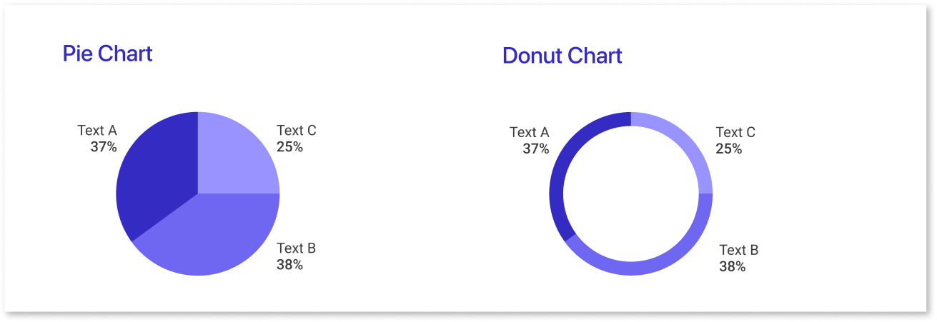
a) Pie Charts
Pie charts are an effective way of visually displaying data in a way that’s easy to understand. They arrange information in slices of a circle and can represent percentages, proportions, or relative frequencies of data.
| Pie Charts | Advantages | Disadvantages |
| Definition | Represents data as a part of a larger whole, useful for communicating information effectively. | Comparing slices can be challenging due to angles and non-adjacent slices. |
| Benefits | Allows for quick comprehension and easy data comparison for analysis. | It can become congested and hard to read with too much data; adding labels may not help. |
Pie charts are a popular form of data visualization. Different types, such as standard pie charts, exploded pie charts, stacked pie charts, and doughnut pie charts, are available for different situations.
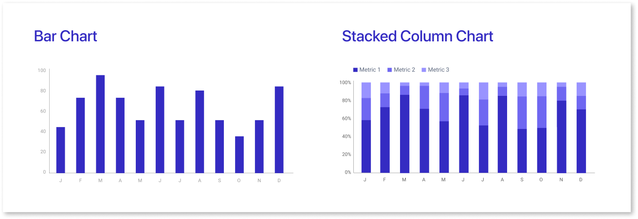
b) Bar Charts
A bar chart is a type of graphic representation that uses vertical or horizontal bars to compare certain data. It is often used in data visualization for scientific, statistical, or economic purposes. It provides an easy-to-understand and quick way to compare different values belonging to one category.
Majorly, there are two bar graphs: horizontal and vertical bar graphs.
| Bar Charts | Advantages | Disadvantages |
| Overview | Bar charts display data simply and facilitate comparison across different categories or data sets. | There is a potential for error if the data is not presented accurately, scale issues, and clutteredness if too many bars are included. |
| Pattern Recognition | They help users recognize patterns and trends quickly, making them suitable for complex data sets. | There are no disadvantages to pattern recognition for bar charts. |
c) Line Charts
Line charts are a commonly used tool in data visualization because they effectively show trends over time. If used properly, with attention to presentation style and design principles, they can be an effective communication tool and very practical for displaying trends over time.
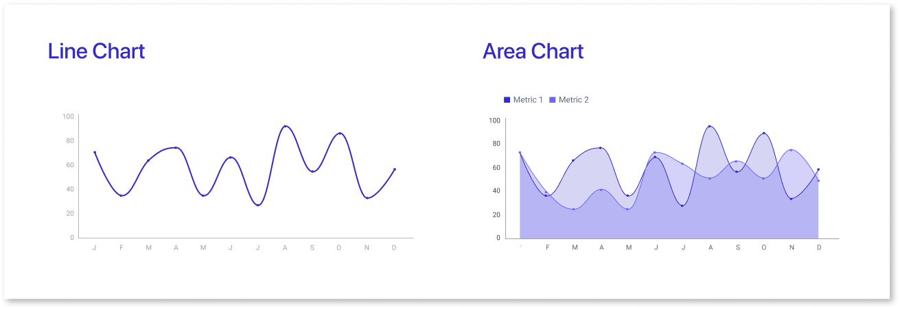
Advantages:
- Simplicity and ease of displaying patterns and changes in data.
- Helps viewers understand the direction of data points, useful for economic/financial analysis.
- Color coding and labeling enhance clarity and interpretation.
Disadvantages:
- Limited capacity for presenting large amounts of information at once.
- Difficult to compare many trends within a single chart.
- Gaps or anomalies in data can distort the entire chart, leading to inaccurate interpretations.
d) Pictographs
A pictograph is a visual representation of data or information. Here, images or symbols communicate statistical or logical data.
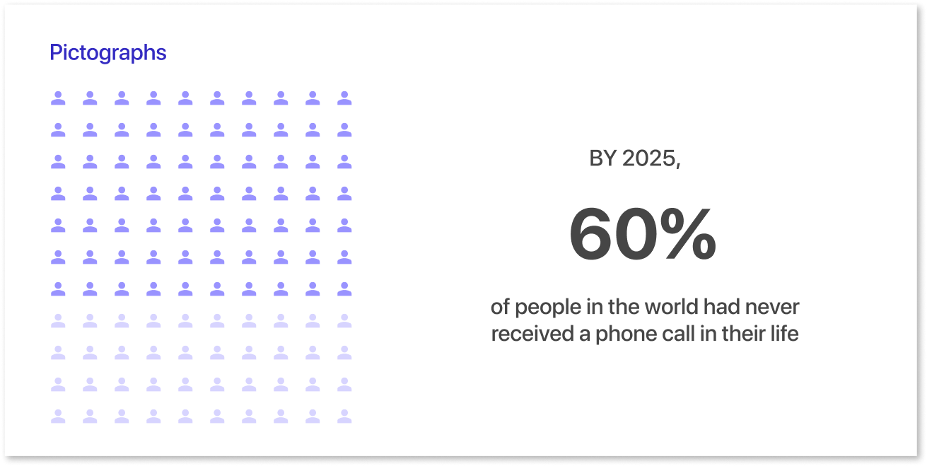
Advantages:
- Quick and easy communication through visuals rather than lengthy text explanations.
- Facilitate interpretation by people with varying educational backgrounds and cultural experiences.
Disadvantages:
- There are several disadvantages to using pictographs:
- Limited comprehension of complex data sets.
- Possibility for error due to subjective interpretations of symbols.
e) Scatter Plots
A scatter plot is a graphical representation that displays the relationship between two variables. The values of each variable are plotted along the X and Y axis, with each data point represented by a dot.
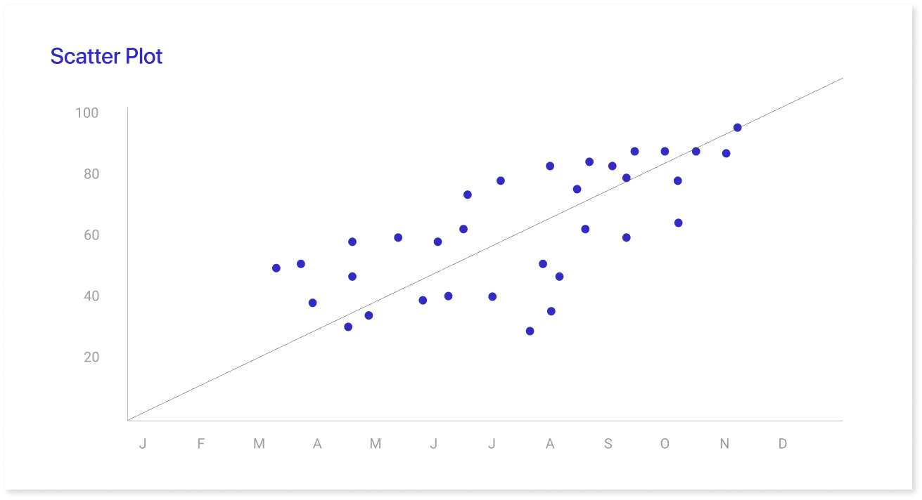
Advantages:
- Highlights patterns, correlations, and trends in large datasets.
- Easily identifies clusters or outliers relevant to research.
- Provides insight into cause-and-effect relationships, aiding informed decision-making.
Disadvantages:
- Difficulty representing three or more dimensions in a single chart.
- Challenging to interpret complex patterns or nonlinear relationships between variables.
- Requires thorough data preparation to avoid errors or biases.
- Other effective visual representations include area graphs, box and whisker plots, etc.
A Few Pointers For Presenting Data Expertly
Presenting data can be difficult, especially when attempting to do so in a captivating manner.
But just because you're providing data doesn't mean you have to present it in the same manner as everyone else. You can change the format and style that are most effective for you and your audience. Some of the key points that will help you to represent your data effectively include:
- Use color contrast: When presenting data, it's important to ensure it's easy to read. Using a high contrast between colors can help achieve this effect.
- Highlight the most significant section: To capture the end user's attention, the most crucial section must be highlighted.
- Create a title highlighting the message: The title should be very specific.
- Use color to highlight key information: Color can help draw attention to specific points in your data. This is especially helpful if you're using many charts with varying amounts of information.
A List of Common Errors To Prevent
There are a few common errors that you should stay away from while building a data visualization.
- Too much data: It's crucial to display just the proper amount. As a general guideline, show only the data that is most pertinent to each category.
- Incorrect scale for graphs and charts: It's important to start the scale at 0 and maintain a proper scale for charts. If these two things are not maintained, users may be presented with inaccurate data.
- Choosing the wrong method to visualize your data: Choosing the right method to visualize your data is critical. It gives your audience an accurate picture of what you're trying to say.
- Zooming in on favorable data: Highlighting just the positive aspects of your data and not showing any negatives can be problematic.
Tools and Resources for Creating Impactful Visualizations
When it comes to creating impactful visualizations, having the right tools and resources can make all the difference. Whether you're aiming to convey complex data insights or just looking to present information clearly and engagingly, using the right platform is key.
One of the best tools to consider is Mokkup, a cloud-based dashboard wireframing tool. Mokkup eliminates the need for an in-house design team by offering a user-friendly platform that makes it easy to visualize and customize your ideas. With its extensive library of customizable dashboard templates, it streamlines the entire process of visualizing your data.
Other resources include data visualization libraries like D3.js for more technical users or platforms like Tableau and Power BI, which provide powerful analytics and visualization capabilities. But if you're looking for a straightforward way to bring your ideas to life, especially in a collaborative environment, Mokkup is a great place to start.
Final Thoughts
Data visualization is a powerful tool for communicating data insights and engagingly presenting data. Various data visualization examples exist, such as pie charts and bar charts. Mokkup.ai provides various ways of presenting data through different user-friendly dashboard design.
Pie charts are an effective way of visually displaying data. The slices represent percentages, proportions, or relative frequencies of data. Bar charts are a type of graphic representation that uses vertical or horizontal bars to compare data. The most common type is rectangular bar charts, but other types include stacked bar graphs, line graphs, column charts, and others.
Line charts are also useful for data visualization but can have disadvantages, such as misjudgment and overcrowding. Lastly, pictographs are visual representations of data or information, using images or symbols to communicate statistical or logical information. The best ways to present data are through color contrast, key information in the title, and highlighting important information.
Prompt it. Wireframe it with Mokkup.ai.
