
Why Data Visualization Matters for Non-Experts?
Data visualization is a powerful tool for non-experts as it simplifies complex data, making it easier to grasp insights without deep technical knowledge. Turning raw data into charts, graphs, and other visuals allows individuals to understand patterns, trends, and correlations quickly. For professionals in fields like marketing, sales, or management, data visualization can help turn numbers into actionable insights, bridging the gap between technical experts and everyday users.
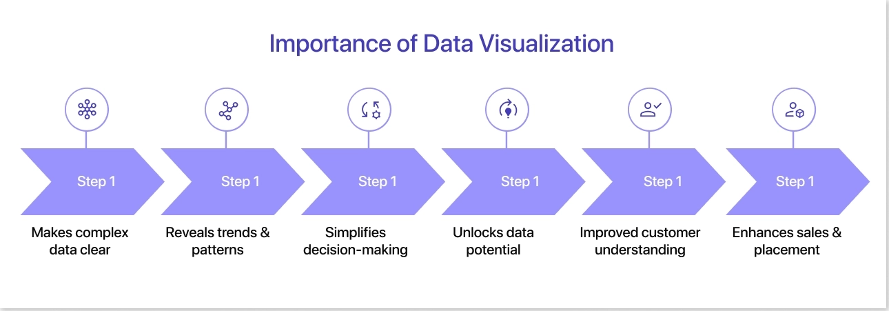
Table of Contents
- Challenges Non-Experts Face in Data Visualization
- Why Simplicity Is Key for Non-Experts
- The Easiest Data Visualization Types for Beginners
- Top Tools Designed for Non-Experts
Challenges Non-Experts Face in Data Visualization
While data visualization helps transform complex datasets into understandable visuals, non-experts often face several challenges that can affect the effectiveness of their visualizations. Below are the detailed challenges and actionable solutions to address them:
1. Lack of Technical Knowledge
- Challenge: Many non-experts are unfamiliar with the technical aspects of data visualization tools, such as configuring charts, adjusting scales, or formatting visuals for clarity.
- Example: A novice user might use a pie chart to represent yearly revenue trends, which is inappropriate since pie charts are best for proportions.
- Solution: Leverage beginner-friendly tools like Canva, Mokkup, or Google Charts that come with pre-built templates and drag-and-drop features.
2. Difficulty Choosing the Right Visualization Type
- Challenge: Knowing which chart or graph best represents a specific dataset can be confusing, especially when there are multiple variables involved.
- Example: Representing demographic data with a scatter plot instead of a histogram might make frequency patterns harder to interpret.
- Solution: Follow basic guidelines, such as using bar charts for comparisons, line charts for trends over time, and utilize tooltips or guides within visualization software that recommend appropriate chart types based on data input.
3. Accessibility and Inclusivity Concerns
- Challenge: Non-experts often overlook accessibility factors, such as ensuring that visuals are easy to interpret for colorblind users or accommodating viewers with visual impairments.
- Example: Using red and green in charts without considering colorblind viewers can make the visuals incomprehensible for some.
- Solution: Use color palettes designed for accessibility, such as ColorBrewer’s palettes or high-contrast themes. Include alternative descriptions or legends to provide context for all users.
4. Overloading Visuals with Data
- Challenge: Attempting to include too much information in one visualization can make it cluttered and difficult to interpret.
- Example: Combining multiple datasets into a single graph with overlapping lines and bars can overwhelm viewers.
- Solution: Break data into smaller, focused visuals instead of overloading a single chart.
5. Limited Understanding of Visual Design Principles
- Challenge: Non-experts might lack knowledge about alignment, spacing, font sizes, and other visual design principles that improve readability.
- Example: Using inconsistent font sizes or poorly aligned elements in a report can detract from its credibility.
- Solution: Stick to a clean and consistent design template, also limit the number of fonts and colors to create a cohesive look.
By recognizing and addressing these challenges, non-experts can build confidence in data visualization and create accurate, accessible, and effective visuals.
Why Simplicity Is Key for Non-Experts
Simplicity plays a vital role in ensuring data visualization is accessible and effective for non-experts. When a visual representation is overloaded with details or complex designs, it increases cognitive load, making it harder for individuals without technical expertise to grasp key insights. By focusing on clear, straightforward visuals, creators can make data more approachable, reducing confusion and ensuring the message is immediately understood. Simplicity also minimizes the risk of errors in interpretation, as cluttered or overcomplicated visuals often lead to misrepresentations or miscommunication of critical information. For example, a simple bar chart highlighting quarterly sales is far more effective than a 3D chart with unnecessary gradients and overlapping elements.
Moreover, simplicity enhances accessibility, ensuring that diverse audiences—including those with visual impairments or limited analytical experience—can engage with the content. Using accessible color palettes, high-contrast themes, and well-defined legends makes the visual experience inclusive and user-friendly. This focus on simplicity empowers non-experts by boosting their confidence in interacting with data, enabling them to extract actionable insights without feeling overwhelmed. In essence, a commitment to simplicity not only improves comprehension but also fosters trust in the data being presented, making it a cornerstone of successful data visualization for all audiences.
11 Easiest Data Visualization Types for Beginners
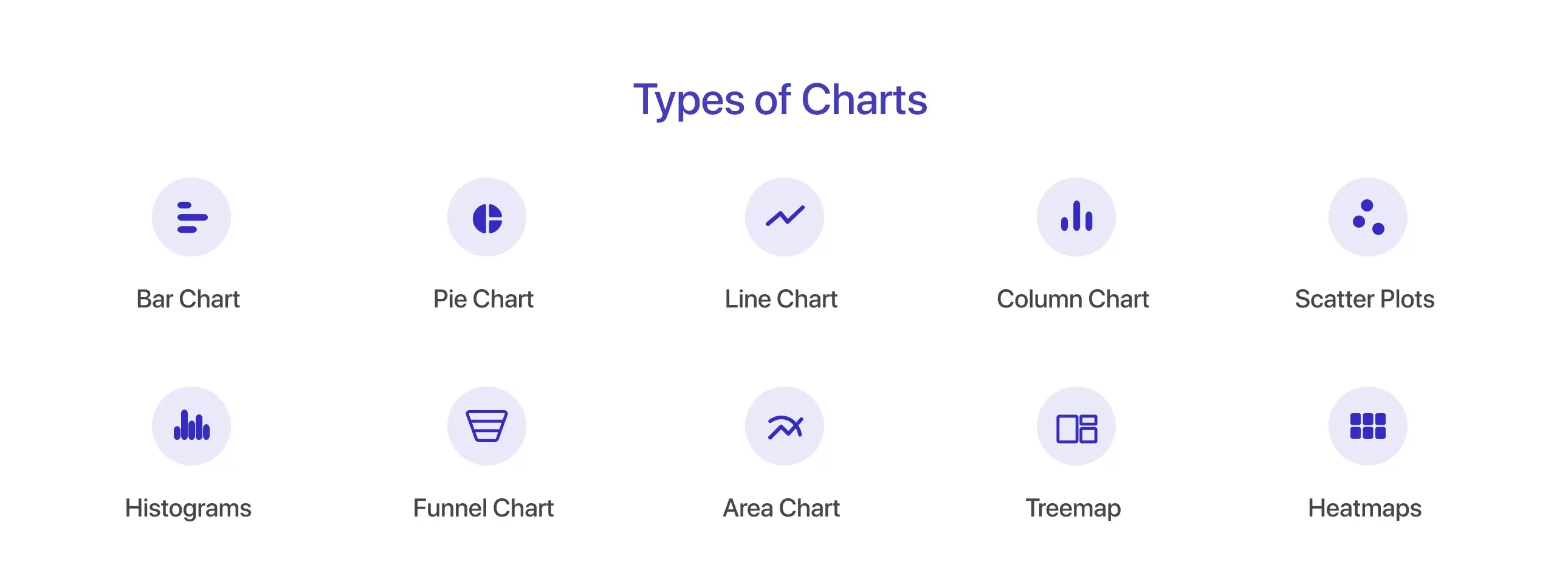
Data visualization helps turn complex information into clear and simple visuals that anyone can understand. For beginners, it’s essential to start with the most commonly used types of visualizations that are easy to grasp. Let’s explore some key types:
1. Bar Charts
- Bar charts use horizontal bars to compare values across categories.
- Each bar’s length represents the value of a specific category, making it easy to analyze differences.
- They are ideal for showcasing data trends, rankings, or comparisons over time or among groups.
2. Pie Charts
- Pie charts divide a circular graph into segments, representing proportions or percentages of a whole.
- Each slice corresponds to a category, helping visualize part-to-whole relationships.
- They are best for showcasing data distribution when there are few categories.
3. Column Charts
- Column charts use vertical bars to compare data across categories.
- Each bar's height reflects the value it represents, making it easy to visualize and compare multiple datasets.
- These charts are often used for performance analysis or time-based comparisons.
4. Line Charts
- Line charts connect data points with lines, illustrating trends or changes over time.
- They’re perfect for showing continuous data, like stock prices, sales, or temperature changes, allowing for easy identification of patterns or fluctuations.
5. Scatter Plots
- Scatter plots display individual data points plotted along two axes to show relationships or correlations between variables.
- Patterns or clusters in the points can indicate trends, making scatter plots useful for exploring cause-and-effect relationships.
6. Histogram
- Histograms group data into bins or intervals, using vertical bars to display frequency distributions.
- They are ideal for understanding the shape, spread, and central tendency of numerical datasets, often used in statistical analysis.
7. Funnel Chart
- Funnel charts represent stages in a process, with decreasing sizes from top to bottom.
- They visualize data like sales pipelines or conversion rates, highlighting drop-offs at each stage to identify bottlenecks.
8. Area Chart
- Area charts fill the space beneath a line chart with color, emphasizing volume changes over time.
- They are useful for comparing quantities, showing cumulative data, or highlighting trends in multiple datasets.
9. Treemap
- Treemaps use nested rectangles to represent hierarchical data.
- Each rectangle’s size and color indicate a category’s value, helping visualize proportions and relationships in complex datasets, like sales by region or market share.
10. Heatmap
- Heatmaps display data using color gradients to represent values, making it easy to spot patterns or intensity variations.
- They are commonly used for geographic data, website analytics, or showing correlations in large datasets.
11. Infographics
- Infographics combine visuals and text to present data in an engaging, storytelling format.
- They are perfect for summarizing key findings and making complex data accessible.
- For example, an infographic might use icons, charts, and minimal text to explain the impact of social media on consumer behavior.
These basic visualizations are ideal for non-experts looking to transform raw data into simple, digestible insights that communicate information clearly and effectively.
Top Tools Designed for Non-Experts
Creating visually appealing dashboards or charts no longer requires technical expertise. Tools like Mokkup, Canva, Google Charts, and Power BI make data visualization accessible to everyone.
1. Mokkup
Mokkup.ai is a user-friendly tool designed to simplify the process of creating dashboard wireframes for beginners and non-design experts. Users can start with pre-built templates tailored for various industries and dashboard types, saving time and ensuring professional output. With no need for prior design experience, Mokkup allows teams to sketch dashboards quickly, improving clarity and communication between stakeholders. Its cloud-based environment ensures easy access, eliminating the need for extensive software installations. While its primary purpose is wireframing, Mokkup enhances the data visualization journey by enabling users to create clean, structured wireframes before implementation. For businesses, it streamlines the design process and reduces reliance on expensive in-house design teams. Mokkup focuses on improving visual communication and turning complex ideas into easy-to-understand dashboard frameworks.
2. Canva
Canva is a popular, user-friendly design tool that offers versatile options for creating engaging data visualizations. Known for its intuitive drag-and-drop interface, Canva simplifies creating charts, infographics, presentations, and reports even for non-experts. Users can choose from hundreds of pre-designed templates to ensure their data stands out while maintaining professional aesthetics. Canva allows easy import of data for chart generation, including pie charts, bar graphs, and line charts. Its vast library of fonts, icons, and illustrations ensures flexibility for storytelling through visuals. For businesses and educators, Canva enables teams to communicate data trends effectively without the need for technical knowledge. The platform also integrates with collaborative tools, making real-time team editing possible. Its free version covers most basic needs, while the paid version unlocks premium features like brand kits, custom templates, and additional storage. Canva is ideal for visually presenting data to a broad audience, whether in meetings, social media posts, or educational projects.
3. Google Charts
Google Charts is a free, web-based tool designed to create interactive and dynamic data visualizations with minimal effort. It is particularly favored by users with basic or no coding experience due to its integration with Google's ecosystem. The platform supports a variety of chart types, including pie charts, bar graphs, scatter plots, heat maps, and geographic charts. Google Charts operates using HTML5/SVG technology, ensuring responsive and mobile-friendly visualizations. Users can customize charts with annotations, titles, and colors to suit branding and reporting needs. Since it is cloud-based, Google Charts allows users to embed visualizations into websites, dashboards, or Google Docs seamlessly. The tool retrieves data in real-time, making it suitable for businesses tracking live metrics and analytics. Its API is straightforward, providing customization for more advanced users. Google Charts remains an accessible option for non-experts who need visually compelling data without investing in specialized software.
4. Power BI
Power BI, developed by Microsoft, is a robust business intelligence tool that enables users to analyze and visualize data effectively. While professionals widely use it, its user-friendly interface also caters to beginners. Power BI allows non-experts to create rich, interactive dashboards and reports by dragging and dropping data into visual components. Users can pull data from diverse sources, such as Excel spreadsheets, cloud databases, and APIs. With a variety of visualization options like bar charts, scatter plots, maps, and KPI trackers, Power BI helps businesses uncover insights and trends. The tool also supports real-time data updates, enabling up-to-date reporting and decision-making. Users benefit from built-in templates and formatting options, which make the visualization process simple. Power BI’s free version is ideal for small projects, while Power BI Pro and Premium cater to larger enterprises. Additionally, its integration with Microsoft tools like Excel and Teams makes it a practical choice for businesses of all sizes.
Summing Up
Data visualization empowers non-experts to simplify complex data and uncover insights with ease. By leveraging reliable dashboard tools, users can present data in a way that is clear and actionable. Tools like Mokkup, Canva, Google Charts, or Power BI help transform raw data into meaningful visuals, enabling better communication and faster decision-making. Whether comparing trends, analyzing performance, or identifying patterns, these tools make complex information accessible to all, ensuring that data-driven insights are within everyone's reach.
Frequently Asked Questions
Choosing the right chart makes data easier to understand, highlights key patterns, and ensures the information is presented clearly and effectively.
Yes, non-experts can create professional-looking dashboards. With the right tools, even those without technical or design expertise can design effective and visually appealing dashboards. Using pre-built templates, customizable features, and drag-and-drop functionality, anyone can structure and present data in an engaging way. The key is choosing tools that simplify the process while still providing enough flexibility to create a polished end result.
Prompt it. Wireframe it with Mokkup.ai.
