
You’re starting a new Power BI project and are eager to get results. You begin building visuals, connecting data, and creating dashboard pages, but soon, you find yourself redoing work. Deadlines are slipping, stakeholders are unsure, and the budget is at risk.
What went wrong?
Often, the culprit is poor or missing wireframing. In business intelligence (BI) projects, particularly Power BI projects, skipping or failing the dashboard wireframing stage increases uncertainty, promotes misalignment, and encourages unending back-and-forths. Over time, these delays accumulate.
This blog will walk you through seven common Power BI wireframing mistakes that derail timelines. We'll provide examples and BI wireframe best practices to help you avoid these mistakes, and conclude with a checklist you can adopt in your projects.
Table of Contents
- Why Wireframing Matters in BI / Power BI
- The 7 Timeline-Killing Wireframing Mistakes
- How to Avoid These Mistakes: Best Practices & Tips
- A Sample Wireframing Checklist for Power BI Projects
Why Wireframing Matters in BI / Power BI
Before we look at common mistakes, we must understand Power BI wireframing and why it matters. A dashboard wireframe is a visual blueprint (low- or medium-fidelity) that shows where visuals, filters, headers, footers, and navigation will be placed without focusing on full styling, colors, or polished visuals.
It acts as a communication tool between stakeholders, designers, and developers, ensuring everyone agrees on layout, flow, and logic before building the dashboard. Tools like Mokkup.ai allow you to create structured wireframes that can be exported directly into Power BI files, bridging the gap between design and development and reducing rework.
By finalizing layouts early through wireframing, teams can significantly cut down on redesigns during development. This is crucial because rework is a major cost in any project. In fact, many software projects spend 30–50% of their effort on avoidable rework, and redoing existing work is often 2.5× more expensive than getting it right the first time.

The 7 Timeline-Killing Wireframing Mistakes
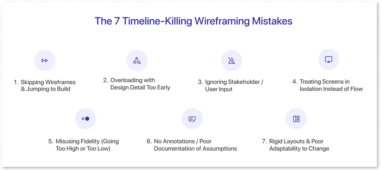
Even with careful planning, Power BI wireframing can sometimes go off track. Small gaps, like unclear KPIs, missing filters, or design changes made too late, can mount up over time. As the project moves forward, these issues often lead to rework, confusion, and missed deadlines.
The good news is that most of these mistakes are simple to avoid once you know what to look for. Below are the most common dashboard wireframing errors that slow down Power BI development.
1. Skipping Wireframes & Jumping to Build:
What it looks like: Your team says, “Let’s skip the wireframe, go straight to Power BI development.” You open Power BI, add visuals, rearrange filters, and create pages.
Why is it Risky?
- Layout or navigation problems may arise only after pages are built. Fixing them means redoing visuals, moving components, and possibly rewriting DAX or data model logic.
- Stakeholders might also assume your “draft dashboard” is nearly final and begin asking for design changes, mixing structure and styling too early.
- Misalignment becomes hidden until the late stage: missing filters, unclear flows, conflicting user roles, etc.
Example: Suppose you create a “Sales Overview” dashboard with a date slicer and side filters. Later, stakeholders request a “geographic drilldown” that requires a map visual on that page. Rearranging the layout may push other visuals around, requiring resizing and rework.
Why Timeline Suffers: The more you develop without validating the structure, the more fragile your work gets. Late structural changes cause cascading rework across visuals and pages, a common Power BI design mistake.
2. Overloading with Design Detail Too Early:
What it looks like: Your wireframe is full color, with fancy icons, shadows, logos, and exact fonts, and it is nearly identical to a mockup or the final design.
Why is it Risky?
- Visual aesthetics (colors, style) distract stakeholders from focusing on flow, interactions, and layout logic.
- Changing placement or navigation becomes laborious because design components must also be updated.
- It creates the false impression that "this is nearly done," making people unwilling to make structural adjustments.
Example: You can create a wireframe with custom icons, backdrop textures, and evenly spaced visuals. Later, when someone suggests shifting an element across the page, you must change the styling, margins, and alignment, adding extra labor.
Why Timeline Suffers: The polish becomes a trap. When structural revisions come, your decorative work slows you down.
3. Ignoring Stakeholder / User Input:
What it looks like: The wireframe reflects only your assumptions, “I think users want X, so I built Y”, without involving users or domain experts.
Why is it Risky?
- You might create filters or visuals that people don't use, misinterpret real user needs, or overlook what users actually want.
- Significant changes later on, when users reject elements of the wireframe or initial dashboard.
- Misalignment results from a lack of early feedback.
Example: You build a dashboard for sales teams, assuming they’ll need a “Region / Product / Month” slicer. However, users actually prioritize “Customer Segment” or “Channel Type.” Later, you have to add or rework filters or visuals.
Why Timeline Suffers: You might need to pull down parts of the model, add new visuals, and rework logic, causing delays.
4. Treating Screens in Isolation Instead of Flow:
What it looks like: You wireframe each dashboard page separately, without defining how users navigate between them or how filters, drilldowns, and cross-page interactions work.
Why is it Risky?
- You may have inconsistent navigation (back buttons, breadcrumbs, filters not persisting).
- Cross-page interactions and drillthroughs might be distracting or confusing.
- Maintaining consistent layout, filters, and design patterns across pages is challenging.
Example: Page A has a date slicer. You forgot to include the same slicer or link it on page B. Users complain that filters reset when moving pages. You must retrofit filter syncing, navigation buttons, or redesign pages.
Why Timeline Suffers: Fixing broken navigation after development is time-consuming and error-prone, a frequent dashboard wireframe failure.
5. Misusing Fidelity (Going Too High or Too Low):
What it looks like: Either you start with an elementary sketch that is overly vague, or you start with a nearly-final mockup.
Why is it Risky?
- Unclear and useless for feedback; stakeholders may misinterpret or request details too early.
- You fall into the trap of mistake 2 (design detail too early), making structural modifications expensive.
- You lose the balance between clarity and flexibility.
Example: You sketch on paper (too minimal), and stakeholders struggle to visualize interactions, leading them to delay feedback. Or you present a pixel-perfect mockup too early, making people think those design decisions are fixed.
Why Timeline Suffers: Either you waste time clarifying vague sketches or spend time reworking polished designs when structure shifts.
6. No Annotations / Poor Documentation of Assumptions:
What it looks like: Your wireframe consists of only boxes and visuals, with little or no notes clarifying what each visual does, what the filters do, and what interactions or assumptions are behind them.
Why is it Risky?
- Developers, BI engineers, and stakeholders may interpret visualizations differently: Is the bar chart showing a monthly or cumulative trend? Are filters single or multi-select?
- Hidden assumptions (e.g., "this filter resets per page," "this visual shows only the top 10") remain implicit and unchecked.
- Clarifications result in back-and-forth and rework.
Example: You wireframe a “Top 10 Customers” visual, but you don’t note that you intend “by revenue, last 6 months, excluding returns.” The developer assumes “all time revenue.” Later, stakeholders complain. You must redo DAX / filter logic.
Why Timeline Suffers: The lack of clarity causes misunderstandings, delays in handoffs, and extra revision loops.
7. Rigid Layouts & Poor Adaptability to Change:
What it looks like: Your wireframes are fixed and rigid, everything locked in position, with no room for evolving requirements. You treat wireframes as final blueprints.
Why is it Risky?
- BI projects frequently evolve, with new KPIs, additional visuals, filters, and stakeholder changes.
- Rigid layouts force wholesale redesign when new elements come in.
- You lose flexibility and simplicity.
Example: Suppose you create a dashboard with four visuals arranged in two rows. Later, someone wants to add a fifth visual, which requires you to rethink the layout, downsize visuals, or move positions.
Why Timeline Suffers: Rigid structures slow iteration and limit adaptability, one of the most common dashboard design pitfalls.
How to Avoid These Mistakes: Best Practices & Tips
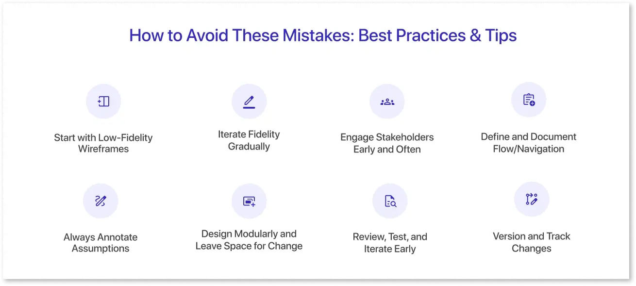
A disciplined approach to wireframing is the first step toward avoiding mistakes that destroy timelines. By following Power BI wireframing tips, you can reduce rework, align stakeholders early, and guarantee dashboards are developed efficiently and effectively.
1. Start with Low-Fidelity Wireframes:
Start with simple sketches or grayscale layouts focusing solely on structure, design, and flow. At this stage, avoid using colors, icons, or polished visuals. Keeping wireframes purposely rough invites feedback and identifies concerns before committing to development work.
2. Iterate Fidelity Gradually
After agreeing on the structure and flow, proceed to medium- or high-fidelity wireframes. After you've confirmed the overall layout, add design elements such as colors, fonts, and icons. This approach balances clarity and flexibility, reducing the need for costly redesigns.
3. Engage Stakeholders Early and Often
The regular involvement of stakeholders is crucial. Use walkthroughs, co-design meetings, or interactive prototypes to emulate dashboard interactions. This helps confirm assumptions about metrics, filters, and user priorities, ensuring that the wireframe satisfies the actual business requirements.
4. Define and Document Flow/Navigation
Plan the user journey across pages, including landing pages, drilldowns, breadcrumbs, and cross-links. Document how filters should be persistent or reset between pages. Flow diagrams or navigation maps provide clarity and help to prevent future inconsistencies.
5. Always Annotate Assumptions
Include detailed annotations for each visual, outlining computations, filters, interactions, and role-specific logic. Well-documented assumptions eliminate misunderstandings, reduce back-and-forth throughout development, and ensure that developers and stakeholders are on the same page.
6. Design Modularly and Leave Space for Change
Use grid systems or modular layouts to provide flexibility. Leave enough whitespace or expansion zones for extra KPIs or visuals without requiring a complete redesign. This modular approach allows for changing project requirements.
7. Review, Test, and Iterate Early
Validate wireframes with stakeholders before proceeding to development. Early testing identifies gaps and misalignments, allowing modifications while costs remain low. To avoid repetitive rework, lock the structure only when everyone agrees.
8. Version and Track Changes
Maintain version control in your Power BI wireframe to track changes and save revision histories. This enables rollback if necessary and keeps a clear record of decisions, which helps the team stay on track throughout the project.
By following these Power BI wireframing best practices, teams can minimize rework, strengthen communication, and keep projects on track.
A Sample Wireframing Checklist for Power BI Projects
Here’s a handy checklist you can include as part of your project kickoff:
|
Check |
Description/Notes |
|
|
1 |
Stakeholder alignment |
Confirm top priorities, KPIs, and user roles |
|
2 |
Low-fi sketch done |
Draft rough layout & define container zones |
|
3 |
Navigation flow mapped |
Map page transitions, filter persistence, drilldowns |
|
4 |
Annotated assumptions |
Add notes on metrics, interactions, and filters |
|
5 |
Modular layout |
Use a grid, reserve space for future visuals |
|
6 |
Feedback loop scheduled |
Stakeholder review early, validate structure |
|
7 |
Medium-fi wireframe |
After the structure is validated, refine the layout (grayscale) |
|
8 |
Visual style deferred |
Don’t invest in colors/icons until the layout is locked |
|
9 |
Versioning/changes tracked |
Use tool history or file versioning |
|
10 |
Final validation before dev |
Once the wireframe is approved, freeze the structure |
You can adapt this checklist to your organization’s processes.
Conclusion
Wireframing isn’t just a step; it’s your first line of defense against dashboard wireframing errors. Skipping or rushing it often leads to avoidable BI project timeline issues. Start simple, get feedback early, document clearly, and leave room for change. Proper wireframing can transform your Power BI project from chaotic to efficient, helping you build dashboards that work right the first time.
Frequently Asked Questions
The most common mistakes include skipping wireframes, adding design details too early, ignoring stakeholder input, treating pages separately, misusing fidelity, missing annotations, and having rigid layouts.
BI wireframing projects often fail because requirements are unclear, communication is poor, stakeholders are not involved early, and wireframes are too rigid to adapt to changes.
Wireframing mistakes cause delays by creating rework, misalignment, navigation issues, and late structural changes, which extend development time and increase costs.
Best practices include starting with low-fidelity sketches, gradually increasing fidelity, engaging stakeholders early, documenting flow and assumptions, designing modular layouts, and reviewing wireframes before development.
Validating assumptions early, keeping layouts flexible, adding clear annotations, collecting stakeholder feedback regularly, and tracking changes using version control can help avoid errors.
Approval delays occur when specifications are unclear, stakeholder feedback is late, wireframes are overstyled, or documentation is inconsistent.
Prompt it. Wireframe it with Mokkup.ai.
