
Building a Tableau executive dashboard is one of the most requested and most revised projects a BI team takes on. The CEO wants revenue and pipeline. The CFO wants P&L and margins. The COO wants headcount and ops metrics. And everyone wants it on a single screen before the next board meeting.
The challenge is rarely connecting the data. It is about agreeing on which KPIs belong on the screen and what the layout should look like before anyone starts building. Gartner found that 91% of organizations have not yet reached a transformational level of data and analytics maturity. Most teams are still figuring out what to measure as they build, not before.
This guide covers 8 real Tableau executive dashboard examples, built for CEOs, CFOs, and COOs, reporting the KPIs each role needs, and 25+ free wireframe templates you can open, customize, and export to Tableau today.
Table of Contents
- 8 Tableau Executive Dashboard Examples
- What Is a Tableau Executive Dashboard?
- Types of Tableau Executive Dashboards
- How to Build a Tableau Executive Dashboard
8 Tableau Executive Dashboard Examples
Here are 8 handpicked Tableau executive dashboard wireframe templates from Mokkup's library, each built for a specific C-suite audience, covering real KPIs and visual approaches. Every template is free to open, edit, and export to Tableau directly.
1. Board of Directors Executive Overview Suite
Also known as: Board of Directors Executive Overview Suite
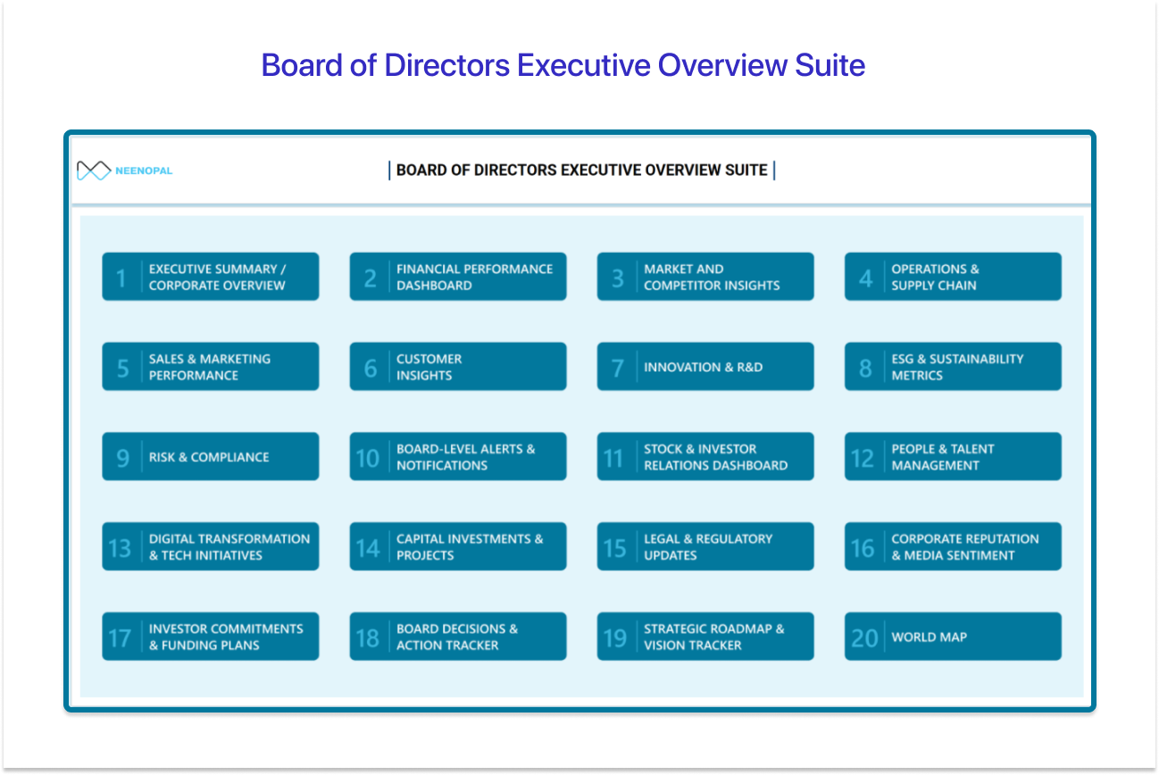
If your stakeholder is a board chair, CEO, or executive team needing a company-wide KPI view for quarterly reviews, the Board of Directors Executive Overview Suite is the Tableau executive dashboard to start with.
The layout opens with a striking 20-tile navigation menu in teal and white tiles. Each routes the viewer to a separate business function: finance, revenue, operations, HR, risk, strategy, and more. This is not a single-screen view; it is a full board-level suite that sequences multiple KPI sheets into a story points-style presentation flow without duplicating the underlying data model. Key metrics at the top level include revenue vs forecast, EBITDA%, headcount trend, customer NPS, market share, strategic initiative completion%, and cash position. The tiled navigation gives board chairs and CEOs an at-a-glance map of every functional area. Then it lets them drill into the sections that require attention before the meeting. This makes it ideal for quarterly board reviews and leadership offsites where stakeholders need both breadth and depth.
Pros: Tableau's story points sequence board-level KPI views into a presentation-ready narrative flow without duplicating data.
Cons: Story point layouts lock at design resolution. Separate device layouts are needed for 4K boardroom displays or mobile access.
Best for: CEOs, board chairs, and executive teams needing a multi-function company-wide KPI view for quarterly board and leadership reviews.
Explore the Board of Directors Executive Overview Suite →
2. Financial Overview Dashboard
Also known as: Financial Overview Template for Revenue, Expense & Profit Analysis
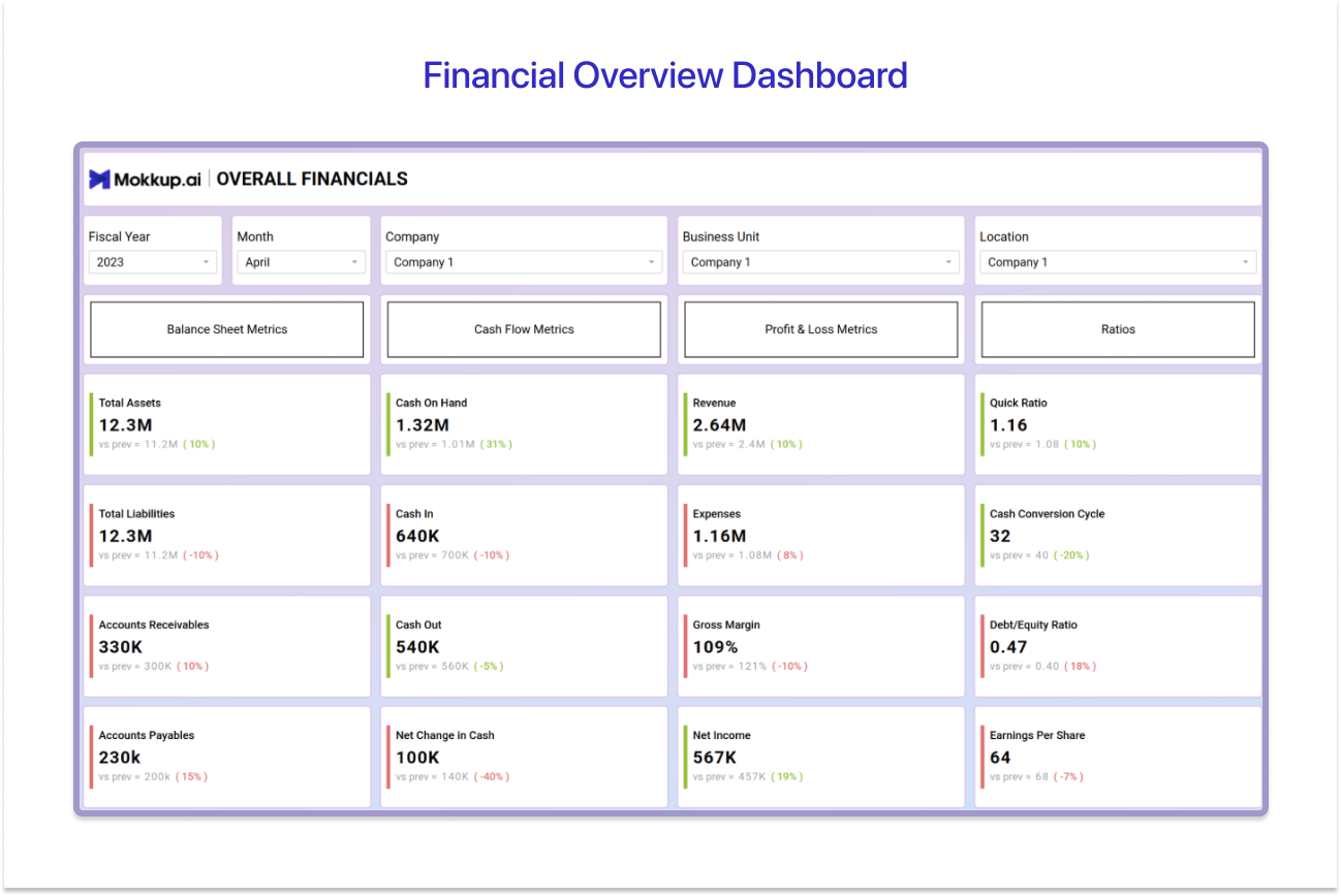
This is the definitive Tableau executive dashboard for CFOs and finance directors who need a full financial picture of P&L, balance sheet, cash flow, and ratios in a single tabbed view designed for monthly close reviews and board financial reporting.
The template opens with an "OVERALL FINANCIALS" header and four clearly labeled tabs: Balance Sheet, Cash Flow, P&L, and Financial Ratios. Below the tabs, a four-column KPI grid displays period-over-period comparisons with color-coded directional indicators: green for on track, and red for variance. Likewise, a CFO scanning before a board meeting can identify problem areas in seconds. Key metrics include total revenue, gross margin %, operating expenses, EBITDA, net profit margin, budget vs actual variance, and YoY growth %. The dual-axis chart approach overlays revenue bars against margin trend lines in one sheet. It is the combined view that finance teams usually rebuild manually in Excel after every export.
Pros: Dual-axis charts handle the revenue-to-margin overlay without requiring secondary axis workarounds in a separate sheet.
Cons: Dense mixed formatting across currency and percentage fields requires custom number format strings per measure to display cleanly.
Best for: CFOs and finance directors needing a single-view P&L with revenue, operating expenses, and net margin trended monthly for exec review.
Explore the Financial Overview Dashboard →
3. Revenue Insights Dashboard
Also known as: Revenue Insights Dashboard Template
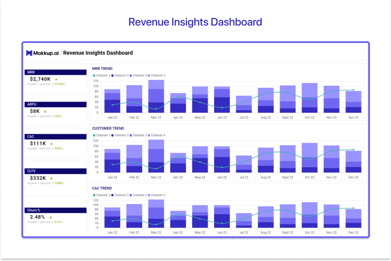
This Tableau executive dashboard delivers SaaS-grade revenue visibility in a single, filterable view. This is popularly used by CEOs and Chief Revenue Officers for tracking total revenue by product, region, and channel, with run-rate trend and YoY comparison for board reporting.
The template is built around six headline KPI cards: MRR at $2,740K, ARPU at $8K, CAC at $111K, CLTV at $332K, and Churn at 2.48%. Below the KPI band, three stacked bar and trend line charts show revenue performance over time, segmented by product or channel, giving the CRO and CEO a direct read on which revenue streams are growing, plateauing, or declining. The run-rate view makes this template especially useful for QBR and quarterly business review reporting, where forecast accuracy is under the most scrutiny. Revenue concentration by top accounts and MoM growth rate give leadership the context to distinguish healthy diversification from over-reliance on a single segment.
Pros: LOD expressions calculate revenue contribution by segment at the correct grain regardless of which filters the exec applies.
Cons: Run-rate projections depend on consistent CRM pipeline stage data. Incomplete deal records degrade forecast accuracy downstream.
Best for: CEOs and CROs tracking total revenue by product, region, and channel with run-rate trend and YoY comparison for board reporting.
Explore the Revenue Insights Dashboard →
4. Profit and Loss Report Dashboard
Also known as: Profit & Loss Report Template; Financial Analysis Tool
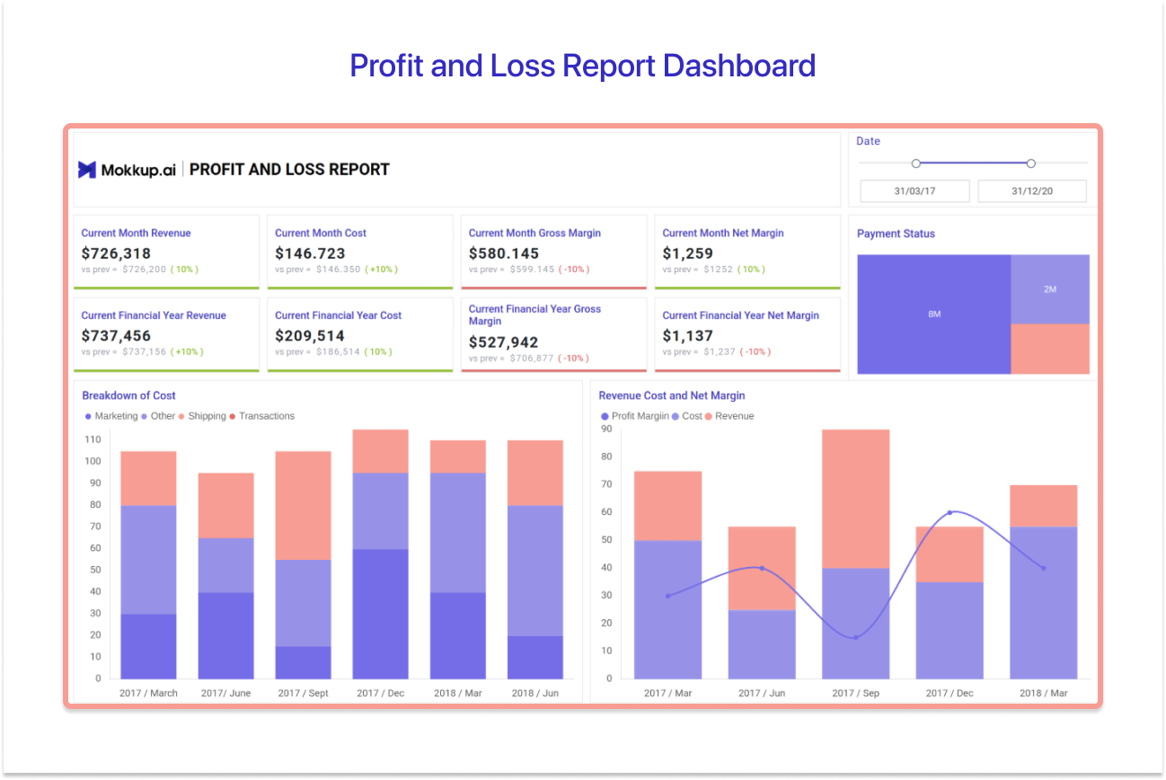
This is the deepest financial view in the suite; the Tableau executive dashboard built specifically for CFOs and FP&A teams who need a line-by-line P&L with drill-down from summary to department-level cost breakdown.
The layout opens with a date slider that lets the CFO select any reporting period without rebuilding the view, followed by eight KPI cards presenting both current month and YTD values for revenue, cost, gross margin, and net margin. Below that, a payment status bar chart shows revenue recognition by status, a cost breakdown bar chart decomposes operating costs by category, and a margin overlay chart tracks gross and net margin trends over the selected period. The template covers net revenue, COGS, gross profit, SG&A, R&D spend, EBITDA, net income, and cost as % of revenue by category, surfaced in a single scannable layout that removes the need for a separate Excel P&L alongside the dashboard.
Pros: Cross-database join links ERP cost data with finance system revenue data in one P&L sheet without a pre-built warehouse.
Cons: P&L hierarchies (category to subcategory to line item) require a calculated field or set action to expand and collapse cleanly.
Best for: CFOs and FP&A teams needing a detailed line-by-line P&L with drill-down from summary to department-level cost breakdown.
Explore the Profit and Loss Report Dashboard →
5. CRM Analytics Dashboard
Also known as: CRM Analytics Dashboard Template
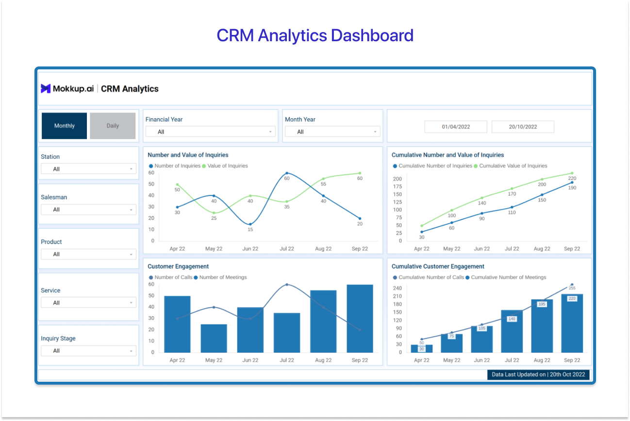
A CEO or Chief Sales Officer needs more than revenue totals. They need pipeline health, forecast accuracy, and sales velocity as the revenue engine view for exec review. This Tableau executive dashboard delivers exactly that in a high-contrast, easily scannable layout.
The template features a dark navy sidebar navigation and four dual-axis charts that track inquiry volume and engagement trends over time. This kind of combined view that reveals whether the pipeline is growing or narrowing before the shortfall hits the revenue line. Key metrics include pipeline value, weighted forecast, pipeline coverage ratio, win rate, average sales cycle length, new logo vs expansion revenue, and quota attainment. Tableau's parameter actions let execs toggle between pipeline snapshot, forecast, and closed-won views without rebuilding any underlying sheet, making this one of the most flexible exec-level CRM views available for leadership teams that need to slice pipeline by region, product, or rep in real time.
Pros: Parameter actions let execs switch between pipeline, forecast, and closed-won views without any workbook rebuild.
Cons: CRM data quality issues, including missing close dates and stale stage updates. Propagate directly into pipeline calculations without data governance guardrails.
Best for: CEOs and Chief Sales Officers tracking pipeline health, forecast accuracy, and sales velocity as the revenue engine view for executive review.
Explore the CRM Analytics Dashboard →
6. Organizational Employee Overview Dashboard
Also known as: Organizational Employee Overview Dashboard Template
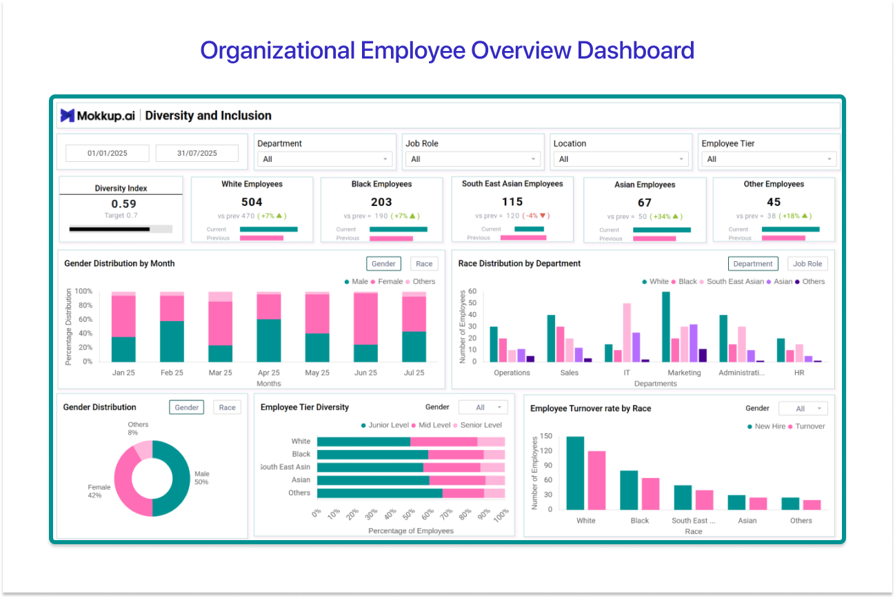
For COOs and HR leaders who need a headcount and workforce health view alongside operational metrics for executive committee reporting, this Tableau executive dashboard brings people data into the C-suite conversation.
The template leads with a diversity and inclusion frame: a diversity index score of 0.59 sits prominently at the top, followed by demographic KPI cards breaking headcount down by gender and ethnicity. Gender distribution, race and ethnicity distribution, and voluntary turnover by race charts give the COO a granular view of workforce composition and attrition risk across the organization. Key metrics include total headcount, headcount by department and level, open roles vs budget, attrition rate, span of control, and labor cost as a % of revenue. Tableau's dashboard actions filter from the org-level headcount view down to department detail without requiring a separate workbook per function.
Pros: Dashboard actions enable org-to-department drill-down in a single workbook without opening a second view.
Cons: HRIS data often requires Tableau Prep to flatten parent-child org hierarchy relationships before the viz layer renders correctly.
Best for: COOs and HR leaders needing a headcount and workforce health view for executive committee reporting.
Explore the Organizational Employee Overview Dashboard →
7. Supply Chain and Inventory Dashboard
Also known as: Supply Chain Inventory Analytics Dashboard Template
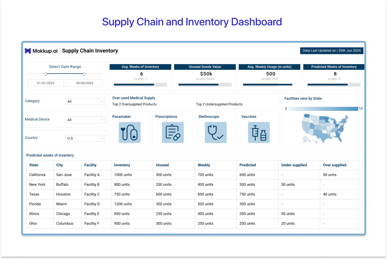
COOs and supply chain directors monitoring inventory health, supplier lead times, and fulfillment efficiency need a Tableau executive dashboard that surfaces regional performance at a glance, and this template delivers it with both geographic and facility-level visibility.
The template is built around a healthcare supply chain context, with four headline inventory KPIs at the top: weeks of supply, stockout indicators, and availability metrics, each displayed with medical device iconography that creates instant visual hierarchy for exec reviewers. A US choropleth map shows regional inventory levels and fulfillment rates geographically across facilities sharing the same data schema. Below the map, a facility-level predicted inventory table gives the COO a line-by-line view of supply health by location, making it straightforward to identify at-risk facilities before an ops review meeting. Key metrics include inventory turnover ratio, days of supply, stockout rate, order fulfillment rate, supplier on-time delivery %, carrying cost, and demand vs supply variance.
Pros: A filled map layer visualizes regional inventory levels and fulfillment rates geographically when facilities share the same data schema.
Cons: Cross-system supply chain data from WMS, ERP, and supplier portals requires a unified schema via Tableau Prep before cross-system calculations are accurate.
Best for: COOs and supply chain directors monitoring inventory health, supplier lead times, and fulfillment efficiency for executive ops reviews.
Explore the Supply Chain and Inventory Dashboard →
8. Express Operations Analytics Dashboard
Also known as: Express Operations Analytics Dashboard Template
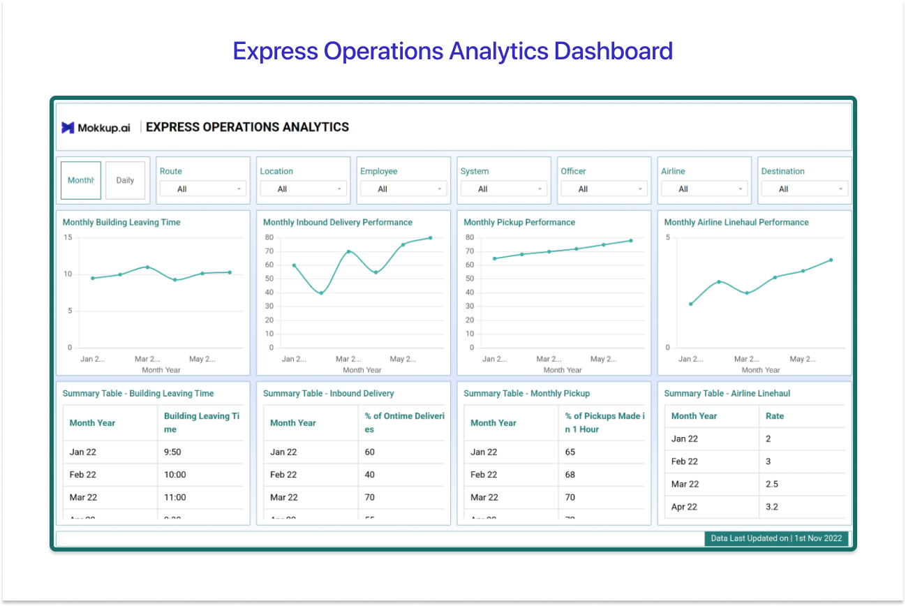
For COOs and operations directors needing a high-level view of throughput, efficiency, and cost across business units for weekly ops reviews, this Tableau executive dashboard brings logistics operations into a single, deeply filterable executive view.
The template opens with a monthly/daily toggle and seven dropdown filters, including Destination Country, Carrier, Quarter, Service Type, Shipment Type, Payment Status, and Year Four trend line charts track Building Leaving Time, Inbound Delivery performance, Pickup efficiency, and Airline Linehaul metrics over time. Four corresponding summary tables sit directly below the charts, providing the numerical detail behind each trend line so the ops director can move from visual pattern to supporting data without leaving the view. Key metrics include operational cost per unit, throughput vs target, capacity utilisation %, process cycle time, quality defect rate, and resource productivity index.
Pros: Cross-database join links ops system data with finance exports to compute cost-per-unit and margin impact in a single Tableau sheet.
Cons: High-level ops summaries can mask root-cause variance. Tableau dashboard actions are needed to move from exec summary to line-level detail.
Best for: COOs and operations directors needing a high-level throughput, efficiency, and cost view across business units for weekly ops reviews.
Explore the Express Operations Analytics Dashboard →
What Is a Tableau Executive Dashboard?
A Tableau executive dashboard is a high-level interactive visualization or workbook that consolidates the most critical KPIs across business functions: finance, sales, operations, and people into a single view built in Tableau Desktop or Tableau Online. Designed for C-suite and senior leadership, it uses Tableau's calculated fields, story points, and parameter actions to present strategic metrics clearly without overwhelming the viewer with operational detail.
The key distinction between an executive dashboard Tableau build and an operational dashboard is scope and intent. An operational dashboard answers, "What happened in this process today?" A Tableau executive dashboard answers a different question: "Is the business on track?" It prioritizes scan-ability and strategic context, surfacing revenue vs forecast, EBITDA, headcount trend, and pipeline coverage in a format a CFO or COO can assess in two minutes, not twenty.
Published via Tableau Server or Tableau Online, a well-built Tableau leadership dashboard gives the CEO, CFO, and COO a consistent, governed view of business health. That is the standard every executive reporting build should be measured against.
What KPIs Does a Tableau Executive Dashboard Track?
Before placing a single field on the marks card, the BI team building a Tableau executive dashboard needs to agree on which metrics belong at the exec level vs the departmental level. Executive KPIs are split into two layers: strategic and financial metrics that answer whether the business is performing, and operational and people metrics that answer whether the organization can sustain that performance.
Strategic and Financial KPIs
Revenue vs forecast, gross margin %, EBITDA, budget variance, cash flow, and YoY growth rate appear on virtually every Tableau C-suite dashboard regardless of industry. These are the metrics that directly answer the board-level question: Is the business growing, profitable, and funded? In Tableau, calculated fields and Level of Detail (LOD) expressions ensure these figures aggregate correctly even when the underlying data spans multiple fiscal calendars or business units. EBITDA and gross margin, in particular, belong at the exec layer because they determine strategic capacity, whether the business can fund the next growth initiative or needs to optimize costs first.
Operational and People KPIs
Headcount vs plan, voluntary attrition rate, pipeline coverage ratio, NPS, operational cost per unit, and strategic initiative completion % give the CEO, COO, and board a view of execution health. These metrics answer whether the organisation has the capacity, talent, and operational engine to deliver on the financial targets above. McKinsey's Performance through People research found that companies excelling at both people development and financial outcomes grew revenue twice as fast as peers (8% versus 4%) and maintained attrition rates nearly five percentage points lower. This is why headcount and attrition data have become non-negotiable in executive reporting, not just an HR concern. Tableau's dashboard actions allow exec-level viewers to drill from the summary KPI into the department or function responsible without opening a separate report.
Types of Tableau Executive Dashboards
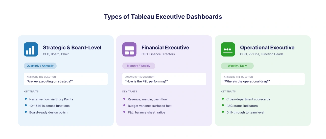
Not every Tableau executive dashboard serves the same audience. The CEO, CFO, and COO each need a different slice of the same business data, and understanding which type fits your stakeholder before building saves significant rework time on executive-facing Tableau projects.
CEO Strategic Dashboards
A CEO dashboard Tableau build consolidates 10–15 company-wide KPIs across revenue, growth, people, and pipeline into a single scan-ready view designed for weekly or quarterly leadership review. Tableau's story points allow the BI team to sequence the view into a board-deck-style narrative without rebuilding data or exporting to PowerPoint. The focus is on trend direction, target vs actual, and strategic initiative progress and not operational depth. Examples 1, 3, and 5 from this guide fit this type.
CFO Financial Dashboards
A CFO dashboard Tableau build delivers P&L visibility, margin analysis, budget vs actual variance, and cash flow in a single Tableau workbook connected to the ERP or finance system. Tableau's dual-axis charts and calculated fields handle the revenue-to-margin overlay that finance teams need without the version control risk that comes from exporting to Excel. Designed for monthly close reviews and board financial reporting. Examples 2 and 4 from this guide fit this type.
COO Operational Dashboards
A COO dashboard Tableau build brings together workforce, supply chain, and throughput metrics from multiple operational data sources, like HRIS, WMS, ERP, into a unified ops view. Tableau's cross-database join and filled map layer make it practical to surface regional efficiency and headcount data without a centralized data warehouse first. High refresh frequency and department-level drill-down are the key requirements at this level. Examples 6, 7, and 8 from this guide fit this type.
How to Build a Tableau Executive Dashboard (The Wireframe-First Approach)
Most BI analysts building a Tableau executive dashboard start by connecting data sources and pulling in finance exports, CRM data, and HRIS feeds. The executive asks for different KPIs, a different layout, and a different grouping by region. The build restarts. The wireframe-first approach breaks that cycle before it starts.
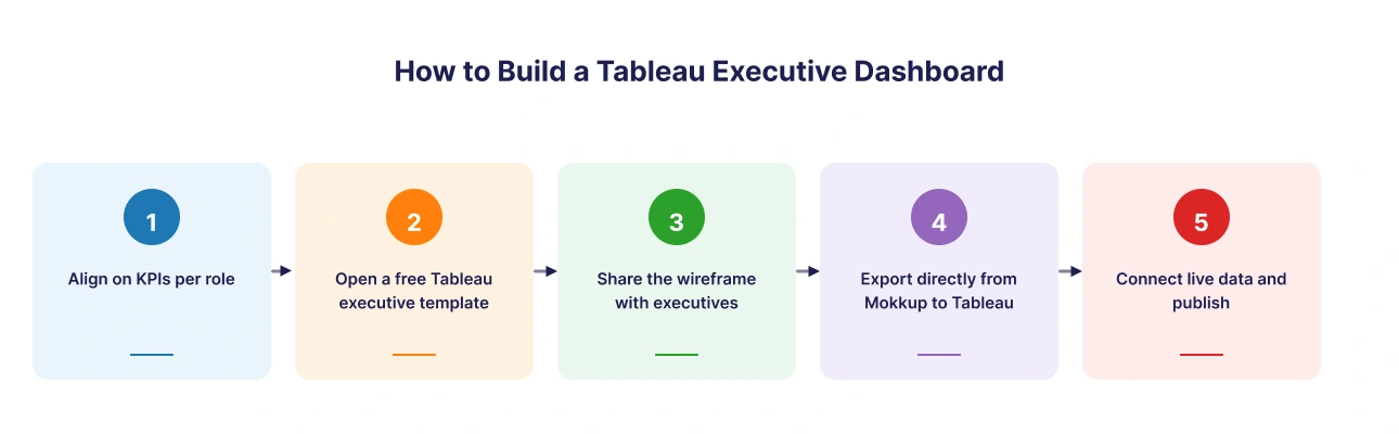
Step 1: Align on KPIs per role
Confirm with each executive which 8–12 metrics belong in their view. Use the KPI sections and the 8 Tableau dashboard examples above as your starting framework. Misalignment at this stage is the single biggest cause of rework on executive-facing Tableau builds. Getting this wrong costs days; getting it right in a 30-minute conversation costs nothing.
Step 2: Open a free Tableau executive dashboard template in Mokkup.
Choose one of the 8 examples above as your starting point. Optionally, upload a sample dataset to Mokkup's Convo AI. It reads the column names and data types and lays the wireframe out around your actual executive data structure, so the layout is already mapped to your fields before you share it for review.
Step 3: Share the wireframe with the CEO, CFO, or COO and collect sign-off before writing a single calculated field.
Getting layout and KPI approval at the wireframe stage eliminates the revision cycles that cost BI teams the most time. A shared link, a 30-minute review, and a confirmed sign-off are worth more than two weeks of post-build feedback requests.
Step 4: Export directly from Mokkup to Tableau.
This is where the Semantic Layer changes the build timeline significantly. The exported .twbx file is not just a layout; it carries the dataset, all calculated fields, measures, and formulas already pre-configured inside the workbook. The developer opens it in Tableau Desktop, connects to the real data source, and skips the manual rebuild step that typically adds two to three days to an executive dashboard project. This is a Tableau-exclusive feature (Power BI support is coming soon), and it is the core reason to wireframe in Mokkup rather than Figma or PowerPoint. The export is functional, not decorative.
Step 5: Connect live data and publish.
Open the .twbx in Tableau Desktop, connect to the live data source, validate KPI calculations against the pre-approved wireframe layout, and publish to Tableau Server or Tableau Cloud with appropriate row-level security for each executive role, so the CFO sees consolidated financials, the COO sees ops metrics, and neither sees data outside their scope.
Explore All 25+ Free Tableau Executive Dashboard Templates
Mokkup's library contains 25+ executive-ready Tableau executive dashboard templates covering every C-suite Tableau use case: board overview suites, CEO revenue and strategic dashboards, CFO P&L and financial views, and COO operational and workforce dashboards. Every template is free to open, edit with Convo AI, and share for stakeholder sign-off before a single calculated field is written.
Unlike static TWBX downloads or Figma mockups, Mokkup templates export to Tableau with the Semantic Layer included. Meaning the .twbx file already contains the dataset, calculated fields, and formulas pre-wired. Executive dashboard builds that typically take a developer 3–5 days of manual field configuration start clean and connected from day one. That is the key differentiator over free TWBX files found elsewhere: you are not downloading a skeleton, you are downloading a working data model that opens in Tableau Desktop ready to connect.
Frequently Asked Questions
A Tableau executive dashboard is a high-level interactive workbook that consolidates the most critical KPIs across business functions into a single view designed for C-suite and senior leadership. Unlike an operational dashboard that tracks process-level detail, a Tableau executive dashboard is built for scannability: a CEO, CFO, or COO should be able to open it, assess company health, and identify where to drill deeper in under two minutes. It uses Tableau's calculated fields, story points, and parameter actions to present strategic KPIs clearly without overwhelming the viewer with raw data.
A CEO dashboard Tableau build typically includes 8–12 company-wide KPIs spanning revenue vs forecast, gross margin, EBITDA, headcount vs plan, pipeline coverage ratio, customer NPS, and strategic initiative completion %. The exact set depends on the CEO's priorities for the current quarter. For instance, a growth-stage CEO will weigh pipeline and user acquisition more heavily, while a profitability-focused CEO will prioritize EBITDA and cost efficiency. Use Tableau's parameter actions to let the CEO toggle between views without requiring a new workbook for each business question.
A CEO dashboard is a company-wide view. It spans revenue, pipeline, headcount, NPS, and ops efficiency in a single scan. A CFO dashboard Tableau build goes deeper into the financial layer: P&L line items, EBITDA, budget vs actual variance, cash flow, and cost as a percentage of revenue. A COO dashboard Tableau build focuses on the execution layer: workforce headcount, operational throughput, supply chain efficiency, and process cycle times. In Tableau, all three can be built from the same underlying data model. The difference is which measures and dimensions each view surfaces and at what level of aggregation.
Mokkup's Semantic Layer exports a .twbx file with your dataset, calculated fields, measures, and formulas already configured. For Tableau executive dashboard builds that blend data from multiple sources, the Semantic Layer means the developer opens the file in Tableau Desktop with the cross-source field logic already wired. Convo AI reads column names and data types from your uploaded sample dataset and maps them into the export automatically, so the build starts clean rather than requiring manual field replacement across every calculated field in the workbook.
Use Tableau's story points feature to sequence your executive KPI views into a board-deck-style narrative. Each story point becomes a slide that guides the audience from a company-wide summary down to the key areas requiring attention. Publish the Tableau executive dashboard to Tableau Server or Tableau Cloud and present from the browser rather than a static PDF, so the board can ask questions and you can filter and drill live. For boards that prefer static handouts, Tableau's PDF export preserves the full layout. Wireframing the story sequence in Mokkup before the board meeting ensures the narrative flow is approved before you build it.
Prompt it. Wireframe it with Mokkup.ai.
