
With so much data being collected daily, making sense of it is more important than ever. Dashboards convert numbers into clear visuals, helping users see trends and make informed decisions. Creating dashboards in Tableau is one of the easiest ways to bring your data to life, no coding needed.
In this Tableau beginner guide, you’ll learn how to create a dashboard in Tableau step by step and present your insights like a pro.
Table of Contents
- What You Need Before You Start
- Understanding Tableau’s Interface & Data Model
- Publishing & Sharing Your Dashboard
- Tips for Making Dashboards User-Friendly
What You Need Before You Start
Before you create dashboard in Tableau, you must determine a few requirements. Sketching a wireframe or layout on paper can speed up and focus the design process. Alternatively, tools like Mokkup can help you create quick dashboard mockups that align with BI best practices
This will allow you to operate more effectively while avoiding common bottlenecks. You'll need the right tools, a clean dataset, and a clear idea of what you want your dashboard to display.
Taking a few seconds to prepare will save you time later and improve the effectiveness and usability of your dashboard.
- Tableau Desktop or Tableau Public: Download and install the version that suits your needs. Tableau Public is free, while Tableau Desktop offers more features with a paid license.
- Clean Dataset: Your data should be well-organized, preferably in Excel, CSV, or connected to a database. Make sure there are no missing or inconsistent values.
- Clear Goal: Know what you want to show. Are you tracking sales performance, customer feedback, or marketing campaigns? A clear purpose will guide your dashboard design.
- Basic Understanding of Your Data: Familiarize yourself with the columns, data types, and key metrics or dimensions.
- Rough Layout Idea (Optional but Helpful): Sketching a wireframe or layout on paper can speed up and focus the design process.
Once you have these ready, you can start building your Tableau dashboard.
Understanding Tableau’s Interface & Data Model
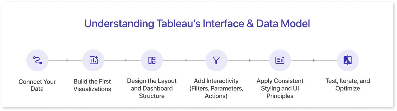
Before you start creating dashboards, it's essential to familiarize yourself with Tableau’s workspace and how it handles data. Tableau has a user-friendly drag-and-drop interface that allows you to build visualizations quickly, but it also uses a complex data model based on dimensions and measurements. Dimensions are categorical fields like names, dates, or regions, while measures are numerical fields like sales or profit. Understanding this difference is key to building informative charts. (Source)
Tableau also supports relationships, joins, and blends between multiple data sources, making it flexible for complex analysis. Once you're familiar with the interface, you’re ready to begin building your dashboard. Here’s a step-by-step guide on how to create a dashboard in Tableau:
Step 1: Connect Your Data
Begin by connecting Tableau to your data source. This could involve an Excel spreadsheet, a CSV, Google Sheets, or a live database such as SQL Server or Snowflake. Tableau's "Data Source" option lets you preview and clean your data if necessary, such as removing nulls, renaming fields, or creating calculated columns.
Step 2: Build the First Visualizations
Drag and drop dimensions and measurements into the Rows and Columns shelves to create simple charts. Use the "Show Me" panel to see chart choices based on your data. To build your dashboard, begin with essential KPIs such as total revenue, number of orders, or average ratings.
Step 3: Design the Layout and Dashboard Structure
Navigate to the “Dashboard” tab and drag your visualizations onto the blank canvas. Use containers (horizontal and vertical) to organize charts neatly. Think of this step as arranging the story you want to tell with your data, grouping related visuals, and leaving space for titles, legends, and filters.
Step 4: Add Interactivity (Filters, Parameters, Actions)
Make your Tableau dashboards more dynamic by adding filters (such as area or date), parameters for customizable inputs, and interactive dashboard actions. These features enable users to explore the data on their own terms and uncover insights more efficiently.
Step 5: Apply Consistent Styling and UI Principles
Stick to clean design rules, such as consistent fonts, color palettes, and spacing. Use tooltips and labels for better readability. These are essential parts of Tableau dashboard design best practices.
Step 6: Test, Iterate, and Optimize
Before you share your dashboard, test it on various screen sizes and data filters. Receive feedback from stakeholders and make improvements. Check performance; large datasets can slow things down, so use data extracts and filters sparingly to keep everything operating smoothly.
With these steps, you’ve gone from connecting raw data to building a fully functional, interactive dashboard in Tableau. Now, it’s time to share your work and let others explore the insights you’ve uncovered.
Publishing & Sharing Your Dashboard
Once your dashboard is complete, the last step is to make it available to your audience. Tableau provides numerous options for publishing and sharing dashboards, based on your setup and who needs access. Whether presenting to internal teams or a larger audience, you must use the appropriate way to ensure your dashboard is safe, engaging, and easy to use.
1. Publish to Tableau Server or Tableau Online:
If you're using Tableau Server or Tableau Online, you may publish your dashboard from Tableau Desktop. This enables users in your business to view the dashboard via a web browser. You can easily configure permissions, schedule data refreshes, and manage user access.
2. Use Tableau Public (for public sharing):
Tableau Public is the best solution for showcasing your Tableau data visualizations publicly, such as in a portfolio or blog. It’s a free platform that allows anyone to view and interact with dashboards online.
You can explore an example of a Tableau dashboard shared on Tableau Public: [here]
3. Export as PDF or Image:
Exporting your dashboard as a PDF or image is ideal for non-interactive sharing, such as reports or presentations, because it is easy to view on any device, even offline.
4. Embed in a Website or Portal:
A simple embed code from Tableau Server, Online, or Public allows you to integrate your dashboard into websites, corporate portals, or applications. This keeps the dashboard interactive while still blending into your platform.
5. Share Tableau Packaged Workbooks (TWBX):
If your audience uses Tableau Desktop, sharing a packaged workbook (.twbx) allows them to open and explore the dashboard offline. It includes the data and visualizations in one file for easy collaboration.
Before publishing, double-check access settings and data sensitivity. Ensure the right users have access and that any private information is properly handled.
Tips for Making Dashboards User-Friendly
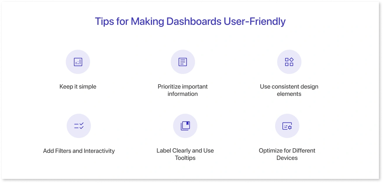
A good dashboard not only displays data, but also allows people to understand and interact with it. Here are some suggestions to make your dashboard easy, accessible, and effective:
- Keep It Simple: Avoid clutter. Focus on key indicators and limit the number of charts on a single screen. A simple layout allows consumers to grasp ideas quickly and without feeling overwhelmed.
- Prioritize Important Information: Place the most significant visuals at the top or top-left, where the eye instinctively begins. Use size, color, and positioning to focus on what is most important.
- Use Consistent Design Elements: Wherever possible, keep the color scheme, font style, and chart types consistent. This creates a visual rhythm and decreases consumers' cognitive stress.
- Add Filters and Interactivity: Interactive filters, dropdowns, and hover tooltips allow users to explore the data on their own terms. This improves engagement and makes the dashboard more useful for a range of questions.
- Label Clearly and Use Tooltips: Use clear titles, axis labels, and legends. Add custom tooltips with short explanations or extra details to help users interpret the visuals without confusion.
- Optimize for Different Devices: Test your dashboard on different screen sizes, especially if it will be viewed on tablets or phones. Use Tableau’s device preview feature to adjust layouts accordingly.
Creating dashboards in Tableau does not have to be intimidating. By following a clear approach, designing thoughtfully, and prioritizing usability, you can transform raw data into meaningful, interactive narratives. Start small, keep learning, and you'll soon be able to create dashboards like an expert.
Conclusion
Building dashboards in Tableau doesn’t require advanced expertise. By following a structured approach and focusing on clarity, it’s easy to create a dashboard in Tableau that delivers real insight. Thoughtful layout, interactivity, and adherence to Tableau dashboard design best practices will result in professional-grade Tableau UI dashboards.
Frequently Asked Questions
The first step is to connect your data source in Tableau. Whether you're using an Excel sheet, CSV, or live database, Tableau makes it easy to bring in your data and start building visualizations.
Yes, Tableau is known for its user-friendly interface. Even beginners can build their first Tableau UI dashboards by following a step-by-step approach and sticking to basic Tableau dashboard design best practices.
A good design focuses on clarity, consistency, and user interaction. Use clean layouts, limit clutter, apply filters for interactivity, and ensure the most important KPIs are easy to find. Following Tableau dashboard design best practices ensures your dashboard is effective and easy to use.
You can publish dashboards to Tableau Public, Tableau Server, or Tableau Online. Alternatively, you can export them as images, PDFs, or share Tableau Packaged Workbooks (.twbx) with other Tableau Desktop users.
Tableau Public is a free platform where users can share dashboards publicly. It’s a great way to showcase your Tableau dashboard example in a portfolio or blog. However, avoid using it for sensitive or private data.
Prompt it. Wireframe it with Mokkup.ai.
