Oncology analytics is transforming how healthcare organizations manage and improve cancer care. Through oncology data analytics and visualization tools, healthcare providers can uncover insights that will enhance patient outcomes and drive more effective oncology data management.
In 2018, an estimated 9.6 million deaths and 18.1 million new cases of cancer were reported worldwide, according to the International Agency for Research on Cancer’s (IARC) GLOBOCAN database. This made cancer the second leading cause of death globally, highlighting the urgent need for more thoughtful, faster decision-making in oncology.
Despite the growing volume of medical data, many hospitals still rely on fragmented systems that limit the potential of oncology clinical data management. Modern oncology analytics platforms help close this gap by bringing together data from electronic health records, pathology reports, genomic sequencing, and imaging systems.
The result is a unified, real-time view that enables doctors, researchers, and administrators to make more informed decisions and enhance patient care at every stage.
Table of Contents
- Why Oncology Needs Data Dashboards
- Top 5 Oncology Dashboards That Drive Better Outcomes
- Benefits of Using Oncology Dashboards
- How to Get Started with Oncology Dashboards
Why Oncology Needs Data Dashboards
Cancer care involves handling massive volumes of data, ranging from diagnosis and test results to therapy updates and patient outcomes. When this data is housed in several systems, healthcare professionals struggle to gain a comprehensive and timely picture of each patient's progress. Data dashboards address this issue by consolidating all information in one location, enabling doctors, researchers, and administrators to make faster and more informed decisions.
Here’s why dashboards are essential in oncology care:
- Fragmented Data Systems: Oncologists often rely on multiple databases for patient records, lab results, and imaging data, which makes it hard to see the complete treatment picture.
- Delayed Updates: Without centralized access, it can take time for new test results or treatment changes to reach all care teams.
- Limited Visibility: Scattered data hinders hospitals' ability to identify patterns, track outcomes, or detect potential risks early.
- Centralized Insights: Dashboards combine data from multiple systems into a single, real-time view, allowing care teams to monitor treatment progress and overall performance.
- Better Coordination: When all departments work from the same dashboard, communication improves and treatment decisions become more consistent.
- Real-Time Monitoring: Dashboards help track patient responses, treatment timelines, and recovery patterns, enabling timely interventions and informed decision-making.
- Data-driven Decisions: With up-to-date insights, healthcare providers can make evidence-based choices that improve accuracy, efficiency, and patient outcomes.
In a nutshell, cancer treatment dashboards offer a centralized view of patient data, facilitating more efficient oncology data management and enhanced collaboration.
Top 5 Oncology Dashboards That Drive Better Outcomes
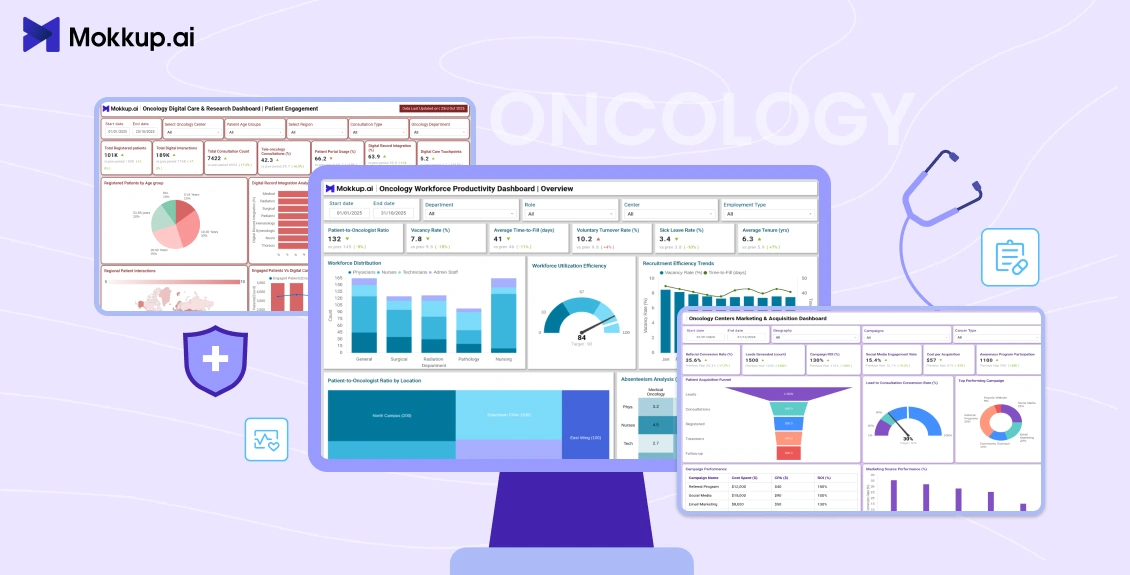
Mokkup.ai offers a collection of specialized oncology dashboard templates to help healthcare organizations analyze performance, streamline operations, and improve patient outcomes. These templates cover all aspects of oncology administration, including staff productivity, patient outreach, digital care innovation, and survivorship tracking.
Each dashboard template enables hospitals, research centers, and public health organizations to turn raw data into meaningful visuals. By helping teams plan and visualize key metrics early, these templates support better decision-making, improved collaboration, and more effective patient care strategies.
Here are five Mokkup.ai oncology dashboard templates that help transform how healthcare organizations track and manage cancer treatment:
1. Oncology Workforce Productivity Dashboard:
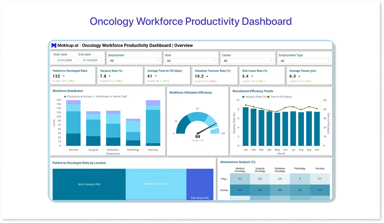
Efficient oncology care depends on how well clinical and support teams are utilized. This oncology dashboard gives hospital administrators a comprehensive view of staff productivity, workload balance, and patient-to-staff ratios. It helps ensure that healthcare professionals are optimally assigned, reducing burnout and improving patient care delivery.
How it helps:
- Tracks key metrics such as average patient load per staff member and utilization rates.
- Monitors performance trends across doctors, nurses, and technicians.
- Identifies staffing gaps or overworked departments.
- Enables better planning for shifts and workload distribution.
With Mokkup.ai’s Oncology Workforce Productivity Dashboard template, administrators can visualize KPIs quickly and adjust layouts before implementation, ensuring efficient workforce management even before real-time data is connected.
2. Oncology Centers Marketing and Acquisition Dashboard:
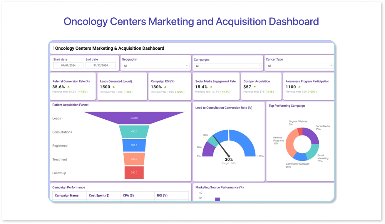
Patient acquisition and outreach are crucial for oncology centers seeking to expand their reach. This dashboard offers insights into referral patterns, campaign performance, and conversion rates, enabling centers to refine their marketing strategies and community engagement efforts.
How it helps:
- Tracks campaign performance across different channels and regions.
- Analyzes referral sources, conversion rates, and patient acquisition costs.
- Identifies the most effective campaigns for specific treatment types.
- Supports strategic decision-making with data-backed insights.
The Mokkup.ai Oncology Centers Marketing and Acquisition Dashboard template allows marketing teams to visualize campaign data clearly and identify the most successful channels, making data-driven patient acquisition planning more efficient.
3. Oncology Digital Care and Research Dashboard
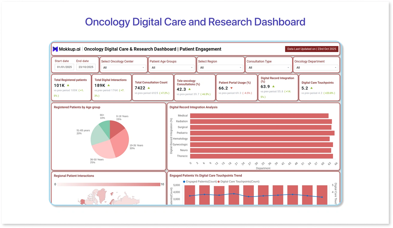
As digital health and telemedicine transform cancer care, this dashboard tracks the impact of digital solutions, AI models, and remote monitoring tools on treatment. It helps track patient engagement, digital consultation trends, and research-driven AI insights.
How it helps:
- Monitors digital consultations, AI-assisted diagnoses, and remote care trends.
- Tracks patient engagement in virtual programs and telehealth adoption rates.
- Visualizes ongoing research outcomes and predictive analytics.
- Helps organizations evaluate the ROI of digital transformation in oncology.
With Mokkup.ai’s Oncology Digital Care and Research Dashboard template, healthcare teams can visually simulate and test digital trends before integrating live data, ensuring their dashboards accurately reflect real-world digital care patterns.
4. Oncology Screening and Outreach Dashboard
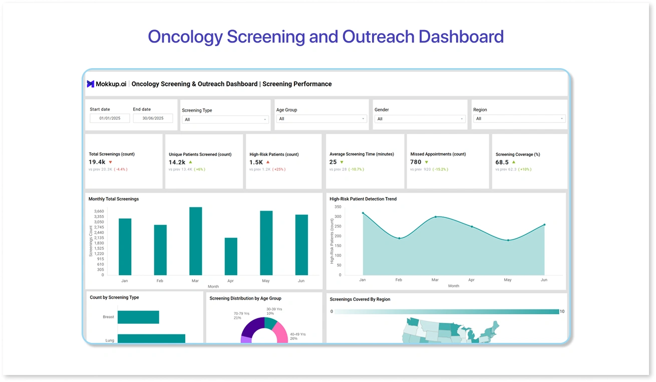
Early detection saves lives, and this dashboard focuses on screening initiatives and performance in outreach. It helps hospitals and public health programs track participation rates, screening coverage, and demographic reach, enabling them to identify areas that require more attention.
How it helps:
- Tracks screening volumes, participation rates, and outcomes.
- Highlights under-screened regions or population groups.
- Monitors campaign effectiveness for awareness programs.
- Assesses the success rates of early detection over time.
The Mokkup.ai Oncology Screening and Outreach Dashboard template enables organizations to visualize screening performance across demographics and locations, helping teams plan targeted awareness drives and increase participation.
5. Oncology Survivorship Dashboard
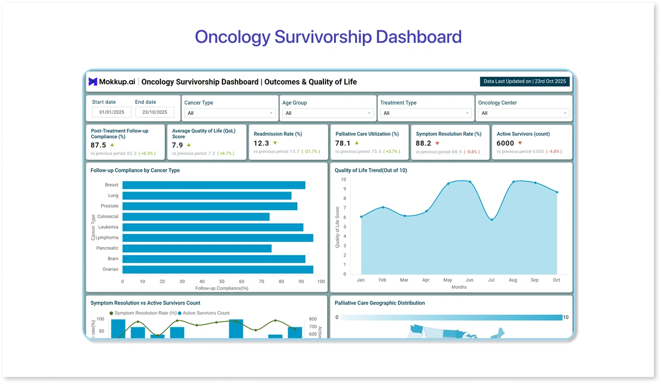
Cancer care doesn’t end with treatment. This oncology dashboard helps track survivorship trends, follow-up care, and readmission rates, providing a comprehensive view of long-term patient outcomes. It supports hospitals in building stronger post-treatment care strategies and improving the quality of life for survivors.
How it helps:
- Tracks survivorship rates, post-treatment recovery timelines, and follow-up visits.
- Monitors readmission trends to identify potential risks or care gaps.
- Helps evaluate long-term support programs and patient satisfaction.
- Enables personalized follow-up strategies for better recovery outcomes.
With Mokkup.ai’s Oncology Survivorship Dashboard, healthcare teams can design and test KPIs that reflect patient recovery and quality of life metrics, allowing continuous improvement of survivorship programs before connecting live data.

Benefits of Using Oncology Dashboards
Oncology dashboards combine complex data from multiple sources and present it in a clear and actionable format. They enable healthcare teams to focus on what is truly important, thereby improving patient outcomes and operational efficiency.
Key benefits include:
- Enhanced Patient Monitoring and Treatment Personalization: Dashboards enable clinicians to visualize patient progress and tailor treatment plans according to individual responses and clinical history.
- Data-Driven Decision-Making: By providing clear performance metrics, dashboards help doctors, researchers, and administrators to make informed decisions backed by data rather than assumptions.
- Better Collaboration Across Teams: When medical, research, and administrative departments work from the same visual framework, it becomes easier to coordinate efforts, share insights, and maintain consistency in care delivery.
- Enhanced Reporting Accuracy: Dashboards simplify compliance reporting and accreditation processes by consolidating verified data into structured, easy-to-share visuals.
These oncology dashboards support more accurate oncology data analytics by transforming fragmented information into meaningful visuals. With better oncology clinical data management, teams can deliver more consistent and personalized patient care.
How to Get Started with Oncology Dashboards
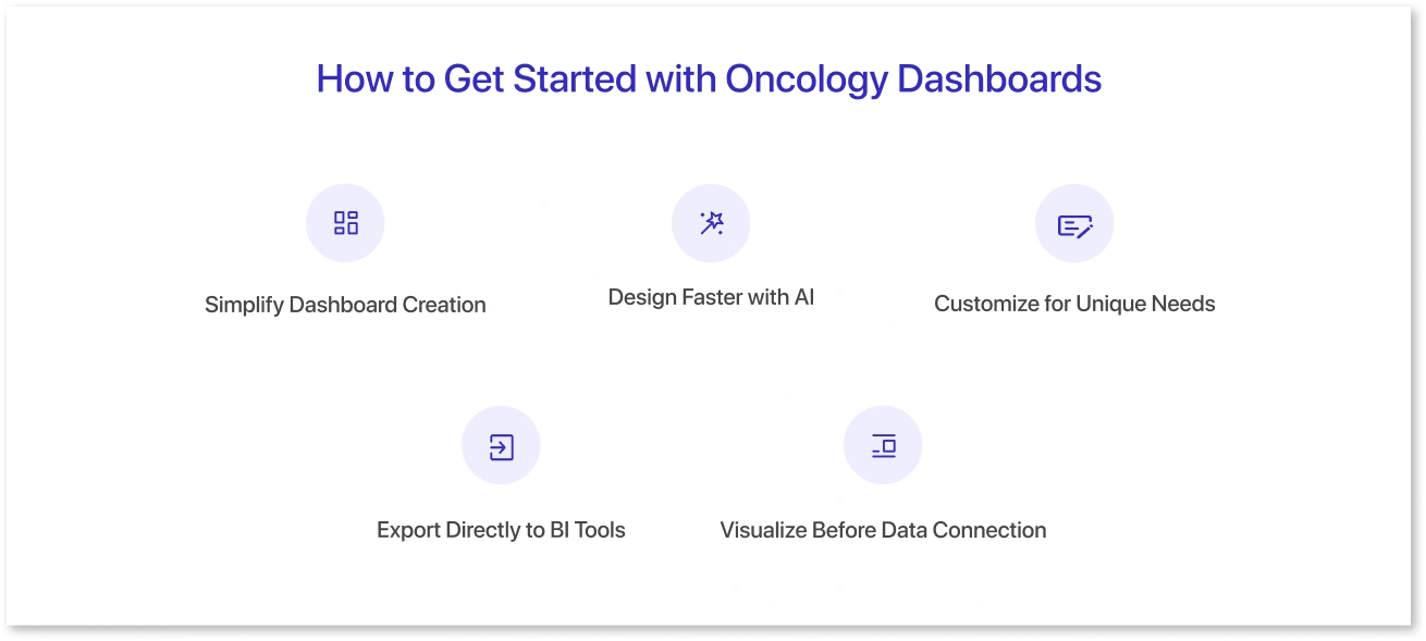
Mokkup’s oncology dashboard templates simplify oncology data management by helping users design, test, and export cancer treatment dashboards efficiently.
- Simplify Dashboard Creation: With pre-built layouts and healthcare-specific KPIs, teams may easily develop structured dashboard mockups that align with their reporting objectives.
- Design Faster with AI: The Create with AI function enables users to create complete dashboard designs in minutes by simply defining their needs. This allows teams to test concepts and refine visual structures quickly.
- Customize for Unique Needs: Each template is easily customizable to meet hospital performance measurements, research results, or patient engagement objectives, maintaining departmental flexibility.
- Export Directly to BI Tools: Once finalized, designs can be exported as Power BI or Tableau files, enabling teams to transition seamlessly from wireframes to development without recreating layouts.
- Visualize Before Data Connection: Teams can preview dashboards before connecting to live data sources, reducing rework, aligning stakeholders early, and speeding up BI delivery.
By simplifying the design-to-development process, Mokkup helps healthcare teams to focus more on insights and outcomes rather than technical complexities.
Conclusion
Oncology dashboards play a crucial role in transforming complex medical data into actionable insights that support informed treatment decisions and improved patient outcomes. By visualizing critical trends, from patient progress to operational efficiency, healthcare teams can identify gaps, streamline processes, and respond more effectively to evolving care needs.
Data visualization not only enhances clinical efficiency but also fosters collaboration across physicians, researchers, and administrators. It consolidates scattered data into a unified view, helping to drive informed, timely, and impactful healthcare strategies. Through oncology analytics and visualization tools, hospitals can make informed, data-driven decisions that enhance patient outcomes and refine their oncology data management strategies.
Frequently Asked Questions
They usually track patient progress, treatment outcomes, staff performance, screening volumes, and survivorship trends.
Pick a template that matches your goals, whether it’s improving workforce efficiency, tracking patient care, or monitoring outreach efforts.
Yes, you can finalize the design layout and metrics before connecting actual data to ensure alignment with team requirements.
Focus on maintaining data accuracy, consistency, privacy, and timely updates across all systems.
They simplify complex data, enabling teams to make faster decisions, identify trends, and enhance overall care quality.
Prompt it. Wireframe it with Mokkup.ai.
