What is an Oncology Workforce Productivity Dashboard?
An Oncology Workforce Productivity Dashboard template provides HR directors, operations managers, and clinical leaders with a comprehensive view of cancer center staff performance and workforce efficiency. It consolidates multiple workforce metrics into one interactive interface, helping teams monitor staffing adequacy, clinical output, and employee engagement. This dashboard wireframe focuses on oncology workforce productivity metrics, enabling cancer centers to track how effectively oncologists, nurses, and administrative staff are allocated, identify gaps in staffing, and optimize workforce utilization.
By integrating workforce data with patient outcomes and operational KPIs, centers can make informed decisions to improve both staff satisfaction and patient care.
How to Create an Oncology Workforce Productivity Dashboard
You don’t need to build your report from scratch—just start with a ready-to-use Oncology Workforce Productivity dashboard template from Mokkup. Add in your data and export it however you like. Here’s how to do it:
1. Create or Log in to Your Mokkup Account
Start by signing up on Mokkup.ai using your email. If you already have an account, just log in, and you’ll be good to go.
2. Choose and Customize Your Dashboard Template
Find the Oncology Workforce Productivity Dashboard template in the Templates section. Use the drag-and-drop editor to adjust KPIs, edit filters, or add elements based on your data.
3. Export to Your BI Tool
Once your dashboard wireframe is ready, use the BI Tool Export feature to send it directly to Power BI or Tableau for further analysis and enhancements. You can also download the dashboard as a PDF, PNG, or JPEG, embed it on a platform, or invite your team to collaborate.
Note: This is a Pro template. You’ll need a Pro subscription on Mokkup to use and customize this dashboard wireframe. Upgrade anytime to unlock full access.
Oncology Workforce Productivity Dashboard Example
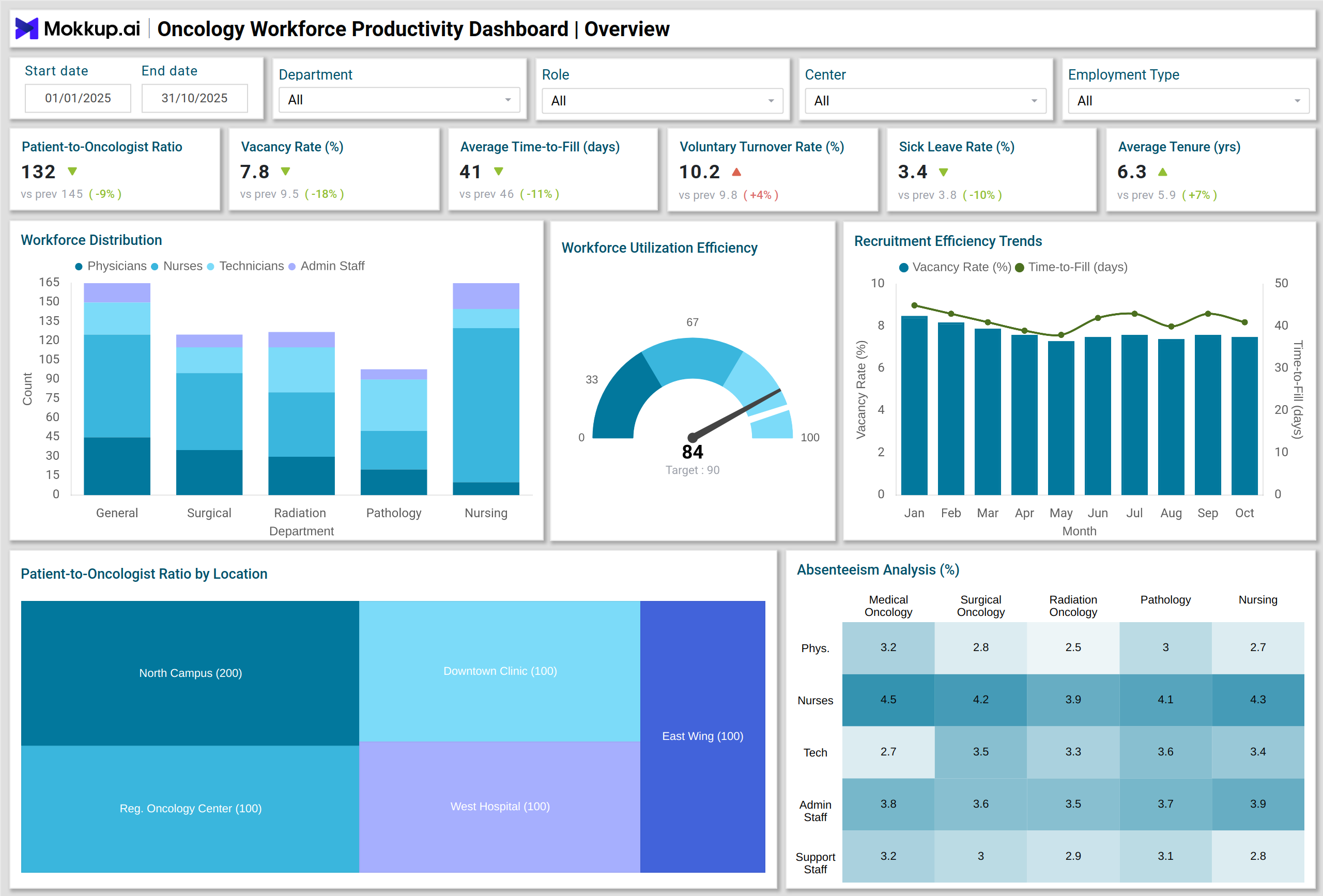
A typical oncology staff productivity dashboard includes multiple visual components to display key metrics clearly. These include Stacked Column Charts to show workforce distribution by role and department, treemaps for patient-to-oncologist ratios across multiple centers, heatmaps highlighting absenteeism rates by department, Gauge Charts measuring workforce utilization efficiency, Combo Charts tracking productivity against overtime hours, and Waterfall Charts illustrating productivity gain attribution.
For instance, a dashboard might show that one oncology center has a higher patient-to-oncologist ratio, signaling the need for additional staffing or reallocation. Simultaneously, absenteeism heatmaps can pinpoint departments with high sick leave rates, enabling proactive management interventions. This example demonstrates the dashboard’s role in cancer center workforce efficiency tracking, helping administrators make data-driven decisions and optimize staff performance.
How to Analyze Data in Oncology Workforce Productivity Dashboards
Oncology workforce productivity dashboards help cancer centers monitor staffing efficiency, workforce stability, and clinical performance. By tracking key metrics, administrators can optimize workforce allocation, prevent burnout, and ensure high-quality patient care:
- Monitor Patient-to-Oncologist Ratios: Ensure staffing aligns with patient demand.
- Track Vacancy Rates & Time-to-Fill: Identify recruitment bottlenecks and optimize hiring processes.
- Assess Voluntary Turnover & Sick Leave Rates: Measure workforce stability and identify risk areas.
- Compare Productivity Ratios: Evaluate clinical output per labor dollar across departments.
- Analyze Overtime Hours: Monitor workload to prevent staff burnout.
- Evaluate Training & Certification Status: Ensure compliance and skill readiness.
- Review Patient Satisfaction Scores: Correlate workforce efficiency with patient outcomes.
Organizations can consistently analyze these metrics to improve workforce allocation, enhance clinical performance, and optimize operational efficiency.
Benefits of Oncology Workforce Productivity Dashboards
These dashboards provide actionable insights that drive HR and operational excellence in cancer centers:
- Improved Workforce Optimization: Align staffing with patient demand to reduce bottlenecks.
- Enhanced Decision-Making: Real-time analytics guide recruitment, training, and resource allocation.
- Higher Clinical Efficiency: Track productivity gains and identify underperforming areas.
- Reduced Turnover & Absenteeism: Insights on voluntary turnover and sick leave enable proactive measures.
- Better Patient Outcomes: Efficient staffing improves patient care and satisfaction.
- Compliance & Certification Tracking: Ensure all staff maintain active licenses and complete training.
These benefits make oncology workforce dashboards indispensable for both HR and operations management in cancer centers.
KPIs to Track in Oncology Workforce Productivity Dashboards
Monitoring these KPIs ensures balanced workloads, efficient staffing, and high clinical performance:
- Patient-to-Oncologist Ratio: Ensures balanced clinical workload.
- Vacancy Rate (%): Monitors open positions and staffing adequacy.
- Average Time-to-Fill (Days): Evaluates recruitment efficiency.
- Voluntary Turnover Rate (%): Measures staff retention and stability.
- Sick Leave & Absenteeism Rate (%): Tracks workforce availability.
- Average Tenure (Years): Indicates employee loyalty and experience levels.
- Productivity Ratio (Clinical Output per Labor Dollar): Assesses cost-effectiveness.
Frequently Asked Questions
Q1. Who should use an oncology workforce productivity dashboard?
HR directors, operations managers, and clinical leaders in cancer centers use the dashboard to track workforce efficiency, allocation, and performance metrics.
Q2. How does the dashboard improve workforce efficiency?
By consolidating key metrics like turnover, absenteeism, productivity ratios, and patient-to-oncologist ratios, the dashboard identifies inefficiencies and supports strategic staffing decisions.
Q3. Is training and certification tracking included?
Absolutely. This dashboard can monitor staff training completion rates and active licenses, ensuring regulatory compliance.
Q4. How does it impact patient satisfaction?
By optimizing staff allocation and monitoring workforce efficiency, patient wait times decrease, staff engagement increases, and overall patient satisfaction improves.