What is an Oncology Screening & Outreach Dashboard?
An Oncology Screening & Outreach Dashboard is a healthcare analytics tool designed to track, monitor, and optimize cancer screening programs and patient outreach efforts within hospital or institutional settings. This real-time oncology screening & outreach dashboard brings together data on total screenings, high-risk patient identification, engagement campaigns, and regional coverage—making it easier for healthcare administrators to evaluate the effectiveness of their oncology outreach strategies and improve patient care outcomes. Using the best oncology screening dashboard like this ensures your team can visualize program performance at a glance, identify gaps, and make data-driven decisions to enhance community health initiatives.
How to Create an Oncology Screening & Outreach Dashboard
You don’t need to build your report from scratch—just start with a ready-to-use Oncology Screening & Outreach dashboard template from Mokkup. Add in your data and export it however you like. Here’s how to do it:
1. Create or Log in to Your Mokkup Account
Start by signing up on Mokkup.ai using your email. If you already have an account, just log in, and you’ll be good to go.
2. Choose and Customize Your Dashboard Template
Find the Oncology Screening & Outreach Dashboard Dashboard template in the Templates section. Use the drag-and-drop editor to adjust KPIs, edit filters, or add elements based on your cancer screening program metrics.
3. Export to Your BI Tool
Once your dashboard wireframe is ready, use the BI Tool Export feature to send it directly to Power BI or Tableau for further analysis and enhancements. You can also download the dashboard as a PDF, PNG, or JPEG, embed it on a platform, or invite your team to collaborate.
Note: This is a Pro template. You’ll need a Pro subscription on Mokkup to use and customize this dashboard wireframe. Upgrade anytime to unlock full access.
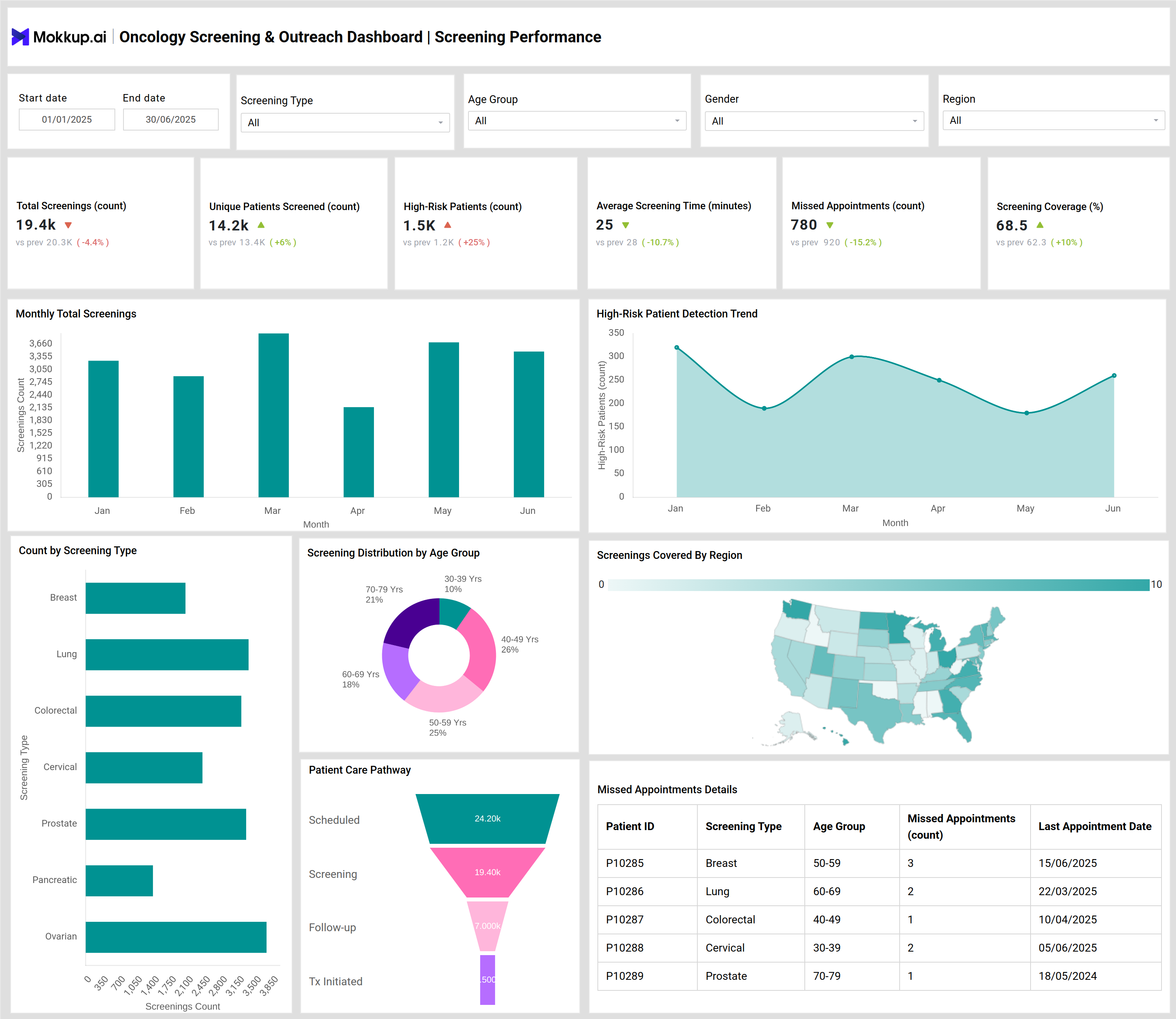
Oncology Screening & Outreach Dashboard Example
The Oncology Screening & Outreach Dashboard template provides an end-to-end view of your institution’s cancer screening performance and outreach campaigns. For example, the dashboard displays cancer screening program metrics such as total screenings conducted, unique patients reached, missed appointments, patient engagement rate of outreach campaigns, and screening coverage across regions. Visual elements include charts for monthly screenings, high-risk patient detection trends, campaign timelines, and geographical coverage, allowing users to analyze both clinical performance and community outreach effectiveness in one snapshot.
How to Analyze Data in Oncology Screening & Outreach Dashboards
Here’s how cancer hospitals can make the most of the data available on the Oncology Screening & Outreach dashboards:
- Identify monthly screening trends by visualizing the number of screenings performed and assess any seasonal changes in patient participation.
- Track unique patient outreach and coverage percentages to evaluate the scope and inclusivity of your cancer screening programs.
- Analyze missed appointment rates to spot areas for intervention and improve patient follow-up.
- Use geographic and age-group distribution charts to discover under-served demographics or regions and tailor future outreach programs accordingly.
- Monitor high-risk patient detection trends to measure early cancer identification effectiveness and refine risk stratification criteria.
Benefits of Oncology Screening & Outreach Dashboards
An Oncology screening & outreach dashboard offers below benefits:
- Faster Decision-Making – Enables real-time tracking of oncology program analytics for swift, informed actions.
- Operational Efficiency – Highlights bottlenecks and missed appointment patterns to streamline workflows.
- Campaign Performance Insights – Measures outreach impact and engagement success for optimized program execution.
- Targeted Community Screening – Uses regional and demographic data to enhance outreach strategies.
- Cancer Prevention Optimization – Provides actionable insights to improve early detection and screening programs.
KPIs to Track in Oncology Screening & Outreach Dashboards
- Total Screenings (count): Measures the total number of completed cancer screenings.
- Unique Patients Screened (count): Tracks the number of distinct individuals screened for cancer.
- High-Risk Patients Count: Identifies patients flagged as high-risk during screenings.
- Screening Coverage (%): Assesses the percentage of eligible population covered by the cancer screening program.
- Average Screening Time (minutes): Monitors time spent per screening for efficiency improvements.
- Missed Appointments (count): Counts failed or non-attended appointments in the screening schedule.
Frequently Asked Questions
1.What types of cancer screening are tracked in this dashboard?
The dashboard tracks multiple screening types, including breast, lung, colorectal, cervical, prostate, pancreatic, and ovarian cancer screenings, allowing institutions to monitor various programs simultaneously.
2.How does the dashboard support patient outreach?
It provides metrics on communication channels used (SMS, email, calls, events), measuring both reach and engagement rates to optimize patient outreach strategies for higher responsiveness.
3.How is campaign performance assessed?
Campaign performance is assessed using reach counts, engagement rates, success rates, and average cost per campaign type, ensuring efficient resource allocation and impact measurement.