Funnel charts are a prominent way to visualize customer journeys, depicting how your leads move from the sales process to the conversion stage. According to the latest statistics, 570,000 sites utilize sales funnel technology to track user behavior.
Marketing funnel visualization can often help marketers understand where the lead is uninterrupted and what improvements are needed. Therefore, sales funnel visualization becomes crucial in pinpointing obstacles and refining user experiences when a series of steps is tracked with a structured diagram.
This blog will explain the basic understanding of funnel charts, elements, and best practices for optimizing a sales or marketing funnel.
Stay tuned!
Table of Contents
- What is a Funnel Chart?
- What are the Crucial Elements of a Funnel Visualization?
- When Should You Use a Funnel Chart?
- Challenges Encountered in Funnel Data Visualization
- Best Practices for Implementing Funnel Diagrams
- Use Cases of Funnel Charts
What is a Funnel Chart?
A funnel chart is a visual representation showing how data moves through different process phases sequentially. In a structured funnel graph, as the data advances through successive stages, its quantity or value usually diminishes. This kind of chart is often used to illustrate a variety of processes, including project management workflows, recruitment pipelines, and customer conversions.
For instance, consider a marketing campaign designed to produce leads for a software product. At the initial stage, the campaign reaches 500 potential customers. 200 individuals engage further from this pool by signing up for a free trial. Among these trial users, only 50 eventually become paying customers.
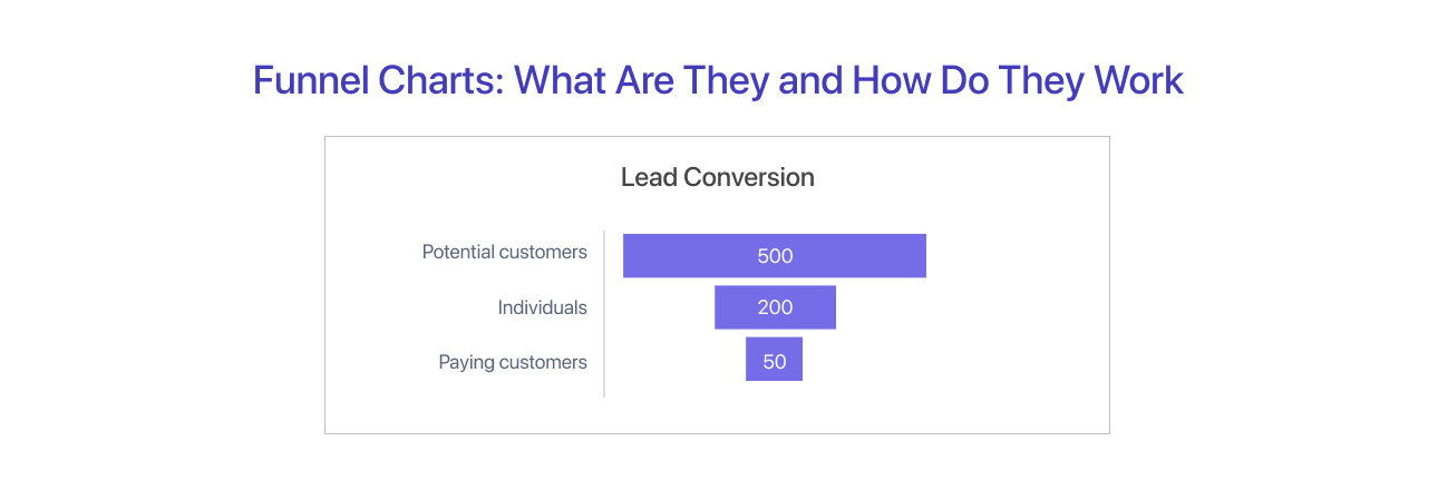
This chart shows the process visually, with fewer people at each stage, from reaching out to becoming paying customers.
What are the Crucial Elements of a Funnel Visualization?
The simplicity of a funnel chart contradicts the amount of data points it can represent. To understand how a funnel chart shows data changes, we need to know its basic parts and how it progresses.
1. Stages or Sections
A funnel chart has sections that show different stages in a process. Arranged vertically, the sections follow a descending size order, with the top one being the biggest and the ones below getting smaller. Data moves down the funnel chart, getting smaller as it goes, creating smaller segments towards the bottom. The sizes of these segments show how important each stage is in the process.
2. Quantitative Data
Each part of the funnel chart has data values that show the amount or measurement for that specific stage. These values, like percentages or numbers, show how data moves through different steps and give us information. Variations in these values between the segments provide important insights on how the data moves or transitions during the process.
3. Entry & Exit Points
The entry at the top and exit at the bottom of the funnel chart serve as two obvious points that frame its visual representation. The process begins with entering the initial volume of data or values. This is the beginning of the funnel visualization, laying the groundwork for further developments. The exit point, positioned at the narrowest part of the funnel, denotes the conclusion of the process. Thereby, it can create an impactful data visualization.
The results can take many forms, including signups, purchases, conversions, or any other desired outcome. These markers' fluctuating sizes draw attention to the decrease that occurs naturally as data moves through each step. These components work together to visually and intuitively communicate information.
When Should You Use a Funnel Chart?
It is important to understand where to use a funnel chart. A funnel chart is a specially designed visual tool that is limited to a certain type of data. Funnel charts work well if the data has the following characteristics:
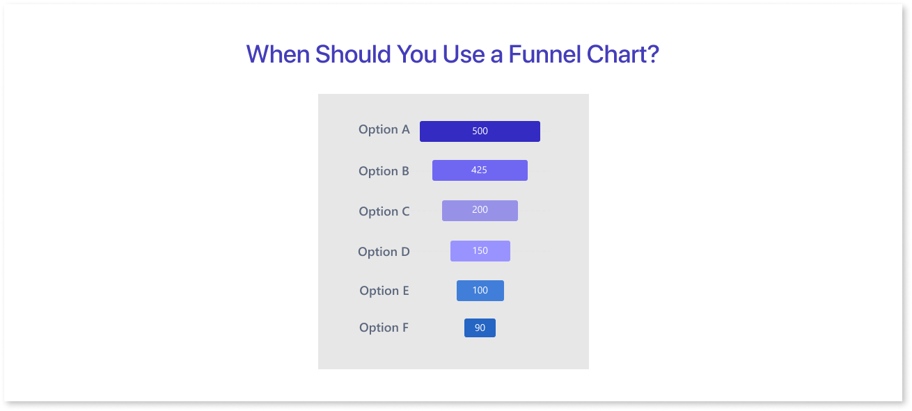
- There are at least three stages in the process that the data goes through.
- At each stage, there's less data. The first stage has more data than the second, and the second has more than the third, and it keeps going like that.
- The sequential stages provide a logical data flow, aligning with business objectives and opportunities.
Each stage shows a different part of the process, demonstrating how the data changes as it moves towards the goal.
Main Uses of the Funnel Charts
The most effective way to show how a variable changes during a process is with a funnel chart. In general, funnel charts have a number of uses:
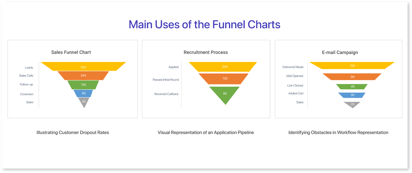
1. Illustrating Customer Dropout Rates:
In a regular sales process, it starts with a bunch of customers. Some customers leave at different stages. A funnel chart displays how many customers move from one sales step to the next. It also shows the number of customers who abandon or leave the sales process.
2. Visual Representation of an Application Pipeline:
A funnel chart visually represents the progressive reduction of applicants at different stages of a process. In this case, 200 actors applied for an acting position. 120 passed the first round of auditions, and 80 proceeded to the callback phase. The chart provides a sequential narrowing of candidates from the initial pool to the final selection stage, providing a quick and clear overview of the audition process.
3. Identifying Obstacles in Workflow Representation:
Funnel charts serve as valuable tools for pinpointing bottlenecks within various business processes. A significant portion of the subscribers in the email marketing funnel chart receive multiple emails, yet only a small percentage of them open the email. Furthermore, an even smaller percentage clicks on the links within the emails.
This decline raises the possibility of problems, like dull content or unclear calls to action, which cause recipients to stop participating in the campaign.
4. Visualize Sales Conversion:
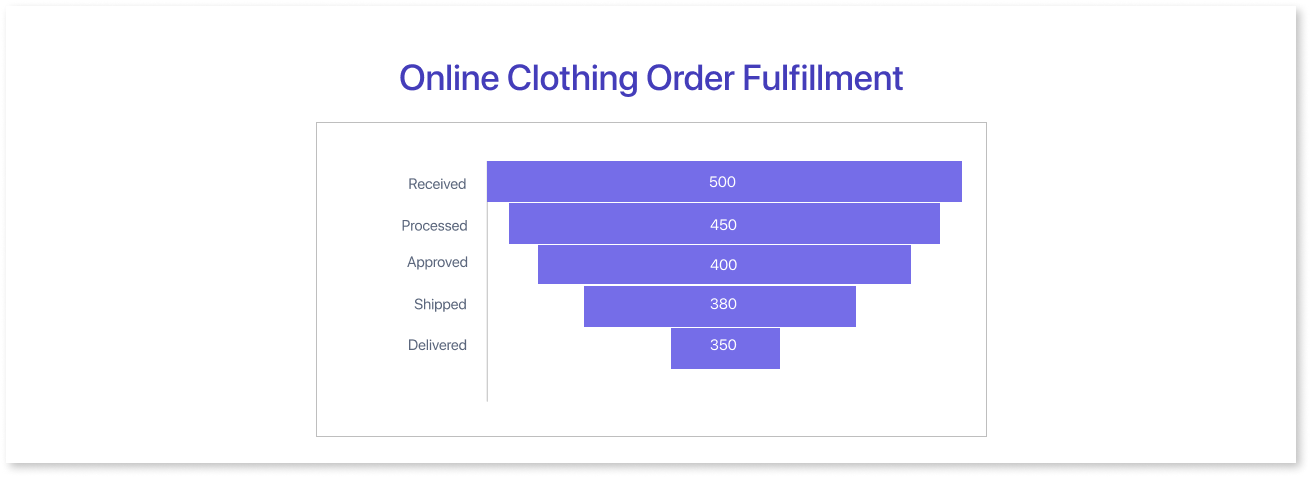
Analyzing Order Fulfillment for an Online Clothing Retailer provides an ideal scenario for using a funnel chart. The chart shows how many orders are placed and the steps they go through before being delivered to customers.
Challenges Encountered in Funnel Data Visualization
Considering the best data visualization practices, funnel charts provide additional challenges due to their particular use case and distinctive structure. Many funnel chart implementations make them more complex to interpret than required.
1. Ensuring Uniform Distance Between Funnel Chart Stages
One method of creating a funnel chart involves using a simple triangle where stage widths represent user proportions.
However, this approach can misrepresent the significance of each stage. It can be misleading to associate stage values with areas rather than widths. Larger drop-offs appear as larger areas, but the actual area depends on where the drop-off occurs. Early losses may seem more substantial than later ones due to the triangle's tapering effect.
For instance, in the example below, while the absolute drop-off between the initial and second stages equals that between the last two stages, the earlier drop-off appears larger due to its higher position on the triangle.
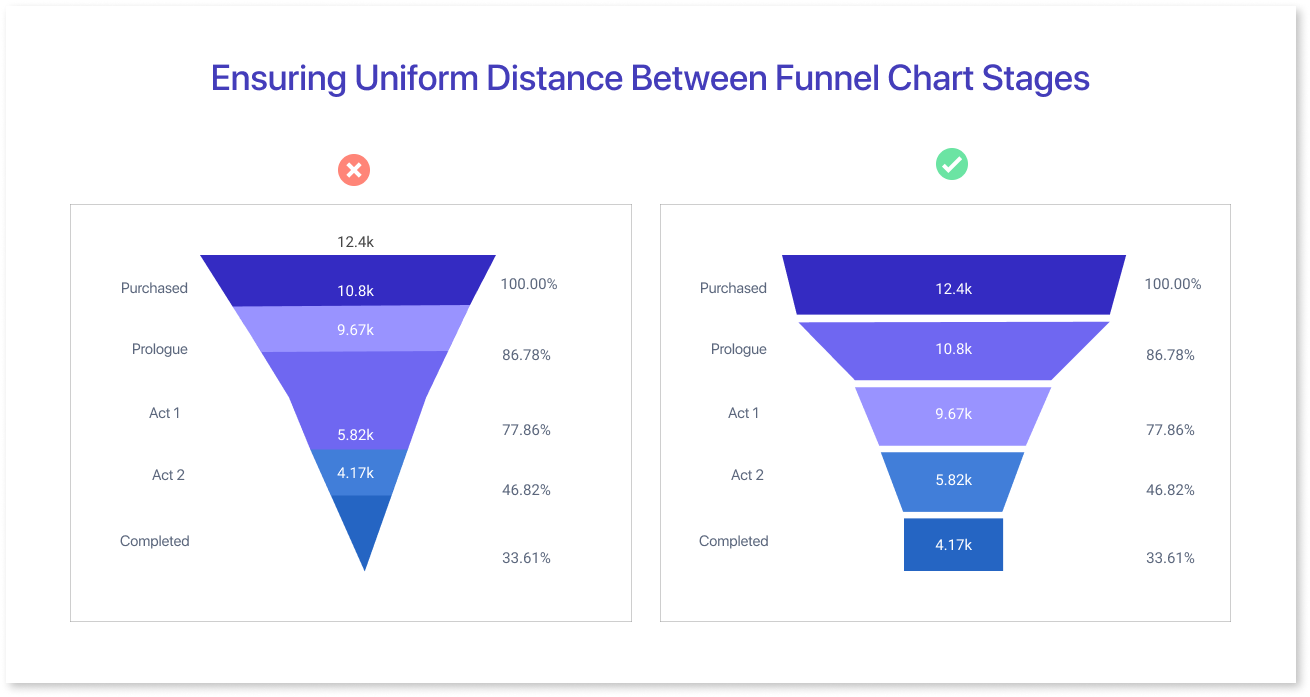
An even better method would be to space the steps equally along the vertical axis. The funnel slopes that connect these stage boundaries will now be the source of variation.
2. Aligning Labels with Measurement Positions
Ensure that the labels on a funnel chart are correctly positioned to match the corresponding data measurements or values at each stage or section of the visualization.
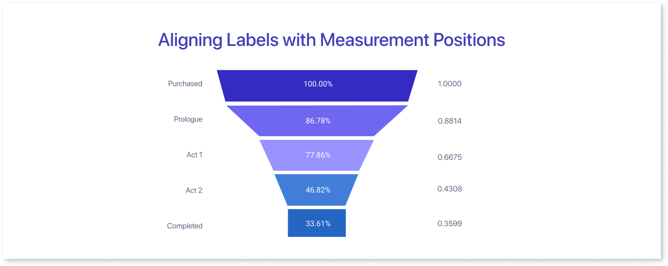
To ensure a clear and precise correlation between labels and measured points or chart segments, place labels in a way that effectively conveys their association with the information.
3. Using Bar-Style Representation for Funnel Charts
The funnel chart's original method, marking stage values on wide regions, though accurate, lacks ideal clarity. Although they attract attention, large filled-in areas don't reflect data. Instead, a better approach involves thinner boundaries with area sizes matching stage values, represented by bars.
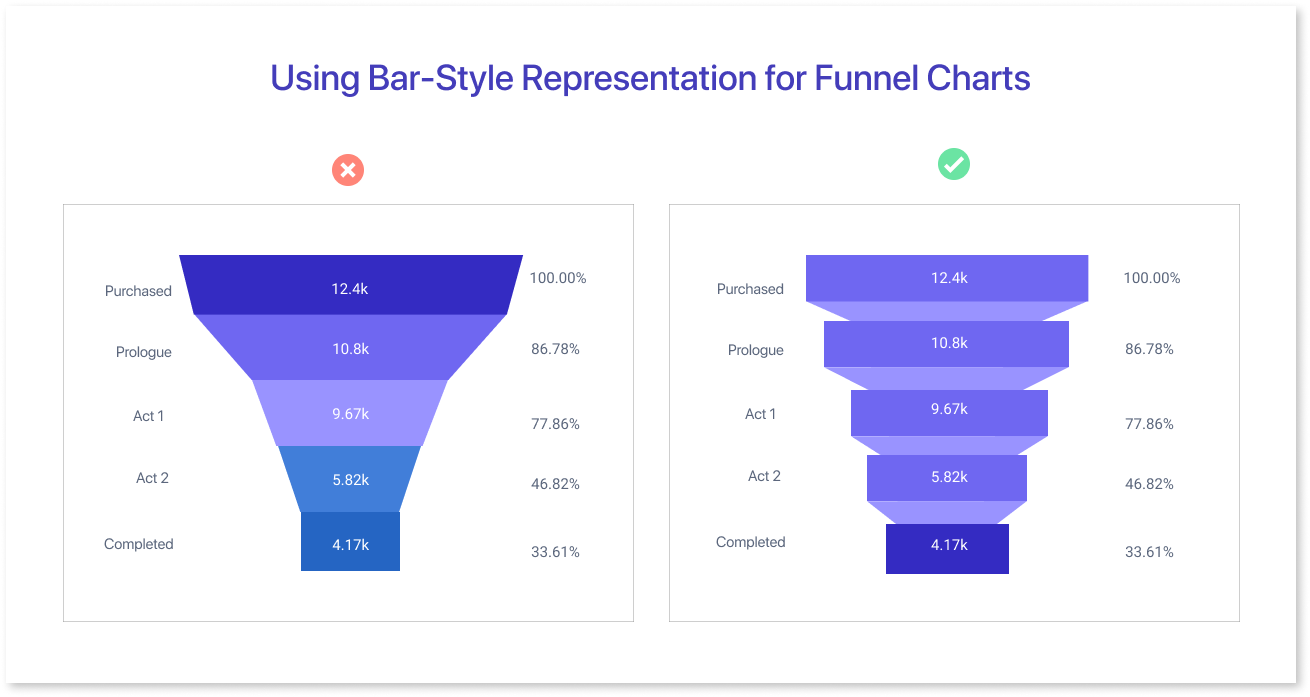
Values are represented by bars, which makes the relationship between area and value obvious and keeps focus on areas relevant to the stage. To reduce attention, connector sections can be colored subtly. This makes the funnel chart design clearer and more efficient.
When considering data visualization tools, options like Mokkup.ai can streamline the process. Access to such tools facilitates the creation of effective data visuals tailored to specific data needs, whether crafting a precise Tableau or PowerBI funnel chart or exploring alternative representations.
Best Practices for Implementing Funnel Diagrams
Effective use of funnel charts depends on implementing the best techniques to guarantee precise and understandable data display. These methods are essential for enabling a thorough and understandable representation of complex data sets.
1. Use Easy-to-Understand Annotations
Clear annotations are like signposts in a map, guiding us through the funnel chart's stages. They make it easy to pinpoint where data decreases and help us understand each step's importance.
2. Implementing an Impactful Color Palette
In a funnel chart, using different colors for the bars improves clarity and often data storytelling capability. On the other hand, if all of the bars are the same color or if the color changes gradually, viewers may become confused and find it more difficult to follow the chart's progress. Consistency or a distinct variation makes understanding easier.
3. Mind the Number of Stages
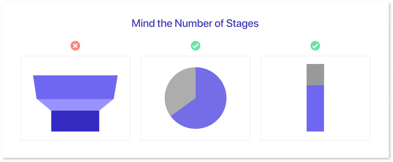
When there are only two stages, simpler graphics like pie charts or single-stacked bar graphs are more effective. These types of charts help illustrate the different components in relation to the overall total, giving a clearer picture of the process's path.
4. Neglecting Mobile-friendliness
The funnel process diagrams need to be compatible with mobile devices, as they can be viewed instantly. Neglecting to test them on smaller screens would be a mistake, which can lead to unreadable labels and even overlapping stages. Therefore, it is important to test on multiple screens to make your charts look clean and effective no matter what device they’ve been reviewed on.
Use Cases of Funnel Charts
Now that you have understood the funnel diagrams let’s understand what some prominent applications of data visualization funnel charts over multiple sectors are:
- Marketing and Sales: Many businesses use funnel charts to track their marketing and sales performance. Metrics like lead times, conversion times, and contacted prospects can be represented using sales funnel visualization.
- Website Analytics: Funnel charts can easily track the moving stages from product awareness to conversion on your website. For instance, the Google Analytics funnel visualization can help you identify the drop-off points and improve the effectiveness of your digital campaign. Also, the social media overview dashboard by Mokkup.ai gives a snapshot of content performance.
- HR analytics: HRs can also use funnel charts to visualize the recruitment stages. When candidates are sourced from the talent pool, they can be kept at the highest level, and you can narrow them down to the screening and assessment stage for a systematic filtering of applications.
- E-commerce and Conversion Rates: Many e-commerce giants use conversion funnel visualization to segment website visitors based on email follow-ups and cart recovery triggers. They can tap into customer purchase history while focusing on high-value customers who often deliver more ROI for the business.
- Event Management: Data funnel visualization helps event planners boost engagement at each stage by analyzing signup rates from banners and email campaigns. The funnel insights are useful for anticipating attendees' participation and planning upgrades accordingly.
Conclusion
Funnel charts are great for visualizing step-by-step processes, showing how data decreases through stages. They're perfect for straightforward processes like sales funnels but might struggle with complex data.
Choosing the right chart type depends on the complexity of your data and the insights you need. Exploring various options is essential to gain a clearer understanding of your data and make better decisions. Try Mokkup.ai, a funnel visualization tool to optimize your sales and convert more leads.
Frequently Asked Questions
As the name suggests, funnel visualizations focus on demonstrating the flow of processes or users, starting from a broad head and ending at a narrower one.
Ideally, funnel diagrams are used for tracking customer journeys, depicting how a prospect moves from the awareness stage to the conversion stage.
You can use a funnel chart to visualize a conversion funnel which represents each stage of the user journey as progressively smaller segments.
Prompt it. Wireframe it with Mokkup.ai.
