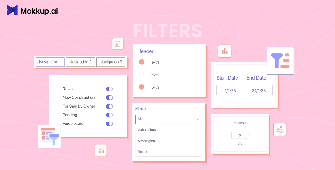
Dashboards are a powerful tool for visualizing data and tracking key metrics. However, they can be overwhelming if they display less data simultaneously. Filters can help to solve this problem by allowing users to narrow down the data displayed on a dashboard. This makes it easier for users to find the information they need and to identify trends and patterns in the data.
In this blog post, we will discuss the following:
Table of Contents
- What are Filters in Dashboards?
- Benefits of Using Filters in Dashboards
- Different Types of Filters
- How to Choose The Right Filters For Your Dashboard
- How Do You Implement Filters in Your Dashboard using Mokkup.ai
- Best Practices for Using Filters in Mokkup.ai Wireframes
- Case Studies & Examples
We will also provide some examples of how filters can be used to make dashboards more effective. Please find this blog post informative and helpful.
What are Filters in Dashboards?
Filters in dashboards are interactive components that allow users to refine and customize the data displayed within a dashboard. They serve as gateways to manipulate and control the data, enabling users to focus on specific subsets or dimensions of information that are most relevant to their analysis or decision-making process.
User-friendly dashboard filters can be used to personalize data by allowing users to select specific criteria to focus on. This can be done by dashboard dynamic filtering factors such as the user's interests, demographics, or past behavior. By personalizing the data this way, filters can help users find the most relevant information. For example, a retailer might use filters to personalize the product recommendations that they show to their customers. They could filter the recommendations based on the customer's past purchases, their browsing history, or their location. This would help ensure that the customers only see products likely to interest them.
Benefits of Using Filters in Dashboards
Filters are effective in dashboards because they allow users to narrow down the data displayed on a dashboard. This makes it easier for users to find the information they seek and identify trends and patterns in the data.
Here are some of the reasons why filters are effective in dashboards:
- They help users to save time: Dashboards can often display a lot of data, which can overwhelm users. Filters can help users quickly find the data they need by filtering out the data that is not relevant.
- They help users to identify trends and patterns: When all the data is displayed on a dashboard, it can be difficult to see trends and patterns. Filters can help users focus on specific data points or time periods, making it easier to identify trends and patterns.
- They help users to drill down into data: Filters can be used to drill down into specific data points to get more detailed information. This can be helpful for users who want to understand the data in more depth.
- They help users to compare different data sets: Filters can be used to compare different data sets to see how they relate to each other. This can be helpful for users who want to understand how different factors affect the data.
Overall, filters are a powerful tool that can be used to make dashboards more effective. By choosing the right filters and implementing them correctly, you can help users to find the information they need quickly and easily.
Different Types of Filters
Several types of filters are commonly used in dashboards to help users interact with and customize the data they view. Here are some of the different types of filters:
1) Dropdown Filters:
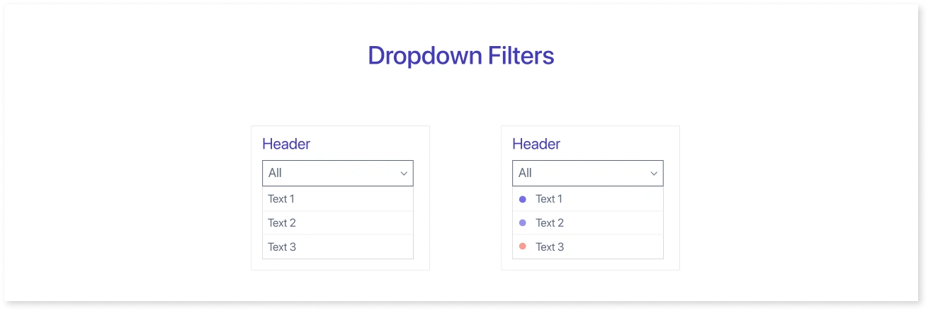
- Dropdown filters present a list of options in a dropdown menu, allowing users to select one or more items. These are versatile and can be used for categorical data like product categories, regions, or departments.
2) Slider Filters:
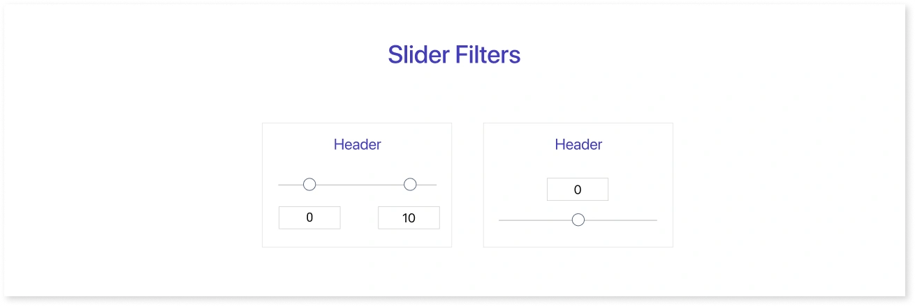
- Slider filters filter numerical data within a specified range. Users can adjust the slider handles to set minimum and maximum values, such as filtering data by price or date range.
3) Checkbox Filters:
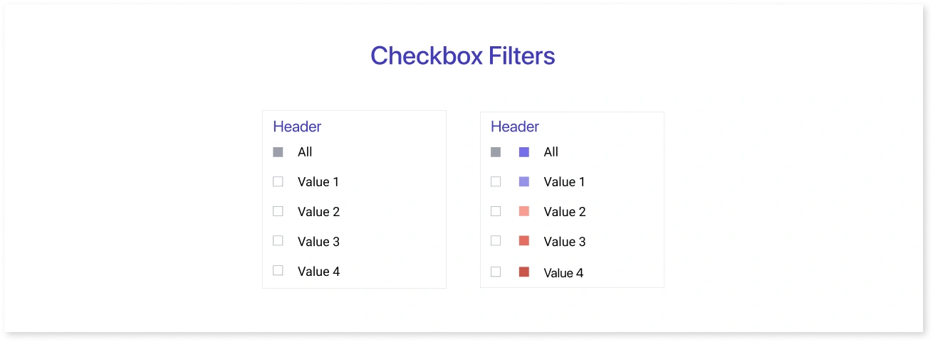
- Checkbox filters enable users to select multiple options simultaneously. They are useful for filtering data that falls under multiple categories or conditions—for example, selecting multiple product features or attributes.
4) Date Filters:
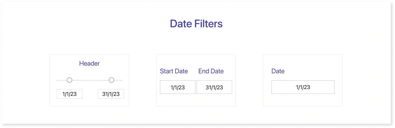
- Date filters allow users to filter data based on specific date ranges or time periods. These are crucial for time-based analysis and reporting.
5) Text Search Filters:
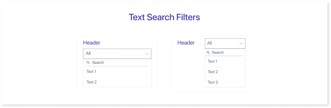
- Text search filters provide a search bar where users can enter keywords or phrases to filter data based on text-based attributes, such as names, descriptions, or tags.
6) Multi-Select Filters:
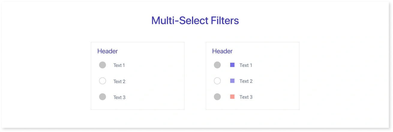
- Multi-select filters combine checkboxes or dropdowns to allow users to select multiple options from a list. These are useful for more complex dashboard filtering techniques scenarios.
7) Hierarchy Filters:
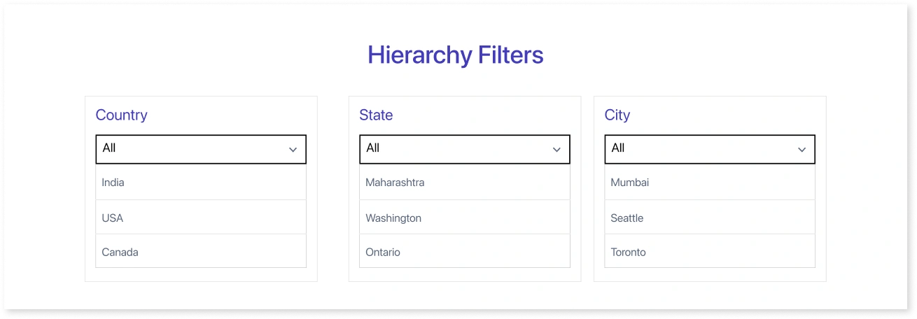
- Hierarchy filters work in a top-down manner. Users start by selecting a top-level item in the hierarchy, and then they can drill down to select lower-level items. For example, a user might filter for countries and then for cities within a country. The filters depend on each other, so the user cannot select a city not in the selected country.
8) Toggle Switch Filters:
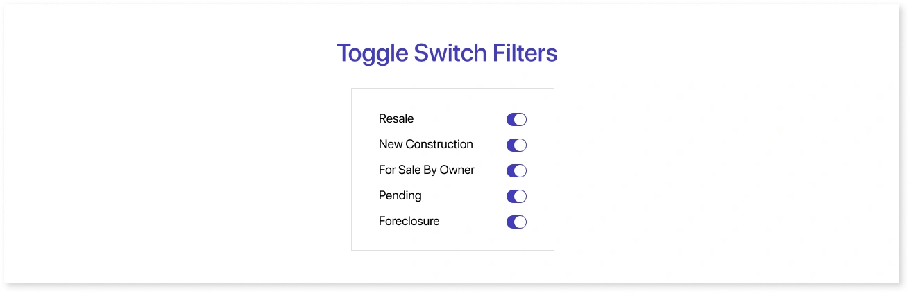
- Toggle switch filters offer a simple on/off or yes/no option for filtering data. These can also be used for switching dashboard colors and themes from light mode to dark mode, providing users a choice between two visually distinct options. They are effective for binary choices or filtering data based on a single attribute. Binary choice filters are a type of filter that allows users to select between two options. For example, a user can filter for products that are either in stock or out of stock.
9) Combined Filters:
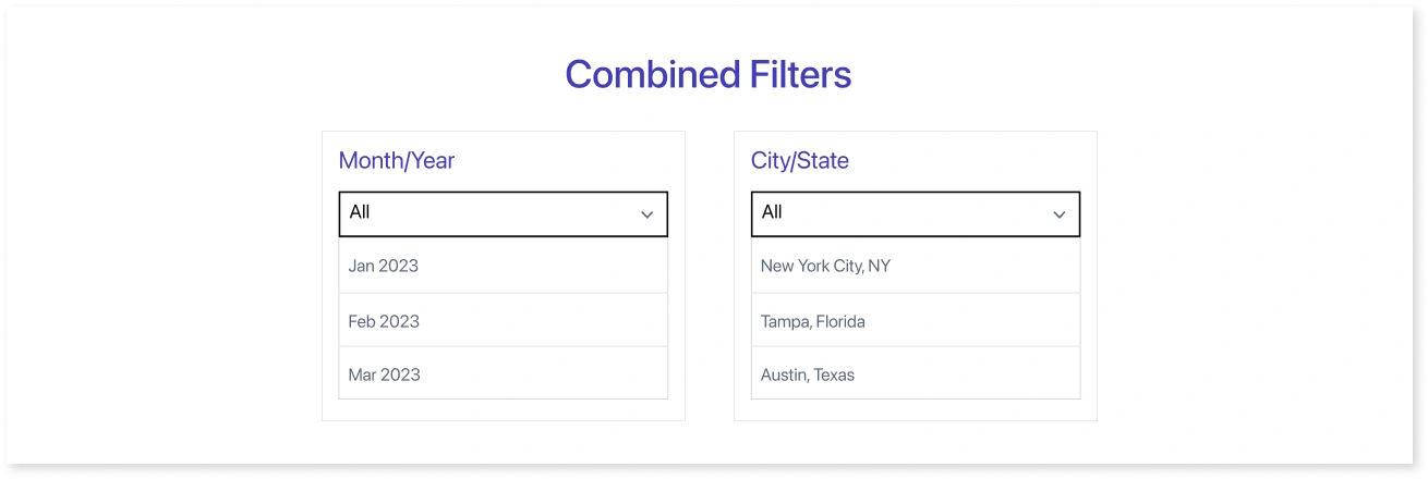
- Combined filters combine multiple filter types into one interface, enabling users to filter data using various criteria simultaneously. This can be especially powerful for complex analyses.
10) Navigation:
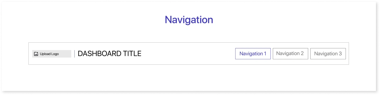
- Navigation is typically placed at the top of a dashboard and provides shortcuts for common filter settings, allowing users to switch between different views quickly.
11) Geo Filters:
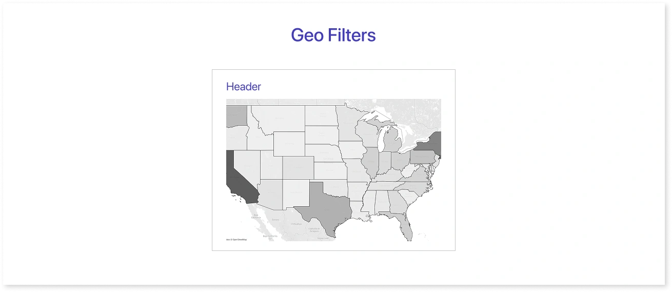
- Geo filters use maps to allow users to filter data based on geographic locations. Users can interact with a map and select specific regions or points.
The choice of filter type depends on the data's nature and the dashboard users' specific needs. Effective dashboard design often involves selecting the most appropriate filter types to provide a user-friendly and efficient data exploration experience.
Interactive chart elements can function as filters, for instance, by choosing a specific area within a treemap or a column in a column chart. This enables users to fine-tune the information displayed on the dashboard. For example, a user might be looking at a treemap that shows a company's sales of different products. The user could select a specific area of the treemap to filter the data for other charts on the dashboard, such as a bar chart showing each product's sales in that area.
How to Choose The Right Filters For Your Dashboard
Choosing the right filters for your dashboard can be a daunting task, but it is important to get it right. Choosing the right filters can make your dashboard more effective and help users find the information they need quickly and easily.
Here are some tips for choosing the right filters for your dashboard:
- Consider the type of data you are using: What kind of data are you trying to visualize? What are the different dimensions and measures of the data? Once you understand the data, you can start to think about what kinds of filters would be useful.
- Consider the questions you are trying to answer: What questions do you want users to be able to answer by using your dashboard? The filters you choose should help users to answer these questions.
- Consider the audience for your dashboard: Who will be using your dashboard? What level of technical expertise do they have? The filters you choose should be easy to use for the intended audience.
- Consider the level of detail you need to show: How much detail do you want to show in your dashboard? The more filters you use, the more detailed the dashboard will be. However, too many filters can make the dashboard overwhelming and difficult to use.
- Test different combinations of filters: Once you have chosen some filters, test them out to see how they work. Try different combinations of filters to see what works best for your data and audience.
- Consider if the filters are being used: In the overall dashboard or for a specific visual and place accordingly
How Do You Implement Filters in Your Dashboard using Mokkup.ai
Mokkup.ai is a cloud-based dashboard design tool that allows you to create interactive and engaging dashboard wireframes. One of the key features of Mokkup.ai is the ability to add filters to your dashboards. Filters allow you to narrow down the data displayed in your dashboard, making finding the information you need easier.
There are many different ways to implement filters in your dashboard. The specific method you use will depend on the dashboarding tool you are using.
There are two ways to use the Filter in Mokkup.
-
Creating a New Project:
- Click on ‘Create new’ from the home page
- Setup the project by filling in the name and choosing the frame size
- Drag and drop the date filter, search, checkbox, etc onto the canvas or click on it to add it from the left menu
- Resize it on the canvas and place it in the desired location
- Edit the filter from the customize element menu, which opens on the element selection
-
Using a Mokkup Template:
- Choose a template from the template library and click ‘Use Template’
- Select the filter that needs modification
- Resize it on the canvas and place it in the desired location
- Edit it from the customize element menu, which opens on the element selection
Once you have added a filter to your dashboard, you can create multiple versions of the filter by duplicating it or changing the variations. This allows you to create different versions of the filter for different audiences or for different purposes. Multiple variations can be accessed by double-clicking on the filter element or clicking Variation in the customize element menu. Some of them are as follows:
- Basic Dropdown
- Legend Dropdown
- Dropdown with Search
- Title In-Line
- Checkbox Filter
- Checkbox Legend Filter
- Range Filter
- Simulator Filter
- Date Slicer Filter
- Date Ranger Filter
- Date Selector
Best Practices for Using Filters in Mokkup.ai Wireframes
Here are some best practices for using interactive filters in dashboards
- Use filters sparingly: Too many filters can make the dashboard overwhelming and difficult to use.
- Use filters to answer specific questions: Don't just add filters for the sake of adding them. Make sure each filter helps users to answer a specific question.
- Make sure the filters are easy to find and use: The labels for the filters should be clear and concise. Users should also be able to save their filter settings and reset the filters to the default settings.
- Make sure to put the filters on the top: If they apply to the whole dashboard, near the specific visual if it only applies to that.
- Filters can be put into a panel: That can be hidden/shown to provide a better user experience
- Use clear and concise labels for the filters: This will help users to understand what each filter does.
- Allow users to save their filter settings: This will make it easier for users to return to the dashboard and see the same data they were looking at previously.
- Allow users to reset the filters to the default settings: This will be useful if users accidentally change the filter settings.
By following these filters' best practices, you can use filters effectively in your dashboards and make them more user-friendly.
Case Studies & Examples
HR Performance Management Dashboard
HR Performance Management Dashboard is a business intelligence tool that summarizes HR KPIs and HR data. The HR team uses this visualization to track, analyze, and report on the productivity and effectiveness of the employees. The dashboard enables the team to gather data from various platforms and conduct precise analyses. This data may assist the HR department in aligning the company's actions with its goals and making informed decisions to improve recruiting, workplace management, and employee performance.
The filters provide precise access to the dashboard view of various departments and job positions, location-specific data, and data for high, medium, and low-level employees.
Some more examples of case studies are explained below:
1) E-commerce:
- Dashboard: filters for products, categories, inventory stock availability, and price range to help identify which products perform better than others.
2) Financial Dashboard:
- Incorporate filters for date ranges, account types, transaction categories, and geographic regions to enable users to analyze their financial data efficiently.
3) Social Media Analytics Dashboard:
- Add filters for social media platforms, date intervals, engagement metrics (likes, shares, comments), and hashtags to allow users to track the performance of their social media campaigns.
4) Healthcare Analytics Dashboard:
- Integrate filters for patient demographics (age, gender), medical conditions, treatment types, and time periods to help healthcare professionals analyze patient data and treatment outcomes.
5) Inventory Management Dashboard:
- Include filters for product categories, stock levels, supplier information, and sales history to enable inventory managers to optimize stock levels and reorder products as needed.
When working with mokkup.ai or any similar design tool, you can typically use pre-built elements or components to create filter elements such as dropdown menus, checkboxes, date filters, and search bars. Ensure that the filter design is user-friendly and intuitive, allowing users to refine data and gain insights effectively.
Conclusion
In conclusion, filters are a powerful tool that can be used to make dashboards more effective. By choosing the right filters and implementing them correctly, you can help users find the information they need quickly and easily. They offer the flexibility to customize data views, extract meaningful insights, and streamline decision-making processes. Whether you're designing a dashboard for e-commerce, finance, social media, healthcare, or any other industry, the judicious use of effective dashboard filters can significantly boost the utility of your dashboard, empowering users to explore and understand data like never before. In a data-driven world, the effectiveness of filters cannot be overstated, making them a fundamental component of modern dashboard design.
Frequently Asked Questions
Global filters apply to the entire dashboard, affecting all visuals, while local filters only apply to a specific chart or section.
Global filters are best for overall analysis, but combining them with local filters creates a more interactive and flexible dashboard experience.
Filters reduce the amount of data being processed and displayed, making dashboards load faster and run more efficiently.
Cascading filters are linked filters where one filter’s selection affects the options available in the next (e.g., selecting a country updates the list of states).
Filters allow users to narrow down data, focus on what matters, and explore insights without cluttering the dashboard.
Dashboard filters are tools that let users interact with data by adjusting views. They matter because they make dashboards dynamic, user-friendly, and tailored to different needs.
Prompt it. Wireframe it with Mokkup.ai.
