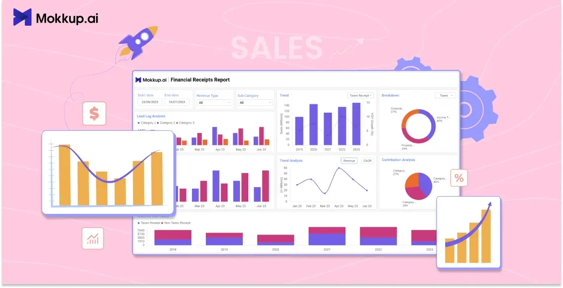
Sales teams deal with a flood of numbers every day—leads, deals, targets, revenue forecasts. But numbers alone don’t tell a story. That’s where sales dashboards come in. These visual tools help you spot trends, monitor team performance, and make quicker decisions.
In this blog, we’ll walk through different types of sales dashboard templates and examples, how to choose the right one for your business, and why tools like Mokkup.ai make dashboard building faster and easier—no design or coding skills needed.
Table of Contents
- What is a Sales Dashboard?
- Benefits of Using Sales Dashboards
- Types of Sales Dashboards with Templates & Examples
- Free vs Premium Sales Dashboard Templates
- How to Choose the Right Sales Dashboard Template
- Best Tool to Build Sales Dashboards – Mokkup.ai
- Tips for Designing Effective Sales Dashboards
What is a Sales Dashboard?
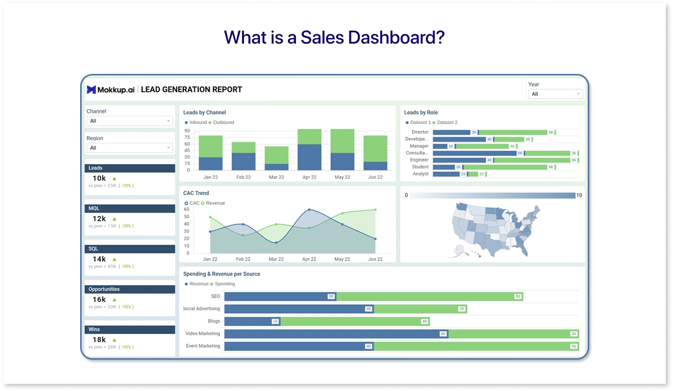
A sales dashboard is a visual workspace that shows your team’s performance, progress toward goals, and key metrics—like total revenue, conversion rate, and pipeline value—all in one place. Whether you're a sales manager tracking your team’s quota or a founder checking monthly growth, a dashboard simplifies the data. If you’re looking for sales dashboard examples to inspire your design, Mokkup.ai offers a variety of customizable sales dashboard templates to get you started quickly.
Instead of digging through spreadsheets or CRM reports, you get instant clarity with charts, graphs, and tables that update in real time. Sales dashboards can be customized to match different roles—executives, account managers, or business analysts.
With Mokkup.ai sales dashboard features, you don’t need to build from scratch. You can drag and drop dashboard elements into a layout, export it to your BI tools later, and get a visual mockup ready for discussion or delivery within minutes.
Benefits of Using Sales Dashboards
A well-designed sales dashboard does more than display numbers—it creates clarity. Here’s how it helps teams work smarter:
1. Instant Performance Insights
Instead of jumping between Excel sheets and CRM tabs, dashboard wireframes built with AI sales dashboard templates give you a quick overview of your sales funnel, targets, and revenue in one place.
2. Faster Decision-Making
With real-time visibility into KPIs like conversion rates or deal velocity, managers can adjust strategies before problems grow, especially when using a drag-and-drop sales dashboard that makes updating visuals simple and fast.
3. Data-Driven Conversations
Dashboards take the guesswork out of sales meetings. You walk in with visuals that support your progress and plans, whether for internal reviews or client updates.
4. Role-Based Focus
Sales reps, team leads, and executives all need different views. Mockups help customize insights so everyone stays focused on what matters to them.
5. Time Savings
Manual report creation takes hours. With tools like Mokkup.ai, you can create dashboard wireframes in minutes using pre-built templates, so analysts and designers can focus on data, not design.
Whether you’re setting up a sales KPI dashboard or experimenting with CRM dashboard examples, a visual system makes your data more usable.
Types of Sales Dashboards with Templates & Examples
Different roles in your sales team need different views of the data. That’s why there isn’t just one type of sales dashboard. Let’s look at a few popular types, along with sales dashboard examples you can quickly customize using Mokkup’s drag-and-drop interface:
1. Ecommerce | Sales Forecasting Dashboard
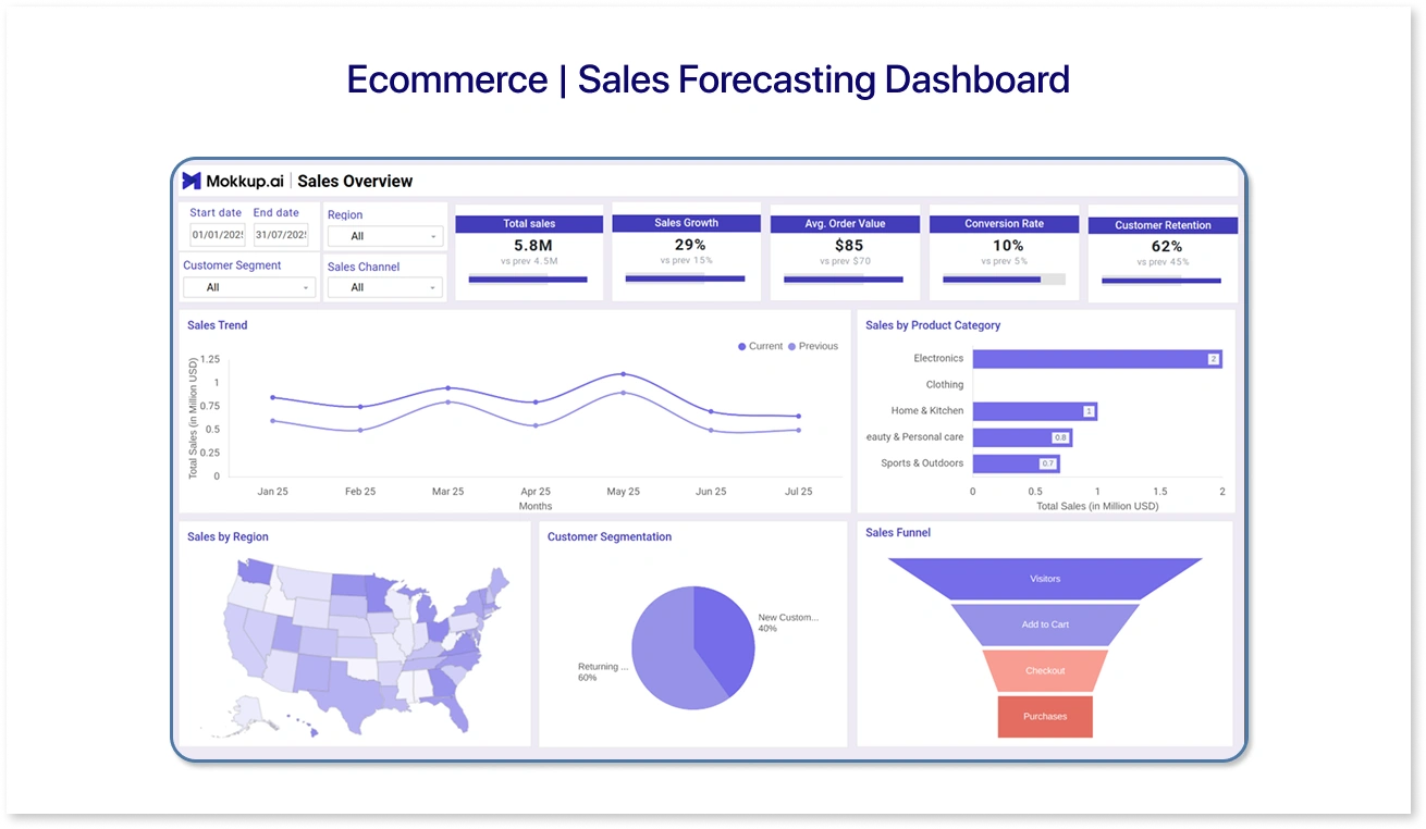
- Purpose: Helps ecommerce businesses predict future sales by analyzing past trends and current performance.
- Key Metrics:
- Projected revenue
- Historical sales data
- Growth rate
- Seasonal trends
- Use Case: E-commerce managers use this dashboard template to plan inventory and marketing campaigns based on forecasted demand.
2. SaaS | Multi-Channel Analytics Dashboard
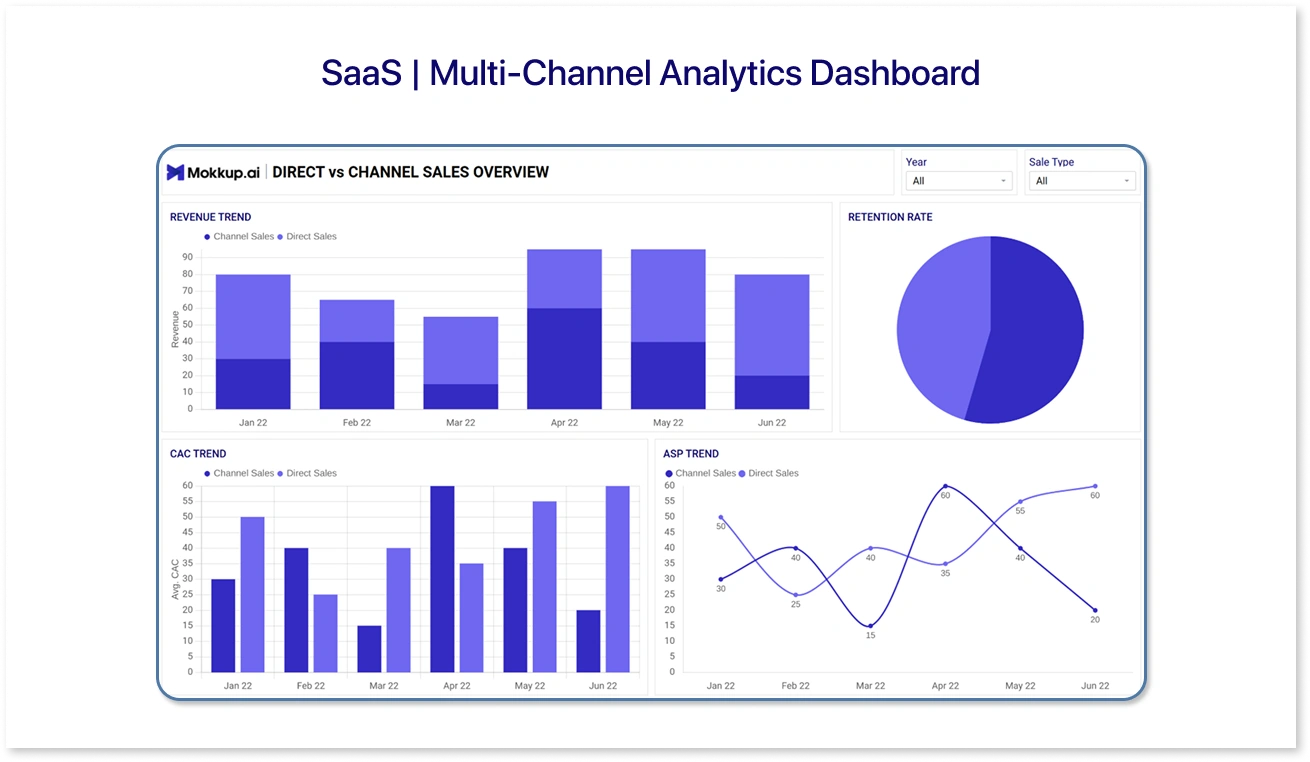
- Purpose: Provides an overview of sales performance across different marketing and sales channels.
- Key Metrics:
- Leads generated per channel
- Conversion rates
- Customer acquisition cost (CAC)
- Channel revenue breakdown
- Use Case: SaaS sales leaders use this dashboard wireframe to identify the most effective channels and optimize budget allocation.
3. SaaS | Lead Scoring Dashboard
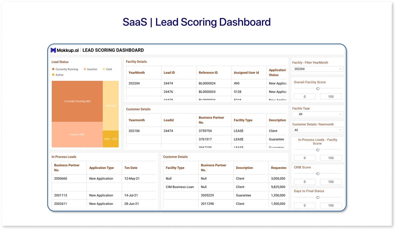
- Purpose: Helps prioritize leads based on scoring models to focus sales efforts on the most promising prospects.
- Key Metrics:
- Lead scores
- Engagement levels
- Conversion probability
- Sales pipeline status
- Use Case: Sales reps and managers use this mock dashboard to target high-value leads and increase closing rates.
Free vs Premium Sales Dashboard Templates
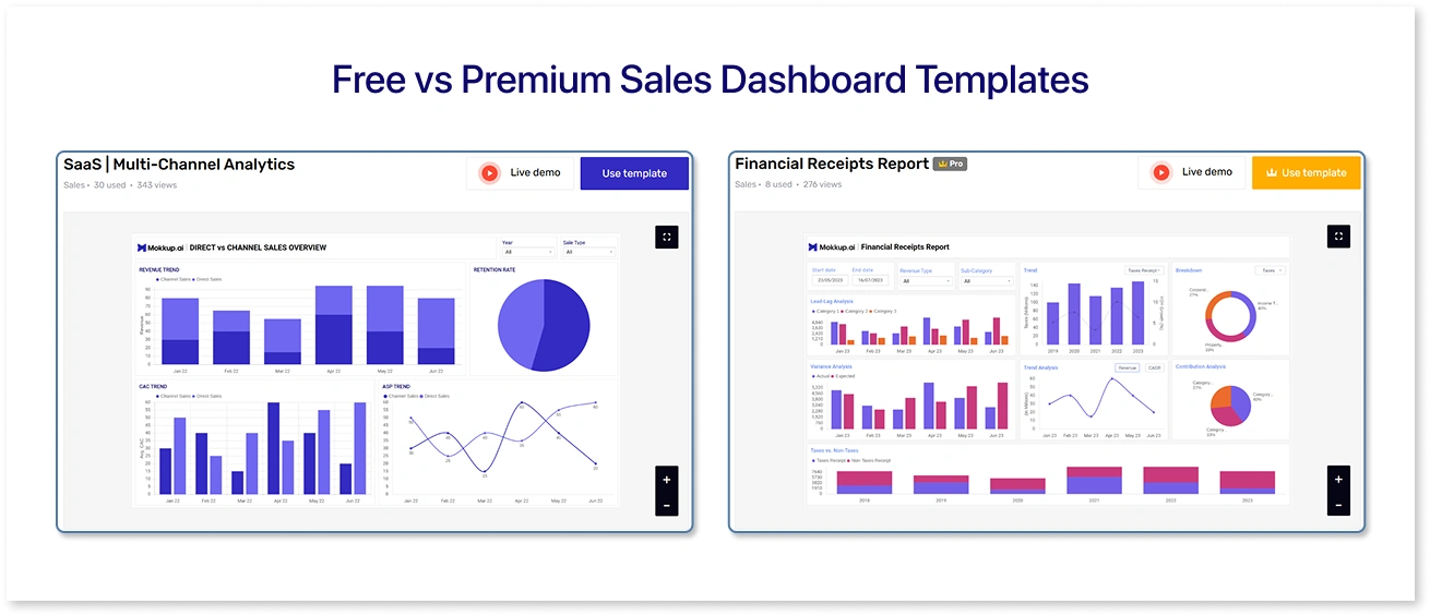
Not every business has the same reporting needs—or the same budget. That’s why Mokkup.ai offers both free and premium sales dashboard templates, giving teams the flexibility to start simple and scale up when needed. Whether you’re a lean startup experimenting with pricing models or an enterprise growth team juggling cross-functional KPIs, there’s a template that fits your stage.
Let’s explore what each of these templates brings to the table and how you can make the most of them.
Free Sales Dashboard Templates on Mokkup.ai
Mokkup’s free templates are designed to get you up and running without any setup complexity or design overhead. These are ideal for teams that want to visualize performance quickly while keeping things lean.
1. SaaS | Pricing Analytics
This template is built for subscription-based businesses trying to make sense of their pricing tiers. It gives you a visual breakdown of plan-level performance—so you can see how each pricing model affects revenue, churn, and upgrades.
Whether you’re testing new tiers or analyzing the impact of a freemium offering, this dashboard wireframe helps bring clarity. You can drag and drop charts that show metrics like Monthly Recurring Revenue (MRR), ARPU, and user distribution across plans. All you need is your billing data—once added, you’re good to go.
It’s especially helpful for product teams, SaaS founders, or revenue managers who want to tie pricing experiments directly to business outcomes.
2. Ecommerce | Geographical Analysis
Selling across regions? This template is a must. It helps you visualize where your sales are coming from—by city, state, or country. Think heatmaps, geo-charts, and side-by-side comparisons of order volumes, average order value, and returning customer rates.
You can use this template to identify your strongest-performing markets and detect regions with untapped potential. It’s great for ecommerce leads planning localized campaigns, and for marketing teams deciding where to double down.
And the best part? You don’t need any design work.
Premium Sales Dashboard Templates on Mokkup.ai
When your reporting needs go beyond the basics—like tracking financial health, managing multiple product lines, or measuring growth across departments—Mokkup’s premium templates deliver. These templates come with richer visual components, advanced layout logic, and more customization space.
1. Financial Receipts Report
This mock dashboard helps you stay on top of incoming payments, delayed invoices, and transaction summaries—all in one place. It’s a hybrid view where finance and sales intersect.
You’ll find pre-built widgets for overdue amounts, cleared receipts, and outstanding balances over time. This makes it easier for sales teams to coordinate with finance, especially in companies where cash flow and sales performance are closely linked.
Perfect for finance controllers, account managers, or sales teams who want to keep revenue leakage in check.
2. Portfolio Management
Managing multiple product lines or business units? The Portfolio Management dashboard template lets you compare performance across them without flipping between tools.
It includes visual blocks for unit-wise revenue, product adoption trends, and margin breakdowns. You can set up a clean layout where each portfolio element has its own section, making it easier to analyze its individual and collective impact on the bottom line.
This is especially useful for sales directors, product heads, or BI teams that need to deliver executive-level summaries.
3. Growth Department Performance
This dashboard offers a holistic view of how your growth engine is performing. It blends data from sales, marketing, and customer success to give you a unified performance snapshot.
From lead sources and pipeline health to campaign ROI and customer retention rates, this template makes it easy to see what’s working—and what’s not. Teams can track collaborative KPIs, align better, and adjust strategies faster.
Best suited for heads of growth, cross-functional leaders, or C-suite execs driving revenue.
How to Choose the Right Sales Dashboard Template
With so many dashboard templates available on Mokkup.ai, choosing the right one can feel overwhelming at first. But the truth is, your choice becomes clearer once you define your goals and understand who the dashboard is for. A good sales dashboard isn’t just about design—it’s about focus, function, and the story your data needs to tell.
Here’s a simple framework to help you pick the best-fit template:
1. Start with Your Sales Objective
Every dashboard is built around a core goal. Are you tracking top-line revenue? Managing inbound leads? Analyzing pricing performance? Narrowing down your primary objective will instantly filter your choices.
For example:
- If you're focused on regional performance, the Ecommerce | Geographical Analysis template is a solid match.
- Want to understand how different pricing tiers impact churn? Go with the SaaS | Pricing Analytics dashboard.
2. Consider the End User
Think about who will use or view the dashboard most often:
- Sales reps may need quick access to leads, conversion rates, or quota progress.
- Managers want summaries across teams or product categories.
- Executives often prefer clean, high-level visuals that support strategic decisions.
The more tailored the dashboard is to the viewer’s needs, the more useful—and used—it will be.
3. Decide If You Need Free or Premium
Free templates work well for simple reports or one-off presentations. But for layered insights, detailed charts, or custom layouts, premium options are often the better fit. They save time in the long run, especially when you're dealing with complex data or multiple stakeholders.
4. Prioritize Design Flexibility
The more you can adjust a template, the more useful it becomes. A good-looking dashboard is only useful if it works for your data. Since Mokkup focuses on design-first editing, look for a template that’s easy to tweak. This way, you can adjust the layout, update KPIs, and tweak the visuals before sharing them with your team or developers.
5. Match the Template to Your Workflow
Here’s a quick pairing guide based on common workflows:
|
Use Case |
Recommended Template |
|
Tracking pricing performance |
SaaS – Pricing Analytics (Free) |
|
Regional campaign planning |
Ecommerce – Geographical Analysis (Free) |
|
Monitoring revenue collection |
Financial Receipts Report (Premium) |
|
Comparing product or team performance |
Portfolio Management (Premium) |
|
Aligning sales, marketing & CS |
Growth Department Performance (Premium) |
Best Tool to Build Sales Dashboards – Mokkup.ai
Choosing the right tool to build your sales dashboard matters just as much as choosing the right data to show. You want something fast, visual, and collaborative—without spending hours figuring out layout design or fiddling with charts. That’s where Mokkup.ai fits in as a top sales reporting dashboard tool.
Unlike traditional BI tools that often need technical expertise or design help, Mokkup simplifies the process. It gives sales teams, analysts, and even non-technical users a way to wireframe and present dashboards in minutes—not days.
Why Mokkup.ai Works So Well for Sales Dashboards
1. Ready-to-Use Templates Built for Sales
Unlike generic wireframing tools, Mokkup offers pre-built templates specifically designed for sales use cases—forecasting, lead scoring, multi-channel performance, and more. You don’t have to start from scratch. Just pick a template, add in your metrics, and fine-tune the layout.
Bonus: each template is structured to reflect the kind of data sales teams actually track—whether it’s revenue by territory or campaign attribution.
2. Visual-First Approach to Sales Analytics
Sales data can be complex, but presenting it doesn’t have to be. Mokkup’s elements are built to display KPIs in a clean, understandable way—from line charts and comparison tiles to heatmaps and progress bars. This makes creating visual sales performance dashboards simple and effective.
You can mock up your final dashboard layout and decide exactly how every number should appear before passing it to your BI team or embedding it into a report.
3. Export to BI Tools (Power BI & Tableau)
Once your dashboard structure is ready in Mokkup, you can export it as a visual reference for your data team. It saves them hours of guessing layout expectations in Power BI or Tableau. This ensures faster build times and fewer back-and-forth changes during development.
It also bridges the gap between design and deployment, especially for client-facing dashboards or C-suite reporting.
4. Workspaces for Team Organization
Mokkup's Workspace feature lets teams manage multiple dashboard projects in one place. Whether you're building different dashboards for sales, marketing, and finance, or managing dashboards for multiple clients, each workspace keeps your layouts, comments, and drafts organized and easy to access.
No more searching across folders or Slack threads for the latest version.
5. Live Collaboration Like Google Docs (Coming Soon)
Just like you're used to in tools like Google Slides or Figma, Mokkup allows real-time collaboration. Multiple team members can jump into the same dashboard, leave feedback, and make edits on the fly. Perfect for design reviews, cross-functional alignment, or quick iteration with leadership.
If you're tired of clunky templates, endless formatting, and unclear metrics, Mokkup offers a faster, more flexible way to bring your sales data to life.
Tips for Designing Effective Sales Dashboards
Once you’ve selected the right sales dashboard template in Mokkup, the next step is making it work for your business context. A good dashboard doesn’t just look polished—it guides decisions, highlights problems, and sparks the right conversations.
Here’s how to make your dashboards work harder for you:
1. Start with Storytelling, Not Just Data
Before placing charts, define the narrative:
- What are you trying to reveal?
- Who is your audience—sales managers, C-suite, or ops teams?
- What decision do they need to make next?
Think of the dashboard as a flow: overview at the top, details below, context alongside. Mokkup’s drag-and-drop editor makes this easy—just arrange your metrics in the order you want your story to unfold.
2. Use Visual Hierarchy to Direct Attention
Mokkup gives you complete control over layout—use that to emphasize what matters most. For example:
- Place KPIs like revenue, win rate, or lead velocity at the top.
- Use larger tiles or contrasting colors for urgent insights.
- Keep supporting details like breakdowns or category filters below the fold.
A good visual hierarchy helps stakeholders scan and absorb key takeaways within seconds.
3. Limit Clutter: Less is More
Overloading a dashboard with too many charts or metrics can dilute its message. Be selective:
- 5–7 well-chosen KPIs are more effective than 15 vague metrics.
- Group related data points using visual sections or labels.
- Stick to consistent formatting for easier scanning.
Mokkup’s pre-built components help you structure your wireframe without needing to adjust spacing or alignment manually, so clarity stays front and center.
4. Design With Reusability in Mind
Your dashboard shouldn’t be a one-time effort. A good layout can—and should—be reused across teams, time periods, and reports. Here's how to build with that in mind:
- Use consistent layout blocks that you can duplicate for different reports.
- Avoid fixed dates or hardcoded labels; prefer dynamic ones like “Current Month.”
- Leave space to add new KPIs or filters without redesigning.
- Organize dashboards in Mokkup workspaces for easy access and version control.
Summing Up
A well-designed sales dashboard helps teams understand performance and make better decisions quickly. Using the right template and design makes all the difference. Mokkup.ai offers easy-to-use tools and templates to help you build clear, effective sales dashboards faster. Give Mokkup a try and see how it can improve your sales reporting.
Frequently Asked Questions
It should include key metrics like revenue, sales targets, pipeline status, lead sources, and conversion rates to give a complete view of sales performance.
Common KPIs include monthly sales, win rate, average deal size, sales cycle length, and customer acquisition cost.
You can use free templates from tools like Mokkup.ai to drag and drop elements and customize dashboards without coding.
Mokkup.ai is a top choice due to its user-friendly drag-and-drop interface, customizable templates, and collaboration features.
Prompt it. Wireframe it with Mokkup.ai.
