Finance teams know the loop too well. You spend three weeks building a dashboard in Power BI, walk into the review, and the CFO asks why revenue isn't at the top, why net profit is buried in a corner, or why the cash position card looks identical to last quarter's variance card.
The numbers explain why this happens. Research shows average BI adoption rates still hover around 25%, while studies estimate that 60% and 73% of enterprise data goes unused for analytics.
The fastest way out of that loop is to look at Power BI financial dashboard examples that already work. They are the layouts CFOs, FP&A teams, and controllers have built, used, and approved, so you can steal the structure before you write a single DAX measure.
This guide walks through 8 such real financial dashboards templates used across CFO reviews, monthly close, and FP&A planning. You'll see the exact KPIs each one tracks, and access to 45+ free wireframe templates you can edit in your browser and export straight to Power BI.
Table of Contents
- What is a Power BI Financial Dashboard?
- Key KPIs Every Power BI Financial Dashboard Should Track
- 8 Power BI Financial Dashboard Examples
- Power BI Financial Dashboards- Quick Comparison
- How to Design a Power BI Financial Dashboard?
- Types of Power BI Financial Dashboards
- Free to Explore 45+ Power BI Financial Dashboard Templates
What is a Power BI Financial Dashboard?
A Power BI financial dashboard is any finance team's command center. It's a complete outlook that brings your accounting, budgeting, and planning data together in one live view. Their key purpose is to help you avoid juggling between five spreadsheets to figure out how the business is doing. You can just open the dashboard, and the answer's right there.
The KPIs you'd typically see on one are revenue, gross margin, net profit, cash flow, and budget vs actual variance. These are basically the numbers leadership asks about in every meeting.
The financial dashboard Power BI users actually keep coming back to does three jobs really well at the same time. First, it shows the headline numbers that the CFO wants to see before their coffee gets cold. Second, it shows what's moved since the last period, with clear MoM and YoY trends so you're not just looking at a snapshot but a story. And third, it surfaces the things that actually need someone's attention.
The 8 Power BI dashboard examples below all hit those three marks in different ways, depending on who's using them and what they're trying to answer.
Key KPIs Every Power BI Financial Dashboard Should Track
Before picking any kind of dashboard, it is important to decide the right KPIs it will represent with the people who will be using the dashboard, whether that’s a CFO or controller reviewing high-level metrics or a finance team handling day-to-day analysis. The structure should support the metrics they need to track instead of forcing the KPIs to fit the layout later.
Profitability and Income KPIs
- Total revenue — the complete amount a business earns from sales before any expenses are deducted. It shows the overall scale of incoming business activity.
- Cost of goods sold (COGS) — the direct cost involved in producing or delivering a product or service, such as raw materials, manufacturing, packaging, or fulfillment.
- Gross profit — the amount left after subtracting direct production or delivery costs from revenue. It helps measure how profitable the core offering is.
- Gross margin % — the percentage of revenue a company retains after covering direct costs. A higher margin usually means the business is keeping more from every sale.
- Net income — the final profit remaining after all expenses, taxes, interest, and operational costs are deducted. This is the company’s actual bottom-line earnings.
- EBITDA — a measure of operating performance that focuses on how the core business is performing before taxes, interest, and non-cash accounting expenses are considered.
- Operating expenses — the ongoing costs required to run the business, including salaries, software, office rent, utilities, and marketing expenses.
Liquidity, Cash, and Variance KPIs
- Cash flow from operations — the cash your core business actually generates each period.
- Free cash flow — operating cash after capex. It's what's available to deploy.
- Current ratio — current assets over current liabilities; a quick liquidity check that ties back to your balance sheet.
- Working capital — the short-term operating buffer; flags when cash is locked into receivables or inventory.
- AR/AP aging — how long customers take to pay and how long you take to pay suppliers.
- Budget variance (budget vs actual) — the single most-asked-for chart in any FP&A review.
- Forecast accuracy % — how close your last forecast was to reality; tells you whether your model is trustworthy.
8 Power BI Financial Dashboard Examples
Here are 8 Power BI financial dashboard examples worth modelling your next build on. Each one maps to a real Mokkup wireframe template; you can open it, edit it in your browser, and export it directly to Power BI when you're done.
1. P&L (Profit and Loss) Dashboard
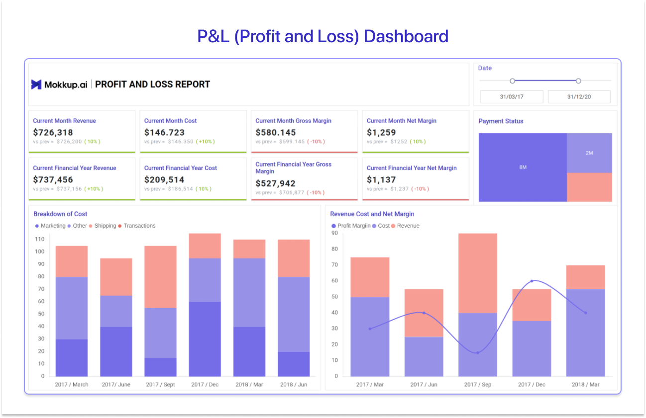
The P&L Dashboard, listed on Mokkup as the Profit & Loss Report Template, is the income statement view that almost every finance team needs first. It gives a structured way to track how revenue, costs, and margins impact overall profitability across reporting periods, without relying on scattered spreadsheets or static reports.
Best for: CFOs, finance controllers, accountants, and FP&A teams who need a centralized view of revenue, costs, margins, and overall profitability across monthly and yearly reporting periods.
Top KPIs to cover: Current month revenue, current month cost, current month gross margin, current month net margin, payment status, current financial year revenue, current financial year cost, current financial year gross margin, and category-wise cost breakdown, including marketing, shipping, and transaction expenses.
Use Profit & Loss Report Template →
2. Cash Flow Dashboard
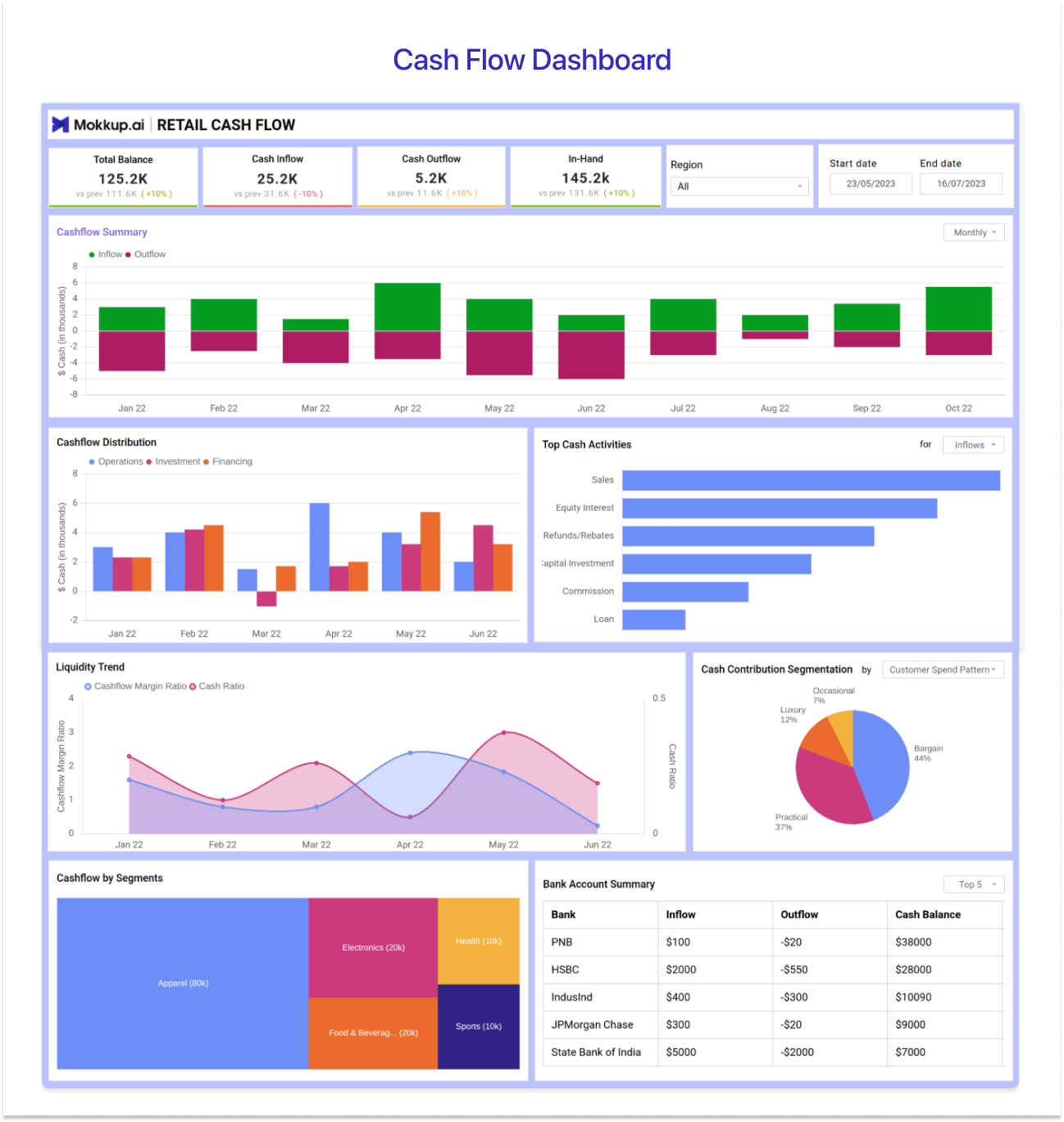
The Cash Flow Dashboard, listed on Mokkup as the Cash Flow Planner Template for Budgeting & Forecasting, gives finance leaders the one number they can't lose track of: how much cash is in the business and where it's moving. It's the layout treasury teams reach for in weekly cash calls. Pick this layout when the question on the table is liquidity rather than profitability, and the audience is the CFO or board treasurer.
Best for: Finance directors and treasury teams who need to monitor cash position, runway, and inflow/outflow patterns across reporting periods.
Top KPIs covered: Total Balance, Cash Inflow, Cash Outflow, and In-Hand Cash, cash flow distribution, Liquidity Trends, Cash Contribution Segmentation, Bank Account Summary and Cashflow by Segments.
Use the Cash Flow Planner template →
3. Budget vs. Actual (Variance) Dashboard
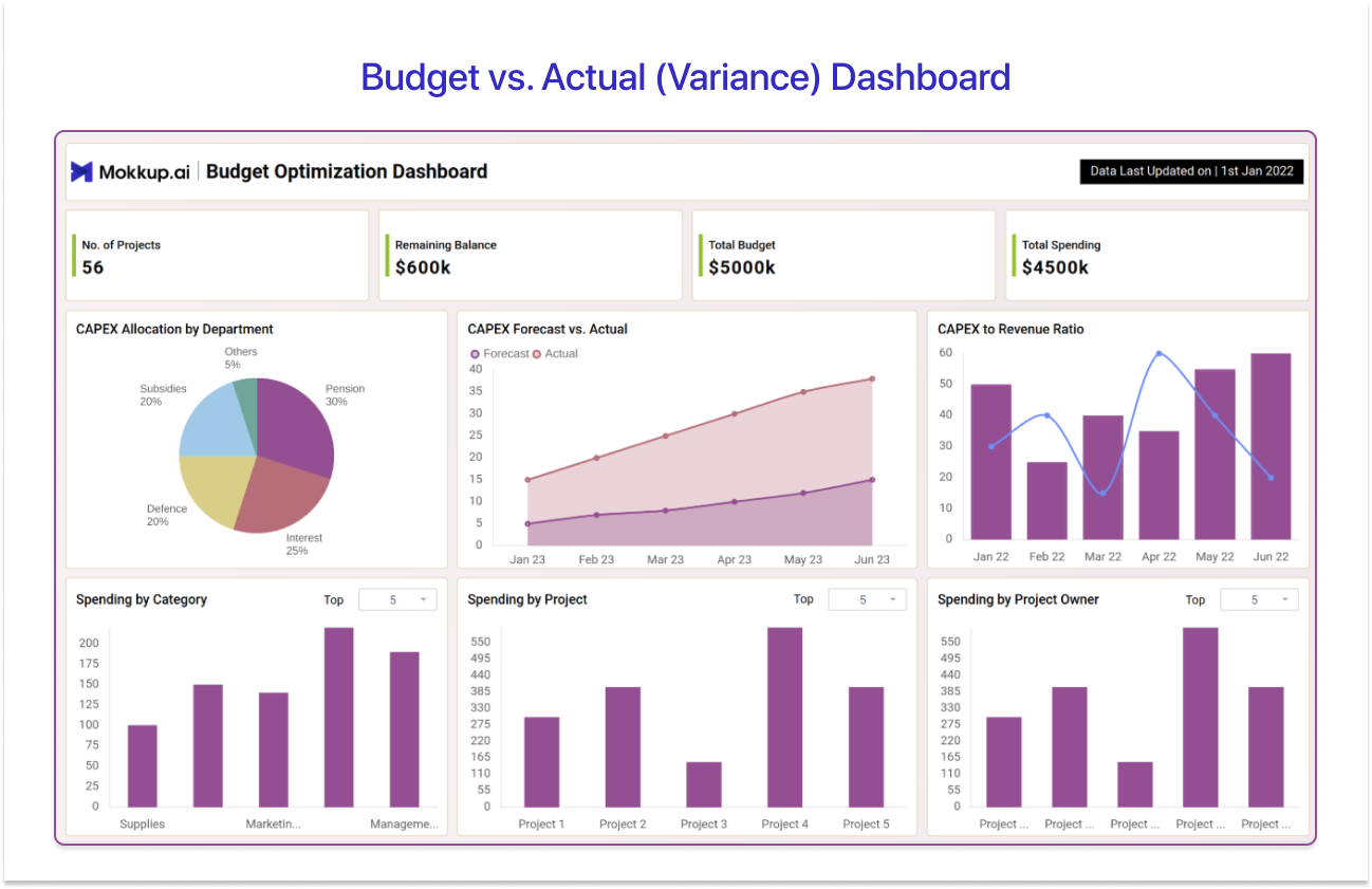
The Budget vs. Actual Dashboard, available on Mokkup as the Budget Optimization Dashboard for Better Forecasting & Cost Control, is the working tool every FP&A team rebuilds at least once a quarter. It assists organizations in tracking and managing their capital expenditures (CAPEX) effectively, with parameters like remaining balance, total budget, and total spending. By doing so, it gives a clear overview of the financial health and budget utilization of an organization.
Best for: FP&A teams and finance managers who need to track actual performance against plan, identify variances, and flag budget overruns early, usually before someone in the leadership team notices first.
Top KPIs covered: Total Budget, Remaining Balance, Total Spending, CAPEX Allocation by Department, CAPEX to Revenue Ratio, Spending by Project, Spending by Project Owners, Monthly Recurring Revenue, Average Revenue per Customer, and more
Use the Budget Optimization template →
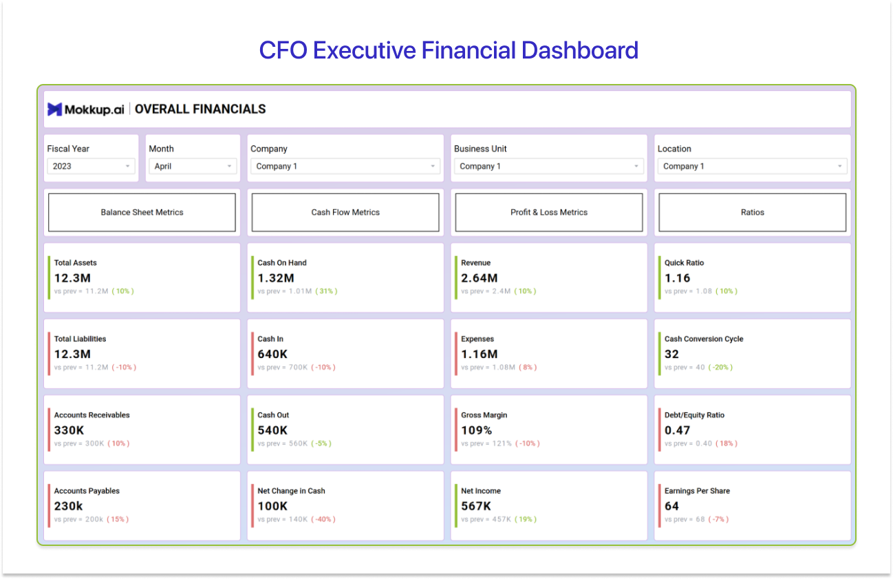
4. CFO Executive Financial Dashboard
The CFO Executive Financial Dashboard, featured on Mokkup as the Financial Overview Template for Revenue, Expense & Profit Analysis, is the summary that every Power BI CFO dashboard eventually converges on. That's because of its complete overview of location-specific insights, along with KPIs like assets, liabilities, income, costs, profits, and more.
Best for: CFOs and finance directors who need a single-page executive summary of the company's financial position to present to the board or leadership team.
Top KPIs covered: Balance Sheet Metrics, Cash Flow Metrics, Profit & Loss Metrics, Ratios, Location Specific Metrics, and more
Use the Financial Overview template →
5. Expense Analysis Dashboard
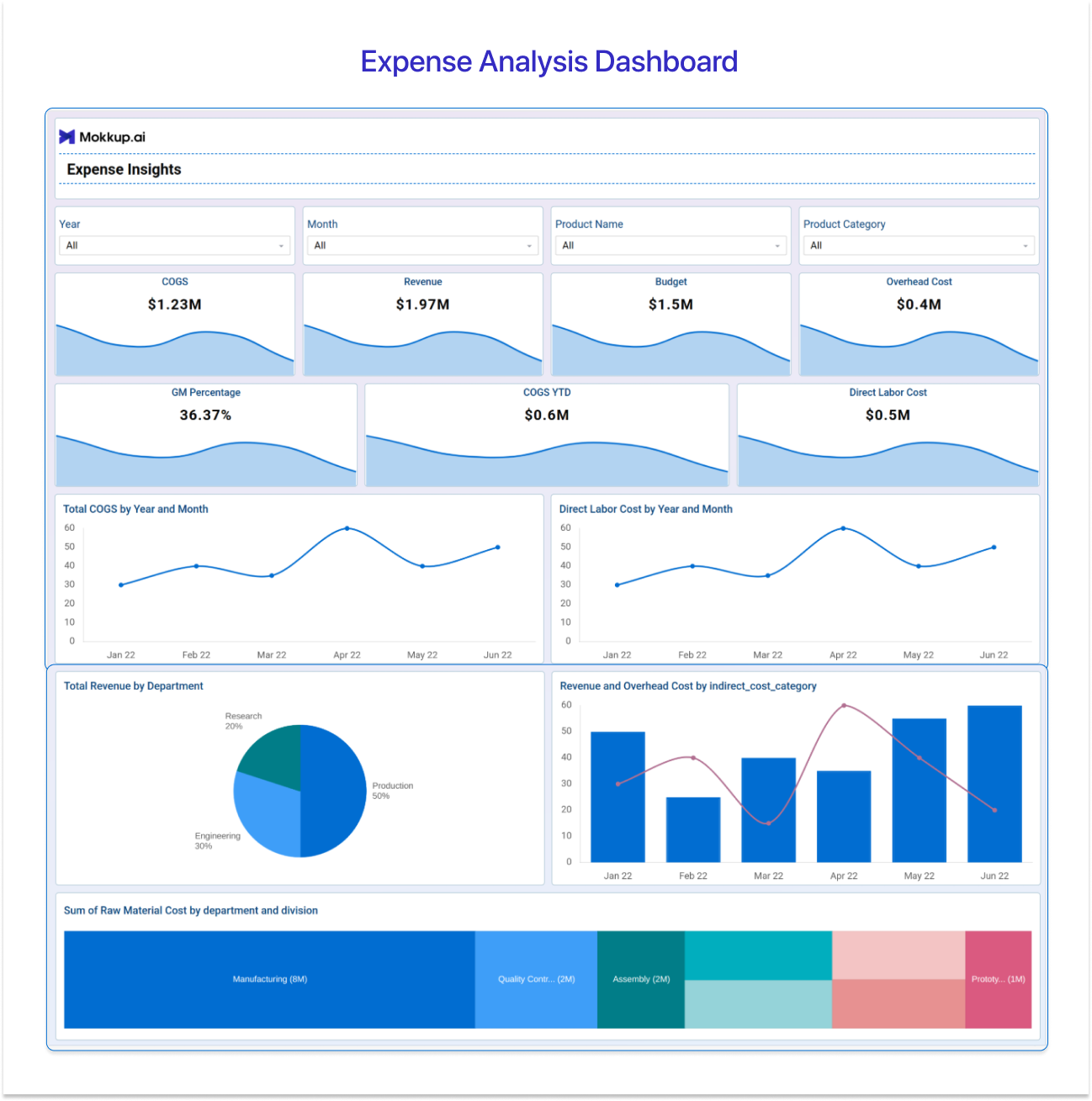
The Expense Analysis Dashboard, listed on Mokkup as the Expense Insights Dashboard, drills into where the money actually goes. It's the layout you build when leadership has asked the dreaded question: "why are costs up?" It encapsulates crucial metrics that empower financial decision makers to strategize with data to optimize operations.
Best for: Finance teams and department heads who need to break down spend, identify top cost drivers, and spot anomalies before they become trends.
Top KPIs covered: COGS, Overhead cost, Direct Labour Cost, COGS YTD, GM Percentage, Sum of Raw Material Cost by Department and Divisions, Overhead budget, Overhead Cost by Budget, Sales Variance %, and more.
Use the Expense Insights template →
6. Financial Ratios Dashboard
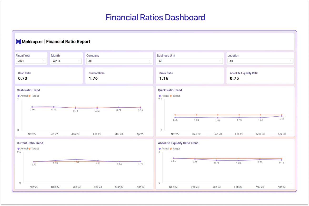
The Financial Ratios Dashboard, on Mokkup as the Financial Ratios Report Template, is the analyst's view. It strips the dashboard back to the standardised ratios you can benchmark across the financial health and operational efficiency of an organization. By doing so, it helps stakeholders identify trends and ensure the organization maintains optimal liquidity levels.
Best for: Finance analysts and controllers who need to monitor the health and efficiency of the business using standardised ratio benchmarks rather than raw values.
Top KPIs covered: Cash Ratio, Current Ratio, Quick Ratio, Absolute Liquidity Ratio, Cash Ratio Trend, Receivable Turnover Ratio, Debtors Turnover Ratio, Cash Conversion Cycle, Operating Leverage, Debt to Equity Ratio, and more.
Use the Financial Ratios template →
7. Revenue and Financial Components Dashboard
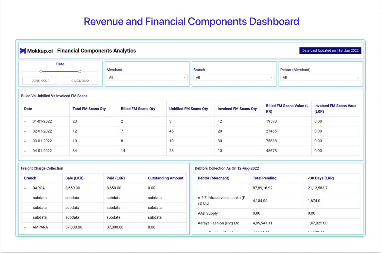
The Revenue and Financial Components Dashboard, available on Mokkup as the Financial Components Analytics template, provides finance teams in the freight industry with a centralized view of operational and financial performance. It helps stakeholders monitor billing efficiency, collections, revenue trends, and outstanding payments for better financial decision-making.
Best for: Finance Managers, Finance Analysts, FP&A Teams, BI and Data Analysts working on finance reporting tools, Accounting teams
Top KPIs covered: Total FM Scans Quantity, Billed FM Scans Quantity, Unbilled FM Scans Quantity, Sales Revenue, Payments Received, Accounts Receivable Collections
Use the Financial Components Analytics template →
8. Financial Summary and KPI Scorecard
The Financial Summary and KPI Scorecard, on Mokkup as the Financial Summary & Analysis Dashboard Template, is the monthly close view. It rolls every important number across the income statement, balance sheet, and cash position into a single scorecard with traffic-light status so leadership knows what to look at first.
Best for: Finance managers and senior leadership who need a consolidated monthly or yearly scorecard view across all the financial KPIs that matter, in one place.
Top KPIs covered: Sales Revenue, Inventory as a % of Sales, Inventory Level, and more
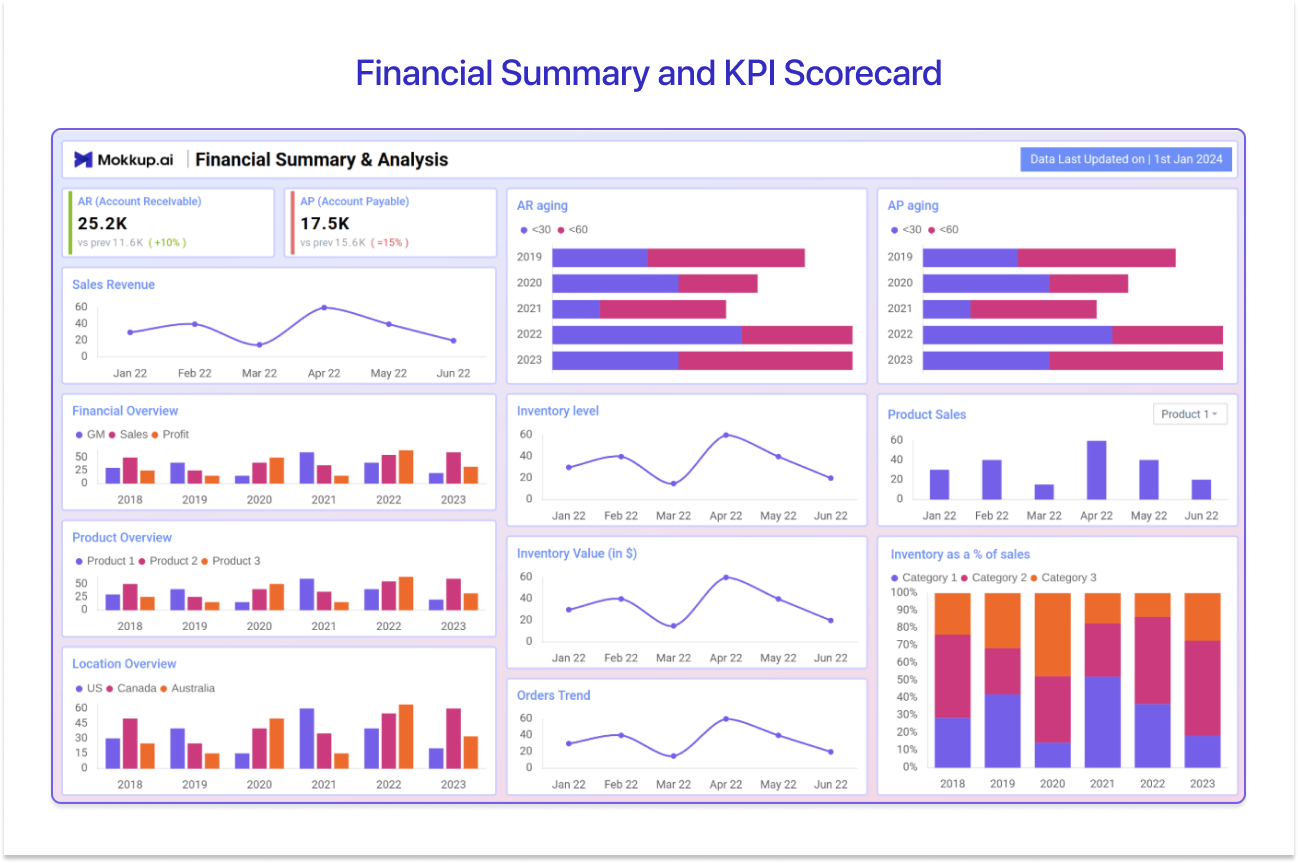
Use the Financial Summary template →
Power BI Financial Dashboards- Quick Comparison
Use this table to quickly pick the dashboard that matches your role and the question you’re trying to answer.
|
Dashboard |
Best For |
Pick This When… |
|
1. P&L (Profit & Loss) Dashboard |
CFOs, finance controllers, accountants, FP&A teams |
You need a centralized view of revenue, costs, and margins across monthly and annual periods. |
|
2. Cash Flow Dashboard |
Finance directors, treasury teams |
The question on the table is liquidity (not profitability) — runway, cash position, weekly cash calls. |
|
3. Budget vs. Actual (Variance) Dashboard |
FP&A teams, finance managers |
You're tracking actuals vs. plan, watching for variances, and want to flag CAPEX overruns before leadership spots them. |
|
4. CFO Executive Financial Dashboard |
CFOs, finance directors |
You need a single-page executive summary for the board or leadership — assets, liabilities, P&L, ratios in one view. |
|
5. Expense Analysis Dashboard |
Finance teams, department heads |
Leadership has asked “why are costs up?” — you need to break down spend and surface anomalies. |
|
6. Financial Ratios Dashboard |
Finance analysts, controllers |
You're benchmarking financial health and operational efficiency using standardized ratios rather than raw values. |
|
7. Revenue & Financial Components Dashboard |
Finance managers, FP&A teams, BI/data analysts, accounting teams (freight & logistics) |
You need to track billing efficiency, collections, and outstanding payments — typically in an operations-heavy revenue model. |
|
8. Financial Summary & KPI Scorecard |
Finance managers, senior leadership |
It's monthly close — you need a single scorecard with traffic-light status across income statement, balance sheet, and cash. |
Types of Power BI Financial Dashboards
The 8 examples above fall into three families. Knowing which family fits your role saves a week of redesign.
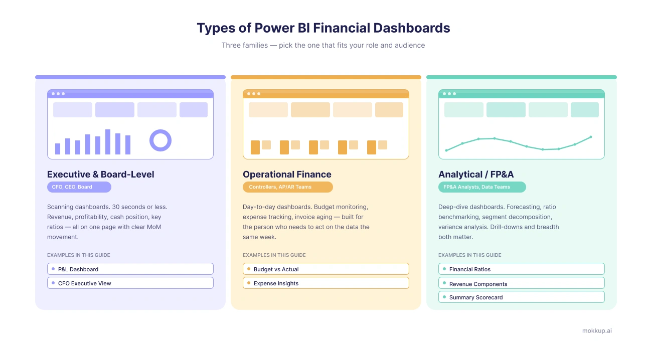
Executive and Board-Level Dashboards
These are scanning dashboards, not drilling dashboards. The audience is the CFO, CEO, or board, and they have 30 seconds or less. They show revenue, profitability, cash position, and a handful of key ratios on a single page, with clear MoM movement. Examples 1 (P&L) and 4 (CFO Executive) sit firmly in this group.
Operational Finance Dashboards
These are the dashboards finance controllers, AP/AR teams, and department managers actually use day-to-day. They live and breathe in budget monitoring, expense tracking, and invoice aging. Examples 3 (Budget vs Actual) and 5 (Expense Insights) fit this type as both are built for the person who needs to act on the data the same week.
Analytical and Power BI FP&A Dashboards
These are for the analyst doing the heavy lifting, like forecasting, ratio benchmarking, segment decomposition, and variance analysis. In these dashboards, drill-downs matter, and so does breadth. Examples 6 (Financial Ratios), 7 (Revenue Components), and 8 (Financial Summary Scorecard) all belong here. If you're building a Power BI FP&A dashboard, your starting point is almost always one of these three.
How to Design a Power BI Financial Dashboard?
Most finance dashboards built in Power BI get rejected the first time the CFO sees them. Not because the data is wrong, but because the layout doesn't match how the finance leader thinks about the business. The revenue card is in the wrong place. The financial dashboard Power BI users were expecting is missing a ratio strip. This means two weeks of rework, plus the time spent rewriting DAX measures that no longer fit the new layout.
The fix is to wireframe the dashboard before you build it. Here's the workflow that saves finance teams from the rebuild nightmare:
- Pick the dashboard type. Explore the 8 Power BI financial dashboard examples above to decide whether you're building an executive view, an operational tracker, or an FP&A deep-dive.
- Open the matching Mokkup wireframe template. Customise the layout, move KPIs around, swap visuals, add or remove sections, without touching any data.
- Share the wireframe link with the CFO or finance lead. Let them mark it up, comment changes, and sign off on placement before you write a single DAX measure. This is where the real time savings come from.
- Export directly to Power BI once approved. You start the build with the right dashboard wireframe already in place, then connect to your real data source.
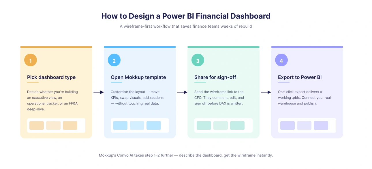
Mokkup's newest Convo AI takes this a step further. Upload a finance data file, describe the dashboard you want in plain language, and Convo AI generates the full wireframe based on the file's headers.
Free to Explore 45+ Power BI Financial Dashboard Templates
Mokkup has 45+ (free & paid) financial dashboard Power BI template designs covering every finance use case you're likely to hit, including P&L, cash flow, budget vs actual, expense analysis, financial ratios, FP&A planning, investment tracking, portfolio reporting, insurance analytics, and executive scorecards. Each one is a wireframe you can open in your browser and start editing immediately.
Unlike static PBIX downloads, which lock you into someone else's layout, every Mokkup template is editable. You can drag and drop visuals, share the wireframe link with your CFO or finance lead for sign-off, and export to Power BI or Tableau in a single click when you're ready to connect real data.
Browse all 45 free financial templates →
Conclusion
The right financial dashboard always depends on two things, who's looking at it and what question they need answered. The 8 Power BI financial dashboard examples above cover the layouts most finance teams lean on through the close cycle, from CFO scorecards to FP&A deep dives. All 45+ Mokkup wireframe templates are free to start with, so you can pick one that fits, tweak it to match your team's reporting style, and skip the painful rebuild loop entirely. Less guesswork, faster sign-off, dashboards that actually get used.
Frequently Asked Questions
A Power BI financial dashboard should cover the three core pillars of financial health: profitability (revenue, gross margin, net income), liquidity (cash flow, current ratio, AR/AP aging), and performance against plan (budget vs actual variance, forecast accuracy). The exact mix depends on the audience.
The fastest path is wireframe-first; agree on the layout and KPI placement with your CFO or finance lead before opening Power BI Desktop. Mokkup's free Power BI financial dashboard templates give you a pre-built starting layout you can customise in the browser and then export to Power BI, saving weeks of back-and-forth on design and rework. You can also speed up the process with Mokkup’s AI-powered dashboard design feature or Convo AI.
The core KPIs that appear across most dashboards are revenue vs target, gross margin %, net income, EBITDA, operating cash flow, budget vs actual variance, and AR/AP aging. A Power BI CFO dashboard adds financial ratios like current ratio and debt-to-equity.
Yes, Mokkup.ai offers free Power BI financial dashboard template wireframes you can open in your browser, customise with AI, and export to Power BI in one click.
Prompt it. Wireframe it with Mokkup.ai.
