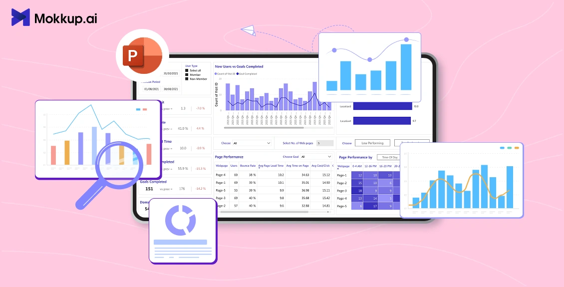
Dashboards help turn complex data into simple visuals that teams can understand quickly. While tools like Excel and Power BI are commonly used for dashboard creation, PowerPoint remains one of the easiest ways to present insights clearly during meetings, reports, and client sessions. It provides complete design control and works well when you require a flexible, presentation-ready layout.
If you want to speed up the layout stage, Mokkup.ai can help you create dashboard wireframes in minutes before you build the final version inside PowerPoint. This makes the process even smoother when creating a PowerPoint dashboard for business reporting.
Table of Contents
- What is a PowerPoint Dashboard and Why it Matters
- Key Steps to Build a PowerPoint Dashboard
- Common Mistakes to Avoid
- Final Review and Export Options
What is a PowerPoint Dashboard and Why it Matters
A PowerPoint dashboard is a single slide (or a series of slides) that clearly and concisely displays key metrics and data visualizations. Unlike static reports, dashboards focus on visual storytelling, enabling decision-makers to grasp key insights quickly. They can include charts, tables, progress bars, icons, and other visual elements designed for PowerPoint data visualization.
A well-designed PowerPoint dashboard brings all essential information into one place, making it easier for teams to track performance, identify trends, and compare results without switching between multiple files or tools. Because PowerPoint offers complete control over layout and branding, it’s ideal for creating presentation-ready dashboards that look polished and align with your reporting needs.

Key Steps to Build a PowerPoint Dashboard
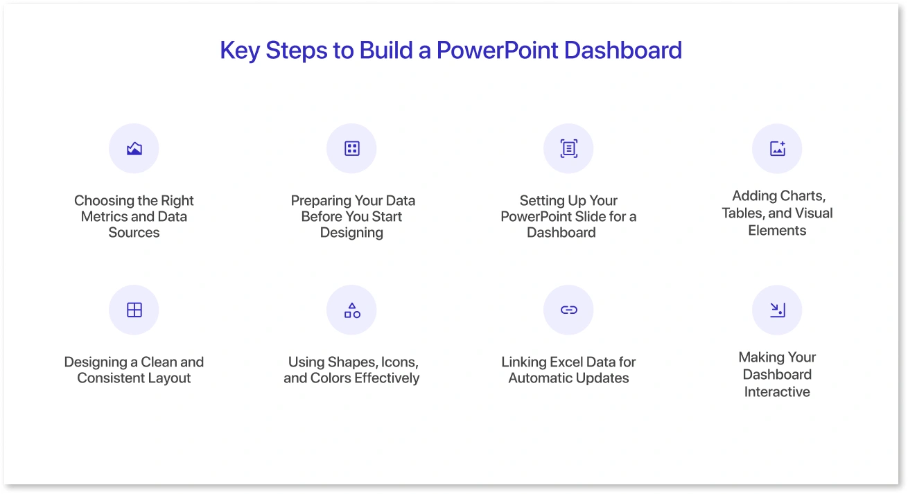
Creating a PowerPoint dashboard becomes much easier when you break the process into clear steps. Each stage helps you organize your data, structure the layout, and design visuals that effectively communicate information. By following these steps, you can create a dashboard that appears polished, updates easily, and facilitates better decision-making.
1. Choosing the Right Metrics and Data Sources
Before designing your dashboard, it’s essential to decide what information matters most. Including too many metrics can overwhelm viewers, while focusing on key indicators helps them make more informed decisions efficiently.
Steps to choose metrics and data sources:
- Identify Your Goal: Determine the purpose of your dashboard. Are you tracking sales performance, project progress, or website analytics?
- Select Key Metrics: Focus on metrics that directly reflect your goal, for example, revenue, conversion rates, or task completion percentages.
- Check Data availability: Make sure the data you need is accurate and up-to-date. PowerPoint dashboards often rely on Excel sheets or CSV files exported from Excel.
- Prioritize Clarity: Choose metrics that are easy to understand at a glance. Avoid including metrics that require heavy explanation.
By selecting the right metrics and reliable data sources, you set a strong foundation to create a dashboard in PowerPoint effectively.
2. Preparing Your Data Before You Start Designing
PowerPoint dashboards rely on clean, well-organized data. Since most visual elements will be linked or imported from Excel, preparing your dataset beforehand ensures accuracy and prevents rework later.
How to prepare your data:
- Clean Your Dataset: Remove duplicates, fix formatting issues, and ensure consistent units.
- Organize Data in Tables: Structured tables in Excel make it easier for PowerPoint to read and update visuals.
- Create Summary Sheets: Instead of linking raw data, create a summarized version that includes only the metrics you want to display on the dashboard.
- Label Everything Clearly: Use clear headings so that your charts and graphs accurately display the correct values.
- Test Calculations: Verify formulas, averages, and totals to avoid incorrect visuals on your dashboard.
Tip: Keep your Excel file in the same folder as your PowerPoint to prevent broken links later.
3. Setting Up Your PowerPoint Slide for a Dashboard
Before adding visuals, you need a proper slide structure that sets the tone for your dashboard’s layout and readability.
Steps to structure your slide:
- Start with a Blank Layout: Remove default text boxes so you can design freely.
- Choose the Slide Size: Most dashboards use a 16:9 aspect ratio, but you can switch to 4:3 or a custom size depending on your display needs.
- Create a Grid: Add guides (View → Guides) to divide your slide into balanced sections. This helps maintain alignment and spacing.
- Decide on Sections: Plan where KPIs, charts, tables, and headers will appear. A clear wireframe ensures a clean final layout.
- Add a Title Banner: A simple header with the dashboard name, date, and filters makes the slide easier to understand.
Tip: Use consistent margins and spacing to maintain a professional appearance on your dashboard.
4. Adding Charts, Tables, and Visual Elements
This step is crucial because your insights are displayed visually. PowerPoint supports a wide range of chart types, which helps you build a clear and meaningful PowerPoint KPI dashboard.
How to add the right visuals:
- Insert Charts Directly from Excel: Go to Insert → Chart and select from bar, line, pie, combo, or area charts. These updates are easy when linked to Excel.
- Use Tables Sparingly: Tables work well for exact numbers, but avoid clutter. Keep them minimal with clean formatting.
- Add KPI Cards: Create small blocks using shapes to display key numbers, such as revenue, growth percentage, or ticket counts.
- Include Icons: Use icons to highlight categories such as finance, operations, marketing, or performance indicators.
- Use SmartArt for Quick Visuals: Good for workflows, funnels, and comparison layouts.
- Maintain Readability: Keep text large enough and avoid unnecessary gradients or heavy 3D effects.
Tip: Always choose visuals that make the data easier to understand, not just more decorative.
5. Designing a Clean and Consistent Layout
A well-designed layout is what makes your PowerPoint dashboard look professional and easy to follow. Consistency ensures that viewers can quickly scan and interpret the information.
Best practices for clean design:
- Use a Consistent Color Scheme: Pick 2 or 3 primary colors plus neutrals. Stick to them across charts, shapes, and text.
- Follow Alignment Rules: Use PowerPoint’s alignment tools so every element lines up perfectly. Uneven spacing can make dashboards look unprofessional.
- Maintain Uniform Spacing: Keep equal padding around charts, KPI cards, and text to avoid clutter.
- Limit Fonts: Use one or two font styles throughout. A bold version can be used to highlight headings or KPI values.
- Group Related Elements: Visually cluster sections (e.g., KPIs together, charts together) so the viewer instantly knows where to look.
- Use White Space Wisely: Don’t fill every corner. Breathing room improves clarity and focus.
Tip: Zoom out occasionally to see the dashboard as a whole and check if the layout flows naturally.
6. Using Shapes, Icons, and Colors Effectively
Visual elements, such as shapes and icons, help make dashboards more transparent and engaging without cluttering the display.
How to use them effectively:
- Shapes for KPI Cards: Rounded rectangles or simple boxes work well for framing your key performance indicators (KPIs).
- Use Icons to Reinforce Meaning: a trend arrow, a calendar, or a dollar symbol helps viewers instantly understand the context.
- Stick to a Simple Color Palette: Use color intentionally to highlight essential metrics, not to decorate.
- Use Contrast Smartly: Dark text on light backgrounds (or vice versa) ensures clarity and reduces eye strain.
- Avoid Overly Stylized Shapes: Keep it minimal. Clean lines make your dashboard look modern and professional.
Tip: When used well, shapes and icons guide the viewer’s eye and support the data story.
7. Linking Excel Data for Automatic Updates
Excel can be linked with PowerPoint, making it one of the easiest ways to keep your dashboard updated without rebuilding charts every time. When your Excel file changes, the linked charts in PowerPoint can refresh automatically.
How to link Excel data:
- Insert a chart via Insert → Chart: This creates an embedded Excel sheet that you can replace with your actual data.
- Use Copy → Paste Link: Copy your chart from Excel, then go to PowerPoint and use Paste Special → Paste Link.
- Keep Files Together: Store your Excel and PowerPoint files in the same folder to avoid broken links.
- Update All Links at Once: Go to File → Info → Edit Links to Files to refresh or manage all linked charts.
- Use Summary Sheets: Link only final, cleaned metrics from Excel; this keeps your PowerPoint fast and avoids errors.
Tip: Linked Excel data saves hours of manual updates, especially for monthly or weekly dashboards.
8. Making Your Dashboard Interactive
PowerPoint offers simple interactive features that enhance user experience and make dashboards easier to explore. These elements help viewers navigate, drill down into details, or switch between different views without overwhelming the slide.
Ways to add interactivity:
- Hyperlinked Buttons: Use shapes or icons as buttons and link them to other slides for deeper insights or detailed reports.
- Clickable Filters: Create category buttons (such as Sales, Finance, or Operations) that jump to different versions of your dashboard.
- Trigger-Based Animations: Reveal charts or KPIs step-by-step by assigning triggers to shapes. Use this sparingly to maintain clarity.
- Navigation Menu: Add a top or side navigation panel to enable users to navigate across multi-slide dashboards easily.
Tip: Keep interactivity purposeful and straightforward. Complex navigation can make the dashboard harder to use.
Common Mistakes to Avoid
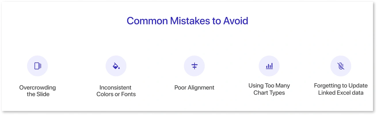
Even a well-designed dashboard can lose its impact if inevitable mistakes slip in. Avoid these issues to keep your PowerPoint dashboard clear, professional, and easy to understand.
Common mistakes to watch out for:
- Overcrowding the Slide: Including too many charts or KPIs can make the layout confusing. Keep only the essentials.
- Inconsistent Colors or Fonts: This breaks visual harmony and makes the dashboard appear unpolished.
- Poor Alignment: Misaligned elements distract the viewer and reduce readability.
- Using Too Many Chart Types: Stick to simple, familiar charts that clearly highlight insights.
- Forgetting to Update Linked Excel Data: Always refresh links before presenting or sharing your work.
By avoiding these common mistakes, your PowerPoint dashboard stays clean, professional, and easy to understand.
Final Review and Export Options
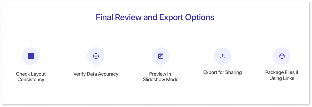
Before you share your dashboard, take a few moments to refine it and ensure everything is accurate. A final review helps maintain quality and prevents errors during presentations.
How to finalize your dashboard:
- Check Layout Consistency: Ensure alignment, spacing, colors, and fonts follow a uniform style.
- Verify Data Accuracy: Confirm that all metrics, charts, and KPIs reflect the latest numbers.
- Preview in Slideshow Mode: This feature displays how your dashboard will appear to others, helping you identify any layout issues.
- Export for Sharing: Save as a PDF or high-quality image using File → Export for easy distribution and sharing.
- Package Files if Using Links: If your dashboard depends on Excel links, use Package Presentation for CD to bundle all the necessary files together.
Tip: Save a master template of your final dashboard layout; it makes future dashboards faster to build.
Conclusion
Creating a dashboard in PowerPoint is a practical and flexible way to present key insights without needing advanced BI tools. With the proper structure, clean design, and linked data, you can build a professional dashboard that’s easy to update and share across teams. PowerPoint’s visual freedom makes it an excellent choice for quick reporting, client presentations, and executive summaries.
Frequently Asked Questions
Yes. If your charts or tables are linked to an external Excel file, they can refresh automatically when the Excel data changes. Ensure that both files remain in the same folder.
Simple visuals, such as bar charts, line charts, pie charts, and KPI cards, are most effective in conveying information. They make trends easy to understand and keep the dashboard clean and organized.
Not necessarily. With consistent colors, proper alignment, and clean layouts, anyone can create a professional dashboard. Templates can also make the process easier and faster.
Prompt it. Wireframe it with Mokkup.ai.
