
Understanding how your blog performs is essential if you want to create content that attracts readers, keeps them engaged, and drives business results. But with data spread across analytics tools, search platforms, social channels, and email systems, tracking everything separately can quickly become overwhelming.
According to Master Blogging, around 7.5 million blog posts are published every day, making it more challenging than ever for brands to stand out. A content performance dashboard or content marketing dashboard solves this problem by consolidating all your essential metrics into one clean, structured, and visually appealing space.
This blog explains how content dashboards help you monitor blog performance and audience engagement, outlines the key metrics to track, and provides guidance on building one efficiently, including the use of a ready-made marketing dashboard template such as the one offered by Mokkup.ai.
Table of Contents
- What is a Content Marketing Dashboard?
- Why Tracking Blog Performance Matters
- Key Metrics a Content Dashboard Should Track
- How Content Marketing Dashboards Track Performance in Real Time
- How to Build a Content Marketing Dashboard
- Why a Ready-Made Marketing Dashboard Template Saves You Time
What is a Content Marketing Dashboard?
A content marketing dashboard is a consolidated reporting interface that combines key performance indicators (KPIs) from multiple data sources, providing a comprehensive view of performance. Instead of moving between Google Analytics, Search Console, social networking platforms, CRM systems, and SEO tools, a content dashboard collects data from all of these sources. It presents it in a single, simple layout.
Dashboards are often visual, featuring tables, scorecards, charts and graphs to help teams understand their content performance without manually downloading data or creating reports in spreadsheets. This consolidated format ensures that writers, marketers, managers, and decision-makers have access to the same insights simultaneously.
Most importantly, content marketing metrics dashboards enable teams to quickly identify trends, understand audience behavior, and assess the effectiveness of individual blog posts in terms of traffic, engagement, and conversions.

Why Tracking Blog Performance Matters
Blogs are often one of the most powerful channels for organic visibility and brand authority. However, simply publishing content is not enough. To maintain consistent growth, you must understand which articles resonate with your audience, where drop-offs occur, and how your content influences user actions such as newsletter signups, product interest, or lead submissions.
Tracking blog performance matters because it helps you:
1. Understand What Your Audience Wants
Performance metrics reveal which topics, formats, and content structures your readers prefer. When you observe patterns across your most successful posts, you can replicate these winning elements in future content.
2. Improve Content Quality
Engagement metrics such as scroll depth, average time on page, and bounce rate highlight how deeply readers interact with your content. Low engagement levels often indicate that your content requires a more transparent structure, improved visuals, enhanced readability, or more relevant examples.
3. Strengthen Your SEO Strategy
Tracking search rankings, click-through rates, impressions, and organic traffic shows how well your blog performs in search results. This insight guides your keyword strategy, supports content optimization, and helps you focus your efforts on the pieces that have the highest growth potential.
4. Measure Return on Investment
A dashboard makes it easy to see whether your blog is influencing conversions, generating leads, or improving brand engagement. When you understand how content contributes to the customer journey, you can justify your content investment and allocate resources more effectively.
5. Identify Growth Opportunities Early
With consolidated data, you can quickly spot content that is climbing in rankings, gaining attention, or showing strong engagement. These insights help you update content strategically, expand on trending topics, and maintain momentum.
Key Metrics a Content Dashboard Should Track
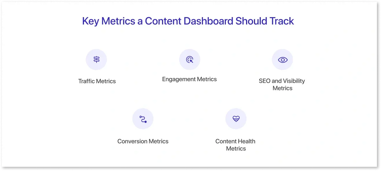
A robust content dashboard should encompass a range of metrics, including traffic, engagement, SEO, conversion, and content health. This balanced approach ensures you see the complete picture of how your blog performs, how people find your content, how long they stay, and whether it drives meaningful outcomes.
1. Traffic Metrics
These metrics measure how many people visit your blog and where they come from.
- Page Views: Shows how often a blog post is viewed.
- Unique Visitors: Indicates the number of individual users who visited your content.
- Traffic Sources: Breaks down visits from organic search, direct traffic, referrals, email, or social platforms.
- New vs Returning Visitors: Helps you understand loyalty and repeat readership.
Traffic metrics reveal which posts attract the most attention and where promotional efforts are yielding the best results.
2. Engagement Metrics
Engagement metrics indicate the depth of readers' interaction with your blog.
- Average Time on Page: Indicates whether users are genuinely engaging with the content.
- Scroll Depth: Indicates how far readers scroll, allowing you to understand whether the content maintains their interest.
- Bounce Rate: Measures the percentage of visitors who leave after viewing only one page.
- Session Duration: Indicates the overall time users spend on your site during a visit.
Strong engagement signals that your blog is helpful, readable, and valuable. Weak engagement may indicate gaps in clarity, structure, or relevance to the topic.
3. SEO and Visibility Metrics
These metrics track how well your blog performs in search engines.
- Organic Traffic: The number of visitors arriving from search engines.
- Keyword Rankings: Position of your blog posts for targeted keywords.
- Impressions: How often your blog appears in search results.
- Click-Through Rate (CTR): The percentage of users who click your blog link after seeing it in search results.
- Backlinks: Other sites linking to your blog content.
These indicators reflect your content’s visibility, authority, and long-term organic potential.
4. Conversion Metrics
Conversions measure the impact of blog content on achieving business goals.
- CTA Clicks: Interaction with call-to-action buttons or links.
- Lead Form Submissions: Users who complete forms after reading blog posts.
- Newsletter Signups: Subscriptions generated from blog content.
- Content-Assisted Conversions: When the blog influences a user on their path to becoming a customer.
These metrics help you determine which posts deliver real business impact, not just traffic.
5. Content Health Metrics
These insights ensure your content remains accessible, updated, and technically optimized.
- Indexing Status: Whether Google successfully indexes your pages.
- Site Performance: Page load speed and mobile-friendliness.
- Content Freshness: Age of your posts and the last update date.
- Internal Linking Coverage: How well your blog pages are linked to each other.
Monitoring content health helps you maintain strong performance over time.
How Content Marketing Dashboards Track Performance in Real Time
Content Marketing dashboards continuously collect updated data from connected data sources. This live syncing enables you to monitor performance changes without the need for monthly reports or manual updates.
For example, if a new blog post begins to gain traction, the dashboard will quickly show increases in impressions, page views, and interaction. Similarly, if a high-traffic article's ranking falls, the dashboard alerts you to the change before it has a substantial impact on overall results.
Real-time tracking helps you:
- Respond quickly to performance issues
- Adjust promotional strategies
- Identify unexpected spikes or trends
- Monitor the impact of updates or optimizations
- Make timely, informed decisions
This responsive approach ensures your content strategy remains agile and aligned with audience behavior.
How to Build a Content Marketing Dashboard
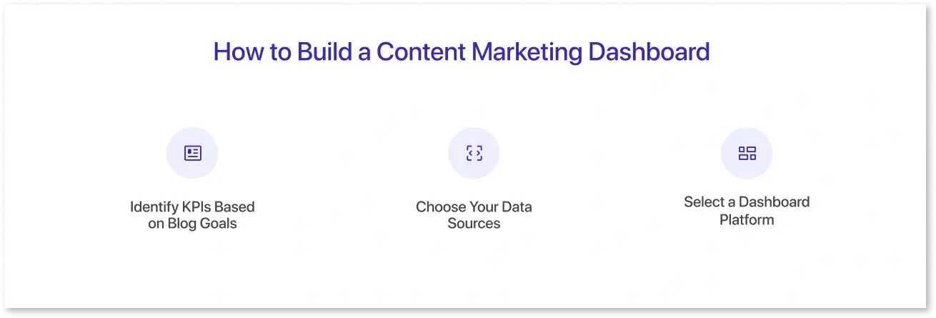
Building a content dashboard involves selecting the right metrics, tools, and data visualization structure. The goal is to create a clear, efficient, and actionable reporting environment that supports your content strategy.
1. Identify KPIs Based on Blog Goals
Your dashboard should reflect your content objectives. Before selecting metrics, define whether your blog aims to:
- Increase brand visibility
- Build authority
- Drive organic traffic
- Increase engagement
- Generate leads
- Support SEO efforts
Aligning metrics to goals ensures your dashboard stays focused and relevant.
2. Choose Your Data Sources
Most teams rely on a combination of:
- Google Analytics 4 for traffic and engagement
- Google Search Console for search visibility
- Semrush or similar tools for SEO insight
- Email platforms for subscription metrics
- CRMs for lead generation tracking
- Social platforms for referral data
Identifying your sources ensures your dashboard captures every important performance dimension.
3. Select a Dashboard Platform
You can build your dashboard using tools such as:
- Looker Studio (Google Data Studio)
- Power BI
- Tableau
- Mokkup (wireframing tool)
These platforms enable you to integrate multiple data sources, customize your layout, and establish an automated reporting workflow.
Why a Ready-Made Marketing Dashboard Template Saves You Time
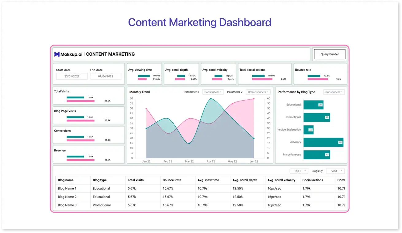
Instead of building a content marketing dashboard from scratch, you can save significant time and effort by using a pre-built dashboard template. One excellent example is the Mokkup.ai Content Marketing Dashboard Template. This template is designed specifically for BI-style dashboards. It is well-suited for content marketing teams that want a visual, structured way to track performance without getting lost in design or data architecture details.
Here’s how this template helps, and why it’s a smart choice:
1. Built for Marketing Use Cases:
The Mokkup.ai template supports content marketing–relevant metrics, including page views, engagement, SEO KPIs, and conversions. Because it’s made for BI-style dashboards, the layout naturally supports trend visualizations, key metric summaries, and detailed breakdowns.
2. Drag-and-Drop Customisation:
You don’t need design experience to use this template. With Mokkup.ai’s intuitive drag-and-drop interface, you can easily add, remove, or rearrange chart elements. This allows you to place KPIs (such as average time on page or newsletter signups) where they make the most sense to your team.
3. AI-Assisted Mockup Creation:
If you’re unsure how to start, Mokkup’s AI feature can generate a starting wireframe based on a prompt. For example, you could write: “Create a marketing dashboard showing monthly organic traffic, top blog posts, bounce rate, average scroll depth, and form submissions.” The AI will interpret your requirements and build a layout you can iterate on.
4. Real-Time Collaboration & Feedback:
Teams can collaborate on the same mockup, leave comments, and make edits in real-time. This reduces back-and-forth during dashboard design, aligns everyone on what metrics matter most, and speeds up approvals.
5. Export to BI Tools:
Once you’re happy with your design, you can export the wireframe directly to tools like Power BI or Tableau. The export retains the layout, visual elements, and containers, meaning your BI developers can build a working dashboard more quickly and accurately.
6. No Data Required to Prototype:
Because it’s a wireframe tool, you don’t need to connect to real data while designing. This is especially helpful when you’re still defining which KPIs to track or when data sources haven’t been finalized yet.
7. Professional Design Without a Designer:
Mokkup.ai offers a library of over 250 templates and more than 50 drag-and-drop chart components, enabling you to build a polished, high-fidelity dashboard without requiring design expertise.
Using a ready-made template, such as the one from Mokkup, helps you move faster, stay organized, and create a content dashboard that is visually clear, data-focused, and easy for your team to use.
Conclusion
A content dashboard provides a single, straightforward view of your blog's performance and audience engagement. By tracking the right metrics and using a structured layout, you can quickly see what works, what needs improvement, and where new opportunities exist.
Whether you build a dashboard from scratch or use a ready-made template like Mokkup, the goal is the same: make your content decisions faster, smarter, and backed by data. With the proper setup, your dashboard becomes a reliable engine for continuous content growth.
Frequently Asked Questions
A content dashboard helps you see all your key blog metrics in one place, so you don’t have to switch between tools to understand performance.
No. Platforms like Looker Studio and Mokkup let you design dashboards easily with drag-and-drop features.
Start with traffic, engagement, SEO performance, and conversions. These four areas give a clear picture of how your blog is performing.
Yes. Even with limited data, a dashboard helps you track early trends and establish healthy content habits from the outset.
It saves time, gives you a clean layout instantly, and makes it easier to structure your KPIs without worrying about design.
Prompt it. Wireframe it with Mokkup.ai.
