Data visualization has moved beyond static charts and dashboards. In 2026, AI will be a key component of how companies analyze and act on data. Across industries, over 78% of businesses use AI in at least one business activity, showing that artificial intelligence is no longer optional but necessary for data management and making better decisions.
AI is transforming data exploration and presentation by enabling AI dashboards and automated data visualization. By detecting patterns, automating results, and accelerating analysis, AI reduces the time spent building reports and increases the time spent interpreting insights. Instead of spending hours looking for trends, teams can focus on understanding the data and deciding what steps to take next. This shift is reshaping data visualization and how organizations interact with data in 2026.
Table of Contents
- What is AI Data Visualization?
- Why AI Matters in Data Visualization
- Real-World Use Cases of AI-Powered Data Visualization
- AI vs Traditional Data Visualization: What’s the Difference?
- Challenges and Considerations in AI Data Visualization
- Future of AI-Powered Data Visualization
What is AI Data Visualization?
AI data visualization refers to the use of artificial intelligence to analyze data and automatically surface insights through visual formats. Unlike traditional visualization methods that depend on manual configuration, AI-enhanced approaches can adapt to the data and guide users toward what matters most.
With AI in place, data visualization can:
- Detect patterns and trends automatically.
- Highlight anomalies or unusual changes.
- Recommend suitable visual formats for clearer interpretation.
- Respond to simple, natural-language questions about the data.
The goal is not just to create charts faster, but to make insights easier to access, especially for users without advanced technical or analytical skills.
Why AI Matters in Data Visualization
Data is growing faster than most teams can realistically analyze by hand. Spreadsheets and static dashboards often struggle to keep up with the volume, variety, and speed of modern data. AI helps bridge this gap by reducing manual effort and making insights easier to understand and act on.
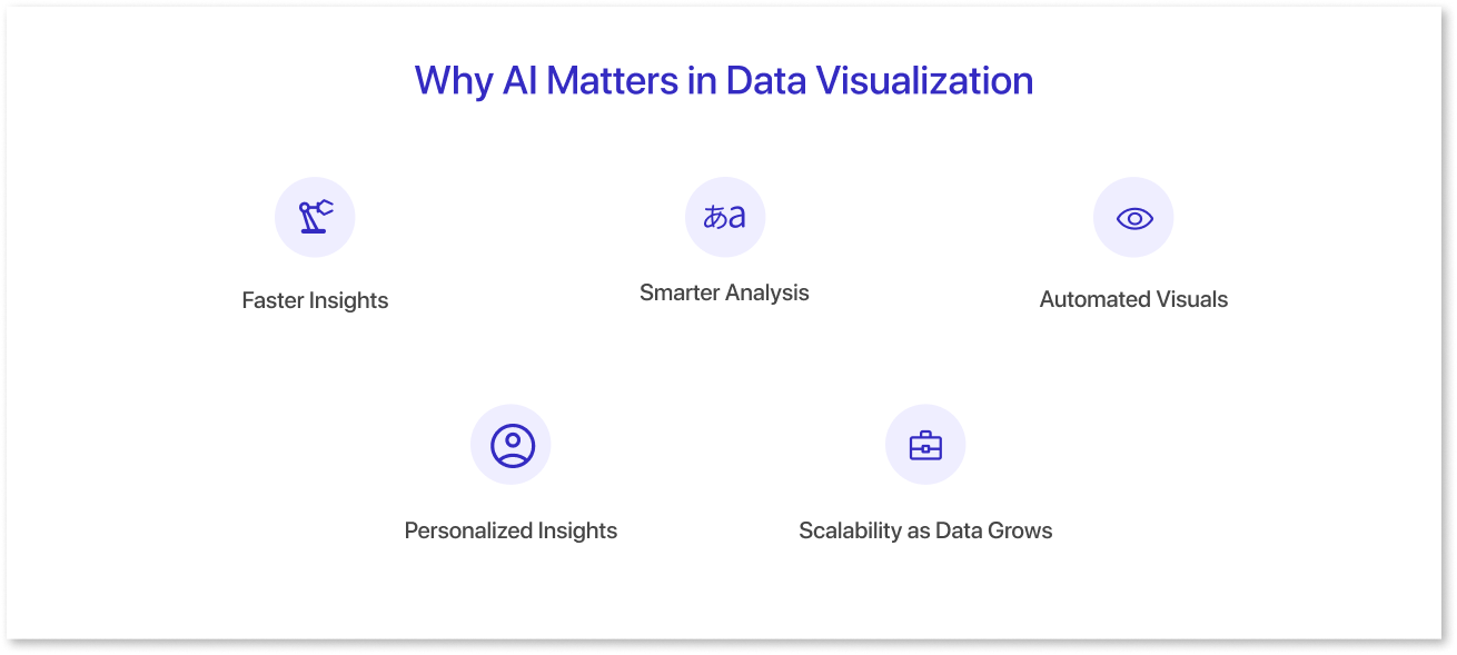
Here’s how AI data visualization makes it more effective:
1. Faster Insights:
AI can process large and complex datasets in seconds, surfacing trends, patterns, and outliers that might otherwise take hours or days to uncover. This allows teams to respond quickly instead of reacting after the fact.
2. Smarter Analysis:
Machine learning models go beyond surface-level reporting by identifying correlations, anomalies, and early warning signals. This deeper analysis helps teams understand not just what is happening, but why it is happening.
3. Automated Visuals:
Instead of manually selecting chart types or building dashboards from scratch, AI can recommend or generate visuals based on the data context and analytical goals. This reduces trial and error and ensures insights are presented clearly.
4. Personalized Insights:
AI-driven visualization can adapt to different users and roles. Executives, analysts, and operational teams can each see insights tailored to their priorities, making dashboards more relevant and actionable.
5. Scalability as Data Grows:
As data volumes and sources increase, manual visualization becomes harder to maintain. AI helps visualizations scale by continuously updating insights and keeping dashboards accurate without constant manual intervention.
Together, these capabilities make data visualization more responsive, intuitive, and focused on supporting better decision-making.

Real-World Use Cases of AI-Powered Data Visualization
AI-driven visualization is already making an impact across industries.
- Retail: Demand Forecasting and Inventory Optimization
Retailers use AI-powered dashboards to forecast demand by considering factors such as seasonality, promotions, and external conditions. This helps reduce stockouts, minimize excess inventory, and improve supply chain efficiency. - Healthcare: Automated Reporting
Healthcare organizations use AI to automate reporting processes, such as clinical registries and performance metrics. This reduces manual workload and allows teams to focus more on patient care and outcomes.
These examples highlight how AI-driven visualization turns complex data into practical insights that improve efficiency, accuracy, and outcomes across industries.
AI vs Traditional Data Visualization: What’s the Difference?
Below is a side-by-side comparison of traditional and AI-powered data visualization:
|
Basis |
Traditional Visualization |
AI-Powered Visualization |
|
Chart Creation |
Manual setup of charts |
Automated chart generation via prompts |
|
Dashboard Type |
Static dashboards |
Dynamic, adaptive dashboards |
|
User Accessibility |
Requires technical expertise |
Accessible to non-technical users |
|
Predictive Capability |
Limited predictive capability |
Machine learning-driven insights |
AI shifts visualization from reporting what happened to helping teams understand what is happening and what might happen next.
Challenges and Considerations in AI Data Visualization
While AI brings speed and intelligence to data visualization, it also comes with important considerations that teams should be aware of.
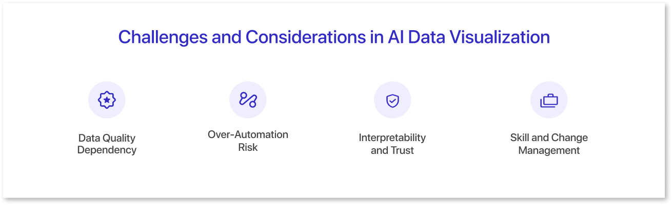
1. Data Quality Dependency:
AI-generated insights are only as reliable as the data they are built on. Incomplete, outdated, or inconsistent data can lead to misleading visuals and conclusions.
2. Over-Automation Risk:
Automated charts and insights can sometimes hide important context. Without human review, teams may accept results at face value without questioning assumptions or data sources.
3. Interpretability and Trust:
Some AI-driven insights can feel like a “black box,” especially for non-technical users. Clear explanations and transparent logic are essential for building trust in AI-generated visualizations.
4. Skill and Change Management:
Although AI reduces manual effort, teams still need basic data literacy to interpret results correctly. Organizations may need training to help users adapt to AI-assisted workflows.
Addressing these challenges ensures that AI-powered data visualization remains accurate, trustworthy, and aligned with business goals.
Future of AI-Powered Data Visualization
AI is becoming a core part of how analytics is built, used, and understood. As generative AI continues to mature, dashboards will shift from static reporting tools to more interactive, intelligent systems that actively support decision-making.
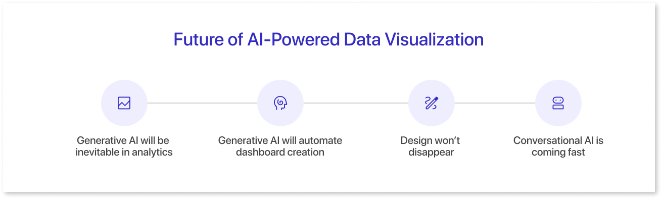
- Generative AI will be Inevitable in Analytics: Gartner projects that by 2027, 75% of new analytics content will be contextualized for intelligent applications through generative AI (GenAI). Dashboards will feel more like assistants than static charts.
- Generative AI will Automate Dashboard Creation: Instead of manually creating dashboards, generative AI will help auto-create charts, identify key patterns, and recommend the most relevant visual views based on raw data. Tools like Mokkup.ai, a dashboard wireframing platform, have already reflected this shift with capabilities like Create with AI, which allows teams to easily build dashboard layouts and visual structures with AI assistance.
- Design won’t Disappear: While AI can automate insights and layout ideas, careful design will remain necessary. Human involvement ensures that dashboards are clear, intuitive, and in line with the business context. Mokkup.ai highlights how AI-assisted processes can improve design speed while maintaining clarity and usability.
- Conversational AI is Coming Fast: With major industry players like Tableau and Power BI positioning themselves in conversational query resolution, dashboards responding to plain-language questions will become a new normal.
In short, the future of data visualization will have AI as an integral part.
Conclusion
AI is reshaping how organizations turn data into insights. By reducing manual effort and enhancing analysis, AI-driven data visualization helps teams focus on understanding information rather than building reports.
As AI becomes more deeply embedded in analytics workflows, data visualization will continue to evolve from static dashboards into intelligent systems that support faster, more confident decision-making. For businesses navigating growing data complexity, this shift is becoming essential rather than optional.

Frequently Asked Questions
AI identifies anomalies, reduces manual errors, and highlights correlations that humans may miss.
Yes, most modern AI-powered dashboard tools like Mokkup allow automated chart generation from queries or datasets.
Faster insight delivery, democratized access for non-technical users, predictive analytics, and reduced manual effort.
Prompt it. Wireframe it with Mokkup.ai.
