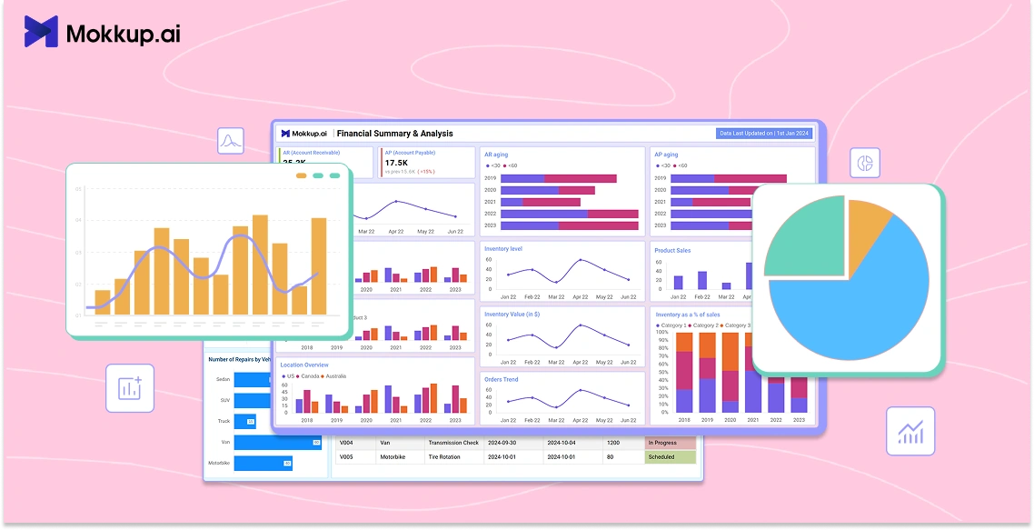
Designing a dashboard is more than just placing charts and numbers on a screen. It’s about making the information easy to read, understand, and use. A well-structured dashboard design lets users quickly spot trends, track performance, and make informed decisions. For instance, a sales dashboard that compares monthly targets with actual figures can help managers respond faster and stay on track.
Yet, even the most valuable data can go unnoticed if the dashboard is cluttered or hard to navigate. That’s where good design comes in. Whether you're designing for sales, marketing, or operations, these examples offer practical ideas to improve clarity and user experience.
If you’re looking for dashboard UI inspiration or trying to build a clean, functional dashboard user interface, this guide has you covered. It explores the best practices in dashboard UI design, showcasing patterns that improve usability and visual clarity. Let’s take a look at 7 dashboard design examples that get it right.
Table of Contents
- What Makes a Dashboard Work? The Basics of Design
- 7 Dashboard Design Examples That Get It Right
- What UX and UI Design Patterns Improve Dashboard Usability?
What Makes a Dashboard Work? The Basics of Design
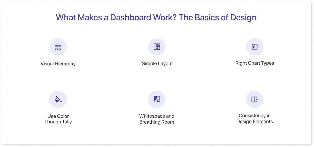
A dashboard performs best when it combines valid data and thoughtful dashboard design. It's not just about displaying data; it's about making it easy to understand, visually organized, and matched to the user's requirements. Good design allows individuals to quickly find what they're looking for and make better judgments without becoming overwhelmed.
In short, dashboard design involves finding a balance between functionality and form. A well-designed dashboard makes data more approachable and relevant, allowing users to move easily from information to insight.
Here are some basic design principles that make dashboards effective:
- Visual Hierarchy: Design your dashboard with a clear visual hierarchy, highlighting the most important information. Use size, placement, and bold text to direct the viewer's attention. KPIs should be at the top or center, with supporting charts around them.
- Simple Layout: Use a grid or organized layout that aligns things neatly. It keeps the dashboard organized and easy to scan. Avoid random placements and unequal spacing between visuals.
- Right Chart Types: Design is more than appearance; it's also about selecting the right visuals. Use bar charts for comparisons, line graphs for trends, and pie charts when needed. Avoid complicated visualizations unless your users are familiar with them.
- Use Color Thoughtfully: Color is a powerful design tool when applied correctly. Use it to highlight important insights or groups of data. To avoid visual clutter, use a limited color palette and make everything accessible (for example, colorblind-friendly palettes).
- Whitespace and Breathing Room: A good design leaves space between elements so users do not feel overwhelmed. Don't try to fit everything into one screen; instead, allow space for the eye to rest and make information easier to absorb.
- Consistency in Design Elements: Maintain consistency in design elements using the exact font sizes, button styles, and label formats. This not only appears professional, but it also allows consumers to focus on the data rather than being distracted by uneven images.
In short, dashboard design involves finding a balance between functionality and form. A well-designed dashboard makes data more approachable and relevant, allowing users to move easily from information to insight.
7 Dashboard Design Examples That Get It Right
Designing a functional and easy-to-navigate dashboard requires more than just adding charts and numbers. It’s about selecting the right layout, visuals, and structure to make data approachable and actionable. Mokkup.ai follows these dashboard UI best practices and offers 250+ ready-to-use templates with clean layouts and intuitive dashboard designs.
These examples highlight how good dashboard design and clean dashboard UI turn complex data into clear insights. With Mokkup.ai’s templates and AI-powered wireframing, users can generate effective dashboards from a simple prompt.
1. Digital Marketing Dashboard
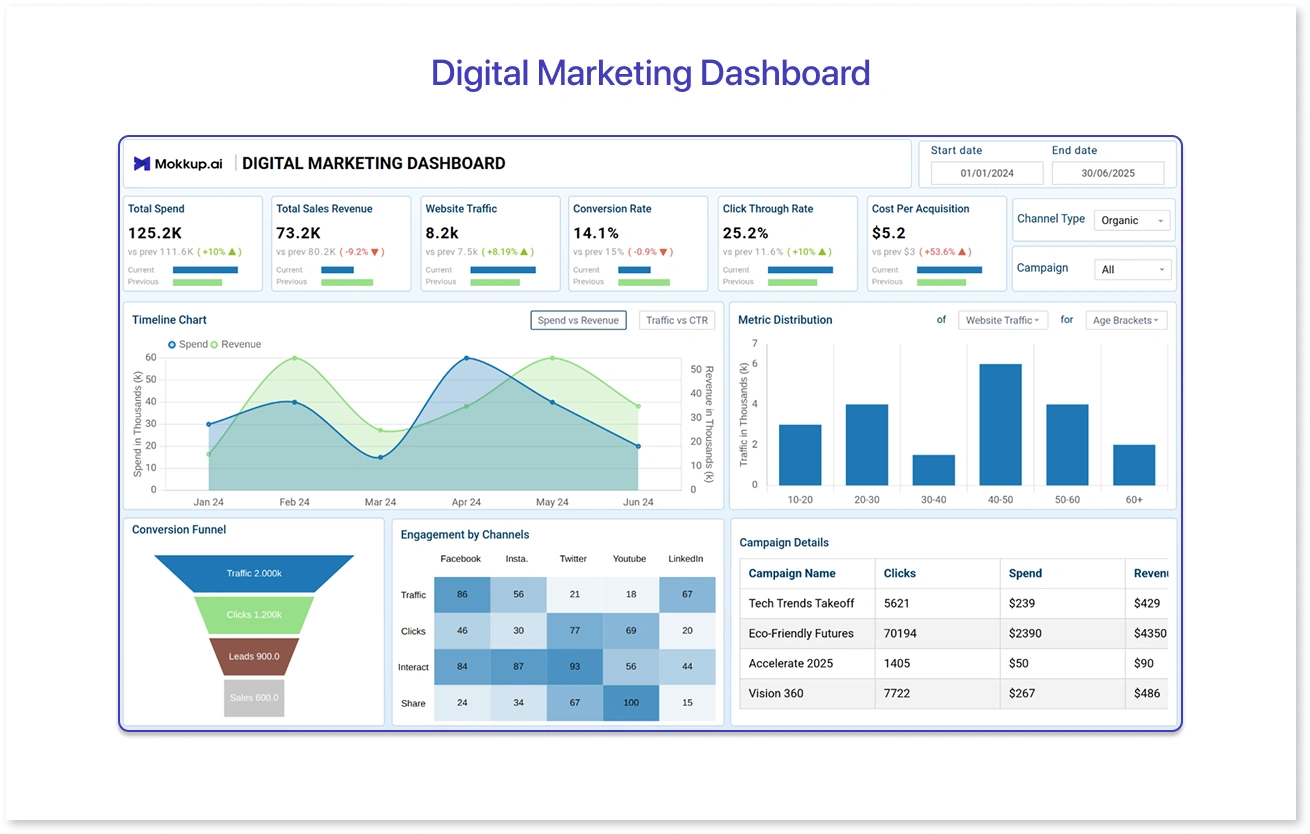
This Digital Marketing Dashboard template is a clean, well-organized operational dashboard that tracks key metrics like spend, revenue, traffic, and conversion rates. Clear KPIs, timeline charts, and a conversion funnel give users a quick overview of campaign performance. The layout uses good visual hierarchy, color cues, and filters to make the data easy to read and act on.
2. HR Recruitment Dashboard
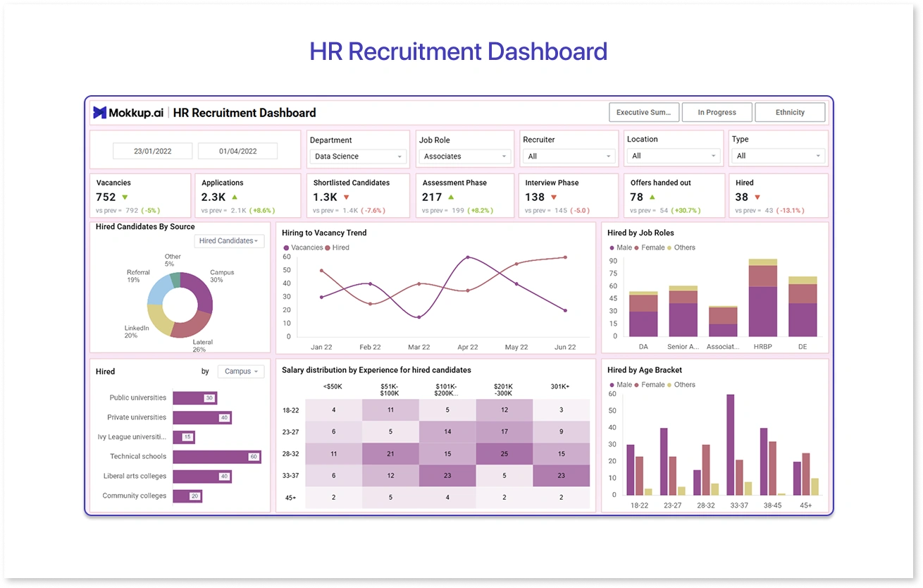
This HR Recruitment Dashboard template provides a clear hiring process overview, tracking key metrics like vacancies, applications, interviews, and final hires. With clean visuals and filters, it highlights trends in hiring sources, job roles, age groups, and salary distribution, allowing HR teams to identify gaps and optimize recruitment easily.
3. Social Media Sentiment Analysis
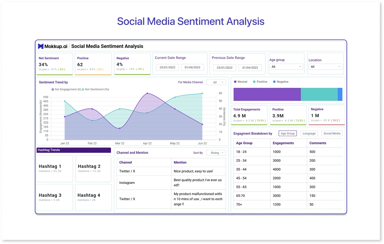
This Social Media Sentiment Analysis Dashboard template provides a quick snapshot of user sentiment across channels, tracking metrics like net sentiment, engagement volume, and positive vs. negative mentions. With a simple UI, color-coded visuals, and filters for age group and location, it helps teams identify audience reactions, trending hashtags, and platform-specific feedback in one easy-to-read view.
4. Inventory Stock Out Report
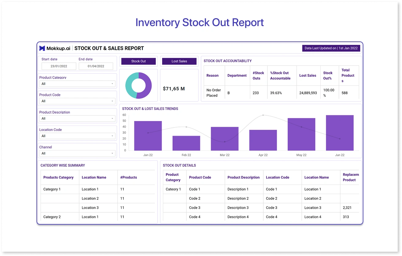
This Stock Out & Sales Report Dashboard template clearly shows how stockouts affect sales, highlighting metrics like total sales loss, stockout trends, and department-wise accountability. A clean layout, monthly breakdowns, and product-level insights help teams quickly spot problem areas and take action to improve availability and revenue.
5. Financial Summary Analysis
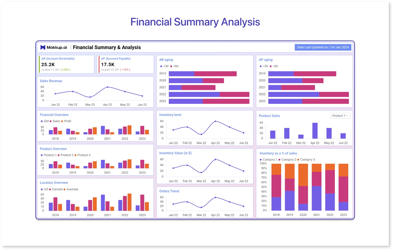
This Financial Summary & Analysis Dashboard template provides a clear overview of key financial data such as receivables, payables, revenue, and profit trends. With an intuitive layout and monthly/yearly comparisons, it helps with cash flow tracking, inventory management, and informed decision-making.
6. Employee Engagement Report
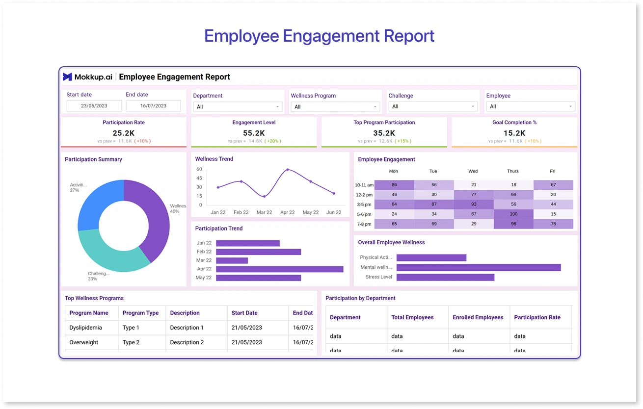
This Employee Engagement Dashboard template gives a comprehensive snapshot of how employees interact with wellness initiatives and activities. It uses interactive elements and thoughtfully grouped metrics to reveal trends in participation, highlight areas needing attention, and support data-driven wellness strategies.
7. Automobile Maintenance Report
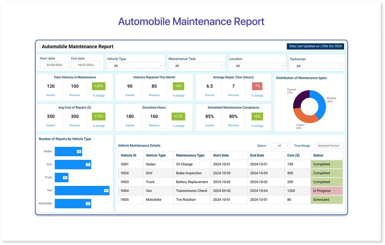
This Automobile Maintenance Dashboard template offers a clear overview of vehicle health and repair activities. It presents data through easy-to-scan visuals and logical groupings, helping teams monitor service frequency, manage repair costs, and reduce vehicle downtime.
These examples highlight how good dashboard design and clean dashboard UI turn complex data into clear insights. With Mokkup.ai’s 250+ templates and AI-powered wireframing, users can generate effective dashboards from a simple prompt.
What UX and UI Design Patterns Improve Dashboard Usability?
Designing an effective dashboard isn’t just about choosing the right charts; it’s also about how they’re arranged so users can easily interact with them. UX and UI design patterns make dashboard design intuitive, accessible, and action-oriented.
According to Bricx Labs, dashboards with clear structure and appropriate visuals can reduce analysis time by up to 24% and improve decision accuracy by about 41%.
Using the right dashboard design patterns, from layout structures and visual hierarchy to interaction elements such as filters, drill-downs, and alerts, allows users to navigate data more easily and discover insights faster.
Many dashboard design mistakes occur when consistency and structure are overlooked. These layout patterns are especially important when building complex tools like admin panels or executive reporting dashboards.
Designing for Natural Navigation:
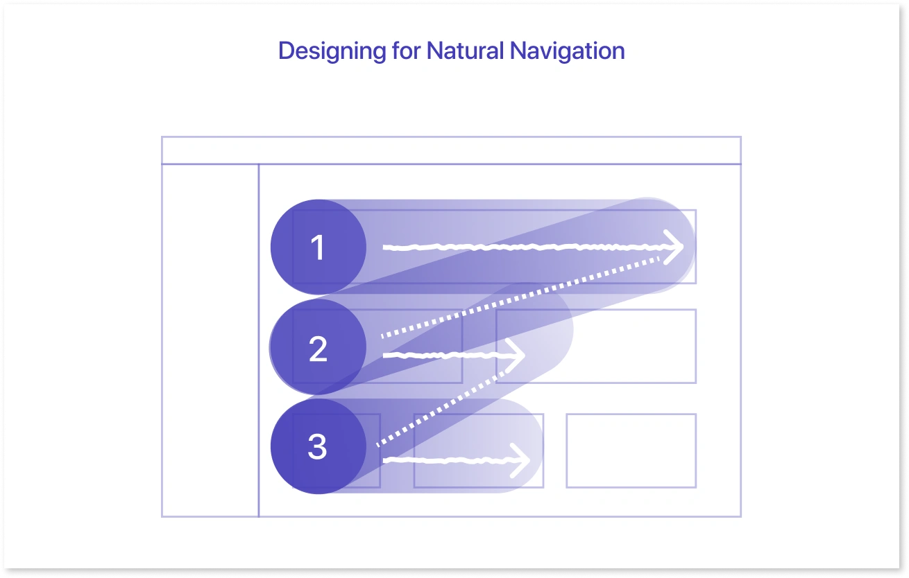
When it comes to dashboard UX and UI, thoughtful layout is everything. Since dashboards often act as a centralized location, how you organize content directly impacts how users explore and interact with the data. Ideally, users should be able to seamlessly click into charts or sections to access more detailed views.
Users often scan screens using F‑shaped and Z‑shaped patterns when reading from left to right. Eye‑tracking research supports this, showing that attention is naturally drawn to a layout's top-left and left-side zones. That makes the top-left corner ideal for high-priority KPIs or summary visuals.
When planning your dashboard layout, think about how users will interact with each module or data point, from scanning key metrics to diving deeper into performance trends.
Maintain a Consistent Card Layout:
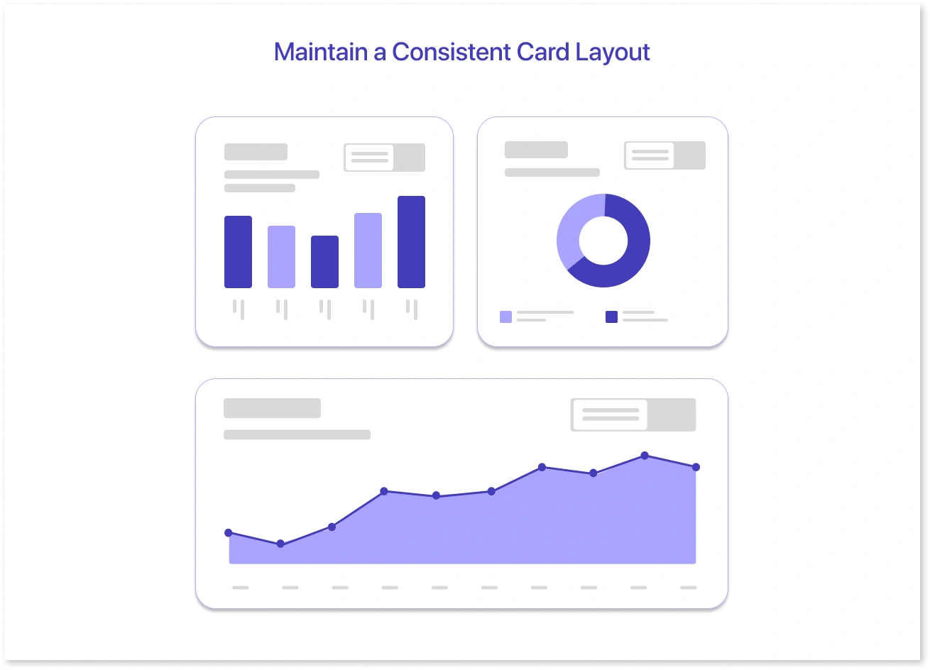
Card-based layouts are standard in data dashboards, and they can take many forms, including floating elements without backgrounds, neatly framed cards with white backgrounds and rounded corners, and even bold title lines stretching across the top. The idea is not that every chart requires a separate box, but that each visual follows a consistent structure. This includes arranging titles, labels, legends, and other supporting elements.
Select a layout strategy that accommodates a variety of chart types while leaving room for essentials such as key metrics, date filters, and legends. For example, consistently placing the title in the top-left corner of the legend beneath the chart establishes a consistent rhythm, making the dashboard easier to scan. Visual consistency reduces cognitive load and improves the overall user experience.
Many dashboard UI examples, especially those of top companies, rely on consistent layouts, familiar interactions, and clean visual hierarchy.
Useful Chart UX Patterns
The best dashboard designs don’t just look good; they guide users toward insights effortlessly. After you've finalized your dashboard's overall layout, the next step is to improve the individual charts and graphs by aligning them with dashboard design UX patterns to truly support the user experience.
1. Using Color Effectively:
Color can convey powerful meaning in your visuals, but it's easy to overdo it. Consider other options instead of using the default red-yellow-green to indicate negative, neutral, and positive values.
For example, you could use different shades of your brand's primary color to represent data intensity, lighter tones for lower values, and darker tones for higher ones. Alternatively, if your dashboard already has traffic light colors, consider using blue for positive data and orange for negative. These colors are still noticeable, but they have a softer tone.
Colors must contrast nicely with the background for easy access. Don't rely solely on color; use labels, textures, or patterns to help everyone understand the data.
2. Lines, Fills & Textures:
Accessibility is key here, too. Relying solely on color may leave some users behind. Use textures or patterns such as dots, stripes, or grids to differentiate areas on your charts. These additions can help all users understand your visuals, especially when dealing with multiple data types in the same space.
Different line styles (such as dashed, dotted, or solid) help to distinguish multiple lines that would otherwise blend visually.
3. Highlighting Deltas (Data Changes):
Deltas indicate how things change, whether a number increases, decreases, or remains constant. You can present these as percentages, comparisons to previous timeframes, or even industry benchmarks.
The key is to remain consistent and easy to read. Use icons, colors, or short descriptions to indicate whether something is up, down, or stable. These quick visual cues help users understand trends at a glance.
4. Responsive Layouts for Mobile:
When designing for mobile, remember that users on the go are unlikely to need everything. Concentrate on what's most important, the top metrics or broad trends. Small screens are often better suited to a vertical stack layout. It is also perfectly acceptable to recommend rotating the phone or using a larger screen for charts that are too detailed for mobile.
5. Smart Use of Data Labels:
Labels are essential, but space is limited, especially with time-based data. Angled labels can be useful, but plan for when things become cramped. Consider how long labels should be and how to shorten them (e.g., "September 19" could become "Septem…" or "Sept… 19" which makes sense to your users?).
If it becomes too crowded, hide the labels and use hover tooltips instead. Even if the labels are minimal, the chart should still tell the story. Also, avoid giving users too many filter or date range options that the screen cannot handle effectively.
6. Typography & Visual Hierarchy:
Bold, oversized numbers in stylish fonts can do more than just look good; they can help users quickly identify what is important. If you've done your homework and know which numbers deserve attention, using bold typography demonstrates confidence and intent.
From the user's perspective, it demonstrates that someone has carefully considered what is most important, thereby increasing trust.
Making Charts Interactive
To reduce overwhelm, consider interactive features that reveal more detail only when necessary, known as progressive disclosure. Here are some ideas:
- Tooltips and Hover States: Allow users to hover over a section to see additional information without cluttering the main view.
- Toggling Data Sets: Allow users to turn individual chart lines on and off, which is useful when a lot of data is displayed at once. Turning your legend into a clickable checklist can help.
- Inline Filters: Rather than global filters that affect the entire page, provide filters tailored to each module. This allows users to filter a section by date or location without affecting the rest of the dashboard.
This level of attention to chart UX makes your dashboards more visually appealing and more usable, accessible, and valuable to those who rely on them.
Conclusion
Designing an effective dashboard isn't about including as many charts or metrics as possible; it's about clarity, usability, and assisting people in making decisions more quickly. As the examples above demonstrate, when clean layouts, smart visual use, and thoughtful interaction patterns are combined, dashboard design becomes not only readable but also useful.
Keep things simple, use consistent UI patterns, and prioritize information according to what is most important. From selecting the appropriate chart types to enabling valuable interactions, every small decision contributes to better dashboard design and user experience.
Frequently Asked Questions
A great dashboard is clean, easy to read, and first shows the most important information. It helps you quickly understand what’s going on, without needing to dig through many details. Everything should be well-organized and easy to find.
Top companies design dashboards with the user in mind. They focus on what the team needs to see and make sure the layout is clear and consistent. They use common design patterns, test their dashboards with real users, and ensure everything works well across devices.
An easy-to-use dashboard is one where you don’t have to think too hard to find what you need. Good dashboards use clear titles, simple visuals, and familiar layouts so users can scan and understand data quickly. Interactive tools like filters or drill-downs make it even easier.
It depends on what your dashboard is for. If it’s for tracking real-time data, a top-down layout works well. A grid layout might be better if it’s for comparing multiple things. Always start with the most important information at the top or top-left, where people naturally look first.
For beginners, simple is best. Use a clean layout with a few key numbers or charts, grouped in sections. Stick to basic visuals, clear labels, and easy navigation. Avoid too many colors or complex interactions.
A good dashboard UI is:
- Clear and consistent
- Easy to navigate
- Mobile-friendly
- Simple, with just the right amount of data
- Designed with filters and drill-downs for more details
- Fast to load and not cluttered
These features make sure the dashboard works well for everyone who uses it.
Prompt it. Wireframe it with Mokkup.ai.