What is an Irrigation and Water Distribution Farmer Outreach Dashboard?
The Irrigation and Water Distribution Farmer Outreach Dashboard is a structured analytics template designed to help agricultural extension agencies, water utility programs, and rural outreach teams measure and improve their engagement with farming communities. This irrigation farmer outreach dashboard template consolidates outreach performance data into a single view, covering how many farmers have been reached, how effectively they are engaging with programs, and what barriers are preventing wider adoption. As a farmer engagement rate tracking dashboard, it gives program managers the trend visibility they need to evaluate whether outreach campaigns are gaining or losing traction over time. Teams responsible for promoting water-saving practices can use this template to evaluate campaign effectiveness, prioritize high-impact channels, and demonstrate results to funding stakeholders. By tracking everything from conservation program participation rates to cost efficiency metrics, this dashboard gives program managers a clear operational picture of how their outreach efforts are performing across regions and farmer segments. It supports the kind of regional farmer engagement by channel analysis that helps planners understand which communication methods resonate most with different farming communities.
How to Create an Irrigation and Water Distribution Farmer Outreach Dashboard
You don't need to build your report from scratch; just start with a ready-to-use dashboard template from Mokkup. Add in your data and export it however you like. Here's how to do it:
1. Create or Log in to Your Mokkup Account
Start by signing up on Mokkup.ai using your email. If you already have an account, just log in, and you'll be good to go.
2. Choose and Customize Your Dashboard Template
Find the Irrigation and Water Distribution Farmer Outreach Dashboard template in the Templates section. Use the drag-and-drop editor to adjust KPIs, edit filters, or add elements based on your data.
3. Export to Your BI Tool
Once your dashboard wireframe is ready, use the BI Tool Export feature to send it directly to Power BI or Tableau for further analysis and enhancements. You can also download the dashboard as a PDF, PNG, or JPEG, embed it on a platform, or invite your team to collaborate.
Note: This is a Pro template. You'll need a Pro subscription on Mokkup to use and customize this dashboard wireframe. Upgrade anytime to unlock full access.
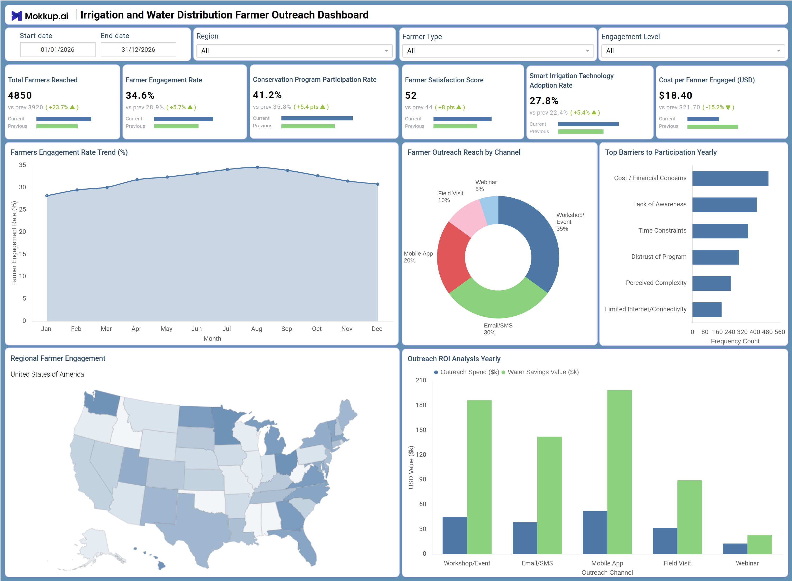
Irrigation and Water Distribution Farmer Outreach Dashboard Example
A regional agricultural extension coordinator opens this dashboard to understand how their latest irrigation outreach campaign is performing across multiple states. The KPI row immediately surfaces whether the total number of farmers reached is growing, whether engagement is trending in the right direction, and how the cost per farmer engaged compares to previous periods. If engagement is lagging in specific states, the choropleth map of regional farmer engagement highlights exactly where those gaps exist, prompting a geographic shift in campaign resources. Moving to the channel breakdown, the coordinator can see which delivery methods — such as email/SMS or mobile app — are driving the most participation and whether investment in field visits is yielding proportional results.
The Outreach ROI Analysis Yearly chart makes it straightforward to compare outreach spend against water savings value by channel, directly informing budget decisions for the next planning cycle. The Top Barriers to Participation chart identifies whether cost concerns or limited internet connectivity are the dominant friction points, allowing the team to tailor messaging or logistics accordingly. With the adoption rate of smart irrigation technology visible as a top-line KPI, teams can quickly assess whether awareness campaigns are translating into actual on-farm behavioral change.
How to Analyze Data in an Irrigation and Water Distribution Farmer Outreach Dashboard
Here is how you can analyze data from this dashboard:
- Use the Region filter to isolate performance metrics for specific geographic areas and compare engagement levels across states.
- Use the Farmer Type filter to segment outreach data by farming profile and identify which segments show the lowest participation.
- Use the Engagement Level filter to focus analysis on low-engagement cohorts and prioritize follow-up outreach efforts.
- Monitor the Farmers Engagement Rate Trend (%) line chart monthly to detect seasonal dips and plan campaign timing accordingly.
- Review the Farmer Outreach Reach by Channel donut chart to identify which channels generate the most farmer reach.
- Analyze the Top Barriers to Participation Yearly bar chart to understand whether cost concerns or connectivity issues are limiting program growth.
- Use the Outreach ROI Analysis Yearly grouped bar chart to compare outreach spend against water savings value by channel.
- Monitor the Regional Farmer Engagement map to identify states with low coverage and redirect outreach resources accordingly.
- Track the Conservation Program Participation Rate KPI over time to measure whether campaigns are converting farmers into active program participants.
- Cross-reference Smart Irrigation Technology Adoption Rate with channel performance to assess which outreach formats drive on-farm technology uptake.
Benefits of an Irrigation and Water Distribution Farmer Outreach Dashboard
The following are the benefits of using this dashboard:
- Centralizes farmer engagement, participation, and cost-efficiency metrics across outreach programs into a single structured template.
- Supports conservation program participation monitoring across multiple channels and regions without manual data aggregation.
- Enables regional farmer engagement by channel analysis through an interactive US map and channel donut chart breakdown.
- Provides a grouped bar chart view of outreach ROI analysis for water distribution programs to support budget justification.
- Reduces reporting effort for agricultural extension teams with pre-built KPI tiles covering all key outreach performance metrics.
- Helps program managers identify top barriers to farmer participation and adjust strategy based on frequency count data.
- Gives field coordinators and program directors a shared view of campaign performance, cost efficiency, and technology adoption trends.
KPIs to Track in an Irrigation and Water Distribution Farmer Outreach Dashboard
The following key KPIs can be tracked by using this dashboard:
- Total Farmers Reached: Tracks the cumulative number of farmers contacted through all outreach channels — foundational for measuring program scale and growth over time.
- Farmer Engagement Rate (%): Measures the percentage of reached farmers who actively participated in outreach activities — central to farmer engagement rate tracking across campaigns.
- Conservation Program Participation Rate (%): Quantifies the share of farmers who enrolled in conservation initiatives — key for conservation program participation monitoring and funder reporting.
- Farmer Satisfaction Score: Evaluates farmer-reported satisfaction with outreach interactions — used to assess program quality and inform future messaging adjustments.
- Smart Irrigation Technology Adoption Rate (%): Tracks the percentage of farmers who adopted smart irrigation practices after engagement — the primary indicator for measuring smart irrigation technology adoption rate progress.
- Cost per Farmer Engaged (USD): Measures the average cost incurred per actively engaged farmer — essential for outreach ROI analysis for water distribution budget planning and resource allocation.
Frequently Asked Questions
1. What types of organizations can use the Irrigation and Water Distribution Farmer Outreach Dashboard?
Agricultural extension agencies, water utility programs, government rural development offices, and NGOs running irrigation outreach initiatives are the primary users. Any team tracking farmer participation and outreach spend will find this template directly applicable.
2. Can this dashboard track performance by outreach channel?
Yes. The Farmer Outreach Reach by Channel donut chart breaks down farmer reach across email/SMS, mobile app, field visit, workshop/event, and webinar. The Outreach ROI Analysis yearly chart further compares spend versus water savings value by each channel.
3. Does the dashboard support geographic analysis of farmer engagement?
Yes. The Regional Farmer Engagement choropleth map visualizes engagement levels across US states, making it straightforward to identify low-coverage areas and redirect outreach resources accordingly.