AI is reshaping how we read and understand data, and its impact is only getting bigger. The global data visualization tools market is projected to reach roughly $9.25 billion in 2026, up from around $8.48 billion in 2025, as enterprises increasingly adopt dashboards and visual analytics for decision-making.
This growth reveals a clear trend: businesses are looking for faster and smarter ways to turn complex data into actionable insights. In this blog, we’ll look at the top 7 AI data visualization tools in 2026 that are helping teams bring data to life. Let’s dive in.
Table of Contents
- What is AI Data Visualization?
- Why AI Data Visualization Matters Today
- What Makes AI Data Visualization Different in 2026
- Top AI Data Visualization Tools to Explore
- AI-Generated Wireframe Example
- Comparison of Top AI Data Visualization Tools in 2026
- Benefits of Using AI-Driven Visualization
What is AI Data Visualization?
AI data visualization is the process of utilizing artificial intelligence to transform raw data into visually appealing representations, such as charts, dashboards, and summaries. Instead of relying solely on manual work, AI helps analyze data in the background and automatically highlights the most important patterns, trends, and insights.
In simple words, AI data visualization does two main things:
- Understands the Data for You: AI can quickly scan large amounts of data. It can find hidden patterns, unusual changes, and relationships that a person might miss.
- Creates Visuals Automatically: Instead of building charts one by one, AI helps generate the right visuals based on the question you ask or the data you upload.
This means you do not have to be a data expert. Even beginners can upload numbers or text and get clear visuals and insights within seconds.
AI data visualization also enhances accuracy by reducing manual errors. It saves time by automating tasks such as cleaning data, selecting chart types, and highlighting key findings. Some tools can even explain the insights in simple language, making it easier for teams to make decisions.
Why AI Data Visualization Matters Today
AI data visualization is essential today because businesses are dealing with more data than ever before. Traditional dashboards struggle to keep up with the speed and volume, creating a need for AI tools in data visualization. AI helps solve this problem by automating most of the heavy work.
Here are the main reasons why it matters:
1. Data is Growing Very Fast:
Companies collect data from various sources, including websites, apps, emails, social media, customer systems, and many others. It is too much for humans to analyze manually. AI helps by quickly scanning this data and turning it into simple visuals.
2. AI Finds Insights You May Miss:
AI can detect patterns, trends, and unusual changes that may not be immediately apparent. This helps teams make more informed decisions based on facts, rather than guesswork.
3. Saves a Lot of Time:
Instead of building charts one by one, AI tools automatically create visuals. This allows employees to spend more time understanding the insights and less time preparing reports.
4. Helps Non-Technical Teams:
Not everyone knows how to work with complex analytics tools. AI makes data easier for everyone by generating charts, summaries, and explanations in plain language.
5. Improves Accuracy:
Manual reporting often includes errors. AI reduces mistakes by cleaning data, verifying values, and choosing clear chart types.
6. Supports Faster Decision-Making:
Teams can get instant insights rather than waiting for long reports. This is particularly important in fast-paced areas such as marketing, sales, operations, and customer service.
Overall, AI data visualization matters today because it helps people understand their data quickly, clearly, and with less effort. It makes data useful for everyone, not just analysts.
What Makes AI Data Visualization Different in 2026
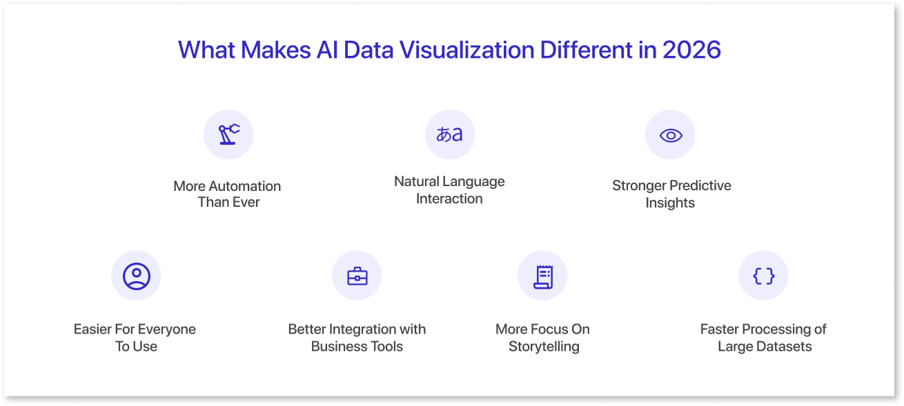
In 2026, data visualization AI tools are expected to be more advanced, faster, and smarter than they were in previous years. The most significant change is that AI is now integrated into nearly every aspect of the visualization process, making it easier for anyone to comprehend complex data without requiring additional effort.
Here are the key things that make AI data visualization different in 2026:
1. More Automation Than Ever:
In 2026, AI tools can clean data, select the most suitable chart types, detect errors, and automatically highlight key insights. This means users do not have to spend hours preparing data or building visuals.
2. Natural Language Interaction:
Many tools now let you type (or speak) a simple question like “show sales trends for the last 6 months,” and the AI instantly generates the correct chart or layout. With Mokkup, you can describe your dashboard in plain language, for example, “Create a sales dashboard with revenue trends, top products, and monthly growth”, and it builds a complete dashboard wireframe ready for editing or export.
3. Stronger Predictive Insights:
AI does not just show what happened. In 2026, it also predicts what might happen next. For example, tools can forecast sales, identify future risks, and estimate customer behavior, all inside the visual dashboard.
4. Easier For Everyone To Use:
Older visualization tools required training. In 2026, most AI tools are expected to utilize simple interfaces, guided workflows, and automatic explanations. Even beginners can understand insights in minutes.
5. Better Integration with Business Tools:
AI visualization platforms now connect smoothly with CRMs, ERP systems, cloud storage, marketing tools, and databases. This enables teams to view real-time insights without needing to transfer data.
6. More Focus On Storytelling:
In 2026, AI tools can now create comprehensive insight summaries, highlight key findings, and explain charts in simple language. This helps decision-makers understand the story behind the data, not just the numbers.
7. Faster Processing of Large Datasets:
Stronger AI models and advanced computing tools can now handle significantly larger datasets without slowing down. This is useful for growing companies with millions of records.
Overall, AI data visualization in 2026 stands out due to its increased automation, predictive capabilities, and enhanced user-friendliness. It helps people get answers instantly, understand insights clearly, and make smarter decisions with confidence.
Top AI Data Visualization Tools to Explore
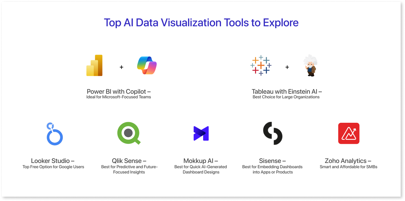
AI data visualization tools have become essential for teams that want to understand data quickly without spending hours on manual analysis. These AI tools for data visualization do more than create charts. They interpret patterns, automate insights, and help you ask better questions with natural language.
In 2026, the most effective platforms will integrate AI, automation, and real-time reporting to make data more accessible to everyone, from analysts to business users. Below are seven reliable tools that offer strong features, simple interfaces, and smart insights to support better decision-making.
1. Mokkup AI – Best for Quick AI-Generated Dashboard Designs
Mokkup.ai is perfect for teams that want to create dashboards quickly. Its “Create with AI” feature lets you describe the type of dashboard you need, and the tool automatically builds the layout, structure, and visual elements. It also includes a useful Review feature, which checks your design and suggests improvements to layout, spacing, and clarity.
This makes Mokkup ideal for rapid prototypes, mockups, and early-stage designs. If you want a tool that saves hours of manual design work and helps you build dashboard wireframes in minutes, Mokkup is an excellent choice.
2. Power BI with Copilot – Ideal for Microsoft-Focused Teams
Power BI is the most natural fit for businesses already using Microsoft tools, such as Excel, Teams, and Azure. With Copilot added, the platform becomes even simpler to use. You can type a question in everyday language, and Copilot instantly generates the right dashboard or chart for you.
It also offers forecasting, KPI monitoring, and trend detection, making analysis much quicker. For teams that want a familiar, cost-effective, and easy-to-adopt AI visualization tool, Power BI with Copilot is a great option.
3. Tableau with Einstein AI – Best Choice for Large Organizations
Tableau becomes far more powerful when paired with Einstein AI from Salesforce. Together, they help teams explore large datasets, ask questions in natural language, and understand not just what changed in their metrics but why it changed.
This deeper level of insight makes Tableau a favorite among large organizations that need strong analytics, reliable scalability, and smooth CRM integration. If your company needs an enterprise-ready AI visualization platform that delivers clear insights, Tableau with Einstein AI is an excellent pick.
4. Looker Studio – Top Free Option for Google Users
Looker Studio is an excellent solution for teams that use Google products and want a free, cloud-based visualization tool. It integrates seamlessly with Google Analytics, BigQuery, Ads, and other Google services, making reporting more streamlined and efficient.
With AI-powered suggestions and automated insights, Looker Studio enables users to build more effective dashboards with minimal effort. If your business wants a simple, accessible, and budget-friendly AI visualization tool, Looker Studio is one of the best options.
5. Qlik Sense – Best for Predictive and Future-Focused Insights
Qlik Sense stands out for its strong predictive analytics capabilities. Its AI engine uncovers patterns you might miss, detects unusual changes, and helps you understand possible future outcomes. It also supports “what-if” scenarios, allowing teams to explore different possibilities before making decisions. For companies that want both robust predictions and clear visualizations in one platform, Qlik Sense remains a top choice.
6. Sisense – Best for Embedding Dashboards into Apps or Products
Sisense is designed for companies that want analytics built directly into their apps, websites, or internal tools. Its AI features include forecasting, anomaly detection, and natural language search, making insights easily accessible. This makes it especially useful for SaaS companies and product-focused businesses that want analytics to be part of the user experience. If you need a tool that integrates deeply into your systems, Sisense is a strong, enterprise-grade choice.
7. Zoho Analytics – Smart and Affordable for SMBs
Zoho Analytics offers powerful AI capabilities at a price small and medium businesses can afford. It provides forecasting, natural language queries, and automated reporting, making it easy for teams to analyze data without technical skills. The platform also integrates seamlessly with popular CRMs, ERPs, and business applications. For startups and growing companies that want brilliant insights without high costs, Zoho Analytics is a practical and budget-friendly option.
These tools demonstrate how AI is making data easier to explore, understand, and utilize for faster decision-making.

AI-Generated Wireframe Example
Creating a dashboard with AI is a fast and straightforward process. With Mokkup’s AI feature, you just write what you need, and the tool automatically generates a complete dashboard wireframe. This helps teams transition from idea to layout in seconds, saving a significant amount of manual design time. Below is an example prompt you can use to create a complete dashboard design.
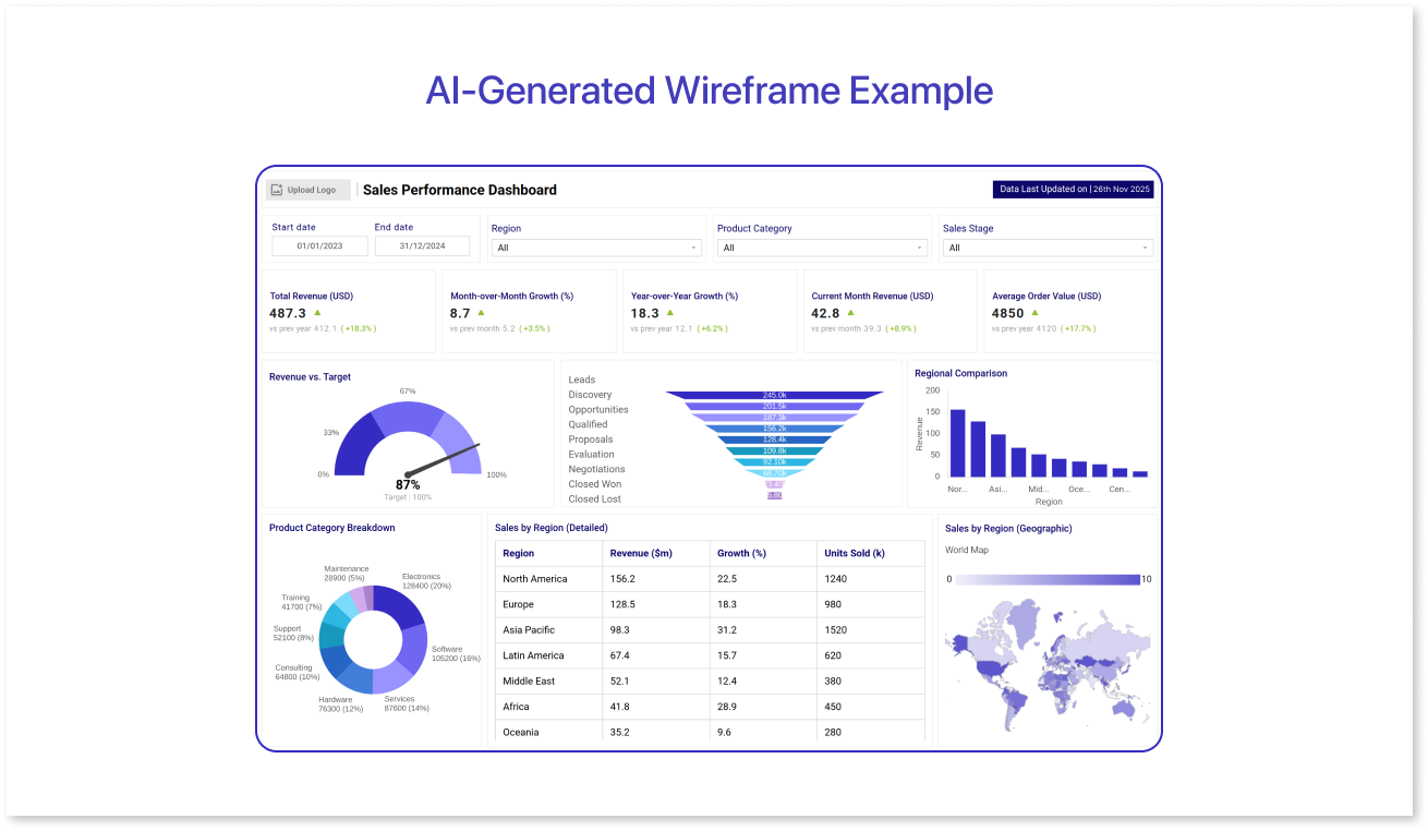
Prompt used:
“Create a sales performance dashboard with total revenue, monthly sales trends, top products, regional comparison, and a KPI summary at the top.”
Comparison of Top AI Data Visualization Tools in 2026
With numerous AI data visualization tools available, selecting the right one for your team can be a challenging task. Each platform offers different AI capabilities, integrations, and pricing, making it essential to compare them side by side. The table below highlights the key features, AI support, best use cases, and pricing for the top 7 tools in 2026, enabling you to quickly identify which one best fits your needs.
|
Tool |
AI Features |
AI-Feature Level |
Platforms / Integration |
Best For |
Pricing (Approx) |
|
Mokkup AI |
AI-assisted dashboard wireframe generation, Review feature for layout & clarity |
Design-only / Automation |
Web / Cloud |
Rapid prototypes, mockups, and early-stage dashboard design |
Free / Pro ($8/mo) |
|
Power BI |
AI-powered natural language Q&A, forecasting, KPI insights, anomaly detection |
Fully AI-powered |
Web, Desktop; integrates with Excel, Teams, Azure |
Microsoft-focused teams |
Free / Paid per user |
|
Tableau |
Predictive insights, “why change” explanations, AI-driven dashboards (requires Salesforce Einstein) |
Partially AI-powered |
Web, Desktop; integrates with Salesforce |
Large enterprises |
Enterprise pricing |
|
Looker Studio |
AI suggestions / automated insights when integrated with Google AI products; native AI features are limited |
Partially AI-powered |
Web; integrates with Google Analytics, BigQuery, and Ads |
Google ecosystem, free option |
Free |
|
Qlik Sense |
AI-powered Insight Advisor, anomaly detection, predictive analytics, conversational analytics |
Fully AI-powered |
Web, Desktop, multiple data sources |
Predictive analytics & future-focused insights |
Custom / Enterprise pricing |
|
Sisense |
Some AI/ML analytics features (requires configuration), predictive insights, and anomaly detection |
Partially AI-powered |
Web, Cloud; embeddable in apps |
Embedded dashboards in products or apps |
Enterprise-level pricing |
|
Zoho Analytics |
AI assistant Zia: automated insights, forecasting, natural-language queries |
Fully AI-powered |
Web; integrates with CRMs, ERPs, business apps |
SMBs / budget-conscious teams |
Free / Paid tiers |
Benefits of Using AI-Driven Visualization
AI-driven data visualization enables teams to more easily understand complex data and take prompt action. Automating analysis and presenting insights clearly saves time, reduces errors, and allows businesses to make more informed decisions. Here are the main benefits:
- Saves Time: AI automatically generates charts, dashboards, and insights, enabling teams to focus on interpreting results rather than manually building visuals.
- Improves Accuracy and Consistency: By cleaning data, selecting the right chart types, and highlighting key trends, AI reduces mistakes that often occur with manual reporting.
- Provides Predictive Capabilities: AI can forecast trends, detect anomalies, and suggest future actions based on historical data, helping teams plan with confidence.
- Accessible to Non-Technical Teams: Even without analytics expertise, users can ask questions in plain language and get clear, actionable insights in seconds.
- Supports Faster, Smarter Decision-Making: By highlighting patterns, trends, and outliers, AI helps teams respond quickly, identify opportunities, and optimize business performance.
Overall, AI-driven visualization enables teams to transform data into insights more quickly, accurately, and with less effort, making decision-making smarter and easier for everyone.
Conclusion
AI data visualization is transforming the way businesses understand and use their data. The tools discussed in this blog enable teams to quickly explore large datasets, uncover insights automatically, and make informed decisions with confidence.
From predictive analytics to natural language interaction and AI-generated dashboards, these platforms make data more accessible to everyone, not just analysts. By adopting AI-driven visualization tools, organizations can save time, reduce errors, and gain a competitive edge in a fast-paced business environment.

Frequently Asked Questions
AI data visualization utilizes artificial intelligence to automatically analyze data and generate charts, dashboards, and summaries, facilitating a clearer understanding of patterns and trends.
Tools like Looker Studio and Mokkup AI are beginner-friendly because they offer simple interfaces, AI suggestions, and automated dashboard creation.
Yes, many AI visualization tools can forecast trends, detect anomalies, and provide predictive insights to help with planning and decision-making.
Yes, Looker Studio is a popular free tool, and Mokkup AI offers a free plan with basic dashboard creation features.
Consider factors such as team size, existing software ecosystem, level of technical expertise, budget, and whether you need predictive analytics, embedded dashboards, or rapid prototyping.
Prompt it. Wireframe it with Mokkup.ai.
