
Extracting essential insights from massive amounts of text can be difficult, especially given big data's expanding significance in data analysis. With over 500 million tweets and 4.3 billion Facebook messages written every day, the huge amount of complicated data can make it difficult to find the information we need. Manual analysis is impractical, hence a tool for scanning qualitative data for quick wins is required.
Table of Contents
- What is Text Data Visualization?
- 5 Points for Using Text into Data Visualization
- Boosting Text Data Visualization with Additional Elements
What is Text Data Visualization?
Text data visualization helps to streamline this process by automatically detecting and highlighting essential information hidden in your data. This approach enhances the visual representation of data and improves dashboard design for creating better business intelligence (BI) dashboards.
In this blog, we'll look at different approaches and tools for using text analytics for data visualization. Charts and graphs are exceptional, but sometimes simplicity is more appealing. Text-based data visualization combines words and basic symbols to clearly display patterns and insights.
This strategy is very beneficial when you need to deliver information fast and effectively without using elaborate graphics. Text-based visualization can be a useful tool for project managers, data analysts, and anybody who wishes to show data in an easy-to-understand manner.
Why Text Visualization is Beneficial:
Let's delve into why text visualization is invaluable for transforming complex textual data into actionable insights.
- Quick Data Summarization: Text visualization tools such as word clouds and interactive timelines enable you to quickly highlight key phrases and topics in huge quantities of text, making it easier for you to understand complex content.
- Improved Understanding: Our brains digest visual information more efficiently than written language. This makes difficult information more accessible and easier to convey with team managers and stakeholders.
- Effective Qualitative Analysis: Visualizing consumer feedback allows you to identify essential products, features, and subjects that are important to your clients. This helps to identify both pain points and areas of achievement, resulting in more informed decision-making.
- Trend Identification: Text visualization reveals hidden trends and patterns by highlighting variations and leading causes in your data. This can result in important concepts that might otherwise go overlooked.
These points highlight how text visualization improves understanding, allows for effective qualitative analysis of consumer feedback, and reveals hidden trends, providing firms with actionable insights for strategic decision-making.
5 Points for Using Text into Data Visualization
Consider trying to navigate a complex subway map that lacks station names or route labels. How confident you would be about reaching your destination? Probably not very confident, however this highlights how important text is in providing clarity and guidance in visual data.
We've compiled a list of key tips to help you master the usage of text in your visualizations. Whether you need clear headers or descriptive labels, these suggestions can help your data communicate its message effectively and clearly.
1. Crafting an Impactful Chart Title
A chart's title is important as it provides the first impression and sets the context for the viewer. It should clearly and concisely communicate the main point of the data being presented. For example, think of it as the headline of a news article – it needs to grab attention and convey the main idea of the story.
To create a good title, focus on the primary insights and key trends in the data, making sure it is both beneficial and engaging. Keep it short, simple, and relevant, reserving elaborate explanations or contextual information for the chart's annotations or footers.
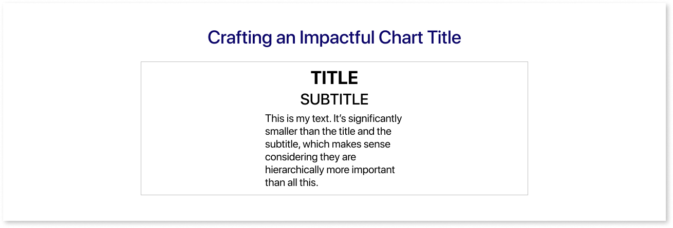
- Visual Hierarchy: Prioritize the most important information by using the boldest and largest text. Use smaller fonts or reduced contrast for less important information, while maintaining the accessibility standards.
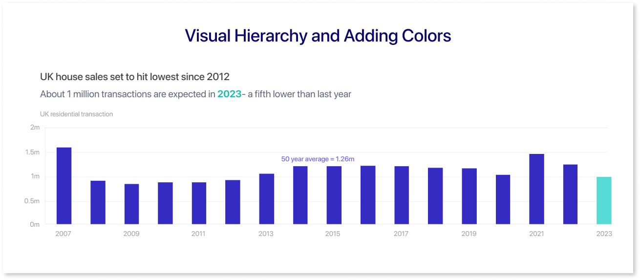
- Adding Colors: Using color in your headers helps to declutter visualizations and draw the viewer's attention.
2. Use Direct Labels Instead of Legends
Use straight labels instead of legends to improve data visualization clarity. Direct labeling involves adding labels next to data points to help viewers understand what each point represents. This method increases readability, especially in cluttered charts where legends are easy to miss.
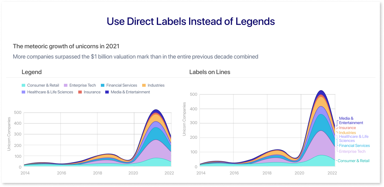
Legends can sometimes confuse viewers because they must align colors or symbols to their meanings. By directly identifying data points, you may avoid confusion and better highlight critical insights, making your data display more engaging.
3. Aligning Text in Data Visualization

As a general guideline, text in data visualizations should be horizontal whenever possible, with the Y-axis title being an exceptional case. For other text elements such as axis labels and highlights, keep the alignment horizontal for better readability.
For instance, If your axis displays time data, use number formatting settings to minimize the format or reduce the number of ticks. Also, if your categorical series are too long to fit correctly, try using a different chart type.
4. Formatting Large Numbers
When working with large numbers, structuring their display is incredibly beneficial. To reduce clutter, shorten them by representing 1 billion as 1B instead of 1,000,000,000.
Include necessary prefixes and suffixes for examples like currency, timestamps, etc. You can add these in the number formatting options or mention them in the chart's caption. The idea is to keep the explanations close to the data, ensuring the metric is always clear and accessible.
5. Utilizing Big Number Cards/KPI Cards
Big Number Cards, also known as KPI (Key Performance Indicator) Cards, are effective tools for visualizing data in a clear and impactful way. These cards present key metrics at a glance, making it easier to understand and track performance without getting lost in details.
They usually show a single, important piece of data, such as total sales, user growth, or revenue. They frequently incorporate a large, bold number and a brief description or label. Some may also use visual signs, such as arrows or color coding, to demonstrate patterns or compare current data to past periods.
Boosting Text Data Visualization with Additional Elements
Text data visualization is a great method for representing complex information using text-based representations. These strategies combine the clarity of textual information with the visual impact of data graphics, allowing audiences to better grasp and analyze data. Integrating text into data visualization allows you to emphasize significant insights, trends, and patterns in a more engaging and accessible way.
When visualizing text data, enhancing the charts and graphs with additional elements can greatly improve clarity and insight. Here are some ways to enhance your visualizations, along with examples of text data visualizations like KPI cards, word clouds, Q&A visuals and more:
- Titles & Subtitles: Titles provide a quick summary of the chart's main idea, while subtitles provide additional context or detail to support the title.
- Axis Labels: Clearly label the X and Y axes to indicate what each represents, and use short and descriptive names for more clarity.
- Data Labels: Use these labels to easily recognize essential data points or series, highlighting notable values, trends, or outliers.
- Annotations: Use annotations to bring attention to certain data points, such as outliers or major trends, and add extensive notes or underline important labels to improve understanding. For example, in Mokkup, you can use text elements to highlight key points or trends.
- Legends: Include legends to explain the colors, symbols, or patterns used in the chart, ensuring that the legend is clear and easy to connect to the related data.
- Callouts and Captions: Use callouts to provide further explanations for certain areas of the chart, while captions can summarize the chart's core message or provide context.
- KPI Cards: These are small, focused visualizations that display key performance indicators (KPIs). They highlight important metrics like sales figures, customer satisfaction ratings, or website traffic.
- Word Cloud: These visuals represent text data, with the size and significance of each word reflecting its frequency. For example, a word cloud of customer reviews might highlight commonly used terms such as "excellent" or "frustrating."
- Q&A Visuals: Power BI includes built-in Q&A capabilities that allows users to ask questions about their data within the report. These visuals can present charts or insights based on your queries.
- Descriptive Text Analysis: Text summaries provide the key facts and trends indicated by the visualizations and explain what the data suggests and its implications.
By using these elements, you can create more useful and visually appealing text data visualizations that improve data comprehension and decision-making.
Conclusion
Text-based data visualization is a powerful method for deriving useful insights from huge quantities of raw data. By leveraging a variety of approaches and tools such as word clouds, sparklines, and inline data indicators, you can simplify complex data into clear, actionable information.
The importance of text visualizations lies in their ability to improve data readability and accessibility while allowing for more effective communication of critical trends and patterns. Integrating text visualization into your data analysis techniques can help you better understand and convey crucial information, leading to more informed decisions and impactful storytelling.
Frequently Asked Questions
Text visualization focuses on patterns, frequency, and sentiment in text, while traditional visualization represents numbers and metrics.
WordClouds, Voyant Tools, Tableau, and Power BI simplify text visualization for beginners.
Match the method to your goal: word clouds for frequency, sentiment graphs for tone, or networks for relationships.
Avoid cluttered visuals, poor labeling, overusing word clouds, and ignoring context behind text data.
It reveals customer opinions, trends, and key themes in text data, helping businesses act quickly and clearly.
Prompt it. Wireframe it with Mokkup.ai.
