
We all know for a fact that the significance of dashboard design cannot be overstated. As organizations use big data and analytics to navigate complex landscapes, dashboards become more important as information hubs. Beyond their aesthetic appeal, well-designed dashboards are pivotal tools that can transform raw data into actionable insights, providing stakeholders with a visual roadmap for informed decision-making.
But how to build a dashboard that is well-designed? Is it the dynamic interface or the capability to decode complex data? It needs to present data clearly and concisely, whether it's for monitoring performance, tracking projects, or analyzing finances.
Without a clear understanding of what the dashboard examples to achieve, design efforts risk becoming a futile exercise. This underscores the importance of setting specific, measurable, achievable, relevant, and time-bound (S.M.A.R.T) goals. A little confused? Let’s make it easy for you.
Table of Contents
- Importance of Data Visualization
- Key considerations for effective dashboard design
- Setting Design Goals with the S.M.A.R.T Framework
- How can the SMART framework help in data visualization?
- Types of Complex Dashboards and Their Fundamental Principles
- Characteristics of Great Dashboards
- The Progressive Disclosure
- Dashboard Design Aspects of Progressive Disclosure
- Final Thoughts
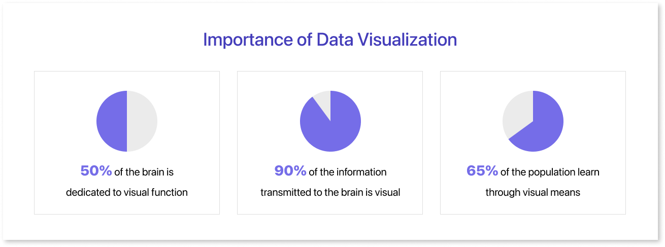
Importance of Data Visualization
In the era of widespread AI and machine learning, data visualization is essential for comprehending model performance and optimizing processes. It has become a vital component of successful data dashboard analytics strategies, crucial for staying competitive in a dynamic marketplace.
Key considerations for effective dashboard design:
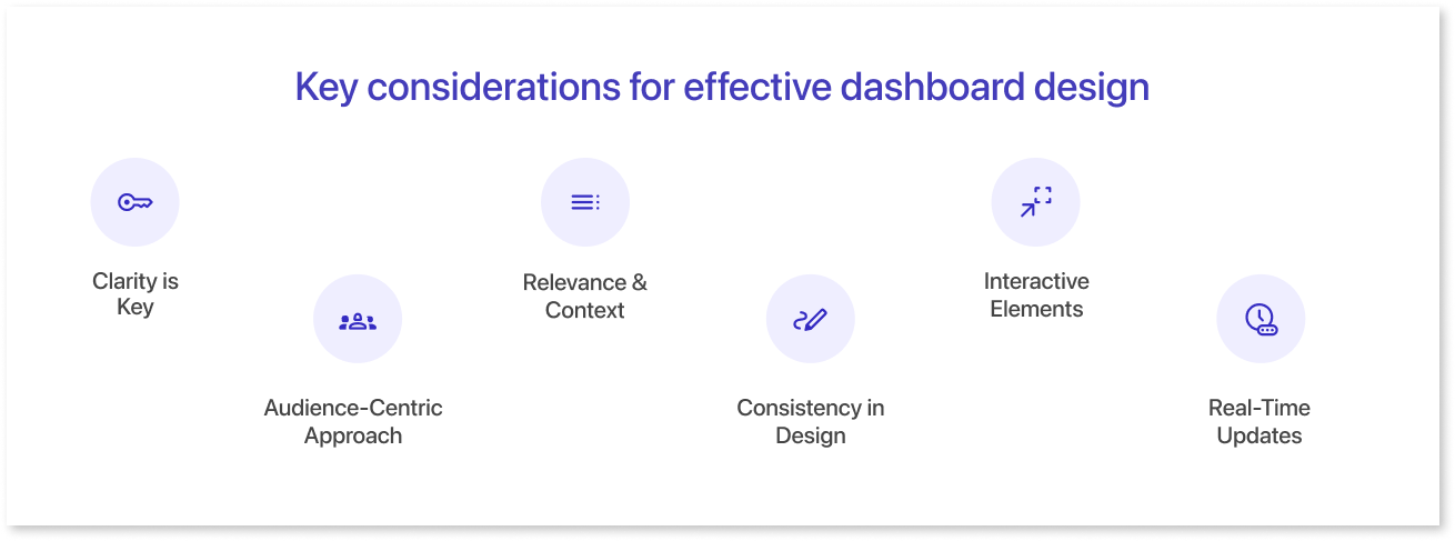
- Clarity is Key: Ensure that your visualizations are clear and easy to interpret. Avoid unnecessary complexity and focus on simplicity without sacrificing the depth of the information.
- Audience-Centric Approach: Understand your audience and tailor your visualizations to meet their needs. Different stakeholders may require different views of the data, so customize your dashboards accordingly.
- Relevance & Context: Provide context for the data by incorporating relevant details. This helps users understand the significance of the information and its impact on decision-making.
- Consistency in Design: Maintain a consistent design throughout your dashboard. Consistency aids in the seamless flow of information and ensures a cohesive user experience.
- Interactive Elements: Integrate interactive elements to allow users to explore the data further. Features like filters and drill-down options enhance user engagement and facilitate a deeper understanding of the data.
- Real-Time Updates: Consider incorporating real-time data updates when applicable. This ensures that it provides the most current information, enhancing its relevance and reliability.
Setting Design Goals with the S.M.A.R.T Framework
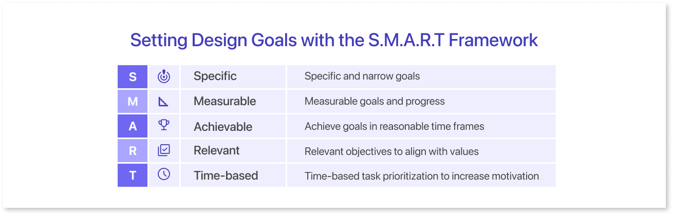
The S.M.A.R.T. framework helps set goals by making them specific, measurable, actionable, realistic, and time-based. It ensures that design objectives are practical targets, not just aspirations.
The SMART goal-setting methodology, often credited to Peter Drucker, a highly influential author and management consultant pivotal in shaping contemporary business practices, made its debut in a November 1981 edition of Management Review. This approach has undergone developments to allow for more expansive interpretations beyond its initial purpose. Some have even extended the acronym to SMARTER, incorporating two additional criteria: Evaluated and Reviewed.
How can the SMART framework help in data visualization?
- Automated Insights: Smart frameworks can employ machine learning algorithms to analyze data and automatically generate insights. Presenting these insights visually helps users understand complex patterns or trends without the need for manual analysis.
- Dynamic Dashboards: Users can explore data in real-time, filter information, and interact with visualizations, providing a more immersive and personalized experience.
- Predictive Analytics: Integrating predictive analytics into data visualization allows users to not only understand historical data but also make informed predictions about future trends. Smart frameworks can use advanced algorithms to model and visualize potential outcomes.
- Natural Language Processing (NLP): By incorporating NLP capabilities, smart frameworks can allow users to interact with data using natural language queries. This makes it easier for individuals without a strong technical background to extract meaningful insights from complex datasets.
- Data Aggregation and Integration: Smart frameworks can seamlessly integrate data from multiple sources and formats. This capability enables users to create comprehensive visualizations that provide a holistic view of their data landscape.
- Anomaly Detection: Utilizing machine learning algorithms for anomaly detection, smart frameworks can automatically identify unusual patterns or outliers in the data. Visualizations can highlight these anomalies, making it easier for users to spot and investigate irregularities.
- Real-time Data Visualization: This framework supports real-time data streaming and visualization. This is helpful for situations where quickly understanding changing data is important, like in finance or IoT.
- User Personalization: It can offer personalized experiences by adapting visualizations based on user preferences, roles, or historical interactions. This customization enhances user engagement and makes data interpretation more relevant to specific stakeholders.
- Accessibility and Usability: Making data accessible to a wider audience is important. Smart features like voice commands and screen reader compatibility help people interact with and understand the information better.
Types of Complex Dashboards and Their Fundamental Principles
Dashboards are powerful tools that simplify complex data into actionable insights using charts and graphs. Their purpose lies in being the visual compass that guides decision-makers through the vast landscape of information.
Types of Complex Dashboards
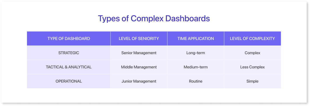
- Operational Dashboards: They provide real-time insights into key performance indicators (KPIs) and metrics, enabling swift decision-making. They help teams respond fast to changes in sales, website traffic, or production efficiency, keeping business processes smooth.
- Strategic Dashboards: They cater to high-level decision-makers, providing a holistic view of an organization's performance against strategic goals. These dashboards often include a balanced mix of KPIs, financial metrics, and other key indicators. Through intuitive visualizations, strategic dashboards empower executives to make informed decisions that align with the overarching objectives of the business.
- Tactical Dashboards: They bridge the gap between operational and strategic dashboards. They help managers improve daily activities by providing insights for specific departments or projects. Dashboards help teams monitor progress, find problems, and adapt strategies in real-time, leading to overall success.
- Analytical Dashboards: They are designed for in-depth data analysis. They have tools to see data better and understand trends, patterns, and outliers by interacting with it. This assists users in examining data, identifying connections, and obtaining a comprehensive view of their business dashboard. Incorporating drill-down features achieves this.
The Fundamental Principles
1. User-Centric Design:
To create a successful dashboard layout, it is important to design it with the user in mind. Use Mokkup.ai to create essential wireframes for complex layouts, guiding developers in crafting clear visualizations and effective data architecture. Prioritize user experience with customizable interfaces, easy navigation, and personalized options, ensuring a seamless experience and fostering better decision-making.
2. Data Accuracy and Reliability:
The foundation of any dashboard design principles are the data it presents. To instill confidence in decision-makers, complex dashboards must prioritize data accuracy and reliability. To make a reliable dashboard, validate data, use reliable sources, and follow good data governance practices. To make a trustworthy dashboard, validate data, use reliable sources, and follow good data governance practices.
3. Scalability and Flexibility:
As businesses evolve, so do their data requirements. Complex dashboards must be scalable and flexible, capable of accommodating growing datasets and adapting to changing business needs. A scalable architecture ensures that the dashboard remains a valuable asset as the organization expands and diversifies.
4. Interactivity and Drill-Down Capabilities:
To unlock the full potential of complex dashboards, interactivity is key. Mokkup lets users interact with visuals, explore data, and customize views to get the most important information. This empowers users to explore data from various angles and make well-informed decisions.
Characteristics of Great Dashboards
Great dashboards are lighthouses of clarity and efficiency, providing a visual story that converts raw data into actionable insights. A great dashboard combines good design, user-friendly features, accurate information, and pleasing looks.
Usability and Customization
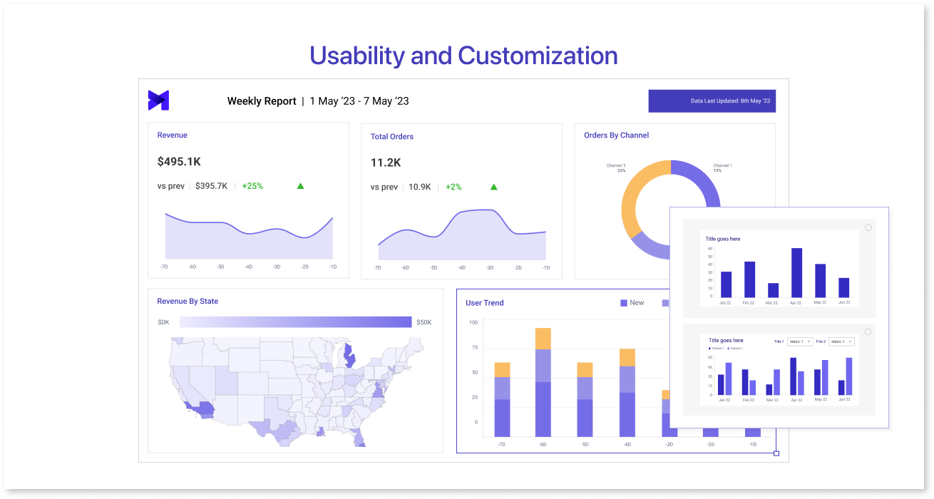
Prioritizing data and displaying it in a visual hierarchy ensures clarity, guiding users effortlessly through the wealth of information. Customization is very important. Customization is crucial. Tailoring dashboards to users' needs allows them to feel a sense of ownership and enhances usability.
Addressing Complexity for Clarity
Navigating the difficulty of excessive data is an essential component of creating outstanding dashboards. Designers focus on giving important information and removing unnecessary details to help users understand better. Using project goals, understanding data, and meeting user demands ensures clarity by managing complexity.
Considerations in Dashboard Design
Understanding user responsibilities and demands is critical for effective dashboard design. Requiring effective communication, technical expertise, and system knowledge. Guiding exploration involves critical considerations, including alignment with reading direction, interaction needs, and minimizing clicks. Drill-down menus, iconography, and color palettes all play a part.
The Progressive Disclosure
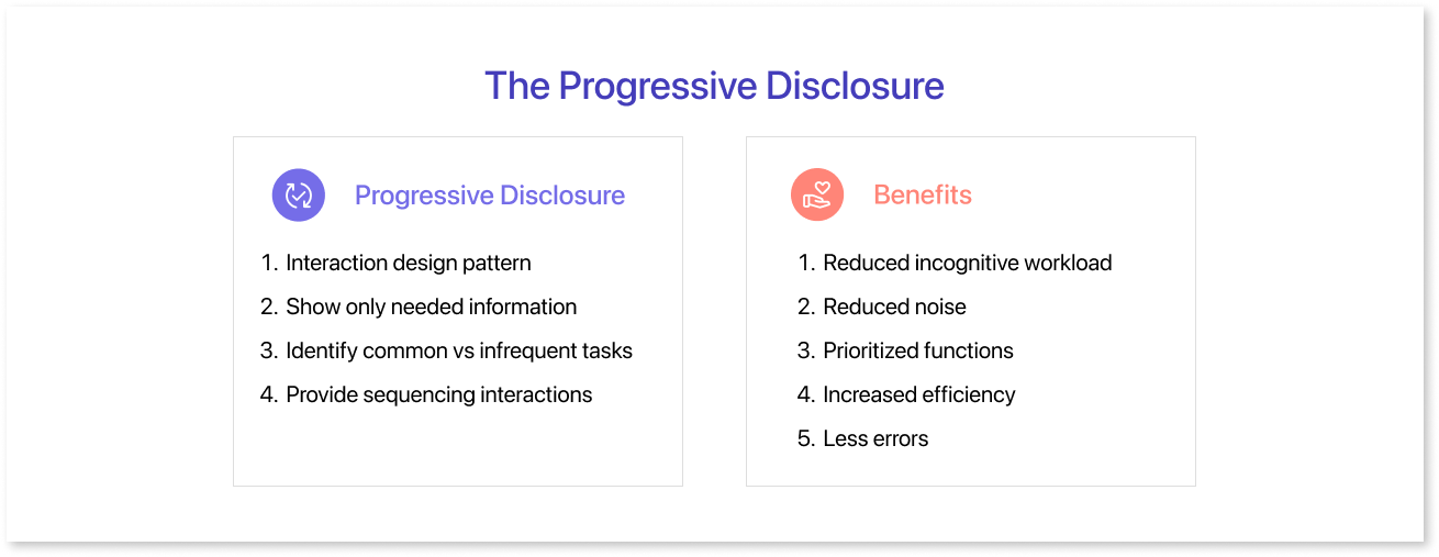
Progressive disclosure is a design principle. It gradually shows information and features to users. It is based on their needs and level of experience.
Progressive disclosure is a useful dashboard mockup tool in dashboard wireframe design to handle complexity and improve user engagement. This principle acknowledges that giving users too much information at once can cause confusion and mental strain.
Dashboard Design Aspects of Progressive Disclosure
- Objective: Progressive disclosure is essential for breaking down intricate datasets and features into manageable, digestible components.
- Approach: Instead of overwhelming users with numerous options and details simultaneously, designers strategically reveal information based on the user's interactions, preferences, and proficiency.
- Guidance: Users are guided through the dashboard in a way that aligns with their level of expertise and specific goals, promoting a more tailored and user-friendly experience.
The inclusion of expanding sections, tooltips, or contextual buttons is one practical application of progressive disclosure in dashboard design. Users can explore the dashboard, starting with an overview and then diving into specific areas they are interested in. This method helps users navigate the dashboard at their own pace, accessing important information easily.
Moreover, progressive disclosure is particularly beneficial in accommodating diverse user roles within an organization. We designed the dashboard for beginners and experts. It gradually shows complex information and provides basic insights.
It also offers in-depth analytics. In essence, progressive disclosure is a key strategy in designing complex dashboards that prioritize user comprehension and interaction.
Designers can balance data representation and user accessibility by presenting information progressively. This ensures that the wireframe dashboard remains valuable and easy to use for a wide range of users.
Final Thoughts
Dashboards aren't just eye candy; they're the GPS for smart decision-making in the data jungle. From clarity to complexities, this blog has paved the way for designing complex dashboards. And if you are looking for an easy way to put your thoughts for a complex dashboard into visuals to see the feasibility or test with users, try Mokkup!
Prompt it. Wireframe it with Mokkup.ai.
