What is a Wastewater Utilities Field Operations Safety Dashboard?
A Wastewater Utilities Field Operations Safety Dashboard is a centralized digital platform designed to monitor, analyze, and improve safety performance in water treatment and wastewater collection operations. This dashboard consolidates incident reports, hazard exposures, near-miss submissions, confined space entries, and safety training compliance into a single, actionable view. By tracking wastewater utilities' field operations safety dashboard software metrics, utility managers can identify high-risk activities, enforce safety protocols, and reduce workplace accidents. Unlike traditional spreadsheets or manual logs, this dashboard provides water treatment plant worker safety monitoring tools with interactive filters for date ranges, crews, incident types, and workforce categories. It helps safety officers detect trends, such as rising hazardous gas exposures or declining safety training compliance, enabling proactive risk mitigation. For wastewater collection crews, the dashboard ensures that field operations adhere to OSHA and EPA regulations while maintaining operational efficiency.
How to Create a Wastewater Utilities Field Operations Safety Dashboard
You don’t need to build your report from scratch; just start with a ready-to-use dashboard template from Mokkup. Add in your data and export it however you like. Here’s how to do it:
1. Create or Log in to Your Mokkup Account
Start by signing up on Mokkup.ai using your email. If you already have an account, just log in, and you’ll be good to go.
2. Choose and Customize Your Dashboard Template
Find the Wastewater Utilities Field Operations Safety Dashboard template in the Templates section. Use the drag-and-drop editor to adjust KPIs, edit filters, or add elements based on your data.
3. Export to Your BI Tool
Once your dashboard wireframe is ready, use the BI Tool Export feature to send it directly to Power BI or Tableau for further analysis and enhancements. You can also download the dashboard as a PDF, PNG, or JPEG, embed it on a platform, or invite your team to collaborate.
Note: This is a Pro template. You’ll need a Pro subscription on Mokkup to use and customize this dashboard wireframe. Upgrade anytime to unlock full access.
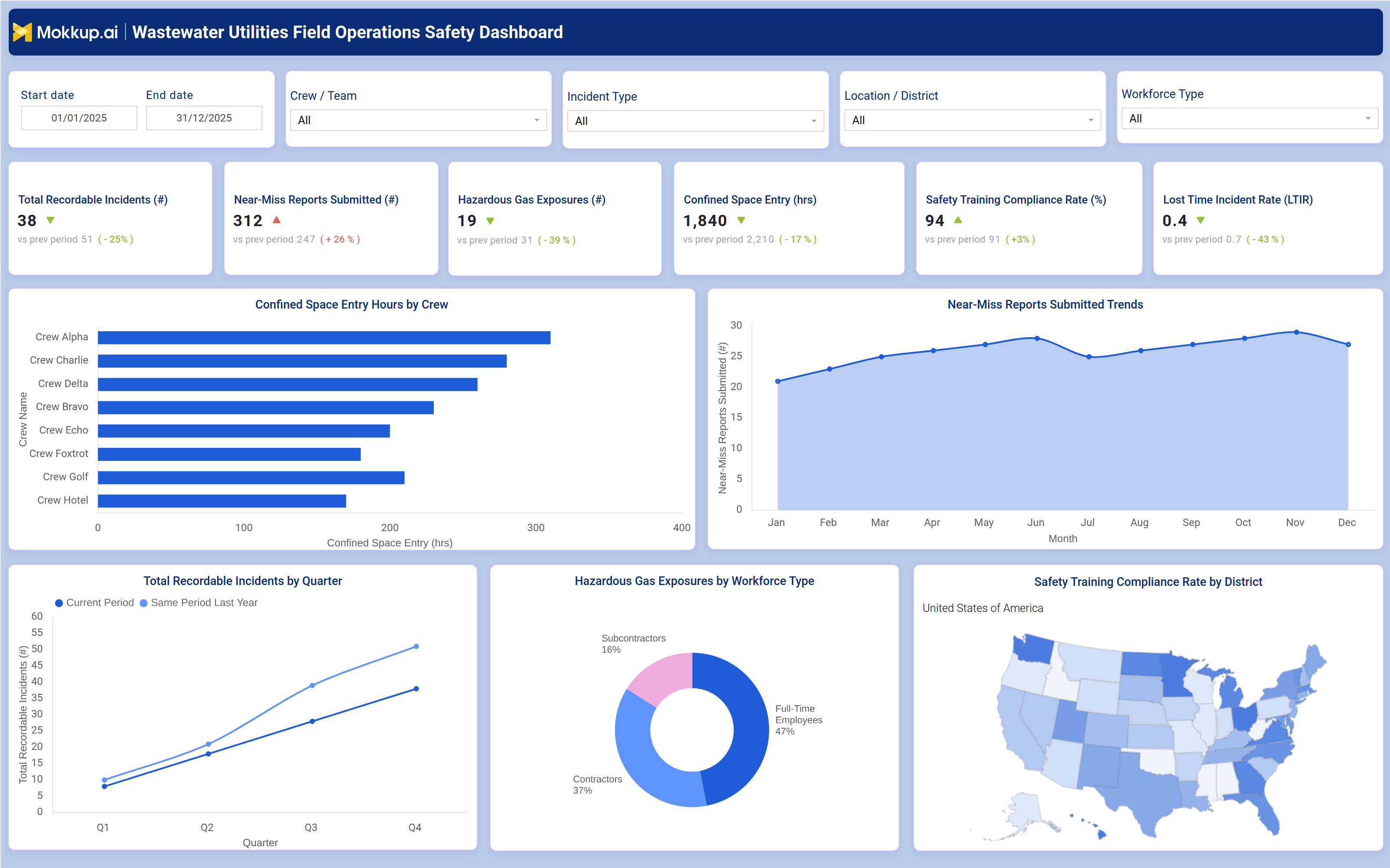
Wastewater Utilities Field Operations Safety Dashboard Example
A typical field operations safety dashboard for water and wastewater utilities includes interactive filters for date ranges, crews/teams, incident types, locations/districts, and workforce types, allowing users to drill down into specific safety data. Key performance tiles display total recordable incidents, near‑miss reports submitted, hazardous gas exposures, confined space entry hours, safety training compliance rate, and lost‑time incident rate (LTIR), each compared against previous periods to highlight improvements or declines.
Trend charts show monthly near‑miss reports and quarterly total recordable incidents, helping safety managers identify seasonal or operational risk patterns. A bar chart compares confined space entry hours by crew (e.g., Crew Alpha, Bravo, Charlie, Delta, Echo, Foxtrot, Golf, Hotel), revealing which teams face the highest exposure and may need additional training or equipment. A pie chart breaks down hazardous gas exposures by workforce type, showing the share among full‑time employees, contractors, and subcontractors. A geographic map visualizes safety training compliance rates by district, enabling targeted interventions in low‑compliance areas. Together, these components provide a comprehensive field operations hazard reporting system that helps utilities reduce incidents, improve compliance, and protect worker safety.
How to Analyze Data in a Wastewater Utilities Field Operations Safety Dashboard
Here is how you can analyze data from this dashboard:
- Review total recordable incidents to assess overall safety performance and compare against previous periods.
- Monitor nearmiss reports to identify recurring hazards before they result in injuries.
- Track hazardous gas exposures by crew and location to pinpoint high risk areas requiring ventilation or PPE upgrades.
- Analyze confined space entry hours to ensure compliance with OSHA regulations and prevent overexposure.
- Evaluate safety training compliance rates by district to prioritize refresher courses where needed.
- Compare lost-time incident rates (LTIR) against industry benchmarks to measure progress in injury prevention.
- Break down incidents by type (e.g., slips, falls, chemical exposures) to tailor safety training programs.
- Use workforce type filters to assess whether contractors or full-time employees face higher risks.
Benefits of a Wastewater Utilities Field Operations Safety Dashboard
The following are the benefits of using such a Hazardous Gas Exposure dashboard:
- Reduces workplace injuries by identifying and mitigating hazards before incidents occur.
- Improves regulatory compliance with OSHA, EPA, and local safety standards.
- Enhances incident response times through centralized hazard reporting.
- Lowers operational costs by minimizing lost time incidents and workers' compensation claims.
- Boosts workforce morale by demonstrating a commitment to employee safety.
- Supports data-driven decision-making with trend analysis and predictive insights.
- Streamlines safety audits with automated recordkeeping and reporting.
KPIs to Track in a Wastewater Utilities Field Operations Safety Dashboard
The following key KPIs can be tracked by using this safety training compliance dashboard:
- Total Recordable Incidents (#): The number of workplace injuries or illnesses requiring medical treatment beyond first aid.
- Near Miss Reports Submitted (#): Hazardous situations reported before they result in incidents, indicating proactive safety culture.
- Hazardous Gas Exposures (#): Instances where workers are exposed to toxic or flammable gases (e.g., hydrogen sulfide, methane).
- Confined Space Entry Hours (Hrs): Total time workers spend in confined spaces, helping assess compliance with safety protocols.
- Safety Training Compliance Rate (%): The percentage of employees who have completed mandatory safety training.
- Lost Time Incident Rate (LTIR): The number of incidents resulting in missed workdays per 100 full-time employees.
Frequently Asked Questions
1. What is a confined space entry monitoring dashboard used for?
It is a digital tool that tracks safety incidents, near-miss reports, hazardous exposures, and compliance metrics for water and wastewater field crews.
2. What data sources feed into this wastewater crew safety tracking dashboard?
Workforce management systems, incident reporting tools, safety training records, and confined space entry logs.
3. Who should use a water utility field safety dashboard?
Safety managers, operations supervisors, compliance officers, and utility executives are responsible for workforce safety.