
What is a Water Supply Source Availability & Drought Risk Dashboard?
A water supply availability dashboard is a business intelligence tool used by water utilities to monitor source reliability, storage levels, demand patterns, and drought risk exposure. It combines hydrological data, operational metrics, and consumption trends to provide a complete view of water availability across service zones. This dashboard tracks key indicators such as reservoir storage, groundwater recharge, total water production, usable water availability, and demand levels. As a water supply drought risk dashboard, it enables utilities to assess how current supply conditions align with consumption and identify early signs of water stress. Using a water source availability analytics dashboard, utilities can evaluate source mix, monitor drought severity trends, and optimize supply strategies. It also functions as a water utility drought monitoring dashboard, supporting proactive planning, conservation measures, and risk mitigation in water supply systems.
How to Create a Water Supply Source Availability & Drought Risk Dashboard
You don't need to build your report from scratch, just start with a ready-to-use dashboard template from Mokkup. Add in your data and export it however you like. Here's how to do it:
1. Create or Log in to Your Mokkup Account
Start by signing up on Mokkup.ai using your email. If you already have an account, just log in, and you'll be good to go.
2. Choose and Customize Your Dashboard Template
Find the Water Supply Source Availability & Drought Risk Dashboard template in the Templates section. Use the drag-and-drop editor to adjust KPIs, edit filters, or add elements based on your data.
3. Export to Your BI Tool
Once your dashboard wireframe is ready, use the BI Tool Export feature to send it directly to Power BI or Tableau for further analysis and enhancements. You can also download the dashboard as a PDF, PNG, or JPEG, embed it on a platform, or invite your team to collaborate.
Note: This is a Pro template. You'll need a Pro subscription on Mokkup to use and customize this dashboard wireframe. Upgrade anytime to unlock full access.
Water Supply Source Availability & Drought Risk Dashboard Example
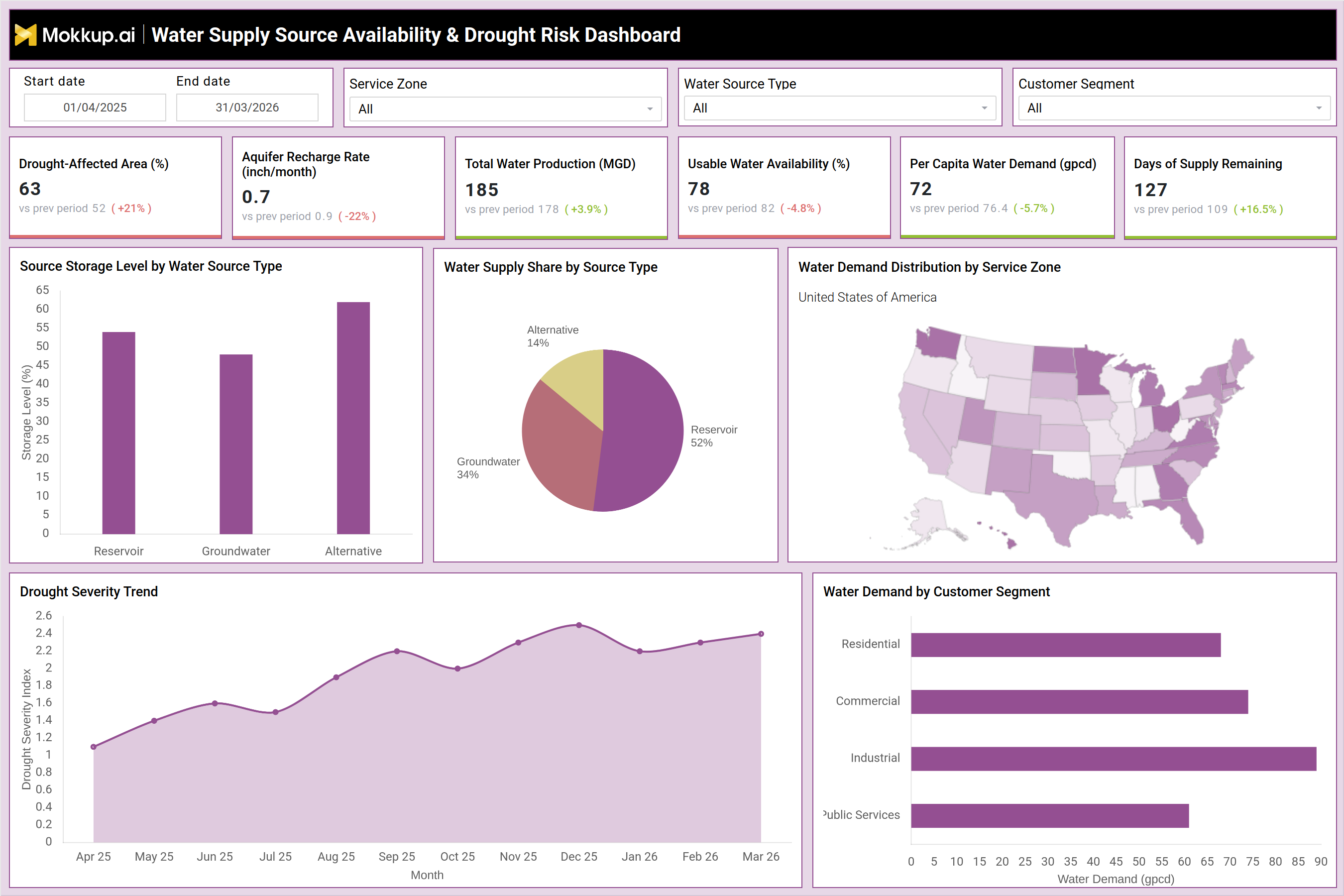
A typical water source reliability analytics dashboard provides a detailed view of supply conditions and drought exposure across regions and customer segments. For example, the dashboard shows the drought-affected area at 63%, indicating significant stress across service zones. Aquifer recharge rate at 0.7 inches per month reflects declining groundwater replenishment. Total water production stands at 185 MGD, while usable water availability is at 78%, suggesting moderate supply constraints. Per capita water demand at 72 gallons per capita per day highlights consumption patterns, while 127 days of supply remaining indicate short-term supply security. Visuals such as source storage levels show reservoir, groundwater, and alternative sources with varying availability levels. A supply share chart indicates reliance on reservoirs (52%), groundwater (34%), and alternative sources (14%), highlighting diversification in sourcing. A drought severity trend shows increasing drought intensity over time, while demand distribution across service zones identifies high-demand regions. Customer segment analysis reveals industrial demand as the highest, followed by commercial and residential consumption. This example shows how the drought risk monitoring dashboard helps utilities balance supply and demand while managing drought risks effectively.
How to Analyze Data in Water Supply Source Availability & Drought Risk Dashboard
Here is how you can analyze data from this dashboard:
- Drought-affected area (%): Measures the percentage of land impacted by drought, helping understand the geographic spread and severity of water stress.
- Aquifer recharge rate: Tracks how quickly groundwater sources are replenished, providing insight into long-term groundwater sustainability.
- Total water production (MGD): Analyzes the total volume of water produced (in million gallons per day) to assess overall supply capacity.
- Usable water availability (%): Evaluates the proportion of total water that is actually usable, indicating the efficiency and reliability of supply.
- Per capita water demand: Monitors water consumption per person to understand usage patterns and demand behavior.
- Days of supply remaining: Indicates how long current water reserves will last, helping assess short-term supply security and risk.
- Source storage levels by type: Breaks down water storage across different sources (e.g., reservoirs, groundwater) to identify dependency and concentration risks.
- Water supply share by source: Reviews how much each source contributes to the total supply, helping evaluate diversification and resilience.
- Drought severity trends: Tracks changes in drought intensity over time to identify whether conditions are improving or worsening.
- Water demand by service zone: Analyzes demand across different regions or service zones to pinpoint high-consumption areas and guide resource allocation.
Benefits of Water Supply Source Availability & Drought Risk Dashboard
The following are the benefits of using this dashboard:
- Visibility into water supply and demand conditions: Provides a clear, real-time view of both water availability and consumption patterns, enabling better situational awareness.
- Early detection of drought risks and supply shortages: Helps identify warning signs of drought or declining supply in advance, allowing timely intervention.
- Data-driven water resource planning and allocation: Enables informed decision-making based on accurate data, improving how water resources are distributed and managed.
- Improved source diversification and supply reliability: Encourages the use of multiple water sources, reducing dependency on a single source and enhancing supply stability.
- Enhanced demand management and conservation strategies: Supports the development of targeted initiatives to reduce water usage and promote efficient water consumption.
- Reduced risk of water shortages and service disruptions: Minimizes the likelihood of supply interruptions by proactively managing risks and balancing supply-demand dynamics.
- Support for regulatory compliance and sustainability goals: Helps meet government regulations and environmental targets by tracking and optimizing water usage.
- Improved operational efficiency in water supply management: Streamlines processes and reduces wastage, leading to more efficient water system operations.
- Proactive decision-making during drought conditions: Enables quicker, forward-looking actions based on predictive insights rather than reactive responses.
- Strengthened long-term water resource resilience: Builds the system's ability to withstand future water stress through better planning, monitoring, and adaptation.
KPIs to Track in Water Supply Source Availability & Drought Risk Dashboard
The following key KPIs can be tracked by using this dashboard:
- Drought-Affected Area (%) – Measures extent of regions impacted by drought conditions
- Aquifer Recharge Rate (inch/month) – Indicates groundwater replenishment levels
- Total Water Production (MGD) – Tracks total water generated from all sources
- Usable Water Availability (%) – Measures effective water available for distribution
- Per Capita Water Demand (gpcd) – Indicates average water consumption per person
- Days of Supply Remaining – Estimates how long current water supply can sustain demand
Frequently Asked Questions
1. Why is a water supply availability dashboard important?
It provides a unified view of water sources, demand, and drought risks, enabling better planning and resource management.
2. How does this dashboard help manage drought risk?
The water supply drought risk dashboard tracks drought indicators, supply levels, and demand trends, helping utilities take proactive measures.
3. What is usable water availability?
It represents the portion of the total water supply that is accessible and ready for distribution.