
What is a Water Supply Digital Monitoring Dashboard
The water supply digital monitoring dashboard is built for water utility operators, SCADA engineers, and infrastructure managers who need a consolidated view of network performance. It tracks six critical KPIs — SCADA system uptime, smart meter coverage, meter read success rates, nuisance alarms, field device connectivity, and data completeness — giving teams an accurate picture of operational health across every zone. This tool's central feature is device connectivity geographic zone analysis, which allows utilities to quickly identify regional gaps and connectivity issues. By unifying these metrics in one structured view, the dashboard helps teams maintain service continuity and meet data quality standards consistently.
How to Create a Water Supply Digital Monitoring Dashboard
You don't need to build your report from scratch; just start with a ready-to-use dashboard template from Mokkup. Add in your data and export it however you like. Here's how to do it:
1. Create or Log in to Your Mokkup Account
Start by signing up on Mokkup.ai using your email. If you already have an account, just log in, and you'll be good to go.
2. Choose and Customize Your Dashboard Template
Find the Water Supply Digital Monitoring Dashboard template in the Templates section. Use the drag-and-drop editor to adjust KPIs, edit filters, or add elements based on your data.
3. Export to Your BI Tool
Once your dashboard wireframe is ready, use the BI Tool Export feature to send it directly to Power BI or Tableau for further analysis and enhancements. You can also download the dashboard as a PDF, PNG, or JPEG, embed it on a platform, or invite your team to collaborate.
Note: This is a Pro template. You'll need a Pro subscription on Mokkup to use and customize this dashboard wireframe. Upgrade anytime to unlock full access.
Water Supply Digital Monitoring Dashboard Example
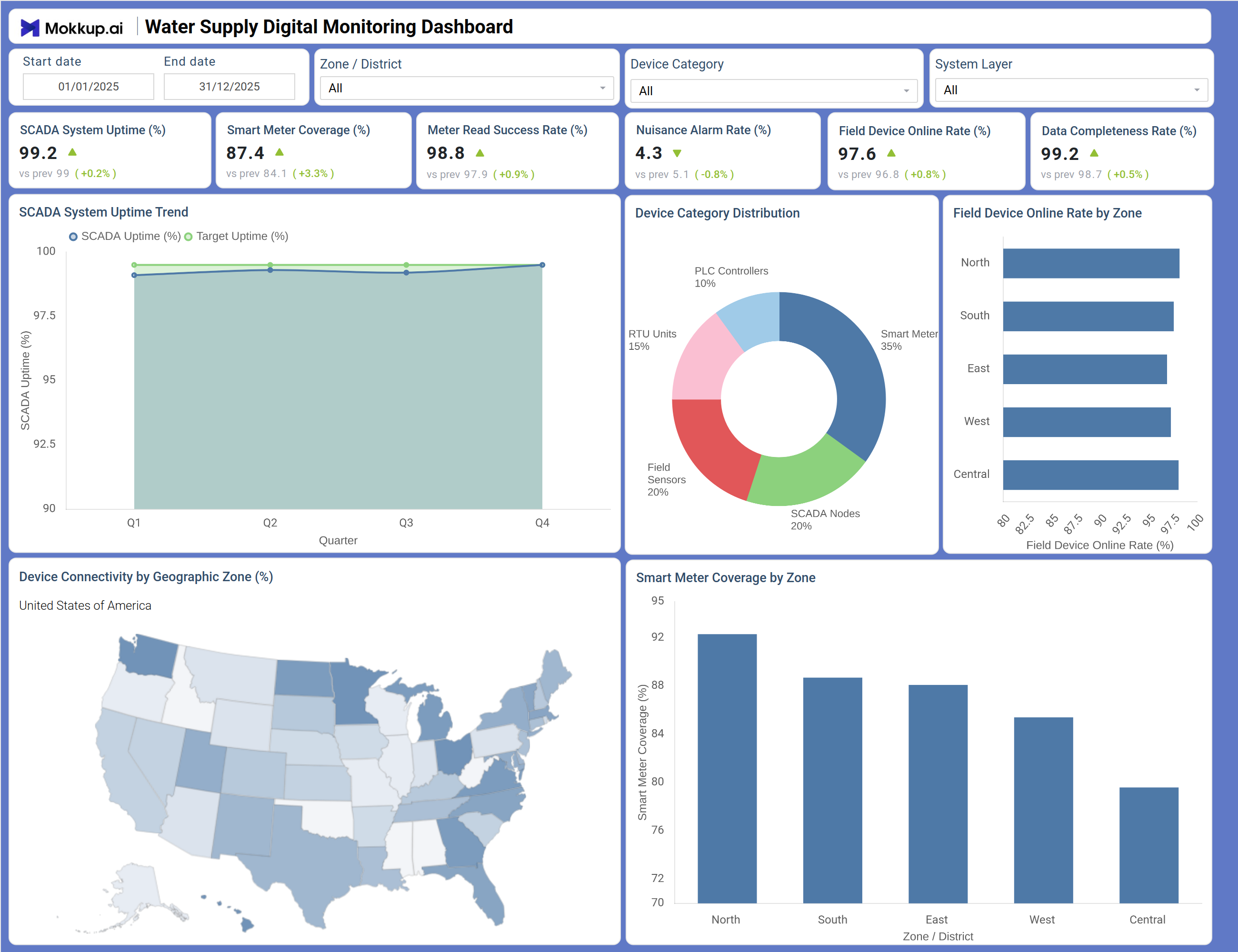
The dashboard opens with six KPI tiles — SCADA System Uptime (%), Smart Meter Coverage (%), Meter Read Success Rate (%), Nuisance Alarm Rate (%), Field Device Online Rate (%), and Data Completeness Rate (%) — each displaying the current value alongside a comparison to the previous period. Filters at the top allow users to slice the data by Start Date, End Date, Zone/District, Device Category, and System Layer for focused analysis. The SCADA System Uptime Trend line chart plots SCADA system uptime tracking against target uptime across all four quarters, while the Device Category Distribution donut chart breaks the connected fleet into Smart Meters (35%), Field Sensors (20%), SCADA Nodes (20%), BTU Units (15%), and PLC Controllers (10%). The Field Device Online Rate by Zone horizontal bar chart and the Device Connectivity by Geographic Zone map show connectivity spread across North, South, East, West, and Central regions, and the Smart Meter Coverage by Zone bar chart visualizes smart meter coverage by zone for every district.
How to Analyze Data in a Water Supply Digital Monitoring Dashboard
Here is how you can analyze data from this dashboard:
- Use the Zone / District filter to isolate performance metrics for specific geographic areas and compare operational health across districts.
- Review the SCADA System Uptime Trend chart to identify quarters where uptime dipped below target and investigate root causes before service is affected.
- Monitor the Nuisance Alarm Rate (%) KPI to detect false alarm spikes before they overwhelm field response teams.
- Analyze the Smart Meter Coverage by Zone bar chart to assess smart meter coverage by zone and prioritize meter deployment in underserved districts.
- Compare the Field Device Online Rate by Zone horizontal bar chart to find which regions report the lowest device availability.
- Investigate the Device Category Distribution donut chart to identify which device type — PLC Controllers, BTU Units, or SCADA Nodes — accounts for the largest share of the monitored fleet.
- Filter by Device Category to align output with specific asset management or maintenance workflows.
- Track Data Completeness Rate (%) over time to measure progress in closing data gaps and improving overall reporting accuracy.
Benefits of a Water Supply Digital Monitoring Dashboard
The following are the benefits of using this dashboard:
- Centralizes SCADA uptime, meter read success, and device connectivity metrics across all water supply zones in one structured template.
- Supports SCADA system uptime tracking across multiple device categories and geographic system layers simultaneously.
- Reduces manual data compilation for infrastructure performance reporting with pre-built KPI tiles and chart layouts.
- Enables zone-level field device online rate monitoring to guide infrastructure investment and proactive maintenance decisions.
- Provides a donut chart breakdown of device category distribution for fleet composition and capacity planning.
- Helps utility engineers align operational KPIs with service reliability standards without rebuilding reports from scratch.
- Gives SCADA operators and field maintenance teams a shared view of system health and connectivity performance.
KPIs to Track in a Water Supply Digital Monitoring Dashboard
The following key KPIs can be tracked by using this dashboard:
- SCADA System Uptime (%): In any water supply digital monitoring dashboard, this KPI measures the percentage of time the SCADA system remains operational — critical for uninterrupted water supply control and early fault detection.
- Smart Meter Coverage (%): Tracks the proportion of water supply points equipped with smart meters — essential for billing accuracy and consumption visibility across all zones.
- Meter Read Success Rate (%): Quantifies how reliably meters transmit data, supporting smart meter coverage by zone evaluations and reducing dependence on manual meter reads.
- Field Device Online Rate (%): Measures the percentage of field devices currently connected — key to field device online rate monitoring and scheduling proactive maintenance before failures escalate.
- Nuisance Alarm Rate (%): Evaluates the frequency of false or non-actionable alarms against total alarms generated — supporting alarm rationalization and reducing unnecessary field dispatch.
- Data Completeness Rate (%): Tracks the water supply data completeness rate across all device categories and zones, ensuring that reporting and compliance workflows are built on accurate, complete data sets.
Frequently Asked Questions
1. What teams use a Water Supply Digital Monitoring Dashboard?
Water utility operations teams, SCADA engineers, field maintenance crews, and infrastructure planning managers use this dashboard to monitor system uptime, device connectivity, and meter performance across all service zones.
2. How does this dashboard improve water supply system reliability?
By surfacing SCADA System Uptime Trend data and Field Device Online Rate by Zone in one view, the dashboard enables operators to spot performance dips early and dispatch maintenance resources before service disruptions occur.
3. Can this dashboard track device performance by category?
Yes. The Device Category Distribution donut chart breaks the connected fleet into Smart Meters, Field Sensors, SCADA Nodes, BTU Units, and PLC Controllers, enabling category-specific performance and coverage analysis.
4. How does the Device Connectivity by Geographic Zone map work?
The map overlays device connectivity data onto a US geographic map using a color-intensity gradient to indicate connectivity density per zone. It helps teams quickly identify regions with low device presence or coverage gaps requiring attention.
5. What does Data Completeness Rate (%) measure?
Data Completeness Rate (%) measures the proportion of expected data records actually received from field devices. A high water supply data completeness rate confirms that monitoring systems are transmitting reliably, supporting accurate operational and regulatory reporting.