
What Is a Water Supply Revenue, Cost & Margin Dashboard?
A Water Supply Water Revenue, Cost & Margin Dashboard is a financial analytics tool designed for water and wastewater utilities to track revenue, expenses, and profitability in a single view. It consolidates billing data, operational costs, capital expenditures, and nonrevenue water losses into actionable insights. By integrating financial and operational metrics, this dashboard helps utility managers identify cost inefficiencies, optimize pricing strategies, and improve financial sustainability. Unlike traditional spreadsheets, this dashboard provides dynamic filtering by date, customer segment, cost category, and geographic zone. It enables utilities to compare performance against historical benchmarks, forecast financial trends, and make data-driven decisions to enhance profitability.
How to Create a Water Supply Revenue, Cost & Margin Dashboard
You don’t need to build your report from scratch; just start with a ready-to-use dashboard template from Mokkup. Add in your data and export it however you like. Here’s how to do it:
1. Create or Log in to Your Mokkup Account
Start by signing up on Mokkup.ai using your email. If you already have an account, just log in, and you’ll be good to go.
2. Choose and Customize Your Dashboard Template
Find the Water Supply Revenue, Cost & Margin Dashboard template in the Templates section. Use the drag and drop editor to adjust KPIs, edit filters, or add elements based on your data.
3. Export to Your BI Tool
Once your dashboard wireframe is ready, use the BI Tool Export feature to send it directly to Power BI or Tableau for further analysis and enhancements. You can also download the dashboard as a PDF, PNG, or JPEG, embed it on a platform, or invite your team to collaborate.
Note: This is a Pro template. You’ll need a Pro subscription on Mokkup to use and customize this dashboard wireframe. Upgrade anytime to unlock full access.
Water Supply Revenue, Cost & Margin Dashboard Example
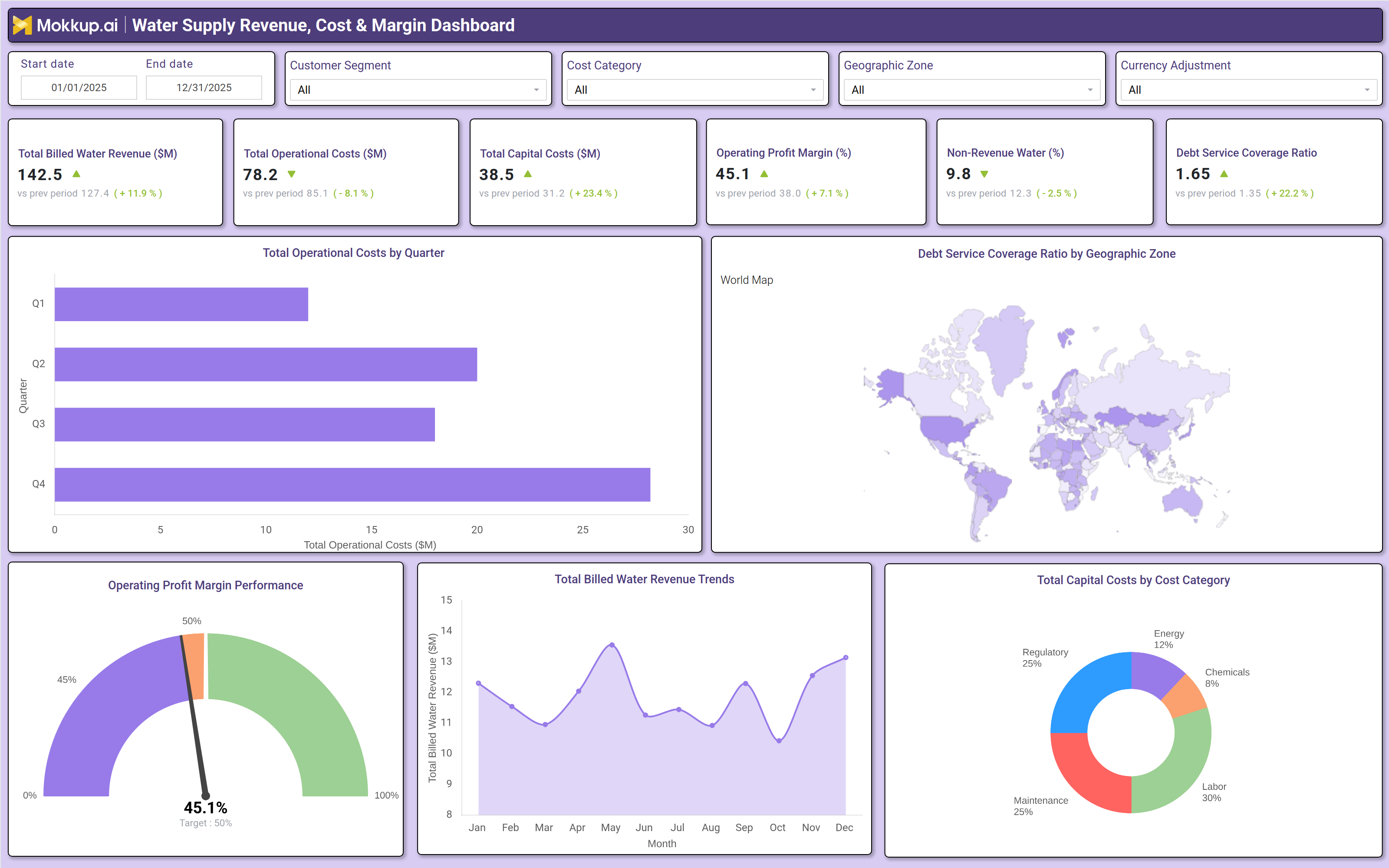
A typical water supply revenue, cost & margin dashboard includes interactive filters for date ranges, customer segments (residential, commercial, industrial), cost categories (energy, chemicals, labor, maintenance), geographic zones, and currency adjustment. Key performance tiles display total billed water revenue, total operational costs, total capital costs, operating profit margin, non‑revenue water percentage, and debt service coverage ratio – each compared against previous periods with trend arrows. \
Trend charts show total operational costs by quarter and total billed water revenue by month, helping utilities identify seasonal patterns. A world map visualizes geographic performance, while a line chart tracks operating profit margin against a target benchmark. Pie charts break down total capital costs by cost category (maintenance, labor, chemicals, energy) and provide similar breakdowns for operational costs. Together, these components form a water utility financial performance dashboard that enables data‑driven decisions on pricing, capital planning, and leak reduction.
How to Analyze Data in a Water Supply Revenue, Cost & Margin Dashboard
Here is how you can analyze data from this public trust index dashboard:
- Compare revenue vs. operational costs to assess profitability trends.
- Monitor capital expenditures by category (maintenance, labor, chemicals) to identify cost drivers.
- Track nonrevenue water percentages to detect leaks or inefficiencies in distribution.
- Analyze operating profit margins against industry benchmarks to evaluate financial health.
- Review debt service coverage ratios to ensure sustainable debt management.
- Use geographic filters to compare performance across service zones.
- Benchmark against historical data to detect costsaving or revenueboosting opportunities.
Benefits of a Water Supply Revenue, Cost & Margin Dashboard
The following are the benefits of using this water utility profitability dashboard:
- Improves financial transparency by consolidating revenue, costs, and margins in one view.
- Identifies cost inefficiencies through detailed expense breakdowns.
- Optimizes pricing strategies by analyzing revenue trends and customer segments.
- Reduces nonrevenue water losses with data driven leak detection.
- Enhances budget forecasting by tracking capital and operational expenditures.
- Supports regulatory compliance with accurate financial reporting.
- Enables data driven decisionmaking for utility managers and policymakers.
KPIs to Track in a Water Supply Revenue, Cost & Margin Dashboard
The following key KPIs can be tracked by using this water utility financial performance dashboard:
- Total Billed Water Revenue ($M): Measures total revenue generated from water sales.
- Operating Profit Margin (%): Indicates profitability after operational costs.
- NonRevenue Water (%): Tracks water lost due to leaks, theft, or metering errors.
- Debt Service Coverage Ratio: Assesses the ability to cover debt obligations.
- Operational Cost per Unit ($/MG): Compares expenses against water volume produced.
- Capital Expenditure ($M): Monitors long term infrastructure investments.
- Customer Revenue Growth (%): Evaluates revenue trends across customer segments.
Frequently Asked Questions
1. What is a water supply revenue dashboard?
It is a financial dashboard that compares water utility revenue against operational and capital costs to identify profitability trends.
2. What data sources feed into a water supply revenue tracking dashboard?
Billing systems, financial software, SCADA (Supervisory Control and Data Acquisition), and asset management tools.
3. How does a utility cost and margin dashboard?
It provides insights into cost drivers, helping utilities optimize spending and improve margins.