
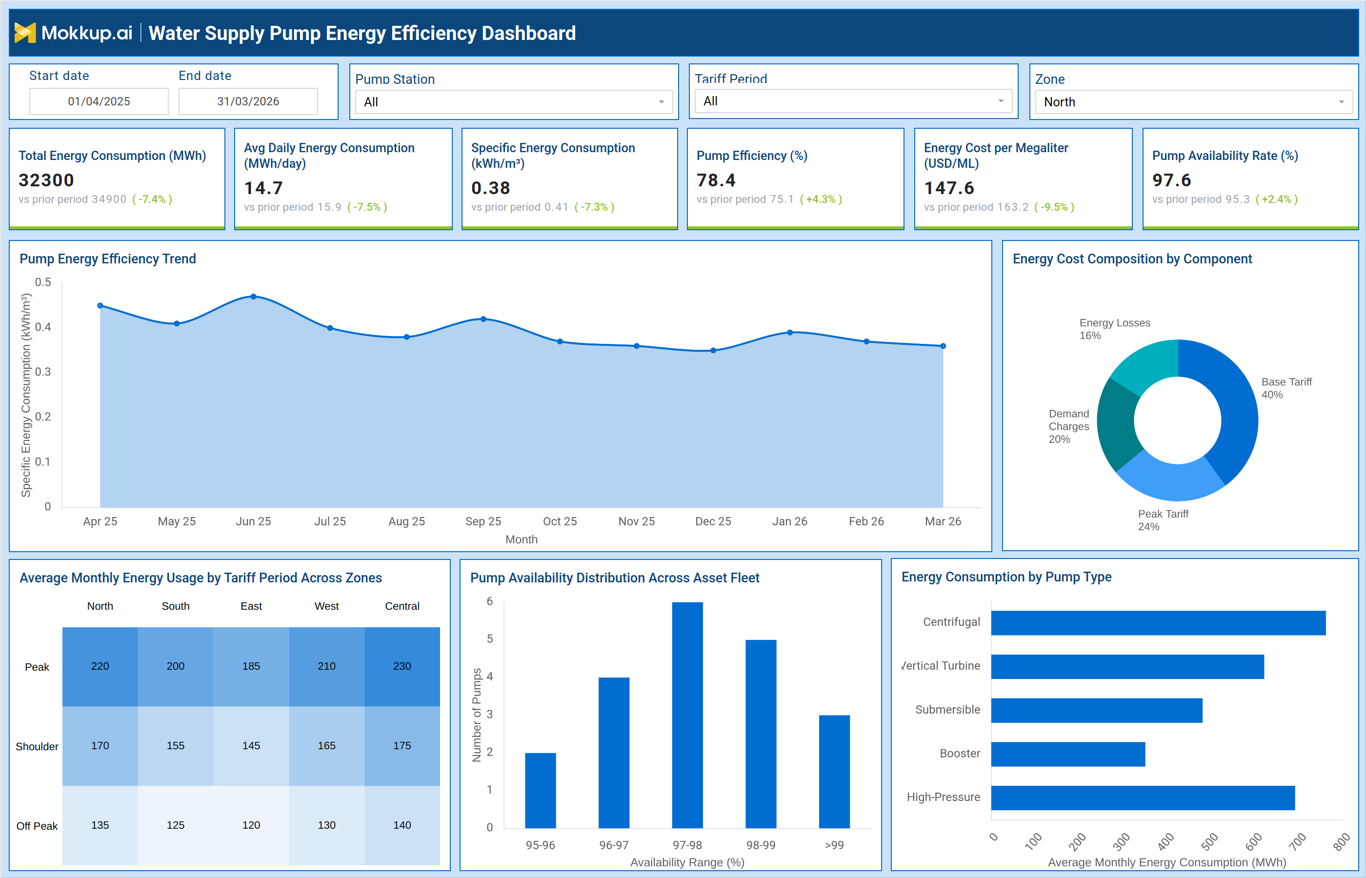
What is a Water Supply Pump Energy Efficiency Dashboard?
The Water Supply Pump Energy Efficiency Dashboard is a structured operational tool designed for water utility engineers, energy managers, and operations directors who need a consolidated view of pump energy consumption, efficiency performance, and tariff-based cost allocation across their distribution network. It brings together the metrics that matter most for energy governance — from total and specific energy consumption to pump efficiency percentages and availability rates — into a single monitoring interface that supports both daily operations and strategic energy planning. Built for water utility pump energy monitoring, this dashboard gives operations and finance teams the clarity they need to assess how energy is being consumed across pump types, service zones, and tariff periods. By tracking pump energy efficiency trends over time and comparing how energy usage breaks down across base tariff, peak tariff, demand charges, and energy losses, teams can identify where costs are climbing and where operational improvements will have the greatest financial impact. The dashboard is filterable by date range, pump station, tariff period, and zone, making it equally suited for shift-level reviews and long-range energy audits.
How to Create a Water Supply Pump Energy Efficiency Dashboard
You don't need to build your report from scratch; just start with a ready-to-use dashboard template from Mokkup. Add in your data and export it however you like. Here's how to do it:
1. Create or Log in to Your Mokkup Account
Start by signing up on Mokkup.ai using your email. If you already have an account, just log in, and you'll be good to go.
2. Choose and Customize Your Dashboard Template
Find the Water Supply Pump Energy Efficiency Dashboard template in the Templates section. Use the drag-and-drop editor to adjust KPIs, edit filters, or add elements based on your data.
3. Export to Your BI Tool
Once your dashboard wireframe is ready, use the BI Tool Export feature to send it directly to Power BI or Tableau for further analysis and enhancements. You can also download the dashboard as a PDF, PNG, or JPEG, embed it on a platform, or invite your team to collaborate.
Note: This is a Pro template. You'll need a Pro subscription on Mokkup to use and customize this dashboard wireframe. Upgrade anytime to unlock full access.
Water Supply Pump Energy Efficiency Dashboard Example
Water utility energy managers typically begin their review by checking the six KPI cards at the top of the dashboard. Total energy consumption, average daily consumption, and specific energy consumption give an immediate read on whether the system is running within expected parameters. A drop in pump efficiency or a rise in energy cost per megaliter signals that further investigation is warranted before costs accumulate or assets degrade. From the KPI row, analysts move to the Pump Energy Efficiency Trend chart, which plots specific energy consumption across months. This view makes it straightforward to identify whether efficiency has improved over the reporting period or whether a particular month saw an unexpected spike. When the trend line drifts upward, operations teams can correlate the timing against maintenance records, seasonal demand shifts, or changes in pump station load.
The Energy Cost Composition by Component donut chart gives finance and operations teams a proportional breakdown of what is driving energy spend. With base tariff, peak tariff, demand charges, and energy losses each represented as a slice, teams quickly see whether peak-period consumption or demand charges are consuming a disproportionate share of the energy budget. This view is particularly useful for informing tariff negotiation and load-shifting strategies. The Average Monthly Energy Usage by Tariff Period Across Zones matrix lets zone supervisors compare how peak, shoulder, and off-peak energy consumption is distributed across the North, South, East, West, and Central service zones. Teams can spot which zones are operating heavily during peak periods and direct operational adjustments — such as shifting high-demand pump cycles to off-peak windows — to reduce tariff exposure. The Pump Availability Distribution and Energy Consumption by Pump Type charts complete the picture by showing how available the asset fleet is across availability bands and how energy consumption is distributed across centrifugal, vertical turbine, submersible, booster, and high-pressure pump types.
How to Analyze Data in a Water Supply Pump Energy Efficiency Dashboard
Here is how you can analyze data from this pump energy efficiency monitoring dashboard:
- Filter by Pump Station to isolate energy consumption and efficiency metrics for a single facility and compare performance across stations
- Use the Tariff Period filter to focus the analysis on peak, shoulder, or off-peak periods and understand how tariff timing affects total energy costs
- Review the Pump Energy Efficiency Trend chart to identify months where specific energy consumption rose and correlate those periods with maintenance events or demand changes
- Examine the Energy Cost Composition by Component donut chart to determine whether base tariff, peak tariff, demand charges, or energy losses are the primary cost driver
- Use the Average Monthly Energy Usage by Tariff Period Across Zones matrix to identify which service zones are most exposed to peak-period energy costs
- Cross-reference the Zone filter with tariff period data to build zone-specific load-shifting strategies that reduce peak consumption
- Review the Pump Availability Distribution chart to identify what share of the asset fleet falls into the highest availability bands and flag units approaching lower thresholds
- Segment Energy Consumption by Pump Type to determine whether centrifugal, vertical turbine, submersible, booster, or high-pressure pumps are driving the largest share of consumption
Benefits of a Water Supply Pump Energy Efficiency Dashboard
The following are the benefits of using this dashboard:
- Gives energy managers a consolidated view of pump efficiency, consumption, and cost in one interface, reducing the time spent gathering data from disparate systems
- Enables tariff-period analysis across service zones, supporting load-shifting decisions that reduce peak energy costs
- Surfaces specific energy consumption trends over time, making it easier to detect efficiency degradation before it becomes a significant cost burden
- Breaks down energy cost composition by component, helping finance teams understand whether peak tariff, demand charges, or energy losses are the dominant cost driver
- Supports asset fleet management by showing pump availability distribution across the entire fleet at a glance
- Identifies which pump types consume the most energy, giving procurement and maintenance teams the data they need to prioritize efficiency upgrades
- Provides filter flexibility across pump station, tariff period, and zone, making it practical for both operational reviews and executive reporting
KPIs to Track in a Water Supply Pump Energy Efficiency Dashboard
The following key KPIs can be tracked by using this water utility energy consumption tracking dashboard:
- Total Energy Consumption (MWh) — measures the total electrical energy consumed across all pump stations in the selected period, the primary indicator of system-wide energy load
- Avg Daily Energy Consumption (MWh/day) — tracks the average energy consumed per day, used to identify consumption trends and flag abnormal daily usage
- Specific Energy Consumption (kWh/m³) — measures energy consumed per unit volume of water pumped, the core metric in water utility pump energy monitoring and efficiency benchmarking
- Pump Efficiency (%) — indicates what percentage of input energy is being converted to useful hydraulic output; a declining value signals mechanical degradation or operational inefficiency
- Energy Cost per Megaliter (USD/ML) — quantifies the cost of pumping each megaliter of water, connecting energy consumption directly to operational expenditure
- Pump Availability Rate (%) — tracks the percentage of time pumps are available and operational, a key indicator of asset reliability and maintenance effectiveness
- Energy Cost by Component — derived from the Energy Cost Composition chart, this metric breaks spend into base tariff, peak tariff, demand charges, and energy losses for cost attribution
- Monthly Energy Usage by Tariff Period and Zone — from the cross-zone matrix, this metric tracks peak, shoulder, and off-peak consumption by service zone to support tariff optimization
Frequently Asked Questions
1. Who should use the Water Supply Pump Energy Efficiency Dashboard?
This dashboard is designed for water utility energy managers, pump station engineers, and operations directors who are responsible for managing energy costs and pump performance across a distribution network. It is also useful for finance teams who need to understand the cost breakdown of energy spend by tariff period and component.
2. How does the dashboard support tariff period energy analysis?
The Average Monthly Energy Usage by Tariff Period Across Zones matrix displays peak, shoulder, and off-peak energy consumption side by side for each service zone. This allows operations teams to identify which zones are most exposed to high-cost peak periods and develop load-shifting strategies to reduce tariff charges.
3. Can the dashboard help identify which pump types are the least energy efficient?
Yes. The Energy Consumption by Pump Type bar chart shows average monthly energy consumption broken down by pump type — centrifugal, vertical turbine, submersible, booster, and high-pressure. Teams can compare consumption levels across pump types and use that data to prioritize maintenance, replacement, or efficiency upgrade programs for the highest-consuming categories.