
What is an Electric Power Retail Energy Efficiency Program Overview Dashboard?
An Electric Power Retail Energy Efficiency Program Overview Dashboard is a performance monitoring view used by power retailers to track how energy efficiency and DSM initiatives are delivering measurable savings. It consolidates program participation, kWh savings per customer, peak load reduction, and smart device adoption into one executive view. This helps utilities and retailers understand which programs are generating real impact and which require intervention. It also supports better planning for incentive programs, customer targeting, and operational readiness. In short, it works as an electric retail energy efficiency dashboard that links program execution to business value.
How to Create an Electric Power Retail Energy Efficiency Program Overview Dashboard
You don’t need to build your report from scratch, just start with a ready-to-use dashboard template from Mokkup. Add in your data and export it however you like. Here’s how to do it:
1. Create or Log in to Your Mokkup Account
Start by signing up on Mokkup.ai using your email. If you already have an account, just log in, and you’ll be good to go.
2. Choose and Customize Your Dashboard Template
Find the Electric Power Retail Energy Efficiency Program Overview Dashboard template in the Templates section. Use the drag-and-drop editor to adjust KPIs, edit filters, or add elements based on your data.
3. Export to Your BI Tool
Once your dashboard wireframe is ready, use the BI Tool Export feature to send it directly to Power BI or Tableau for further analysis and enhancements. You can also download the dashboard as a PDF, PNG, or JPEG, embed it on a platform, or invite your team to collaborate.
Note: This is a Pro template. You’ll need a Pro subscription on Mokkup to use and customize this dashboard wireframe. Upgrade anytime to unlock full access.
Electric Power Retail Energy Efficiency Program Overview Dashboard Example
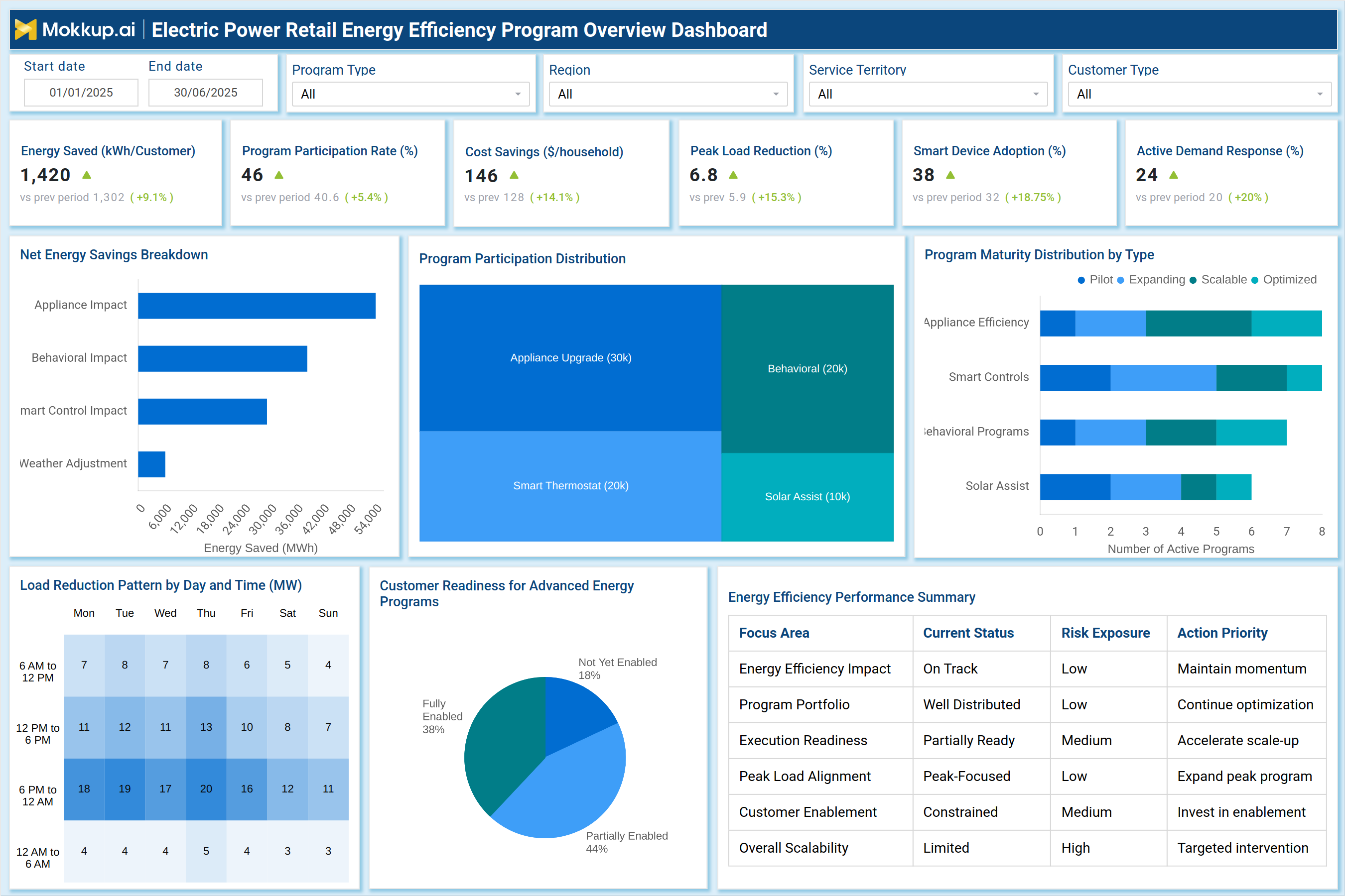
In this example dashboard, the retailer tracks Energy Saved (kWh/customer), Program Participation Rate, and Cost Savings per household to validate program success across regions and service territories. The dashboard highlights peak-driven benefits using peak load reduction and active demand response, making it a strong demand-side management performance dashboard. Visuals like the Net Energy Savings Breakdown show where savings come from (appliances, behavioral, smart controls), while the participation treemap shows which programs drive adoption. The maturity distribution helps identify scalable vs pilot programs, and the readiness pie chart indicates how prepared customers are for advanced programs. Together, it functions as a complete energy efficiency program performance dashboard for retail utility leadership.
How to Analyze Data in the Electric Power Retail Energy Efficiency Program Overview Dashboard
Here is how you can analyze data from this dashboard:
- Start with Energy Saved (kWh/customer) to measure program impact per customer instead of total volume only.
- Compare program participation rate by region/segment to detect adoption gaps.
- Validate financial value using cost savings ($/household) vs program investments.
- Track grid relief performance through peak load reduction and align it with peak periods.
- Monitor Smart Device Adoption (%) to confirm long-term controllable load growth.
- Use Active Demand Response to understand how many customers contribute during peak events.
- Review the Net Energy Savings Breakdown to see which levers drive the most savings (appliance vs behavior vs smart controls).
- Analyze the program participation distribution treemap to identify the highest-performing program types.
- Use Program Maturity Distribution to prioritize optimized programs for scaling and reduce focus on low-impact pilots.
- Study the Load Reduction Pattern heatmap to pinpoint days/times with maximum curtailment effectiveness.
- Review the Energy Efficiency Performance Summary table to connect risks → priorities → actions.
Benefits of Electric Power Retail Energy Efficiency Program Overview Dashboard
The following are the benefits of using this dashboard:
- Improve Program Decision-Making: Use a centralized energy efficiency KPI dashboard to gain a holistic view of program performance and outcomes.
- Scale the Right Programs: Link participation, maturity, and savings metrics to identify which programs deliver the greatest impact and deserve expansion.
- Strengthen DSM Planning: Apply demand-side impact metrics such as peak reduction and demand response to improve demand-side management strategies.
- Reduce Grid Stress: Track adoption of controllable loads and peak-focused programs to support grid stability and reliability.
- Support Regulator-Friendly Reporting: Provide measurable efficiency and readiness indicators that simplify regulatory reporting and audits.
- Enable Targeted Customer Campaigns: Analyze adoption patterns across customer segments to design more effective outreach initiatives.
- Increase Program ROI: Monitor cost savings per household and execution gaps to maximize returns on efficiency investments.
- Improve Operational Focus: Use action priority and risk exposure summaries to guide teams toward high-impact initiatives.
KPIs to Track in Electric Power Retail Energy Efficiency Program Overview Dashboard
The following key KPIs can be tracked by using this dashboard:
- Energy Saved (kWh/customer): Measures average energy efficiency benefit achieved per customer through active programs.
- Program Participation Rate (%): Tracks how many eligible customers are enrolled and actively participating in efficiency programs.
- Cost Savings ($/household): Estimates the household-level financial savings generated through efficiency adoption.
- Peak Load Reduction (%): Measures how effectively programs reduce demand during peak hours (critical for grid stability).
- Smart Device Adoption (%): Tracks adoption of enabling assets such as smart thermostats, controls, and energy devices.
- Active Demand Response (%): Indicates the share of customers contributing to DSM events or automated demand response actions.
- Net Energy Savings (MWh): Tracks total program-driven energy savings and supports portfolio-level performance reporting.
- Program Maturity Mix (count): Shows distribution of programs across pilot, expanding, scalable, and optimized stages.
- Customer Readiness (%): Measures readiness levels for advanced energy programs across the customer base.
- Load Reduction Intensity (MW): Tracks time-based curtailment strength using load reduction patterns by day and hour.
Frequently Asked Questions
1. Who uses this dashboard in a power retail utility?
Program managers, DSM teams, energy efficiency operations, regulatory reporting teams, and retail strategy leadership.
2. Why is peak load reduction important for energy efficiency programs?
Because peak reduction decreases network stress, reduces procurement cost during high-price hours, and improves system reliability.
3. How does this help improve program ROI?
By showing which program types generate the highest savings and participation, and by exposing readiness gaps and maturity bottlenecks.