
What is a Water Supply Network Expansion & Pipe Replacement Dashboard?
The Water Supply Network Expansion & Pipe Replacement Dashboard is a purpose-built analytics template for water utility managers, infrastructure planners, and capital project teams. It consolidates project-level data across budget, pipe replacement progress, permit processing, and zone-level programme health into a single view. Designed for multi-zone expansion projects, this water supply network expansion dashboard template helps teams working on permit approval tracking water utility compliance make faster, data-backed decisions on resource allocation, contractor performance, and regulatory compliance.
How to Create a Water Supply Network Expansion & Pipe Replacement Dashboard
Find the Water Supply Network Expansion & Pipe Replacement Dashboard template in the Templates section. Use the drag-and-drop editor to adjust KPIs, edit filters, or add elements based on your data.
1. Create or Log in to Your Mokkup Account
Start by signing up on Mokkup.ai using your email. If you already have an account, just log in, and you'll be good to go.
2. Choose and Customize Your Dashboard Template
Find the Water Supply Network Expansion & Pipe Replacement Dashboard template in the Templates section. Use the drag-and-drop editor to adjust KPIs, edit filters, or add elements based on your data.
3. Export to Your BI Tool
Once your dashboard wireframe is ready, use the BI Tool Export feature to send it directly to Power BI or Tableau for further analysis and enhancements. You can also download the dashboard as a PDF, PNG, or JPEG, embed it on a platform, or invite your team to collaborate.
Note: This is a Pro template. You'll need a Pro subscription on Mokkup to use and customize this dashboard wireframe. Upgrade anytime to unlock full access.
Water Supply Network Expansion & Pipe Replacement Dashboard Example
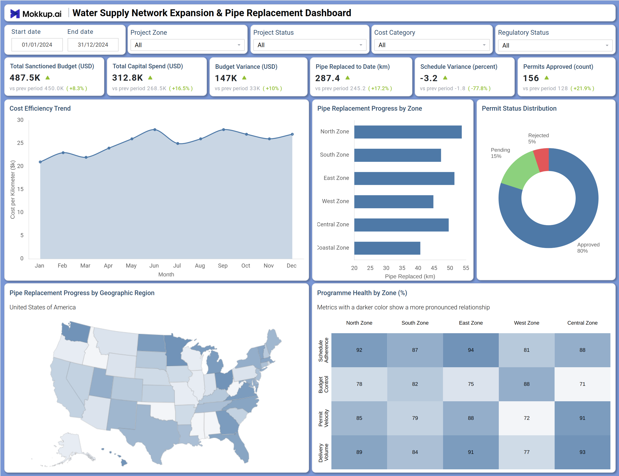
The dashboard opens with six KPI tiles covering Total Sanctioned Budget, Total Capital Spend, Budget Variance, Pipe Replaced to Date, Schedule Variance, and Permits Approved. Each tile includes a prior period comparison, giving project managers an immediate read on cost and output trends.
The Cost Efficiency Trend line chart tracks cost per kilometre across twelve months, making it easy to spot where the pipe replacement tracking dashboard data shows efficiency shifting. The pipe replacement progress by zone dashboard view presents a bar chart breaking pipe volume across North, South, East, West, Central, and Coastal zones for direct zone-level comparison. The Permit Status Distribution donut chart splits permits into approved, pending, and rejected categories, supporting permit approval tracking in water utility projects where approval delays directly affect installation timelines. The choropleth map plots pipe replacement activity geographically across the United States, giving leadership a regional coverage view.
How to Analyze Data in a Water Supply Network Expansion & Pipe Replacement Dashboard
Here is how you can analyze data from this dashboard:
- Use Start Date, End Date, and Project Zone filters to scope data to a specific period and zone
- Filter by Project Status to separate active, completed, or on-hold projects
- Use Cost Category to break down spend by type of infrastructure work
- Apply Regulatory Status to track compliance posture across the project portfolio
- Monitor Budget Variance alongside Total Capital Spend to detect cost overruns early
- Use the Cost Efficiency Trend chart to identify months with rising cost per kilometre
- Compare the Pipe Replacement Progress by Zone bar chart to assess output across zones
- Use the Programme Health by Zone heatmap to prioritise zone-level intervention
Benefits of a Water Supply Network Expansion & Pipe Replacement Dashboard
The following are the benefits of using this dashboard:
- Centralises water utility capital spend dashboard data to reduce manual reporting time
- Tracks pipe replacement progress by zone to improve contractor accountability
- Identifies budget variance early to prevent project cost overruns
- Monitors permit approval tracking across regulatory categories in one view
- Provides geographic visibility through a choropleth map of regional pipe output
- Supports water infrastructure budget variance tracking with period-over-period comparisons
KPIs to Track in a Water Supply Network Expansion & Pipe Replacement Dashboard
The following key KPIs can be tracked by using this dashboard:
- Total Sanctioned Budget (USD) - total approved funding for the expansion programme
- Total Capital Spend (USD) - cumulative expenditure incurred to date
- Budget Variance (USD) - difference between sanctioned budget and actual spend, flagging overruns or underspend
- Pipe Replaced to Date (km) - volume of pipe physically installed or replaced within the reporting period
- Schedule Variance (percent) - deviation from planned milestones, positive or negative
- Permits Approved (count) - regulatory permits granted, which directly gates pipe installation activity
- Cost per Kilometre (Cost Efficiency Trend) - cost efficiency of pipe replacement work over a twelve-month period
- Schedule Adherence (Programme Health by Zone) - whether each zone is meeting its planned schedule
- Budget Control (Programme Health by Zone) - each zone's ability to stay within its allocated budget
- Permit Velocity (Programme Health by Zone) - pace at which permits are being processed and approved per zone
- Delivery Variance (Programme Health by Zone) - deviation between planned and actual delivery output per zone
Frequently Asked Questions
1. Who should use the Water Supply Network Expansion & Pipe Replacement Dashboard?
This dashboard is designed for water utility managers, infrastructure project leads, and capital programme directors overseeing multi-zone pipe replacement or expansion projects. It is also useful for regulatory compliance teams monitoring permit approval tracking across project zones.
2. Can the dashboard filter data by zone or regulatory status?
Yes. The dashboard includes filters for Project Zone, Regulatory Status, Project Status, Cost Category, and date range. These allow users to isolate specific zones or compliance categories for focused analysis.
3. What makes the Programme Health by Zone heatmap useful?
The heatmap evaluates each zone across Schedule Adherence, Budget Control, Permit Velocity, and Delivery Variance simultaneously. This makes it faster to identify which zones are struggling across multiple dimensions, rather than reviewing each metric separately.