
What Is a Water Supply Executive Overview Dashboard?
A Water Supply Executive Overview Dashboard is a centralized analytics tool designed for utility leaders to monitor, analyze, and optimize water and wastewater operations. It consolidates key performance metrics, financial data, and operational trends into a single view, enabling data-driven decision-making. This executive overview dashboard for water utilities helps track total water production, non-revenue water loss, capital expenditures, energy efficiency, and infrastructure performance—all critical for maintaining a sustainable water infrastructure. By integrating water supply management dashboard insights, executives can identify inefficiencies, reduce waste, and improve service reliability. Whether managing municipal water systems or large-scale wastewater treatment, this dashboard provides actionable intelligence to enhance operational efficiency and financial sustainability.
How to Create a Water Supply Executive Overview Dashboard
You don’t need to build your report from scratch, just start with a ready-to-use dashboard template from Mokkup. Add in your data and export it however you like. Here’s how to do it:
1. Create or Log in to Your Mokkup Account
Start by signing up on Mokkup.ai using your email. If you already have an account, just log in, and you’ll be good to go.
2. Choose and Customize Your Dashboard Template
Find the Water Supply Executive Overview Dashboard template in the Templates section. Use the drag and drop editor to adjust KPIs, edit filters, or add elements based on your data.
3. Export to Your BI Tool
Once your dashboard wireframe is ready, use the BI Tool Export feature to send it directly to Power BI or Tableau for further analysis and enhancements. You can also download the dashboard as a PDF, PNG, or JPEG, embed it on a platform, or invite your team to collaborate.
Note: This is a Pro template. You’ll need a Pro subscription on Mokkup to use and customize this dashboard wireframe. Upgrade anytime to unlock full access.
Water Supply Executive Overview Dashboard Example
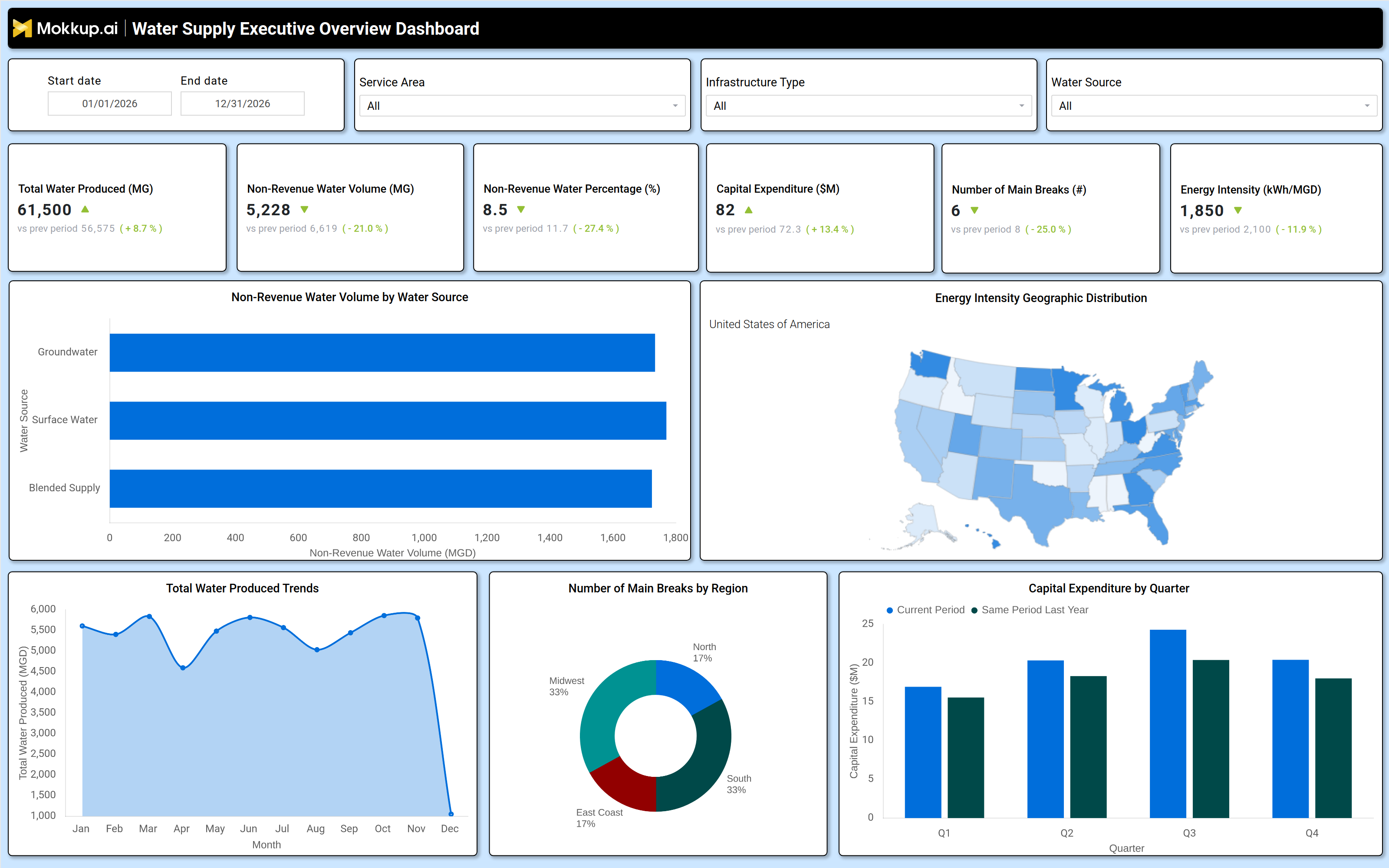
A well structured water supply executive overview dashboard includes interactive filters for date ranges, service areas, infrastructure types, and water sources, allowing users to drill down into specific performance metrics. Key data tiles display total water produced (MG), non revenue water volume, capital expenditure trends, main breaks, and energy intensity, all compared against previous periods for benchmarking.
Visualizations such as non revenue water by source, geographic energy intensity distribution, and quarterly capital expenditure trends provide deeper insights. For example, the non revenue water breakdown helps utilities pinpoint leakage sources (groundwater, surface water, or blended supply), while the energy intensity map highlights regions with high operational costs. Together, these elements form a smart water supply and wastewater reporting tool that supports strategic planning and regulatory compliance.
How to Analyze Data in an Water Supply Executive Overview Dashboard
Here is how you can analyze data from this dashboard:
- Monitor total water production trends to assess supply/demand balance and detect anomalies.
- Track nonrevenue water volume to identify leakage, theft, or metering inaccuracies.
- Compare capital expenditure trends against previous periods to evaluate investment efficiency.
- Analyze main break frequency by region to prioritize infrastructure upgrades.
- Review energy intensity (kWh/MGD) to optimize pumping and treatment costs.
- Assess nonrevenue water by source to target highloss areas for repairs.
- Benchmark performance against industry standards or historical data for continuous improvement.
Benefits of a Water Supply Executive Overview Dashboard
The following are the benefits of using this water utility capital expenditure dashboard:
- Enhances operational visibility with historical performance tracking.
- Reduces nonrevenue water loss through targeted leak detection and repairs.
- Optimizes capital spending by aligning investments with infrastructure needs.
- Improves energy efficiency by identifying high consumption processes.
- Supports regulatory compliance with accurate reporting on water quality and usage.
- Enables data driven decision making for long term utility planning.
- Increases cost savings by minimizing waste and improving resource allocation.
KPIs to Track in a Water Supply Executive Overview Dashboard
The following key KPIs can be tracked by using this non‑revenue water tracking dashboard:
- Total Water Produced (MG): Measures daily water supply output to ensure demand is met.
- Non Revenue Water Volume (MG): Tracks lost water due to leaks, theft, or inefficiencies.
- Non Revenue Water Percentage (%): Indicates the proportion of water lost before reaching customers.
- Capital Expenditure ($M): Monitors infrastructure investment trends over time.
- Number of Main Breaks (#): Assesses pipeline integrity and maintenance needs.
- Energy Intensity (kWh/MGD): Evaluates energy efficiency in water treatment and distribution.
Frequently Asked Questions
1. What is a water infrastructure performance dashboard used for?
It helps utility leaders monitor water production, nonrevenue losses, capital spending, and energy efficiency to improve operational and financial performance.
2. What data sources feed into this utility operational overview dashboard?
SCADA systems, billing records, asset management databases, and energy consumption reports.
3. How does this sustainable water infrastructure analytics dashboard improve decision making?
By providing data driven insights on water loss, infrastructure health, and cost efficiency, enabling proactive maintenance and resource allocation.