What is a Water Distribution Municipal Service Experience Dashboard?
The Water Distribution Municipal Service Experience Dashboard is a structured analytics template designed for municipal water utilities, public works departments, and utility service managers who need to monitor customer experience metrics across large distribution networks. This water distribution municipal service experience dashboard consolidates service reliability, complaint resolution time, billing satisfaction, and customer sentiment into a single view, giving operations teams and leadership the clarity they need to act on service gaps. It supports municipal water service reliability rate tracking across customer segments - residential, commercial, industrial, and municipal - and enables water service reliability by state analysis through a built-in choropleth map. Teams responsible for regulatory reporting and customer retention find this dashboard essential for aligning daily operations with long-term service commitments.
How to Create a Water Distribution Municipal Service Experience Dashboard
You don’t need to build your report from scratch; just start with a ready-to-use template from Mokkup. Add in your data and export it however you like. Here’s how to do it:
1. Create or Log in to Your Mokkup Account
Start by signing up on Mokkup.ai using your email. If you already have an account, just log in, and you'll be good to go.
2. Choose and Customize Your Dashboard Template
Find the Water Distribution Municipal Service Experience Dashboard template in the Templates section. Use the drag-and-drop editor to adjust KPIs, edit filters, or add elements based on your data.
3. Export to Your BI Tool
Once your dashboard wireframe is ready, use the BI Tool Export feature to send it directly to Power BI or Tableau for further analysis and enhancements. You can also download the dashboard as a PDF, PNG, or JPEG, embed it on a platform, or invite your team to collaborate.
Note: This is a Pro template. You'll need a Pro subscription on Mokkup to use and customize this dashboard wireframe. Upgrade anytime to unlock full access.
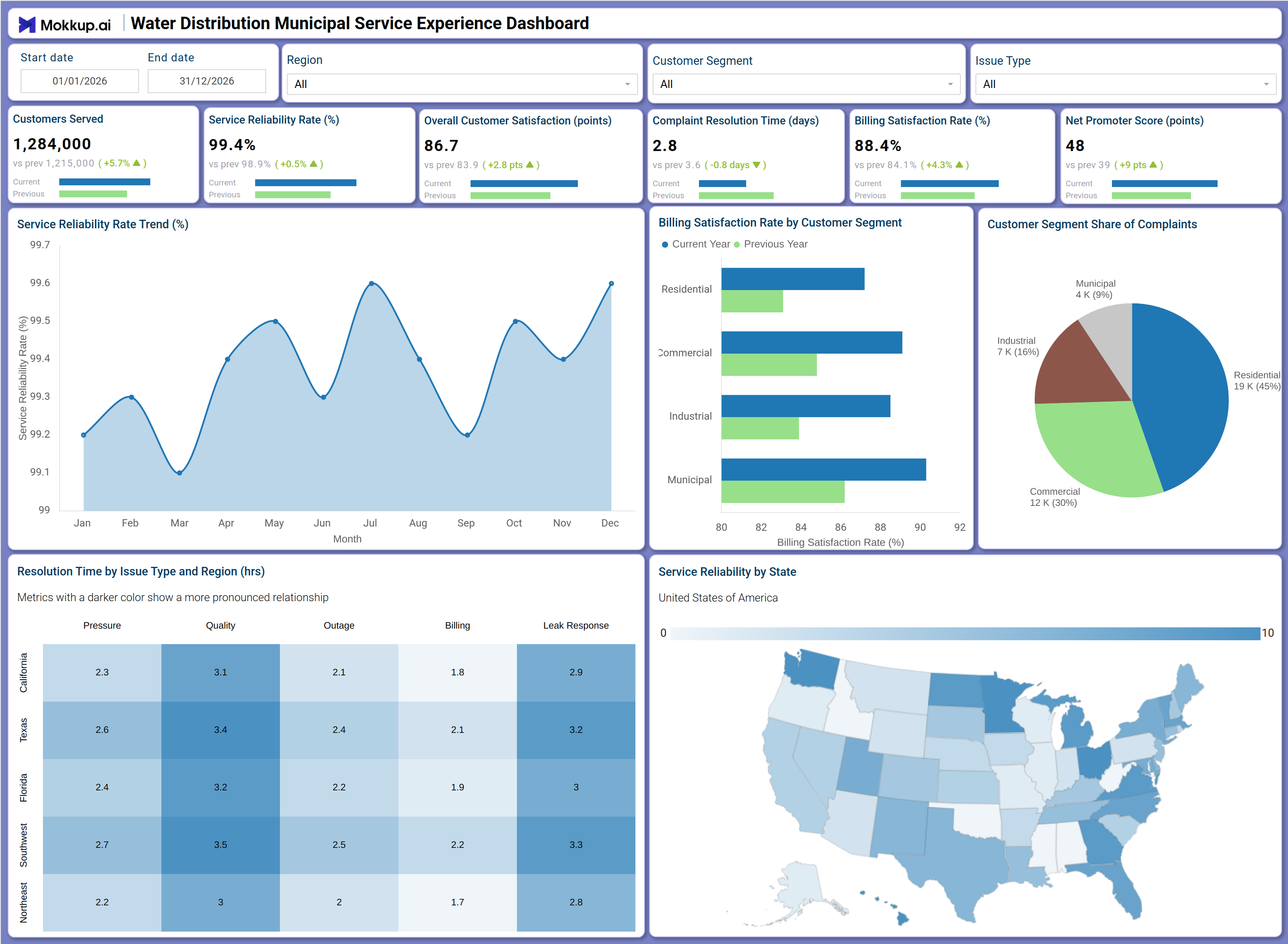
Water Distribution Municipal Service Experience Dashboard Example
A municipal utility operations manager opens this dashboard at the start of the week to assess whether service quality held steady across the distribution network. The KPI row immediately surfaces whether service reliability is within target and whether customer satisfaction has shifted since the prior period. If the complaint resolution time water utility teams are monitoring has increased, the manager can filter by region and issue type to pinpoint which combination is driving the delay.
The Service Reliability Rate Trend chart allows planners to compare monthly performance across the full year, making it easy to spot seasonal pressure points or months where infrastructure strain affected delivery. In the Billing Satisfaction Rate by Customer Segment chart, billing teams can compare current-year performance against the previous year for each segment, identifying accounts that need targeted outreach. The Customer Segment Share of Complaints pie chart and the Resolution Time by Issue Type and Region heat map help service directors prioritize staffing and maintenance resources. The net promoter score water distribution utility teams track is visible alongside satisfaction metrics, giving leadership a complete picture of how customers perceive service quality across the network.
How to Analyze Data in a Water Distribution Municipal Service Experience Dashboard
Here is how you can analyze data from this dashboard:
- Use the Region filter to isolate service reliability metrics for specific geographic areas and benchmark performance across distribution zones.
- Monitor the Service Reliability Rate Trend to detect months where reliability dips and investigate root causes before complaints escalate.
- Review the Resolution Time by Issue Type and Region heat map to identify where complaint resolution time water utility teams should prioritize - pressure, quality, outage, billing, or leak response.
- Use the Billing Satisfaction Rate by Customer Segment chart to compare current year versus previous year performance across residential, commercial, industrial, and municipal accounts.
- Analyze the Customer Segment Share of Complaints pie chart to determine which groups generate the highest complaint volumes relative to their size.
- Filter by Customer Segment to assess whether the billing satisfaction rate by customer segment outcomes differ between commercial and residential accounts.
- Track Net Promoter Score alongside Overall Customer Satisfaction to confirm whether service improvements are building customer loyalty.
- Use the Service Reliability by State map for water service reliability by state analysis to identify regions where infrastructure investment is most urgently needed.
Benefits of a Water Distribution Municipal Service Experience Dashboard
The following are the benefits of using this dashboard:
- Centralizes service reliability, billing satisfaction, complaint resolution, and customer sentiment in one structured template.
- Supports municipal water service reliability rate tracking across multiple customer segments and regions simultaneously.
- Reduces manual data compilation for regulatory and operational reporting with pre-built KPI tiles and chart layouts.
- Enables state-level analysis of complaint resolution time water utility teams manage, guiding resource allocation decisions.
- Provides a heat map breakdown of resolution time by issue type and region for targeted operational planning.
- Helps service managers align billing satisfaction rate by customer segment findings with customer retention strategies.
- Gives operations teams and customer experience directors a shared view of service performance across the distribution network.
KPIs to Track in a Water Distribution Municipal Service Experience Dashboard
The following key KPIs can be tracked by using this dashboard:
- Customers Served: The total number of active customers receiving water service - central to the water distribution municipal service experience dashboard for understanding service scale.
- Service Reliability Rate (%): Tracks the percentage of time water service is delivered without disruption - core to municipal water service reliability rate tracking and compliance reporting.
- Overall Customer Satisfaction (points): Measures aggregated satisfaction scores across all service interactions - indicates whether operational improvements are visible to customers.
- Complaint Resolution Time (days): Quantifies average days to resolve complaints - directly tied to complaint resolution time water utility performance standards and SLA management.
- Billing Satisfaction Rate (%): Evaluates satisfaction with billing accuracy - supports billing satisfaction rate by customer segment comparisons across all account types.
- Net Promoter Score (points): Tracks customer likelihood to recommend the utility - a key measure in net promoter score water distribution utility benchmarking and loyalty analysis.
Frequently Asked Questions
1. What types of organizations benefit most from this dashboard?
Municipal water utilities, public works departments, and regional utility service managers benefit most. It is particularly useful for teams responsible for service quality reporting, customer experience improvement, and infrastructure planning across multiple distribution zones.
2. Can this dashboard track complaint resolution performance by region and issue type?
Yes. The Resolution Time by Issue Type and Region heat map shows average resolution times across five issue categories - pressure, quality, outage, billing, and leak response - broken down by region, making it straightforward to identify where delays are concentrated.
3. Is this dashboard suitable for comparing current year versus previous year billing performance?
Yes. The Billing Satisfaction Rate by Customer Segment chart directly compares current year and previous year scores for each customer segment, supporting period-over-period reviews and trend analysis.