What is an Electric Power Distribution Utilities Customer Service & Engagement Dashboard?
An Electric Power Distribution Utilities Customer Service & Engagement Dashboard template is a centralized analytics interface used by distribution system operators (DSOs) to monitor, measure, and improve customer interactions across service channels. It combines operational, service, and experience data into a single electric power distribution utilities customer service dashboard that tracks complaints, service calls, digital self-service usage, outage communications, and satisfaction scores.
This type of electric utility customer experience dashboard enables utilities to understand customer behavior, identify service bottlenecks, and evaluate engagement performance in real time. By integrating data from call centers, web portals, mobile apps, and field services, the dashboard acts as a DSO customer service analytics platform that supports data-driven decisions, service optimization, and regulatory reporting.
How to Create an Electric Power Distribution Utilities Customer Service & Engagement Dashboard
You don’t need to build your report from scratch, just start with a ready to use dashboard template from Mokkup. Add in your data and export it however you like. Here’s how to do it:
1. Create or Log in to Your Mokkup Account
Start by signing up on Mokkup.ai using your email. If you already have an account, just log in, and you’ll be good to go.
2. Choose and Customize Your Dashboard Template
Find the Electric Power Distribution Utilities Customer Service & Engagement Dashboard template in the Templates section. Use the drag and drop editor to adjust KPIs, edit filters, or add elements based on your data.
3. Export to Your BI Tool
Once your dashboard wireframe is ready, use the BI Tool Export feature to send it directly to Power BI or Tableau for further analysis and enhancements. You can also download the dashboard as a PDF, PNG, or JPEG, embed it on a platform, or invite your team to collaborate.
Note: This is a Pro template. You’ll need a Pro subscription on Mokkup to use and customize this dashboard wireframe. Upgrade anytime to unlock full access.
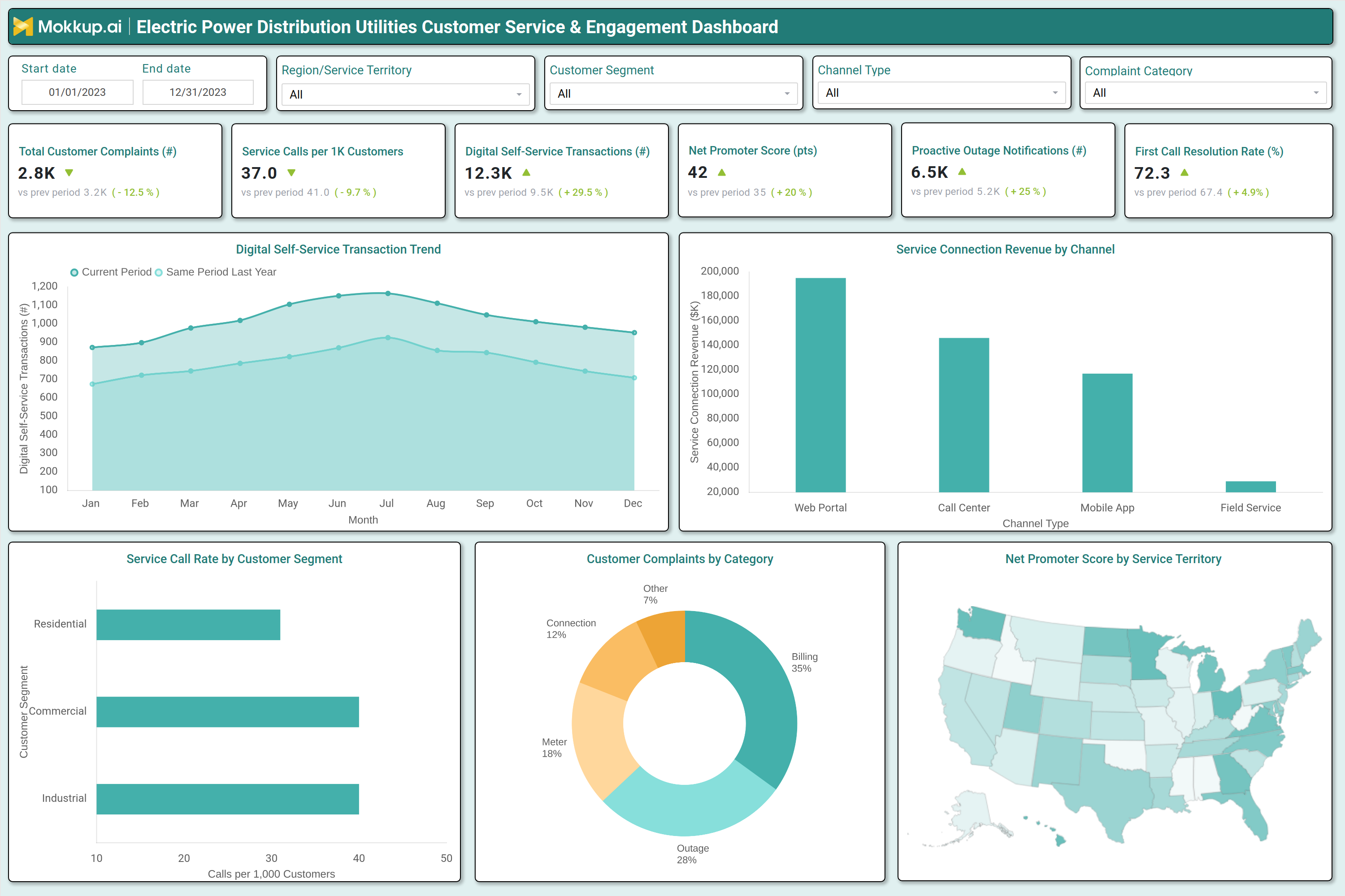
Electric Power Distribution Utilities Customer Service & Engagement Dashboard Example
A typical example of a customer engagement dashboard for electric utilities includes high-level KPI tiles such as total customer complaints, service calls per 1,000 customers, digital self-service transactions, Net Promoter Score (NPS), proactive outage notifications, and first call resolution rate. Below the KPI layer, trend charts display monthly changes in digital self-service usage and year-over-year comparisons. Channel performance visuals show service connection revenue by web portal, call center, mobile app, and field service. Segment level charts break down service call rates for residential, commercial, and industrial customers.
Complaint distribution by category highlights billing, outage, meter, connection, and other service issues. A regional map visualizes NPS scores by service territory. Together, these elements form a power distribution customer engagement software view that supports customer service planning, channel investment, and service quality benchmarking.
How to Analyze Data in an Electric Power Distribution Utilities Customer Service & Engagement Dashboard
Here is how you can analyze data from this dashboard:
- Complaint Volume Trends: Review total customer complaints and trend direction to identify rising or recurring service issues.
- Call Center Demand: Compare service calls per 1,000 customers across time periods to assess pressure on customer support teams.
- Digital Channel Adoption: Analyze digital self-service transactions to measure customer shift toward online and mobile channels.
- Customer Sentiment: Track Net Promoter Score (NPS) changes to understand loyalty levels and overall satisfaction.
- Outage Communication Effectiveness: Monitor proactive outage notifications to evaluate the timeliness and reach of customer communications.
- Support Efficiency: Review first call resolution rate to measure how effectively issues are resolved during initial contact.
- Revenue by Channel: Compare service connection revenue by channel to understand customer preferences and channel performance.
- Customer Segment Demand: Analyze service call rates by customer segment to identify high demand or high risk groups.
- Root Cause Analysis: Review complaint categories to pinpoint recurring drivers such as billing errors or outage frequency.
- Regional Service Gaps: Use regional NPS maps to detect service quality variations across territories.
Benefits of an Electric Power Distribution Utilities Customer Service & Engagement Dashboard
The following are the benefits of using this dashboard:
- Centralized Performance View: Provides a single view of customer service and engagement metrics across DSO operations.
- Service Quality Visibility: Improves insight into response efficiency and service delivery performance.
- Channel Optimization: Enables data-driven optimization of call center and digital service channels.
- Digital Adoption Growth: Supports higher self service usage through performance and adoption tracking.
- Customer Trust Building: Improves outage communication effectiveness and customer confidence.
- Issue Detection: Enables faster identification of recurring customer service problems.
- Customer Satisfaction: Improves retention and satisfaction through consistent experience monitoring.
- Regulatory Support: Assists with customer service related regulatory reporting and compliance.
- Cost Optimization: Reduces operational costs through channel shift and demand analysis.
- CX Strategy Enablement: Strengthens long term customer experience strategy using DSO customer service analytics.
KPIs to Track in an Electric Power Distribution Utilities Customer Service & Engagement Dashboard
The following key KPIs can be tracked by using this dashboard:
- Total customer complaints (count): The total number of service-related complaints reported by customers in a given period.
- Service calls per 1,000 customers (rate): The average number of customer service calls received per 1,000 customers.
- Digital self-service transactions (count): The number of customer transactions completed through online or mobile self-service channels.
- Net Promoter Score (pts): A metric that measures customer loyalty and satisfaction based on their likelihood to recommend the utility.
- Proactive outage notifications (count): The number of outage alerts sent to customers before or during service disruptions.
- First call resolution rate(%): The percentage of customer issues resolved during the first support interaction.
Frequently Asked Questions
Q1. What is the purpose of an electric power distribution utilities customer service dashboard?
The purpose is to track customer interactions, service performance, and engagement outcomes in one unified electric utility customer support analytics tool.
Q2. Who should use a DSO customer service analytics platform?
Customer service teams, operations managers, digital channel owners, and regulatory reporting teams benefit from using the dashboard.
Q3. How does the dashboard improve outage communication?
It tracks proactive outage notifications and customer response to ensure timely and accurate communication.