
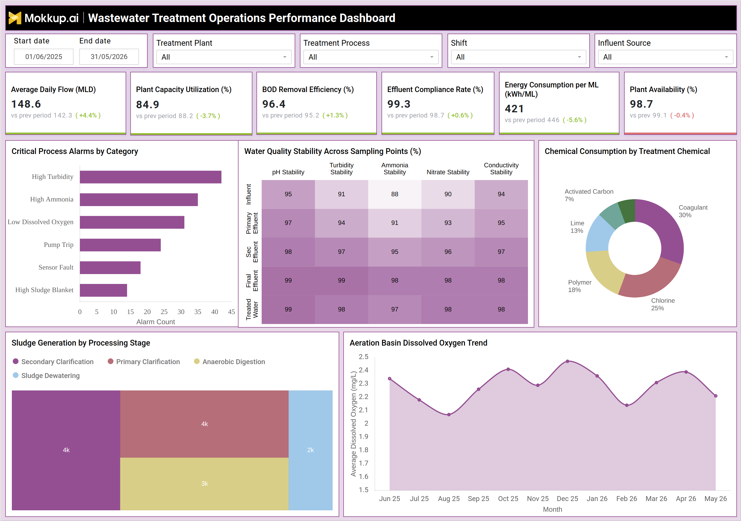
What is a Wastewater Treatment Operations Performance Dashboard?
The Wastewater Treatment Operations Performance Dashboard is a centralized analytics interface for plant operations managers, process engineers, and compliance teams overseeing municipal and industrial wastewater treatment facilities. It consolidates operational, chemical, and environmental data into a single view so decision-makers can assess how effectively the plant is processing influent water across all treatment stages.
From plant capacity utilization wastewater systems depend on to BOD removal efficiency tracking, this dashboard surfaces the operational transparency teams need to stay ahead of compliance risks. Filters for treatment plant, process, shift, and influent source let operators isolate relevant data across a multi-site operation. Whether tracking effluent compliance rate monitoring outcomes against discharge permit thresholds or reviewing the aeration basin dissolved oxygen trend, the wastewater treatment operations performance dashboard gives teams the visibility to manage treatment quality without switching between systems.
How to Create a Wastewater Treatment Operations Performance Dashboard
You don't need to build your report from scratch; just start with a ready-to-use dashboard template from Mokkup. Add in your data and export it however you like. Here's how to do it:
1. Create or Log in to Your Mokkup Account
Start by signing up on Mokkup.ai using your email. If you already have an account, just log in, and you'll be good to go.
2. Choose and Customize Your Dashboard Template
Find the Wastewater Treatment Operations Performance Dashboard template in the Templates section. Use the drag-and-drop editor to adjust KPIs, edit filters, or add elements based on your data.
3. Export to Your BI Tool
Once your dashboard wireframe is ready, use the BI Tool Export feature to send it directly to Power BI or Tableau for further analysis and enhancements. You can also download the dashboard as a PDF, PNG, or JPEG, embed it on a platform, or invite your team to collaborate.
Note: This is a Pro template. You'll need a Pro subscription on Mokkup to use and customize this dashboard wireframe. Upgrade anytime to unlock full access.
Wastewater Treatment Operations Performance Dashboard Example
A plant operations manager opens this dashboard at the start of each shift to assess whether the facility is meeting its operational targets. The KPI row surfaces whether average daily flow is within expected bounds, plant capacity utilization wastewater systems are running at, and whether BOD removal efficiency tracking shows secondary treatment delivering at standard. If any metric trends below the previous period, the manager knows exactly where to direct attention.
Shift supervisors use the Critical Process Alarms by Category chart to identify which alarm types — high turbidity, low dissolved oxygen, pump trips, or sensor faults — are generating the most volume, helping maintenance teams prioritize inspections. The Water Quality Stability matrix shows stability percentages from influent through treated effluent so engineers can verify discharge quality at every sampling point. Chemical managers monitor consumption across coagulants, polymers, chlorine, lime, and activated carbon to keep dosing within budget. The sludge generation by processing stage view helps biosolids teams plan disposal logistics. The aeration basin dissolved oxygen trend provides a month-over-month view of aeration performance to catch gradual drift before effluent quality is affected, helping teams act on insights rather than chasing data.
How to Analyze Data in a Wastewater Treatment Operations Performance Dashboard
Here is how you can analyze data from this dashboard:
- Filter by treatment plant, process, shift, or influent source before drawing conclusions.
- Compare each KPI to its prior period value to distinguish short-term variation from a sustained trend.
- Rank alarm categories by frequency to prioritize maintenance response using the Critical Process Alarms chart.
- Cross-reference the Water Quality Stability matrix against Effluent Compliance Rate to trace instability through treatment stages.
- Track the Aeration Basin Dissolved Oxygen Trend to detect drift before it affects BOD removal efficiency tracking.
- Review Sludge Generation by Processing Stage to align disposal scheduling with volumes across secondary clarification, primary clarification, anaerobic digestion, and sludge dewatering.
- Monitor Energy Consumption per ML alongside Plant Capacity Utilization to assess operational efficiency under varying flow loads.
Benefits of a Wastewater Treatment Operations Performance Dashboard
The following are the benefits of using this dashboard:
- Centralizes operational, chemical, and environmental data to eliminate manual report compilation.
- Enables earlier identification of process alarms, reducing the risk of effluent compliance rate monitoring failures.
- Improves chemical dosing decisions by surfacing consumption trends across all treatment chemicals.
- Supports proactive sludge management by quantifying generation at each processing stage.
- Strengthens regulatory reporting accuracy with a consistent, auditable performance record.
KPIs to Track in a Wastewater Treatment Operations Performance Dashboard
The following key KPIs can be tracked by using this dashboard:
- Average Daily Flow (MLD): Volume of wastewater entering the facility per day; assesses hydraulic capacity.
- Plant Capacity Utilization (%): Percentage of design capacity in use; identifies overload risk.
- BOD Removal Efficiency (%): Effectiveness of biochemical oxygen demand removal; direct measure of secondary treatment performance.
- Effluent Compliance Rate (%): Consistency of treated effluent meeting discharge permit standards; the primary compliance indicator.
- Energy Consumption per ML (kWh/ML): Energy per megalitre treated; supports cost and sustainability tracking.
- Plant Availability (%): Proportion of time the plant is operational; reflects equipment reliability.
Frequently Asked Questions
1. Who is this dashboard designed for?
Built for plant operations managers, process engineers, shift supervisors, and environmental compliance teams at municipal and industrial wastewater treatment facilities. It is also useful for utility management teams monitoring performance across multiple sites.
2. How does this dashboard support regulatory compliance?
The dashboard tracks effluent compliance rate monitoring metrics against discharge permit thresholds with period-over-period visibility. Teams can identify risks around BOD removal efficiency, ammonia stability, and turbidity early and take corrective action before a breach occurs.
3. Can this dashboard be customized for different plant configurations?
Yes. The wastewater treatment operations performance dashboard template on Mokkup supports customization of KPI tiles, chart types, and filters. The sludge generation by processing stage view and chemical consumption breakdown can be adapted to reflect the actual process units at each facility.
4. What KPIs does this dashboard track?
The dashboard tracks Average Daily Flow (MLD), Plant Capacity Utilization (%), BOD Removal Efficiency (%), Effluent Compliance Rate (%), Energy Consumption per ML (kWh/ML), and Plant Availability (%) — covering operational, environmental, and regulatory performance.
5. How can teams use this dashboard to reduce compliance risk?
Teams can cross-reference the Water Quality Stability matrix against the Effluent Compliance Rate, track the Aeration Basin Dissolved Oxygen Trend to catch BOD removal drift early, and monitor Critical Process Alarms by Category to prioritize maintenance response before issues escalate into permit violations.