
What is a Wastewater Treatment Executive Performance Dashboard?
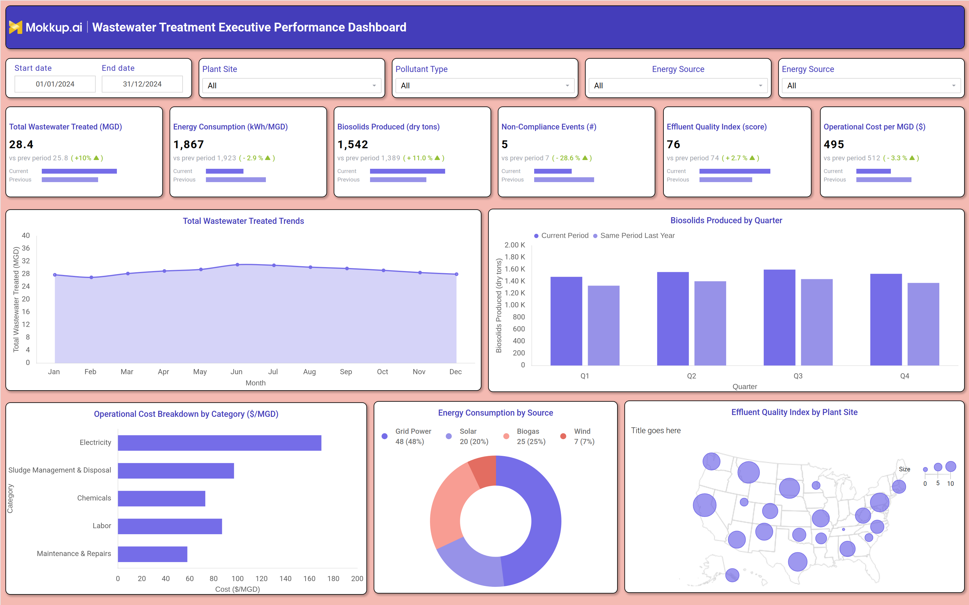
The Wastewater Treatment Executive Performance Dashboard is a single-screen analytical tool designed for utility directors, plant managers, and environmental compliance officers who need a consolidated view of treatment operations across multiple facilities. It surfaces key operational metrics from total volume treated and energy intensity to biosolids output and effluent quality in one place, eliminating the need to pull data from separate plant-level reports.
This wastewater treatment executive performance dashboard helps leadership teams move from reactive reporting to proactive decision-making by making performance gaps visible at a glance. By tracking energy consumption kWh per MGD wastewater analytics alongside cost and compliance indicators, executives can benchmark efficiency across sites and identify where operational investments are most needed. The dashboard supports date-range filtering, plant site selection, pollutant type segmentation, and energy source breakdowns, giving users full control over the scope of their analysis.
How to Create a Wastewater Treatment Executive Performance Dashboard
You don't need to build your report from scratch; just start with a ready-to-use dashboard template from Mokkup. Add in your data and export it however you like. Here's how to do it:
1. Create or Log in to Your Mokkup Account
Start by signing up on Mokkup.ai using your email. If you already have an account, just log in, and you'll be good to go.
2. Choose and Customize Your Dashboard Template
Find the Wastewater Treatment Executive Performance Dashboard template in the Templates section. Use the drag-and-drop editor to adjust KPIs, edit filters, or add elements based on your data.
3. Export to Your BI Tool
Once your dashboard wireframe is ready, use the BI Tool Export feature to send it directly to Power BI or Tableau for further analysis and enhancements. You can also download the dashboard as a PDF, PNG, or JPEG, embed it on a platform, or invite your team to collaborate.
Note: This is a Pro template. You'll need a Pro subscription on Mokkup to use and customize this dashboard wireframe. Upgrade anytime to unlock full access.
Wastewater Treatment Executive Performance Dashboard Example
A utility executive opens this dashboard ahead of a quarterly operations review, wanting to understand how treatment volumes have trended across the year and whether costs are staying within target. The wastewater treatment executive performance dashboard loads a full-year view with monthly trends in treated volume, making it immediately clear whether throughput has remained stable or shifted due to seasonal inflow. If energy consumption kWh per MGD wastewater analytics show a spike in a particular month, the team can investigate whether it corresponds to a change in treatment load, equipment inefficiency, or a shift in energy source mix. On the cost side, operations managers use the horizontal bar breakdown to see where the largest expenditure categories lie, whether electricity dominates operational cost per MGD, or whether sludge management and disposal have grown as a proportion of total spend.
This helps prioritize where efficiency improvements will have the greatest financial impact. The biosolids production tracking dashboard view by quarter allows planners to compare current output against the same period last year, flagging whether biosolids volumes are running higher than the disposal capacity can absorb. Compliance officers focus on the non-compliance events count and drill down by pollutant type to identify which effluent parameters are most frequently breached. The effluent quality index monitoring by plant site, displayed as a bubble map across facility locations, makes it easy to see which sites are performing within acceptable discharge standards and which require immediate attention. Together, these views give leadership teams the cross-functional visibility needed to manage wastewater operations with confidence and accountability.
How to Analyze Data in a Wastewater Treatment Executive Performance Dashboard
Here is how you can analyze data from this dashboard:
- Filter by Plant Site to compare performance across individual treatment facilities
- Use Start Date and End Date filters to assess trends over specific reporting periods
- Monitor Total Wastewater Treated (MGD) trends month-over-month to detect volume fluctuations
- Analyze Operational Cost Breakdown by Category to identify the highest-spend cost drivers
- Compare Biosolids Produced by Quarter against same-period prior-year values to track output shifts
- Use the Energy Consumption by Source donut chart to evaluate the share of renewable vs. grid power
- Filter by Pollutant Type to isolate non-compliance events tied to specific discharge parameters
- Review the Effluent Quality Index by Plant Site map to prioritize sites needing compliance action
- Track Energy Consumption (KWh/MGD) changes alongside volume data to identify energy intensity issues
- Cross-reference Non-Compliance Events with Effluent Quality Index scores to validate compliance risk
Benefits of a Wastewater Treatment Executive Performance Dashboard
The following are the benefits of using this dashboard:
- Consolidates multi-site treatment performance into a single executive view
- Enables data-driven prioritization of capital and maintenance spend by cost category
- Supports wastewater non-compliance events dashboard tracking to reduce regulatory exposure
- Provides quarter-over-quarter biosolids production tracking to improve disposal planning
- Helps management benchmark energy efficiency across facilities using per-MGD intensity metrics
- Reduces manual reporting time by aggregating plant-level data in one filterable interface
- Improves transparency between operations, finance, and compliance teams with shared metrics
KPIs to Track in a Wastewater Treatment Executive Performance Dashboard
The following key KPIs can be tracked by using this dashboard:
- Total Wastewater Treated (MGD): Measures the total volume of wastewater processed across all facilities in million gallons per day, indicating system capacity utilization
- Energy Consumption (KWh/MGD): Tracks the amount of energy consumed per million gallons of wastewater treated, a standard measure of treatment energy efficiency
- Biosolids Produced (dry tons): Quantifies the solid byproduct generated during treatment, used to plan disposal, land application, or beneficial reuse logistics
- Non-Compliance Events (#): Counts the number of regulatory or permit violations recorded within the selected period, critical for environmental risk management
- Effluent Quality Index (score): A composite score reflecting the quality of treated water discharged relative to permitted standards, aggregated by plant site
- Operational Cost per MGD ($): Measures the total operating expenditure per million gallons treated, enabling cost-efficiency benchmarking across facilities
Frequently Asked Questions
1. Who is the primary user of the Wastewater Treatment Executive Performance Dashboard?
This dashboard is built for utility directors, plant managers, and environmental compliance officers who need a cross-site operational view without pulling individual plant reports. It is designed for executive-level decision-making rather than day-to-day plant operations.
2. Can this dashboard track performance across multiple treatment plant sites?
Yes. The Plant Site filter allows users to isolate data for a single facility or view aggregate performance across all sites. The Effluent Quality Index by Plant Site map also provides a geographic view of how each facility is performing.
3. How does this dashboard support wastewater compliance reporting?
The Non-Compliance Events KPI and Pollutant Type filter allow compliance teams to monitor regulatory breach frequency and trace it to specific effluent parameters. Combined with the Effluent Quality Index score, it provides the data needed to prepare accurate compliance reports and address violations proactively.