
What is a Natural Gas Retail Energy Efficiency Dashboard?
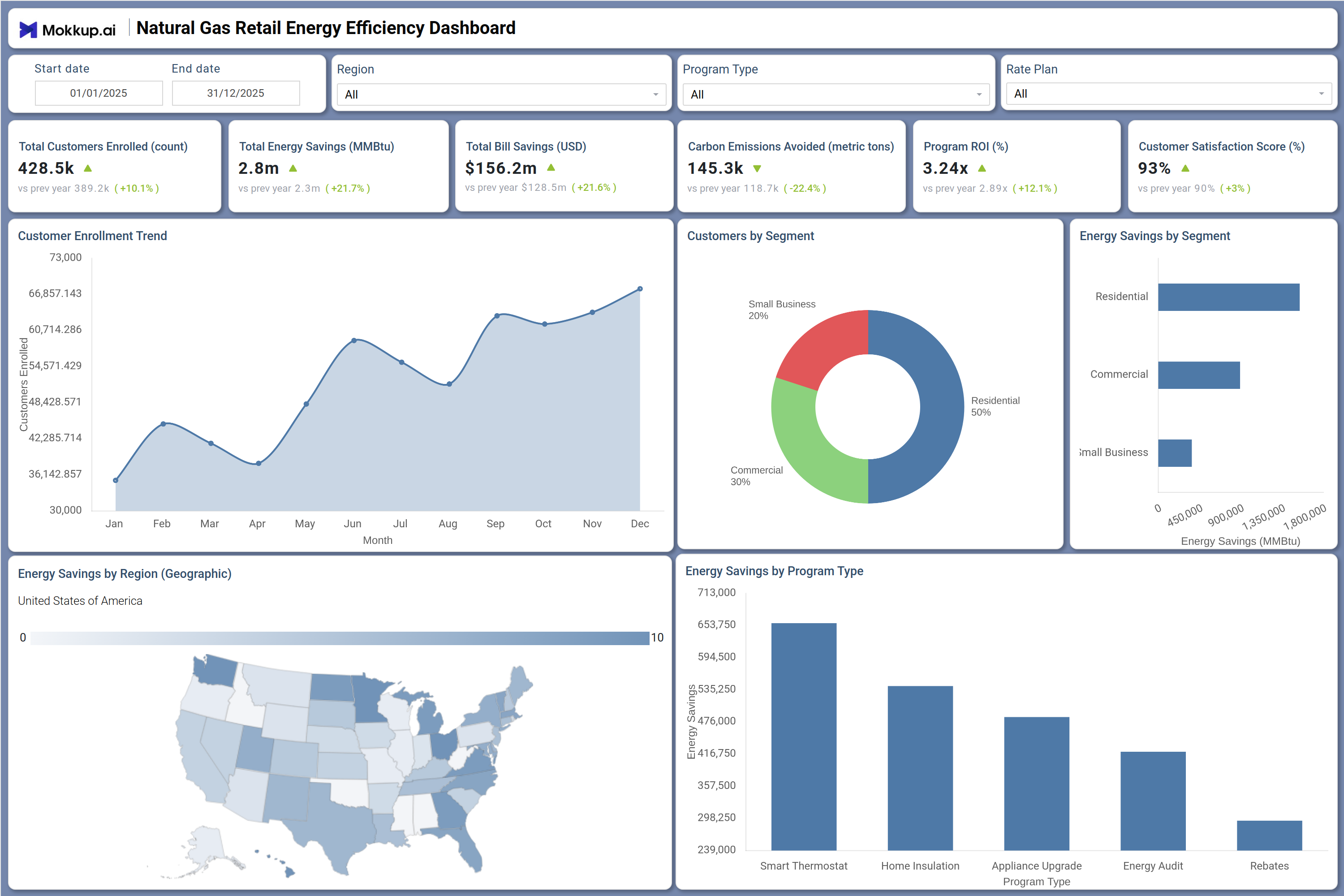
The Natural Gas Retail Energy Efficiency Dashboard is a structured analytics template designed for natural gas utilities, retail energy providers, and program administrators responsible for managing consumer energy efficiency initiatives. It consolidates customer enrollment data, energy savings metrics, bill reduction figures, program return on investment, and supports carbon emissions tracking for gas utilities through a dedicated KPI tile.
With filters for date range, region, program type, and rate plan, teams can quickly segment performance across residential, commercial, and small business customer groups. As a natural gas retail energy efficiency dashboard, it gives program managers and sustainability leads the visibility they need to evaluate which initiatives drive the greatest impact and where to focus resources next.
How to Create a Natural Gas Retail Energy Efficiency Dashboard
You don’t need to build your report from scratch, just start with a ready-to-use Natural Gas Retail Energy Efficiency dashboard template from Mokkup. Add in your data and export it however you like. Here’s how to do it:
1. Create or Log in to Your Mokkup Account
Start by signing up on Mokkup.ai using your email. If you already have an account, just log in, and you'll be good to go.
2. Choose and Customize Your Dashboard Template
Find the Natural Gas Retail Energy Efficiency Dashboard template in the Templates section. Use the drag-and-drop editor to adjust KPIs, edit filters, or add elements based on your data.
3. Export to Your BI Tool
Once your dashboard wireframe is ready, use the BI Tool Export feature to send it directly to Power BI or Tableau for further analysis and enhancements. You can also download the dashboard as a PDF, PNG, or JPEG, embed it on a platform, or invite your team to collaborate.
Note: This is a Pro template. You'll need a Pro subscription on Mokkup to use and customize this dashboard wireframe. Upgrade anytime to unlock full access.
Natural Gas Retail Energy Efficiency Dashboard Example
An energy efficiency program manager opens this dashboard at the start of a review cycle to understand how enrollment and savings are trending across the customer base. The Customer Enrollment Trend line chart shows how participation has grown month over month, helping the team identify which periods saw the strongest uptake and whether marketing pushes translated into lasting engagement. Paired with the Customers by Segment donut chart, teams can see how residential, commercial, and small business groups are distributed and compare those proportions against actual energy savings using the Energy Savings by Segment bar chart, supporting precise consumer energy savings and bill reduction analytics.
When regional performance is under review, planners can examine the Energy Savings by Region map to identify geographic gaps and determine where targeted outreach or expanded program offerings are needed. The Energy Savings by Program Type bar chart makes it straightforward to assess which programs are generating the most savings across Smart Thermostat, Home Insulation, Appliance Upgrade, Energy Audit, and Rebates, supporting budget planning and utility energy savings program management decisions. Combined with the top-line KPIs covering carbon emissions avoided, program ROI, and customer satisfaction, leadership can evaluate both environmental and financial performance in one view.
How to Analyze Data in a Natural Gas Retail Energy Efficiency Dashboard
Here is how you can analyze data from this dashboard:
- Filter by Region: Isolate energy savings and enrollment performance by geographic market.
- Compare Program Types: Evaluate Smart Thermostat, Insulation, Appliance Upgrade, and other programs independently.
- Track Enrollment Trends: Monitor customer enrollment to spot seasonal patterns and adjust campaigns.
- Understand Customer Mix: Review segment distribution across residential, commercial, and small business users.
- Measure Segment Contribution: Analyze energy savings by segment to identify top contributors.
- Identify Low-Adoption Areas: Use the regional map to target markets needing stronger outreach.
- Evaluate Program Impact: Compare energy savings by program type to guide budget allocation.
- Analyze Rate Plans: Segment by pricing structure to find correlations with participation and savings.
Benefits of a Natural Gas Retail Energy Efficiency Dashboard
The following are the benefits of using this dashboard:
- Centralized Performance View: Combines enrollment, savings, billing, and emissions data.
- Comprehensive Program Tracking: Monitors performance across programs and customer segments.
- Reduced Reporting Effort: Prebuilt KPIs simplify analysis of ROI and customer metrics.
- Regional Insights: Supports targeted decisions using geographic performance data.
- Better Budget Allocation: Highlights program-level contribution to total savings.
- Consistent Reporting: Aligns data across residential, commercial, and small business segments.
- Shared Strategic Visibility: Gives teams a unified view of financial, environmental, and customer outcomes.
KPIs to Track in a Natural Gas Retail Energy Efficiency Dashboard
The following key KPIs can be tracked by using this dashboard:
- Total Customers Enrolled (count): Tracks total participation in the program — a core growth indicator for any natural gas retail energy efficiency dashboard and program expansion planning.
- Total Energy Savings (MMBtu): Measures cumulative energy conserved across all program types, supporting natural gas energy efficiency program tracking and sustainability reporting.
- Total Bill Savings (USD): Quantifies the total financial benefit delivered to customers through efficiency programs, central to consumer energy savings and bill reduction analytics.
- Carbon Emissions Avoided (metric tons): Measures greenhouse gas reductions from program participation, essential for carbon emissions tracking for gas utilities and environmental compliance reporting.
- Program ROI (%): Evaluates financial return on the program portfolio, helping leadership assess cost-effectiveness and outcomes from utility energy savings program management.
- Customer Satisfaction Score (%): Tracks customer experience with program delivery — a key metric in any retail energy customer engagement dashboard for measuring program satisfaction and retention.
Frequently Asked Questions
Q1. What industries benefit most from this Natural Gas Retail Energy Efficiency Dashboard?
Natural gas utilities, retail energy providers, and state-level energy program administrators benefit most. It is particularly useful for program managers overseeing residential, commercial, and small business efficiency initiatives.
Q2. Can this dashboard track performance across multiple program types simultaneously?
Yes. The dashboard includes a Program Type filter and an Energy Savings by Program Type bar chart that shows performance across Smart Thermostat, Home Insulation, Appliance Upgrade, Energy Audit, and Rebates programs side by side.
Q3. Is this dashboard suitable for regional energy efficiency reporting?
Yes. The Energy Savings by Region geographic map visualizes energy savings across U.S. states, and the Region filter allows teams to isolate and compare performance by specific geographic areas. It also serves as a retail energy customer engagement dashboard by linking geographic insights to customer satisfaction and enrollment trends.