
What is a Wastewater Collection Sewer Network Health Dashboard?
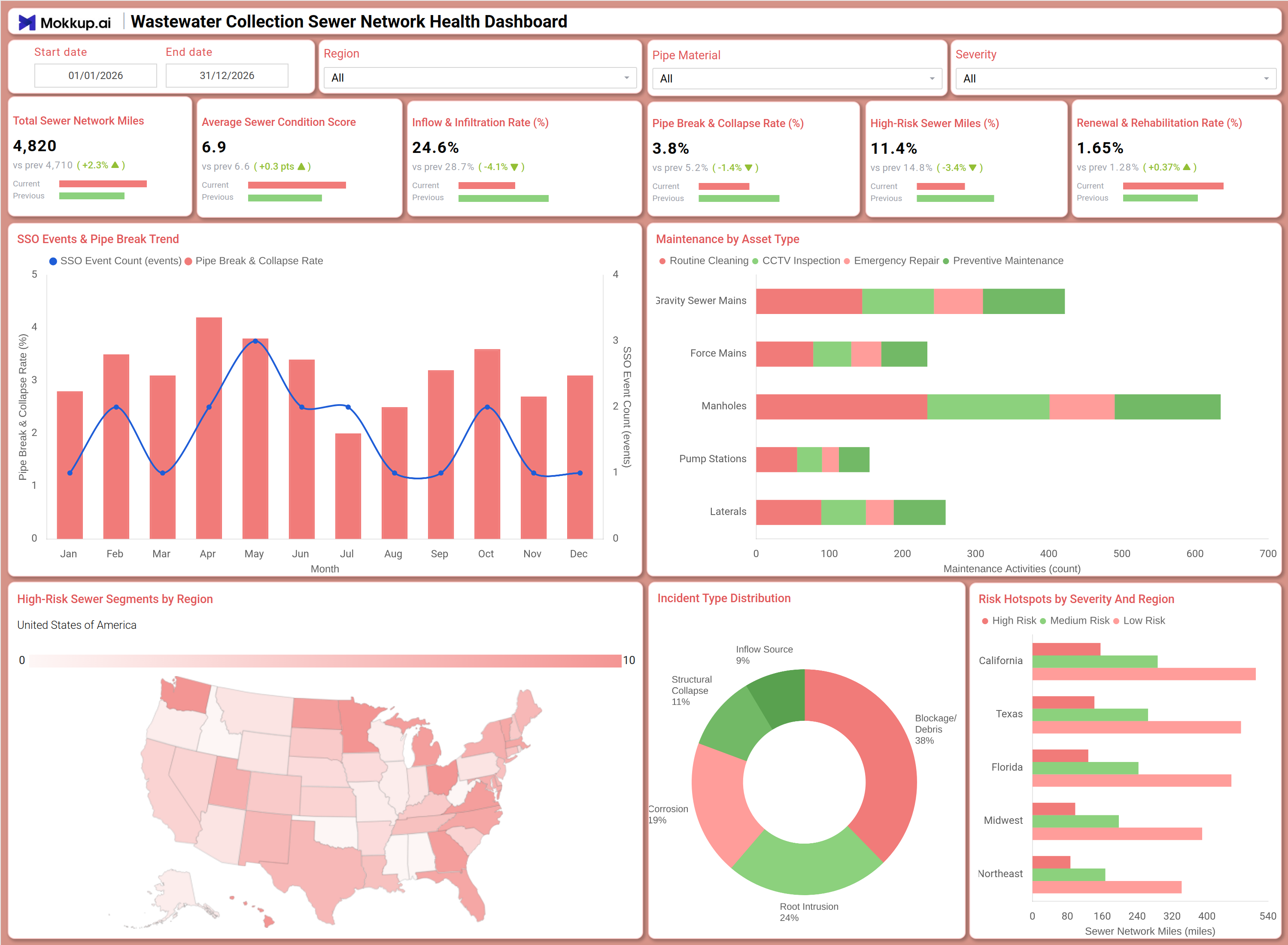
The Wastewater Collection Sewer Network Health Dashboard is a structured analytical template built for municipal utilities, wastewater management agencies, and public works departments that monitor underground sewer infrastructure condition. This wastewater collection sewer network health dashboard brings together total sewer network miles, average sewer condition scores, inflow and infiltration rate monitoring results, pipe break and collapse rates, high-risk sewer mileage, and planned rehabilitation rates into a single operational view. It combines trend tracking, geographic risk mapping, and maintenance planning visuals so that infrastructure managers can assess system health and act without relying on manual reports compiled from multiple data sources.
How to Create a Wastewater Collection Sewer Network Health Dashboard
You don't need to build your report from scratch; just start with a ready-to-use dashboard template from Mokkup. Add in your data and export it however you like. Here's how to do it:
1. Create or Log in to Your Mokkup Account
Start by signing up on Mokkup.ai using your email. If you already have an account, just log in, and you'll be good to go.
2. Choose and Customize Your Dashboard Template
Find the Wastewater Collection Sewer Network Health Dashboard template in the Templates section. Use the drag-and-drop editor to adjust KPIs, edit filters, or add elements based on your data.
3. Export to Your BI Tool
Once your dashboard wireframe is ready, use the BI Tool Export feature to send it directly to Power BI or Tableau for further analysis and enhancements. You can also download the dashboard as a PDF, PNG, or JPEG, embed it on a platform, or invite your team to collaborate.
Note: This is a Pro template. You'll need a Pro subscription on Mokkup to use and customize this dashboard wireframe. Upgrade anytime to unlock full access.
Wastewater Collection Sewer Network Health Dashboard Example
A regional utility operations team opens this dashboard at the start of a planning cycle to understand where the sewer network is under the most stress. The KPI row tells managers immediately whether inflow and infiltration rate monitoring results are within acceptable thresholds or signal a wet-weather infiltration problem. If the pipe break and collapse rate is trending upward, teams can cross-reference the SSO Events and Pipe Break Trend chart to assess whether the spike is seasonal or a sustained pattern. The Planned vs Completed Maintenance by Asset Type chart lets planners verify whether gravity sewer mains, manholes, force mains, pump stations, and laterals are receiving scheduled cleaning, CCTV inspections, emergency repairs, and preventive maintenance. The High-Risk Sewer Segments by Region map, combined with the Risk Hotspots by Severity and Region chart, enables supervisors to direct field crews toward areas with the highest concentration of high-risk sewer miles. The Incident Type Distribution donut chart breaks down root intrusion, blockage, structural collapse, and inflow sources so teams can direct rehabilitation budgets toward the failure modes generating the most incidents.
How to Analyze Data in a Wastewater Collection Sewer Network Health Dashboard
Here is how you can analyze data from this dashboard:
- Use the Region filter to isolate network health metrics for a specific service territory and compare condition scores.
- Apply the Pipe Material filter to check whether certain pipe materials show elevated sewer pipe break collapse rate tracking patterns.
- Use the Severity filter to surface only critical or high-risk sewer incidents for immediate triage.
- Monitor the SSO Events and Pipe Break Trend combo chart to detect months when event counts and collapse rates spike together.
- Review the Planned vs Completed Maintenance by Asset Type chart for sewer maintenance planning by asset type gaps.
- Analyze the Incident Type Distribution donut chart to identify which failure mode drives the most network incidents.
- Use the High-Risk Sewer Segments by Region map for high risk sewer segment identification across service territories.
- Cross-reference the Risk Hotspots by Severity and Region bar chart with the regional map to confirm findings and prioritize work orders.
Benefits of a Wastewater Collection Sewer Network Health Dashboard
The following are the benefits of using this dashboard:
- Centralizes sewer network condition data, including miles, scores, incident rates, and maintenance status, into one structured template.
- Supports SSO event trend analysis dashboard workflows by tracking monthly event counts alongside collapse rate trends in a single chart.
- Eliminates manual maintenance record compilation with pre-built grouped bar visuals across all five major asset types.
- Enables regional high-risk sewer segment identification through a choropleth map and severity breakdown in one view.
- Provides an incident type distribution that directs rehabilitation budgets toward the dominant failure modes.
- Helps utility planners align scheduled maintenance with actual completion rates to reduce unplanned emergency repairs.
- Gives operations teams and capital planning managers a shared view of network health and risk distribution.
KPIs to Track in a Wastewater Collection Sewer Network Health Dashboard
The following key KPIs can be tracked by using this dashboard:
- Total Sewer Network Miles: The baseline scale metric for this wastewater collection sewer network health dashboard, representing total active pipe under management.
- Average Sewer Condition Score: Measures aggregate structural health on a standardized scale to indicate whether the network is deteriorating or stable.
- Inflow and Infiltration Rate (%): Tracks inflow and infiltration rate monitoring results as the share of flow attributable to groundwater or stormwater entering through cracks or improper connections.
- Pipe Break and Collapse Rate (%): Quantifies the share of pipe segments in structural failure, making sewer pipe break collapse rate tracking critical for detecting accelerated aging.
- High Risk Sewer Miles (%): Measures the proportion of total network miles classified as high risk, directly supporting high risk sewer segment identification and rehabilitation investment decisions.
- Planned and Rehabilitation Rate (%): Tracks the percentage of planned activities completed, showing how well sewer maintenance planning by asset type converts into executed work.
Frequently Asked Questions
1. What industries benefit most from this wastewater collection sewer network health dashboard?
Municipal wastewater utilities, county public works departments, and regional sanitation districts benefit most. Capital planning engineers, network operations supervisors, and compliance teams are the primary users.
2. Can this dashboard track maintenance completion by specific asset types?
Yes. The Planned vs Completed Maintenance by Asset Type chart covers routine cleaning, CCTV inspection, emergency repair, and preventive maintenance across gravity sewer mains, force mains, manholes, pump stations, and laterals.
3. How does the SSO Events and Pipe Break Trend chart work?
It overlays monthly SSO event counts as bars with the pipe break and collapse rate as a line. This supports SSO event trend analysis dashboard reviews by revealing whether overflow events and structural failures move together or independently.
4. What does the Inflow and Infiltration Rate KPI measure?
It measures the share of sewer flow attributable to groundwater or stormwater entering through cracks, joints, or improper connections. High values are the primary output of inflow and infiltration rate monitoring for compliance and capacity planning.
5. Is this dashboard suitable for identifying geographic risk concentrations?
Yes. The High-Risk Sewer Segments by Region map and the Risk Hotspots by Severity and Region chart together show where high, medium, and low-risk sewer mileage is concentrated across California, Texas, Florida, the Midwest, and the Northeast regions.