
What is a Wastewater Collection Pumping Station Operations Performance Dashboard?
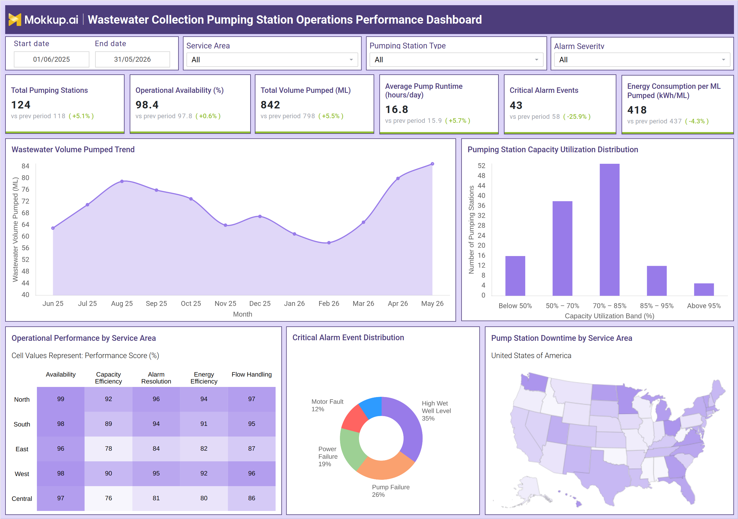
The Wastewater Collection Pumping Station Operations Performance Dashboard is a structured monitoring tool built for utility operations teams managing distributed pump station networks. It consolidates operational metrics, alarm activity, energy performance, and service-area breakdowns into a single view, giving managers the information they need to assess how well their collection infrastructure is functioning. The dashboard tracks key indicators, including station availability, total volume pumped, average pump runtime, critical alarm events, and energy consumption per unit of volume pumped. Filters for service area, pumping station type, and alarm severity make it straightforward to isolate specific segments of the network and compare performance across regions. Designed to support wastewater collection system KPI tracking, this wastewater pumping station operations performance dashboard helps operations teams move from reactive incident response to consistent, evidence-based station management.
How to Create a Wastewater Collection Pumping Station Operations Performance Dashboard
You don't need to build your report from scratch, just start with a ready-to-use dashboard template from Mokkup. Add in your data and export it however you like. Here's how to do it:
1. Create or Log in to Your Mokkup Account
Start by signing up on Mokkup.ai using your email. If you already have an account, just log in, and you'll be good to go.
2. Choose and Customize Your Dashboard Template
Find the Wastewater Collection Pumping Station Operations Performance Dashboard template in the Templates section. Use the drag-and-drop editor to adjust KPIs, edit filters, or add elements based on your data.
3. Export to Your BI Tool
Once your dashboard wireframe is ready, use the BI Tool Export feature to send it directly to Power BI or Tableau for further analysis and enhancements. You can also download the dashboard as a PDF, PNG, or JPEG, embed it on a platform, or invite your team to collaborate.
Note: This is a Pro template. You'll need a Pro subscription on Mokkup to use and customize this dashboard wireframe. Upgrade anytime to unlock full access.
Wastewater Collection Pumping Station Operations Performance Dashboard Example
An operations manager overseeing a regional wastewater utility opens this dashboard after a period of increased rainfall to check whether the network met service obligations without degradation. The first thing they review is whether the pump station's operational availability is holding above acceptable thresholds and whether total volume throughput is tracking within expected bounds. The volume pumped trend line, spanning the full reporting window month by month, shows exactly where demand surged and whether the network absorbed it without gaps in service continuity. When the manager notices that critical alarm events are elevated during a specific quarter, they move to the alarm event distribution chart to understand which fault categories are driving the pattern. The breakdown between motor faults, high wet well levels, pump failures, and power failures makes it possible to prioritize corrective maintenance by impact. This kind of wastewater collection system KPI tracking ensures that field crews focus on the failures most likely to affect throughput and availability.
For service-area planning, the operational performance table provides a performance score across five dimensions for each region in the network. Teams using the wastewater pumping station operations performance dashboard can immediately see which regions are underperforming on alarm resolution or flow handling and direct resources accordingly. The geographic downtime map reinforces this by showing where station delays are physically concentrated across the service territory. Energy managers use the pumping station energy consumption per ML pumped analysis to track efficiency trends over time. When energy per unit volume rises without a matching increase in throughput, it signals pump degradation or inefficient duty cycling, both correctable before they drive up operating costs.
How to Analyze Data in a Wastewater Collection Pumping Station Operations Performance Dashboard
Here is how you can analyze data from this dashboard:
- Filter by Service Area to isolate performance metrics for North, South, East, West, or Central regions independently.
- Use the Pumping Station Type filter to compare performance across different station configurations within the network.
- Review the Wastewater Volume Pumped Trend line chart to identify seasonal demand patterns and throughput anomalies over the reporting period.
- Analyze the Pumping Station Capacity Utilization Distribution bar chart — this is the core of pump station capacity utilization monitoring dashboard analysis.
- Cross-reference the Critical Alarm Event Distribution donut chart with the alarm resolution score in the performance table to find service areas with unresolved fault backlogs.
- Track Average Pump Runtime alongside Total Volume Pumped to assess whether stations are operating at appropriate duty cycles.
- Monitor Energy Consumption per ML Pumped across reporting periods to detect efficiency degradation early.
Benefits of a Wastewater Collection Pumping Station Operations Performance Dashboard
The following are the benefits of using this dashboard:
- Consolidates station availability, volume output, alarm events, and energy data into one view for faster decision-making.
- Supports pump station capacity utilization monitoring dashboard analysis across multiple utilization bands to prevent network overloading.
- Enables service-area-level performance benchmarking to prioritize field maintenance resources where they are needed most.
- Reduces response time to critical faults by categorizing alarm events using the critical alarm event distribution wastewater dashboard view.
- Provides a repeatable framework for wastewater pumping station operations performance review across reporting cycles.
- Tracks energy consumption trends to support operational cost management and long-term efficiency planning.
KPIs to Track in a Wastewater Collection Pumping Station Operations Performance Dashboard
The following key KPIs can be tracked by using this wastewater collection system KPI tracking software dashboard:
- Total Pumping Stations: Counts the number of active pump stations being monitored across the network.
- Operational Availability (%): Measures the percentage of time stations are functioning without unplanned outages — central to any pump station operational availability monitoring tool.
- Total Volume Pumped (ML): Tracks total wastewater volume moved through the collection network in the reporting period.
- Average Pump Runtime (hours/day): Indicates average daily operating hours per pump, helping identify overworked or underutilized assets.
- Critical Alarm Events: Counts high-priority alarms across the network, a direct input for the critical alarm event distribution wastewater dashboard view.
- Energy Consumption per ML Pumped (kWh/ML): Measures energy used relative to volume output — the primary metric for pumping station energy consumption per ML pumped analysis.
Frequently Asked Questions
1. What types of pumping stations can this dashboard monitor?
The dashboard includes a Pumping Station Type filter that allows teams to segment performance data by station category. As a pump station operational availability monitoring tool, it applies to networks with mixed infrastructure configurations across a service territory.
2. How does the Critical Alarm Event Distribution chart support maintenance prioritization?
It categorizes alarm events by fault type — motor faults, pump failures, high wet well levels, and power failures — showing which types occur most frequently. Maintenance teams use this to allocate resources toward the fault categories with the highest operational impact.
3. Can this dashboard support performance comparison across multiple service areas?
Yes. The Operational Performance by Service Area table scores each region across availability, capacity efficiency, alarm resolution, energy efficiency, and flow handling. Combined with the geographic downtime map, it provides a clear regional comparison for prioritizing interventions.